
The Intentional Overlay: Why Most Double Exposure Photos Fail
Where The Blend Actually Breaks
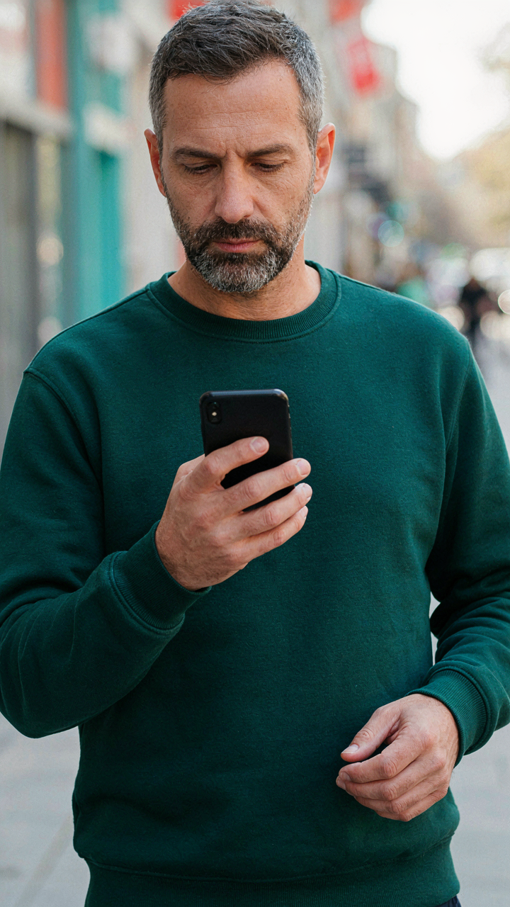
You want people to think you have a trained eye. That’s why this section matters. But most double exposure fails because people treat layering like a math problem instead of a contrast problem. In graphic design, layering works on a principle called “figure-ground separation”—the relationship between what stands forward and what recedes. On iPhone, your base image and overlay compete for attention instead of defining each other. When both elements fight for the same tonal space, the viewer’s brain can’t parse either one. The mechanism is simple: overlap without contrast creates visual noise, not depth.
The common advice says “just blend until it looks cool.” Wrong. You need strategic darkness and brightness. Your base image should anchor one tonal range, and your overlay should occupy a distinctly different one. If your landscape is mid-tone and your silhouette is also mid-tone, they’ll muddy into an unreadable mess. The fix comes before you touch any app. Choose your base image for its highlight or shadow dominance, then choose an overlay that lives in the opposite range. This forces separation without manipulation.
Seeing The Composite Before Capture
Pre-visualization isn’t mystical intuition. It’s the disciplined act of deciding what the final image does before you shoot. Most people grab a pretty landscape, grab a random silhouette, and hope the app makes magic. The result is random, and randomness reads as accidental. You need to decide: does the silhouette sit inside the landscape, or does the landscape texture the silhouette? Does the overlay strengthen the story or distract from it? These aren’t aesthetic questions. They’re structural ones about what the image communicates.
Start by choosing your base image first, then hunting for overlays that specifically complement it. If your base is a person in shadow, your overlay should be something with visible internal detail and edge definition. If your base is a bright sky, your overlay needs strong silhouette geometry. The overlay must add information the base image lacks, not repeat what’s already there. When you pre-visualize this relationship on your phone before opening any app, you eliminate the 80 percent of failed attempts that come from indecision during the editing process.
Beyond The Blur: Mastering The Merge With Simple Apps

What Your Blending App Actually Controls
You want to look like you understand photography without learning photography. The real mechanism here is opacity and layer interaction. Blending apps give you direct control over how two images stack on top of each other, which layer sits where, and at what strength one image shows through the other.

Most apps label this wrong. They call it “opacity” or “transparency,” but what you’re actually doing is controlling signal strength. Think of it like audio engineering, where you’re mixing two tracks at different volumes. One image is your main track; the second is the overlay. The app’s slider doesn’t make magic happen. It determines what percentage of the top layer’s pixels the camera sees versus the bottom layer’s pixels behind it.
From Raw Footage To Finished Composite
Capture two images in sequence without moving your phone between shots. The first image becomes your foundation. Open your blending app and import both images. The app stacks them automatically. Now adjust the opacity slider until the overlap reads as intentional, not accidental. Most people stop here and quit. Refine the alignment next. Tap and drag the top layer until the edges line up where you want them to. If the app has masking, use it to hide parts of the overlay so the blend looks deliberate, not sloppy. Export at full resolution. Blending apps compress output by default, which kills detail.
The sequence matters more than the app. A weak capture workflow ruins a strong merge. Lock your exposure before taking the first shot so both frames match in brightness. If light shifts between images, the blend will look fractured no matter what controls you have. Tap to lock exposure on iPhone, wait two seconds, then take both shots. This single step separates intentional double exposures from failed experiments.
The Archetype Method: Selecting Your Foundation Images

Base Images With Real Separation
You want the double exposure to look intentional, not like you accidentally layered two mediocre photos. That’s the real fear. The mechanism is borrowed from figure-ground separation in visual design: your base image needs tonal zones that read as distinct foreground and background so the overlay actually lands instead of disappearing. Silhouettes work. Dark subjects against bright skies work. Blown-out backgrounds work. What doesn’t work is picking images where everything competes for the same tonal space.

iPhone apps applying double exposure will reveal edges where layers fail. The base image’s light areas become the canvas for your overlay. If your foundation shot has no real blacks or no real whites, you’ve surrendered the effect before you started. Shoot or source images where contrast isn’t subtle. Build your double exposure on that separation.
Overlays That Integrate, Not Assault
Everyone says find pretty textures and slap them on top. That’s how you end up with transparent leaves floating over a portrait like a design school mistake. The overlay isn’t decoration. It’s a second narrative that occupies the negative space your base image created. Pick overlays with their own tonal range, not just light wisps. Photographs of trees, water, or geometric patterns work better than generic texture filters because they have actual shadow and substance.
The overlay should feel like it belongs inside the base image, not on top of it. Test this in your app by adjusting blend modes before settling on opacity. If you’re cranking opacity to 100 percent just to see the overlay, it’s the wrong overlay. The best double exposures make you wonder for a half-second whether you’re looking at one image or two.
Narrative Double Exposure Portrait: Weaving Visual Stories
Meaning Built Into Layers
You want this because it transforms a basic photo trick into something that looks intentional, like you understand visual language. Here’s the mechanism: double exposure works because juxtaposition forces the viewer’s brain to find meaning between two unrelated images. This is borrowed from montage theory in film—where Eisenstein proved that meaning doesn’t live in individual shots but in the collision between them. On iPhone, you’re doing the same thing: the overlap creates a third narrative that neither image holds alone.

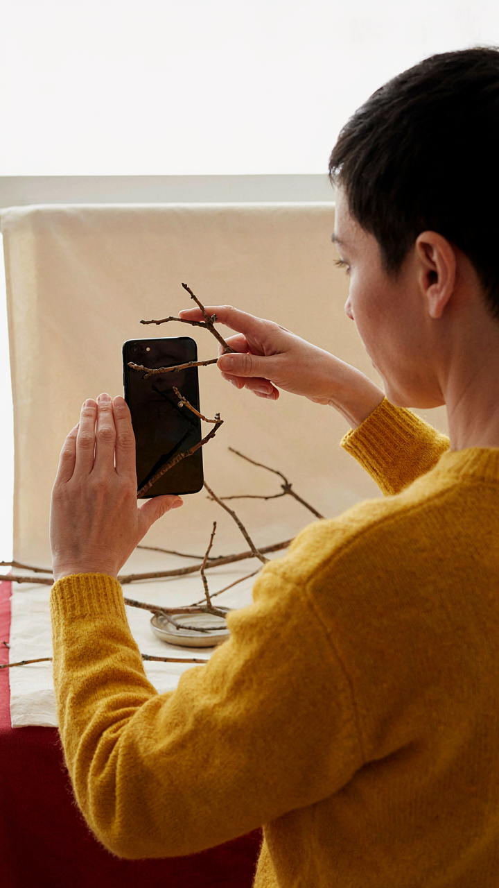
The practical application is deliberate selection. Don’t layer random textures over faces. Choose a second image that contradicts or completes the portrait’s context. If you’re shooting someone in a corporate headshot, layer in bare branches or water to suggest constraint or depth. The app—whether Snapseed, Photoshop Express, or the native Photos editing tool—handles the blend mode mechanics. Your job is picking which story the collision tells. The viewer reads the composite as a statement about the subject, not as two separate pictures stacked on top of each other.
Resonance Through Strategic Opacity
Generic advice says blend images until they “feel right.” That’s avoiding the actual work. What matters is controlling which image dominates at which opacity level, because that determines what emotion the viewer processes first. Lower opacity on the overlay creates subtlety. High opacity creates conflict. Medium opacity creates harmony. The eye processes dominant elements before recessive ones, so your opacity choice controls the hierarchy of meaning.
Most apps let you adjust blend mode and opacity independently. Start with the portrait at full opacity, then dial the secondary image in at 30 to 50 percent. This forces recognition of both elements without one drowning the other. If the result feels muddled, you’re trying to tell two competing stories instead of one unified narrative. Simplify the overlay image or shift its opacity five to ten percent at a time until the collision produces a single clear reading. This is your protocol.
Nature Double Exposure: Harnessing Organic Forms
Texture And Pattern Layering
You want this section because layering nature textures makes your work look intentional, not accidental. The mechanism is simple: texture becomes a visual anchor that prevents double exposure from reading as a mistake. When you stack a leaf pattern over a face, the leaf does the heavy lifting—it signals design choice rather than technical failure.

Start with high-contrast textures. Bark, water ripples, and frost patterns photograph with clear light and shadow separation on iPhone. These read immediately when layered. Open your first image in a blend app, then select overlay or screen mode—not multiply, which darkens everything into mud. The texture layer needs to sit on top without erasing the base image entirely.
Behavioral Composition And Framing
Ethology studies animal movement and positioning. Apply this to your double exposure: foreground behavior plus background environment creates narrative depth. Most people stack random images and wonder why it feels hollow. The real answer is there’s no spatial or behavioral relationship between the layers.
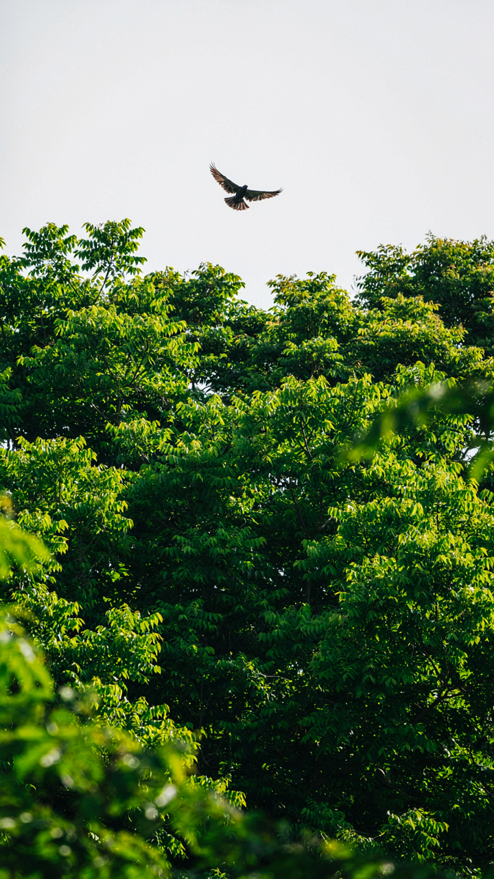
Observe how subjects interact with their environment first. A bird in flight needs sky or trees behind it, not a random texture. Photograph the behavioral moment before considering what texture or pattern will enhance its story. Then select overlay elements that show relationship, not just visual contrast. Layer a migration pattern of birds with a forest canopy. Layer an animal’s hunting posture with predatory shadows. The double exposure works because the layers speak to each other through composition logic, not accident.
Cinematic Double Exposure: Crafting Mood And Atmosphere
Contrast As Your Primary Tool
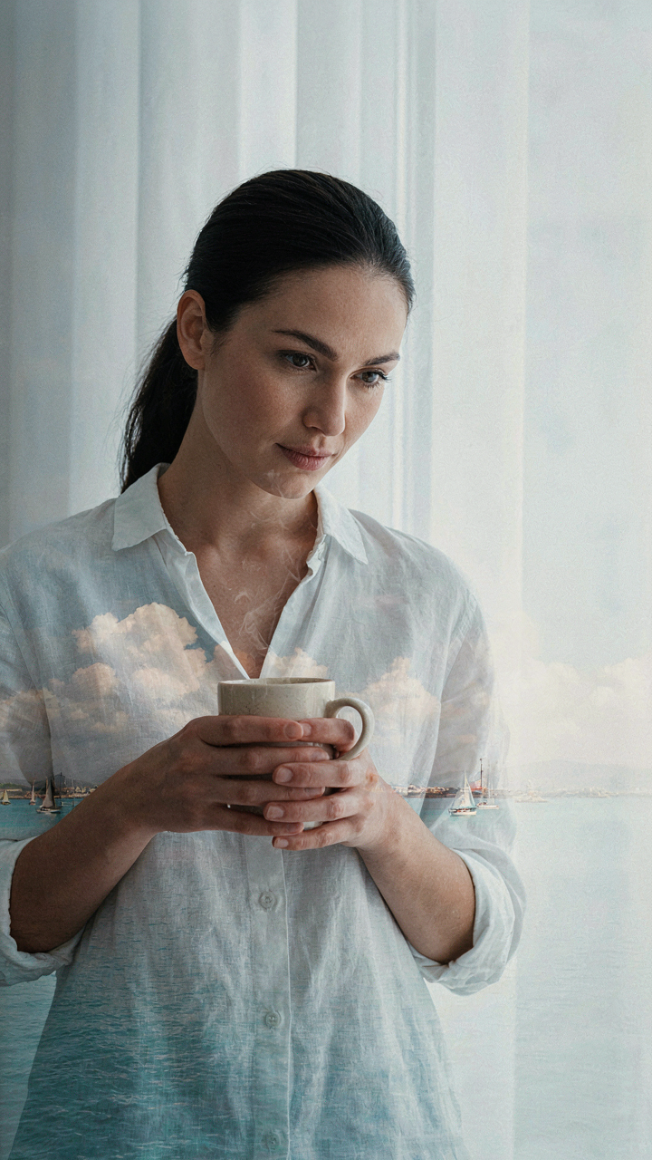
You want people to feel something when they see your image, and you think that comes from picking the right subjects. It doesn’t. The mechanism borrowed from photography’s exposure theory is simple: contrast creates visibility, and visibility creates emotion. In double exposure on iPhone, you control contrast through the placement of light and shadow across both image layers. One image provides the skeleton. The other provides the skin tone. If both are similarly lit, they merge into visual mud. If one layer is predominantly dark and the other bright, the blend becomes readable and carries weight.

The technical move is direct. Shoot your first layer with intentional shadow—a silhouette, a backlit figure, a scene with deep blacks. Shoot your second layer with clear highlights or bright midtones. When you blend them in apps like Snapseed or Superimpose X, the dark areas of the first image become transparent to the second, revealing detail where you need it. The bright areas stay opaque and anchor the composition. This is why backlighting works so well for double exposure subjects. You’re not chasing mood through sentiment. You’re engineering readability through contrast ratios.
Building Unified Color Across Layers
Most people assume color grading happens at the end, after blending. That’s backwards and wastes your leverage. Color work starts before you shoot either layer. When your two images already share a color temperature and saturation level, the blend feels intentional instead of accidental. An iPhone shot in warm tungsten light will fight against a cool daylight image no matter how you blend them. The solution isn’t to grade harder after. It’s to shoot with the same light story from the start.
Once blended, use Snapseed’s tune image tool or Lightroom Mobile to shift the overall tone as a single object, not two separate pieces fighting each other. Cool down warm shadows or warm up cool highlights until the image reads as one scene, not a composite. The final step is saturation control. Drop it slightly across the entire image so no single color dominates the blend. This creates cohesion. When all colors sit in the same tonal family and saturation range, viewers see atmosphere instead of technique.
The Subtlety Principle: Avoiding Overprocessed Double Exposure Photos

Restraint Over Rendering
You want your double exposure to look intentional, not like you discovered a filter and couldn’t stop clicking. The real mechanism here comes from signal-to-noise ratio in photography: too many layers muddy the message. Stack three images with full opacity and you get visual chaos. Stack two images where the second sits at 30 to 50 percent opacity and you get depth. The difference isn’t aesthetic preference. It’s readability. Your eye needs to parse what it’s seeing.

Most apps default to blend modes that crush contrast or blow out highlights because those settings look dramatic in previews. Ignore this. Start with Screen or Lighten mode at low opacity, then adjust down from there rather than up. The counterintuitive move: reduce opacity before you think you need to. If your composition reads clearly at 40 percent, don’t push it to 60. That’s the line between craft and desperation.
Spotting And Fixing Digital Noise
Common advice says to shoot in good light and use high-quality source images. True, but incomplete. The real culprit is what happens when blend modes interact with compressed JPEG data. Your iPhone captures JPEGs by default, and when you layer two compressed images with Screen or Overlay mode, the algorithm amplifies noise in shadow areas. You see this as grainy patches that break the illusion.
Open your composited image in a detail view before saving. Zoom to 100 percent and check the transition zones where your two images meet. If you see speckled texture that wasn’t in your source photos, that’s compression artifact amplification. Fix it by lowering the opacity of the noisier layer by 5 to 10 percent or switching to a gentler blend mode like Soft Light. Save as a high-quality export, not a camera roll JPEG, to prevent another compression cycle.
Beyond The Screen: Printing And Presenting Your Photography Double Exposure
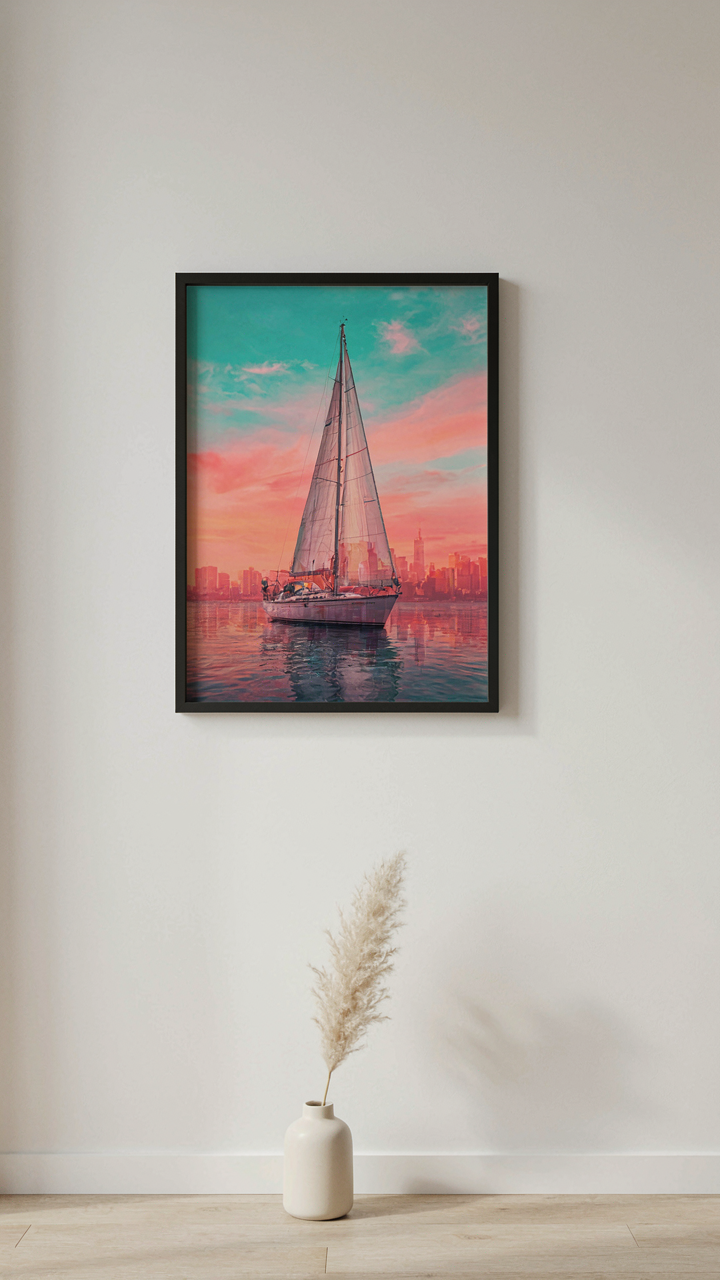
Print Files That Don’t Fall Apart
You want your double exposure work to look as good in print as it does on your phone because hanging something on a wall signals permanence and investment in a way a screen never will. Print quality hinges on resolution and color space. Your iPhone captures in sRGB, which works for web but clips color range in professional printing. Export your double exposure at 300 DPI minimum for prints above 8×10 inches. Anything lower renders soft and pixelated. Use a color management tool like ColorLogic or Adobe DNG export to preserve your layering work during file conversion.
- 8×10 and smaller prints: 240 DPI minimum suffices. File size stays manageable while maintaining sharpness for tabletop or shelf display.
- 11×14 to 16×20 prints: 300 DPI required. This resolution matches professional lab standards and prevents visible pixel degradation at arm’s length viewing.
- Canvas or fine art paper: Shoot in ProRAW mode if available. The added color data survives the digital-to-physical translation without banding or color shift.
- Metallic or glossy finishes: Export with slight over-saturation adjustment. These surfaces compress contrast, so compensating in the file prevents dull, washed results.
- Black and white double exposure: Convert to CMYK before sending to print labs. Grayscale iPhone exports lose shadow detail CMYK captures.

Most app exports default to web-optimized settings. Switch to manual export options and verify bit depth is 16-bit, not 8-bit. The difference shows immediately under professional printing. Your lab will flag compressed files. Avoid that friction by exporting at full capacity from the start.
Building Your Portfolio Around Strength
Stop treating your portfolio like a resume of everything you’ve made. Curation is inverse: remove pieces until only the ones that communicate a single visual idea remain. Your double exposure portfolio should establish one repeatable principle, not prove range. If your work spans portraiture overlaid with landscapes, cityscapes with textures, and abstract shape combinations, viewers remember nothing. Narrow to two themes maximum. Show five strong executions of each rather than twenty scattered attempts.
Sequence matters more than individual images. Open with your strongest single shot, close with your second-strongest. Middle pieces should show progression or technique variation, not weakness. Use a platform that lets you control presentation without auto-layout fluff. Squarespace, Format, or even a simplified Cargo site beats Instagram’s algorithm-driven feed. Platform choice signals professionalism. The double exposure work you’re proud of deserves a container that doesn’t compete for attention with the internet’s noise.
Developing Your Eye For Unique Double Exposure Photography
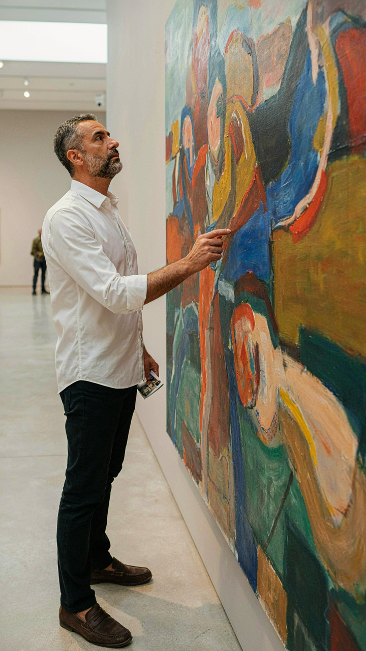
See What Others Miss
You want this section because you’re afraid your double exposures look like everyone else’s, and you’re right to worry. The real mechanism is this: your eye trains itself on what you’ve already seen, so you keep making variations of the same image. Perception in photography mirrors how neural networks work. They pattern-match against training data. Your brain does the same thing. The more diverse imagery you consume, the more reference points your visual cortex has to pull from when composing a shot.

Stop scrolling double exposure feeds looking for inspiration. That’s the opposite of what you need. Instead, study non-double-exposure work. Look at editorial fashion photography, architectural renders, medical imaging, abstract painting. Study how light splits across surfaces in a museum. Notice how one object’s texture changes when layered over another. The best double exposure ideas never came from looking at double exposures. They came from observing something else and recognizing how two unrelated things could collide.
Deliberate Repetition Builds Intuition
The common advice here is “just take more photos.” That’s incomplete. You need structured repetition, not volume. This is deliberate practice, not reps. Pick one concept—say, faces merged with landscapes—and shoot it ten times using different silhouettes, different background textures, different opacity levels. Each iteration, you’re not just clicking. You’re testing a single variable and watching how it changes the outcome.
The compounding effect emerges after two weeks of this. Your muscle memory adapts. Your phone finger learns the layer adjustment interface. Your eye knows instinctively which subject works with which background before you even open the app. After thirty days of focused practice on one concept, switch to another. This is how you build a genuine library of compositions instead of a random collection of lucky shots. The mechanism is simple: repetition removes friction, and friction removal exposes intuition.
The Real Obstacle Isn’t Your App, It’s Your Underdeveloped Eye; Cultivate It, And The Tools Will Follow

Most people blame their tools when their work sucks. You don’t need a better app for iPhone double exposure. You need to spend three days studying how light actually behaves in photographs. Open your camera roll right now and pick one image that made you stop scrolling. Study why it worked. What contrasts did the photographer layer? What textures complemented each other? Do this exercise daily, and suddenly your double exposures will stop looking like amateur accidents and start looking intentional. The app is irrelevant if your eye can’t see what matters. Your vision will always outpace your equipment.