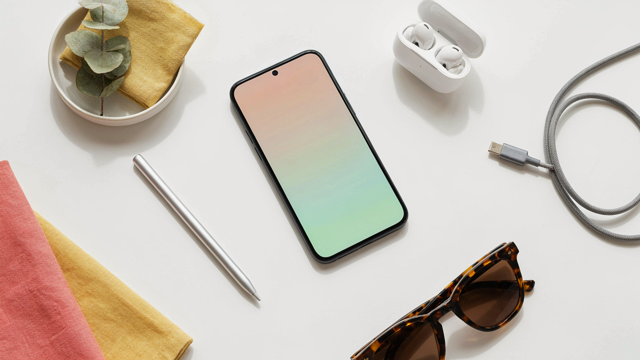
The Unseen Architecture Of Flat Photography
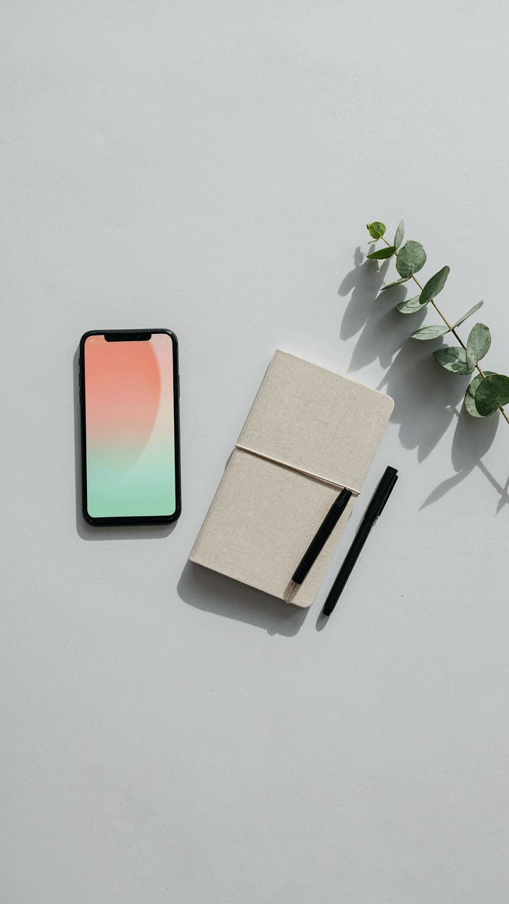
How Light Actually Moves In Your Frame
You want people to think your flat lay is effortless. It’s not. Physics doesn’t care about your intentions. Light behaves in two distinct ways in flat photography, and understanding this difference determines whether your shot looks flat or dimensional. In physics, we distinguish between incident light (the rays traveling toward a surface) and reflected light (the rays bouncing off that surface). In flat lay iPhone photography, incident light is your control variable. Reflected light is your result.
Here’s what most people get backwards: they think lighting is about brightness. It’s not. Lighting is about directing incident light so it reflects predictably off your objects. Your iPhone camera only sees reflected light. When you place a light source above and to the side of your flat lay, the incident angle determines how much reflection reaches your lens. A steeper angle creates contrast. A shallow angle creates wash. The surfaces you choose (matte versus glossy) change how they reflect that same incident light. Adjust your light source position first, objects second.
Shadows Are The Narrative You’re Not Writing
Most flat lay advice says shadows are a problem to eliminate. That’s incomplete thinking. Shadows aren’t noise in flat photography, they’re the primary tool for creating spatial depth on a two-dimensional plane. A completely shadowless flat lay looks like a catalog page. A flat lay with intentional shadow placement tells a story about form, proximity, and intentionality.
The mechanism is simple: shadows create visual separation between objects that have no actual distance between them. When your iPhone sees a shadow cast by one object onto another, it reads depth. The darker the shadow and the sharper its edge, the more distinct the spatial relationship feels. Control this by adjusting light direction, object height (use small stands or stacked cards), and surface reflectivity. Shadows force your viewer’s eye to track a path through the composition instead of scanning randomly.
Phone Product Photography: The Rigging And Restriction Principle

DIY Mounts Beat Expensive Tripods
You want the mount to disappear from your shot, which is why you’re tempted to buy a fancy rig. That’s backward. The real constraint is stabilization, not gear cost. A phone placed on a stack of books, a bean bag, or a simple L-bracket costs nothing and holds position better than tripods designed for cameras twice the weight. The mechanism is friction and mass distribution. Dead weight beats articulation every time.

Build your mount from materials that won’t shift under the phone’s slight vibration when you tap the shutter. Blu Tack, gaffer tape, and wooden blocks let you dial in exact height and angle without fiddling with loose joints. Your phone isn’t moving during exposure, so the rig only needs to stay locked for five seconds. That’s the entire job. Expensive tripods solve problems you don’t have.
Calibration Locks Out Lens Distortion
Optics engineering teaches us about barrel and pincushion distortion, the optical warping that happens when light rays bend unevenly through a lens. iPhone lenses create this same effect at the edges of the frame. Your flat lay setup controls it by fixing the phone’s angle relative to your subject plane, not by fighting the physics.
Position your phone’s rear camera exactly perpendicular to your flat lay surface using a spirit level or a digital level app. This eliminates the angular error that multiplies distortion in product shots. Once perpendicular, edges stay straight and products don’t appear warped or stretched. Check calibration before every shoot session because a one-degree tilt compounds across the frame. Lock the mount down after calibration and do not adjust during shooting.
Mastering The Flat Lay Compositional Grid

Rule Of Thirds For Overhead Work
You want permission to stop overthinking placement. That’s what this section is really about. The rule of thirds applies to flat lay photography the same way tension operates in physics—as a force that pulls the viewer’s eye toward points of energy rather than the dead center. On your iPhone, divide the frame into nine equal sections with two horizontal and two vertical lines. Place your primary subject where these lines intersect, not in the middle. This creates visual weight that feels intentional instead of accidental.

The overhead angle changes how the rule functions compared to traditional portrait work. Objects closer to the camera’s direct center appear larger and command attention by default. Offset them slightly toward one intersection point to counter this optical pull. Your secondary objects fill the remaining grid sections based on visual hierarchy, not symmetry. Test this by shooting the same flat lay three times: centered, then offset to each of two intersection points. One will read as composed. The others will feel sloppy. That’s the mechanism working.
Negative Space: The Deliberate Absence
Most flat lay advice tells you to “fill the frame” or “use white space for clarity.” That’s incomplete. Negative space in overhead work functions as visual breathing room that prevents cognitive overload, the same way silence functions in music. Your iPhone processes the entire frame at once from above, so empty areas don’t feel empty—they feel intentional. A flat lay with one object and 60% background reads as confident. The same layout with four objects crammed into that space reads as chaotic.
Plan negative space before you shoot, not after. Decide how much of your frame will contain nothing, and commit to it. Most effective flat lays use 40 to 60 percent empty space. This forces the viewer’s eye to land on what matters instead of wandering. Place your composed objects in one grid section and leave the rest untouched. The iPhone’s camera sees this as deliberate restraint, not as wasted real estate. This transforms a snapshot into a considered image.
Tech Accessories Flat Lay: The Art Of The Deliberate Prop
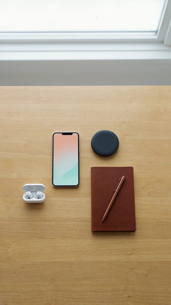
What Actually Belongs In The Frame
You want people to think you’re intentional. That’s the real reason you care about which objects land in your shot. Here’s what actually matters: every prop either reinforces your central message or it dilutes it. Think of it like signal-to-noise ratio in communications theory. Each object is either signal or noise. Most flat lays fail because photographers mistake busyness for sophistication.

The gap between amateur and professional flat lays isn’t complexity. It’s specificity. A watch, a cable, a notebook, a plant—these aren’t random. They connect thematically or functionally. They tell a coherent story about how someone uses the iPhone in their life.
- Thematic Alignment: Every prop matches the central subject. A creative’s flat lay includes design tools. A fitness enthusiast includes water bottles, not coffee cups.
- Functional Proximity: Items that work together appear near each other spatially. Charger and phone. Earbuds and music app. Notebook and notes app.
- Color Restraint: Limit your palette to three colors maximum. iPhone silver plus two complementary accent colors. More creates visual chaos.
- Material Variation: Mix two textures only. Metal and leather. Wood and rubber. Texture contrast creates depth without adding objects.
- Negative Space: Empty areas matter more than filled ones. The blank canvas around props makes each one readable. Crowding destroys focus.
The rule nobody follows: remove one object. Then remove another. Your instinct says add more. Resist it. The best flat lay has exactly enough props to communicate the concept and nothing else.
White Space Wins Every Time
Most advice says balance your frame. Wrong. Unbalanced frames with dominant empty space outperform symmetrical, crowded ones because they force the viewer’s eye to work. The iPhone sits alone on a white background, creating pressure through absence, not presence.
Clutter reads as indecision. It signals the photographer doesn’t trust their subject. When you leave 60-70 percent of the frame blank, you signal confidence. The props you keep are chosen. The space itself becomes a design element. Deliberately leave areas white or neutral. Resist the urge to fill every corner. Evaluate your shot: if you can remove it and the meaning stays intact, remove it.
Phone Product Shoot: The White Balance Deception

Manual White Balance For True Color
You want your product to look “professional” because you think the camera sees what your eye sees. It doesn’t. The mechanism here comes from physics: your brain performs automatic white balance constantly, adjusting color perception based on light source temperature. Your iPhone does the same thing, but it guesses wrong half the time, especially under mixed lighting. Manual white balance forces the camera to stop guessing and lock onto a reference point you control. This is where most flat lay shots fail—the auto setting drifts between warm and cool, making your product look sickly or blown out depending on the second you pressed the shutter.

Set manual white balance by pointing your phone at a white or gray card under your actual shooting light, then lock that setting before you compose the shot. This eliminates the variables that destroy consistency. The card reflects the exact light temperature in your space, so the camera now has a truth to measure against instead of a moving target. Professional product photographers do this first, before any styling, because correcting white balance in post-production means correcting every single pixel, which compounds errors.
Post Production Color Correction: Reality Vs Perception
Most people believe post-production color correction is about making things look better. Wrong. It’s about making things look true to what was actually in front of the lens, then deciding what “true” means for your brand. The common advice says “fix it in post,” which is lazy thinking—it means you abdicated control on set and now you’re spending time recovering from a bad decision. Real color correction starts with a properly exposed, properly white-balanced image. What you do after that is calibration, not rescue.
The mechanism is psychological, not technical. Your monitor, your phone screen, and your customer’s screen all display color differently based on brightness, angle, and calibration. A “true” color on your MacBook looks different on an iPhone 12. Color correction accounts for this by establishing a baseline: shoot against a gray card under known light, and your edits become transferable. Lock in the color once through reference, then trust it. Stop chasing perfection across ten different screens.
Flat Photography Workflow: The Assembly Line Method

Batch Processing Cuts Editing Time In Half
You want to feel productive without actually changing your process. Here’s the mechanism: editing one photo at a time trains your eye to drift. Batch processing forces consistency because you’re making the same decision repeatedly on similar images, not reinventing the wheel for each shot.

Shoot ten to fifteen flat lays in one session under identical lighting. Import them all at once. Apply the same exposure, contrast, and saturation adjustments across the entire batch before touching individual files. This eliminates the decision fatigue that makes each photo look slightly different. Your eye stays calibrated.
Visual System Templates Lock The Brand
Everyone says “develop a consistent style.” They don’t explain why consistency matters in flat lay iPhone photography, or how to actually build it. Think in systems terms from manufacturing: a template is your production specification. Without it, you’re hand-crafting every image instead of reproducing a proven formula.
Create three to four master editing presets in your iPhone’s native Photos app or a third-party editor like Lightroom Mobile. These presets should cover your baseline: color temperature, shadow lift, highlight recovery, and vibrance. Every flat lay gets one of these presets applied first, then minor tweaks. This prevents style drift and cuts editing time from thirty minutes per photo to five. Apply the same preset to every image before considering any custom adjustments.
Brown Aesthetic & Bookstagram Inspiration: Beyond The Filter

Organic Textures Create Tactile Appeal
You want this section because you think a brown aesthetic signals taste and depth, but you’re actually chasing permission to stop overthinking color theory. The mechanism is borrowed from product design: texture substitutes for contrast when your color palette is limited. Brown flatlays work because raw materials—linen, cork, aged paper, unfinished wood—trigger a visual expectation of weight and quality without demanding bright colors to grab attention.

Tactile surfaces do the work your eyes can’t perform alone. Rough canvas reads as intentional. Weathered leather reads as lived-in. Creased book pages read as valuable. Your phone’s camera picks up shadow depth in these textures, creating dimension that flat color swatches destroy. This is why bookstagram accounts that win use actual worn spines and dog-eared corners instead of pristine editions.
Narrative Through Objects Builds Story
Stop treating objects as props. Each item in frame should answer one question: why is this here instead of something else? Narrative doesn’t mean complexity—it means logic. A coffee cup next to a book isn’t decoration, it’s evidence of a reading ritual. A fountain pen placed on an open page suggests annotation, not just ownership. Your brain interprets objects as a sequence, not a collection, so arrange them along a path the eye naturally follows.
Flat lay iPhone photos fail when they’re museum displays of things you own. They succeed when they’re scenes of things you do. Stack your objects to show cause and effect: the book, the bookmark, the notes beside it. Place the coffee cup where someone would set it down mid-read. This transforms your flat lay from a showcase into a moment, and moments trigger engagement because they’re documentable proof of a life viewers recognize as worth living.
Aesthetic Photography: The Semiotics Of The Scene

What Objects Actually Mean
You want your flat lay to look intentional because you’re afraid it looks like clutter. That’s the real fear. The mechanism is this: every object in frame broadcasts meaning whether you design it or not. Semiotics, borrowed from linguistics, treats symbols as signs with three layers: the object itself, what it represents, and what the viewer infers. A coffee cup in your flat lay isn’t just a cup. It signals ritual, domesticity, morning routine. A pen signals intentionality. A crumpled receipt signals chaos. You’re not arranging objects. You’re composing a statement.

Most flat lay advice skips this entirely and just says “add a plant for life.” Wrong. You need to audit every object for what it communicates before it enters the frame. A luxury watch next to budget stationery creates cognitive dissonance. A branded product next to an unbranded one tells a story about value judgment. A worn notebook next to a pristine one tells a story about use versus aspiration. This isn’t decoration. It’s visual argument.
Layers Of Silent Communication
Signals work through contrast and context, not through individual objects shouting. Your iPhone photo isn’t a museum exhibit with isolated artifacts. It’s a system where proximity, repetition, material, and color create meaning together. The common advice says “make it cohesive,” which is vague enough to be useless. What actually works is deciding what narrative the composition tells, then removing anything that contradicts it. If your flat lay tells a story about focused work, a half-empty coffee cup reinforces that. A decorative item that serves no purpose in that narrative weakens the signal.
Shoot with a specific viewer in mind. What do they need to infer about you from this image? Not “you have good taste.” That’s generic. Instead: you’re organized, you work with intention, you choose quality over quantity, or you’re emerging in a specific field. Every object either strengthens or dilutes that inference. The strongest flat lays violate composition rules because they’re built around a single clear signal, not around looking “pretty.” Arrange only what the narrative demands, then stop.
The Editing Imperative: Beyond The Hype

Contrast And Clarity: Actual Image Impact
You’re editing because you want the work to look professional without admitting the raw file looks flat. Here’s the mechanism: contrast isn’t decoration. It’s signal separation. In visual perception, contrast is what allows the eye to parse foreground from background. A flat lay iPhone photo with muddy contrast reads as amateur because objects blur into the surface they sit on. Raise contrast by 15 to 25 points in post-processing. This isn’t a suggestion. It’s the difference between objects appearing dimensionless and objects appearing placed intentionally on a defined plane.

Clarity serves a specific function in flat lays that most people miss. It sharpens midtone detail without blowing highlights or crushing shadows. Objects in overhead shots rely on clarity to convey material texture and form. A matte ceramic mug needs clarity to read as matte. A polished phone needs it to show reflection. Start with clarity around 10 to 15 points, then adjust based on whether you’re shooting matte or reflective surfaces. Don’t push clarity past 25 points on iPhone edits. You’ll introduce halos and artificial grain that screams digital manipulation instead of intentional composition.
Strategic Sharpening: Avoiding Artificiality
Most advice says sharpen everything evenly. That’s wrong. Sharpening is a tool with boundaries. On flat lays, selective sharpening works because you’re not fighting depth of field. You’re fighting the lens compression that comes from shooting directly overhead. Use targeted sharpening on subject edges and details only. Your iPhone’s native editing tools don’t offer mask-based sharpening, so use a dedicated app with selective capability. Apply sharpening to objects in focus, leaving the background softer. This preserves depth perception even in a flat plane.
The amount matters more than the method. Oversharpened flat lays look digitally rendered instead of photographed. Aim for sharpening values between 0.5 and 1.2 in professional editing, or subtle to moderate if using phone sliders. Check your work at full screen size and at reduced size. Halos around object edges mean you’ve overshot. If the photo reads as cleaner and more dimensioned without looking processed, you’ve found the threshold. That’s where you stop.
The Pursuit Of A Pristine Flat Lay Is Not About Perfection; It Is About Intentional Manipulation Of Perceived Value

Stop treating flat lay iPhone photos like documentation. You’re selling a feeling, not showing reality. Every shadow, every angle, every object placement is a choice that tells your audience something costs more than it does. Pick one item today. Photograph it five different ways. Notice which setup makes you want to buy it. That’s your actual skill. You’re not a photographer. You’re a perception architect.