
Beyond “Good Lighting”: The Psychology Of Perception In Phone Product Photography

Light Direction Controls What The Brain Accepts As Real
You want lighting to make your product look expensive because you know cheap lighting makes cheap products. Here’s what nobody says plainly: light direction is borrowed from stage lighting design, where a single key light source creates what’s called “modeling”—the sculpting of form through contrast. On iPhone, this means the angle of your single light source determines whether a customer’s brain registers your product as dimensional or flat. Side lighting from 45 degrees creates shadows that reveal texture and depth. Front lighting flattens everything into a two-dimensional plane, which reads as suspicious to the viewer’s eye.
The mechanism is neurological, not aesthetic. Your brain evolved to judge object quality by how light behaves across its surface. Unnatural light angles trigger a subconscious alarm. Shoot with your primary light source at 45 degrees from the camera position, slightly above the product’s centerline. This replicates how sunlight typically hits objects outdoors, which is the baseline your customer’s brain expects. The iPhone’s camera sensor is sensitive enough to capture this distinction at phone-native ISO without degrading the image.
Shadow Density Determines Perceived Price Point
The common advice is to “eliminate shadows” to make products look professional. That’s incomplete. Harsh shadows without any fill light look amateurish, but zero shadows make products look cheap and weightless. What you’re actually controlling is shadow density—the ratio between the darkest shadow and the mid-tones on your product’s surface.
Luxury goods photography uses dense but not pure-black shadows because expensive materials hold light differently than cheap ones. A leather jacket absorbs light; plastic reflects it uniformly. On iPhone, create shadow depth by placing a single light source at 45 degrees and adding a white reflective surface opposite the light to catch bounce. This creates a shadow that’s dark enough to show volume but light enough to reveal material texture. Shoot at a 16:9 aspect ratio with the product taking up 60 to 70 percent of the frame, positioning shadows into the negative space rather than across the product itself.
The Product As Protagonist: Framing For Irresistible IPhone Product Photos

Negative Space Is Your Operating System
You want your product to feel important without saying so. That’s the real reason you care about this section—the mechanism is attention economy. In physics, negative space functions as a force that contains and directs energy. In iPhone product photography, negative space operates the same way: it concentrates viewer focus by removing competing inputs. A cluttered background diffuses attention. An empty one channels it.

Most small shops fill frames with props, textures, and “lifestyle” elements. This fails because it splits the viewer’s cognitive load. Your iPhone camera has one job: isolate the product as the only logical place for eyes to land. Plain backgrounds work because they remove the choice architecture entirely. White, concrete, or deep shadow—the surface matters less than the absence of visual noise.
Angle Rejection Over Angle Selection
Stop thinking about which angle looks best. That’s not the question. The real question is: which angle makes the product’s core function obvious without explanation? Most angles fail because they hide what the item actually does. A water bottle at a 45-degree tilt looks artistic but obscures capacity. Shot from above with water inside, the function reads instantly.
Reject any angle that requires the viewer to mentally rotate the product to understand it. Reject angles that create shadow confusion about shape or size. Your iPhone’s camera is flat and direct—use that limitation. Front-facing, slight elevation, or straight overhead work because they map to how humans scan objects in real space. Test three angles maximum. The angle that requires zero interpretation wins.
The “Poverty Of Choice” Protocol: Curating Your Best Shots, Not All Shots
When More Options Become A Liability
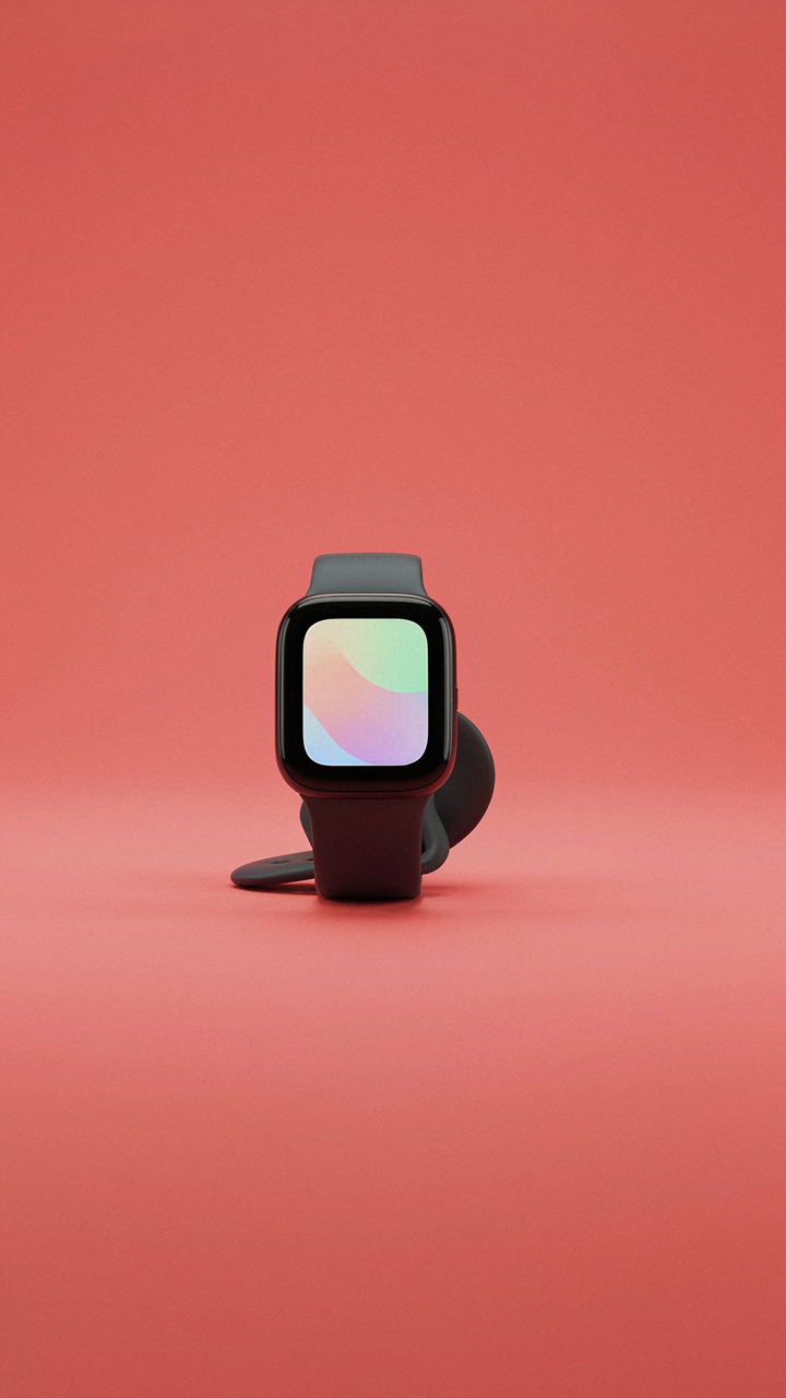
You want to post everything because you’re afraid the one photo you delete was the one that converts. That’s the real fear under this section. But economics has a principle called the paradox of choice, and it applies directly to iPhone product photos: too many options paralyze the buyer instead of persuading them. Your job is not to show range. Your job is to show conviction. One clear angle outsells five mediocre ones because it forces the viewer to decide about the product, not about which image to trust.

Most shops post eight to twelve product photos per listing thinking volume builds credibility. It doesn’t. It creates noise. The iPhone’s camera produces acceptable images quickly, which trains you to keep shooting instead of stopping when you have the shot. You end up with redundant angles, lighting variations that muddy the story, and subtle duplicates that waste scroll real estate. Viewers see quantity and interpret it as either desperation or clutter, not thoroughness.
Cutting Through The Mediocre Middle
The common advice is to “keep only your favorites.” That’s vague and useless because you’ll rationalize keeping a weak image if it shows a detail. The real mechanism is elimination by standard, not by feeling. Photograph more than you need, then apply a single criterion to each image: does this photo teach the buyer something they cannot learn from another photo, or does it merely repeat information? If it repeats, it dies. No nostalgia. No “but it’s a nice angle.” Repetition kills conversion rates.
Start with fifty shots of the same product if you need to. Then apply the standard ruthlessly. You’ll end up with four to six keepers, maximum. That’s your edit. Your iPhone shot those fifty images in fifteen minutes. Culling takes thirty minutes because you must examine each one against the others and ask the hard question: does this add friction or clarity to the sale? Post only the images that remove buyer hesitation, nothing else.
IPhone Editing For Impact, Not “Perfection”: The Subtraction Method
The Case For Removing, Not Adding
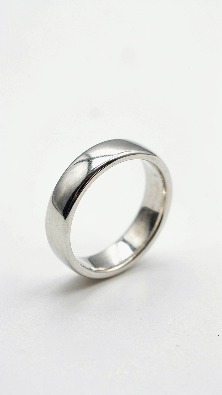
You want your photos to look professional because you believe professional equals trustworthy, and trustworthy converts buyers. The mechanism is simpler: your phone camera captures flaws that don’t exist in person. Dust on the lens, sensor noise in shadows, color shifts from indoor lighting. These aren’t part of your product. Editing means identifying what shouldn’t be there and deleting it, not layering filters on top of reality.

The smartphone’s camera sensor performs like a microscope for imperfection. Every flaw gets magnified. Your job is surgical removal of artifacts while preserving what makes the product actual. This isn’t about making things look “better than real.” It’s about showing the real thing without the camera’s lies distorting it.
The Authenticity Line You Can’t Cross
The consensus says “keep it real” and then does nothing to define where real ends and fake begins. Here’s the line: enhance what exists, don’t create what doesn’t. Brightness adjustments that match actual lighting conditions are honest. Saturation increases that match the product’s true color under proper light are honest. Shadow lifting that reveals actual product detail is honest. Invented dimension, smoothed textures that hide what buyers will see, or color shifts that don’t track reality are fraud.
Most small shops fail here by over-processing because they confuse “polished” with “trustworthy.” iPhone editing tools make it too easy to crush contrast, oversaturate, and blur backgrounds into submission. The result looks cheap because it advertises deception. Your protocol: shoot the raw phone file, make one adjustment pass per category (exposure, color, sharpness), then stop. If you’re still editing after three minutes per image, you’re adding, not subtracting.
Context Is King: Lifestyle Shots That Convert, Not Just Decorate

Show The Problem Being Solved
You want lifestyle shots because you think they look professional. That’s not why they work. They work because they replace the gap between what your customer imagines and what they’re actually buying. The mechanism is removal of friction in the buying decision.

A phone camera can capture your product in the hand of someone using it. Not posed. Not sterile. This is direct evidence your customer can trust more than any product spec. When someone holds your item while doing the thing they actually bought it for, the image closes the loop between intention and reality.
Build Desire Through Earned Context
The old advice says “make it aspirational.” That’s vague and often backfires. Aspirational without context reads as fake. The real move is to show the product solving a problem within an environment your customer already wants to be in. Anthropology calls this “environmental fit.” Your iPhone shot needs to position your product as the natural object that belongs in that space.
A water bottle in a gym doesn’t need a fitness model. It needs to be photographed mid-use on a gym bench next to actual workout gear. A journal photographed on a cafe table during golden hour works because the environment signals the moment when someone would actually use it. The context makes the desire real, not the styling.
The Human Element: How To Inject Emotion Into Apple Product Photography

The Hand As Storytelling Device
You want your product to feel less like an object and more like a solution someone already owns. That’s the real motive here. In photography, the hand serves as what semiotics calls the “indexical sign”—it points to use without stating it. When a hand enters an iPhone product frame, it collapses the distance between viewer and action. The hand doesn’t just hold the phone; it proves the phone belongs in the world of the buyer’s actual hands, not in some sterile catalog.

Position hands at oblique angles rather than straight-on grips. A thumb scrolling the screen, fingers cradling the edge, a palm supporting the device from below—these micro-gestures telegraph competence and familiarity. Avoid the flat “product showcase” grip. The goal is to make the viewer’s brain pattern-match: their hand looks like that hand, therefore their experience will mirror what they see. The lighting on the hand matters as much as the lighting on the device. Ensure the hand receives the same quality of light so it reads as equally important to the phone itself.
The Context Over The Object
Most product photography advice says “let the product dominate the frame.” That’s incomplete. Emotional resonance comes from what surrounds the phone, not the phone alone. A coffee cup beside it, a notebook, a desk with actual work happening—these elements signal a lifestyle, not a purchase. They tell the viewer this phone fits into a real environment, not a stage.
The iPhone’s neutral aesthetic actually demands context to feel human. Without it, the device reads as clinical. Your job is to shoot the scene the phone belongs to, with the phone as the credible detail within it. Arrange the surrounding objects first. Light for the entire composition. Then place the iPhone where it interrupts the scene naturally, as if the person using it stepped away for a moment. This method transforms product photography into lifestyle documentation, which is the mechanism that drives actual buying behavior.
The “Tech Aesthetic” Multiplier: Elevating Gadget Photography With IPhone
Minimal Backgrounds That Don’t Apologize
You want people to think your product is expensive without saying it out loud. That’s the real game here. In design theory, negative space functions as contrast—the unused area makes the subject command attention by default. Your iPhone camera reads this immediately. A white wall, a gray surface, or black void creates tension that your brain interprets as intentionality.

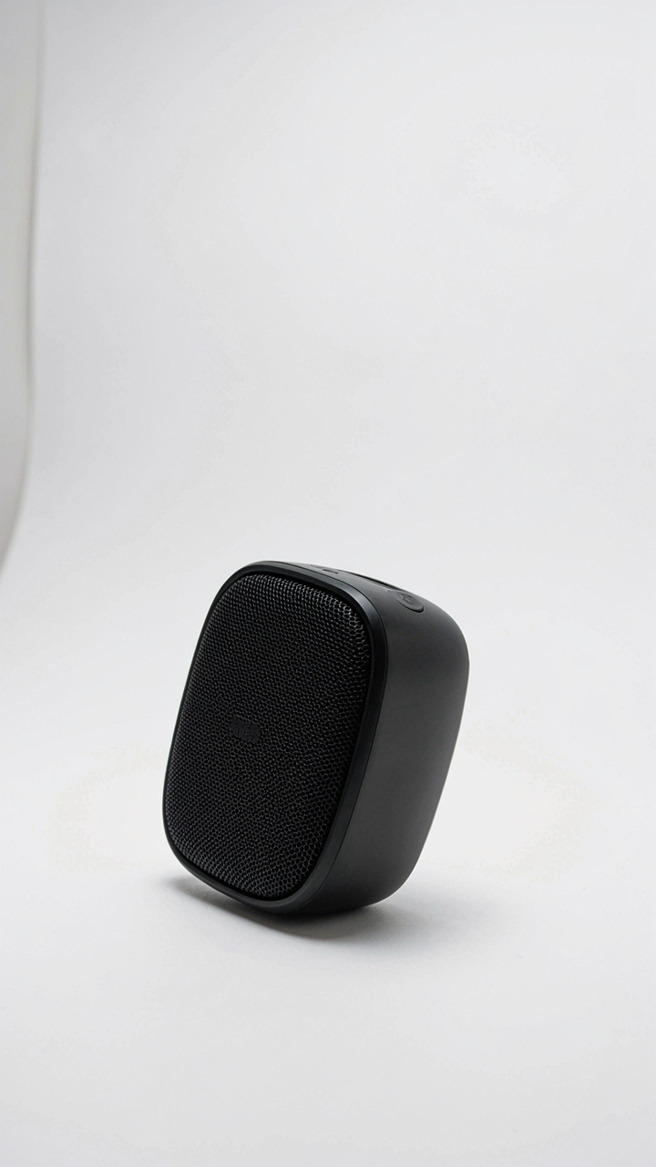
The mistake most shops make is treating the background as something to “not mess up.” Wrong angle. The background is the amplifier. Use pure white seamless paper or a solid-colored wall positioned close enough that it fills the frame completely. Distance matters: place your gadget three to four feet from a white surface, not inches away, to avoid harsh shadows that flatten the tech aesthetic. Shoot from a slight angle above the product, not flat-on. This creates dimensionality without clutter.
- White seamless paper: Reflects light evenly and reads as premium. Costs under 20 dollars and lasts through dozens of shoots.
- Concrete or raw wood: These textures signal durability and craft without competing for attention against the product itself.
- Black matte surfaces: Creates silhouette potential and makes reflective tech components stand out. Requires precise lighting to avoid total blackness.
- Neutral gray backgrounds: The middle ground between white and black. Absorbs light softly and reduces blown highlights on shiny gadgets.
- Gradient or blur effect: iPhone’s depth control can soften the background in post. Use this when your physical space is limited or imperfect.
The lighting setup reinforces this. One light source from the upper left or right creates a subtle shadow line that defines the object’s form. Your iPhone’s camera sensor handles this better than older devices because it reads shadow detail without crushing blacks. Position a white reflector opposite your main light to fill in the dark side. This creates definition without competing geometry. The product emerges from the background as a solved object, not a thing you found.
Design Language That Signals Intent
Gadgets photograph best when you understand what designers actually solved for. Industrial design uses a concept called “form follows function”—but in photos, form precedes perception. Your iPhone captures the actual proportions and material qualities of what you’re selling, which means the product’s lines do the talking if you frame them right.
Stop treating tech photography like traditional product shots. Tech has visual language: clean edges, geometric rhythm, material contrast. An iPhone with a machined aluminum edge catches light in a specific way. A device with rounded corners reads differently than one with sharp lines. Shoot to reveal these decisions, not hide them. Use overhead angles to show top-surface design elements. Use side angles to emphasize profile and material transitions. A three-quarter angle shows depth and proportion simultaneously.
The mechanical element matters more here than in other categories. Most shops ignore how light travels across angled surfaces. When you shoot a gadget with intentional angles—not random—the geometry itself becomes the composition. The viewer’s eye follows the product’s edges naturally. This isn’t accident. Set your product at 30 to 45 degrees to your camera angle and watch how the lines guide attention toward the brand mark or key feature. Use your iPhone’s gridlines to align these angles precisely. When the angles are deliberate, the aesthetic multiplies without extra effort.

Beyond The Pixel: The Marketing Engine Of Your IPhone Product Shoot
The Consistency Rule That Actually Moves Units
You want your product to feel trustworthy across every platform because inconsistency signals amateur operation to buyers, and amateurs don’t get repeat customers. Here’s the mechanism: platform algorithms reward accounts that maintain visual coherence. Instagram’s feed algorithm prioritizes accounts with consistent grid aesthetics. Facebook’s feed prioritizes accounts with consistent branding. This isn’t coincidence. Platforms treat visual consistency as a signal of legitimacy, which pushes your content higher in feeds.
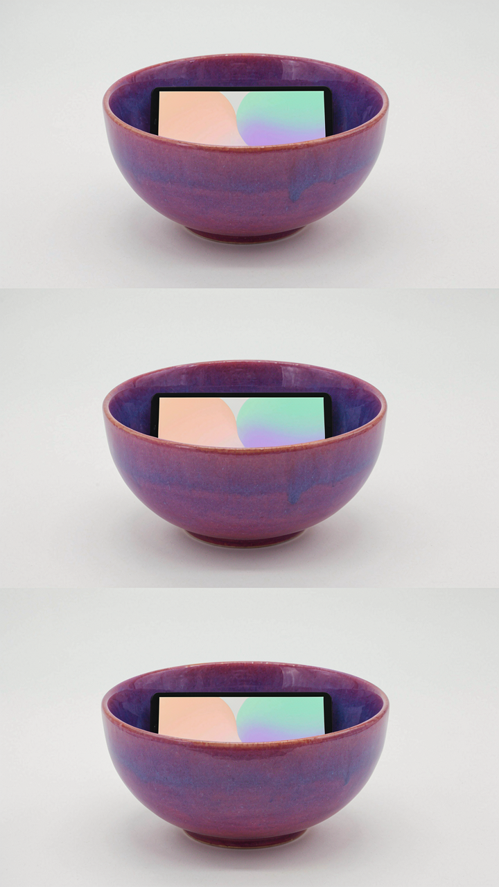
Your iPhone camera’s sensor captures the same color information regardless of platform, but each platform compresses, crops, and displays that image differently. If you shoot without accounting for these differences, your product looks like three different things across Instagram, TikTok, and your website. Shoot with a fixed white balance, consistent lighting angle, and the same product positioning for every shot. This doesn’t mean every photo looks identical. It means the lighting temperature, shadow direction, and background tone stay constant enough that a buyer recognizes your product instantly.
Mobile First Means Vertical Formats Win
Most small shop owners still treat mobile as secondary, which is why their product photos underperform on the platforms where 80 percent of their traffic actually lands. Mobile-first design isn’t aesthetic preference. It’s structural necessity. Your iPhone screen is roughly 1080 pixels wide by 2400 pixels tall. That ratio determines how your product photo displays in feed, story, and DM contexts.
Shoot with the vertical frame in mind from the moment you position your product. A horizontal photo forced into a vertical feed gets cropped by the algorithm or displayed small, wasting the space you have. The iPhone’s camera app lets you switch orientation instantly. Use that. For web and email, shoot wider frames, but your primary competitive advantage lives in social feed vertical space where your audience actually scrolls. Compose your product so it occupies 60 to 75 percent of the frame’s height, leaving breathing room at top and bottom for text overlays without obscuring the product itself.

The “Fashion Poster Design” Framework For Small Product Photography

Editorial Hierarchy Over Product Specs
You want this framework because it signals you understand design—the thing that actually converts browsers to buyers. Most small shops photograph products like they’re filling a catalog. They’re wrong. Fashion editorial design treats the frame like a hierarchy of information, not a dump of facts. The mechanism is contrast: one dominant element, secondary supporting elements, empty space that makes the dominant element scream.
Your iPhone captures this naturally. A single product centered with negative space around it reads as intentional, expensive, designed. The viewer’s eye has nowhere else to go. This isn’t accident. It’s the same principle magazines use when they run a single shoe on a white page instead of twelve shoes in a grid. One clear focal point beats clutter every time.
Sequential Storytelling Without The Narration
Common advice says to show your product from multiple angles. That’s not wrong, but it’s incomplete. What you’re actually doing is building a visual argument across frames, like a film director using cuts to control meaning. Photographers borrowed this from cinema: the sequence matters more than the individual shot.
Your iPhone product photos should move from wide context to intimate detail to lifestyle confirmation. Frame one: product in simple environment. Frame two: product’s surface or mechanism visible. Frame three: product in use or on a person. This progression trains the viewer’s brain to understand value before they read price. The sequence is the sales mechanism, not the individual image.
The Inversion Principle Of All Apple Products Photography: What NOT To Do

Stop Copying Apple’s Actual Method
You think studying Apple’s official product photos will teach you how to shoot yours. It won’t. Apple’s photography serves a corporation protecting brand equity and controlling narrative. Your shop needs to move inventory. The constraint isn’t your constraint. Their studio has three-axis robotic arms, spectral lighting systems that cost more than your entire inventory, and a retouching team that removes individual dust particles. You’re competing for attention using the iPhone you already own. The real mechanism here comes from industrial design: Apple’s photos work because they eliminate variables to communicate perfection. You need the opposite. Introduce the variable that matters to your customer.
Most advice tells you to match Apple’s minimalism, white backgrounds, and centered composition. Stop. That’s cargo cult photography. You’re not Apple. Your customer doesn’t need you to look like Apple. They need you to prove the product solves their specific problem in their specific context. The difference between copying and learning is whether you understand why something works before you replicate it.
The False Doctrine Of Sterile Environments
Professional product photography doesn’t require clinical lighting or perfectly neutral backgrounds. That’s inventory photography, not sales photography. Your small shop’s actual advantage is authenticity, not polish. When you strip away all context, you strip away proof that your product exists in the real world. A customer buying a coffee mug wants to see it holding coffee, not floating in void space like it’s waiting for a quantum physicist. The psychological barrier between “this is a nice object” and “I will buy this object” collapses when they see themselves using it. Context is permission. White void is suspicion.
The mechanism at work is cognitive load. A sterile image forces the buyer’s brain to imagine the entire use case alone. A contextual image gives their brain the work already done. They just need to recognize themselves in the frame. Stop optimizing for what you think looks professional. Start optimizing for what removes friction from purchase decisions. If your product has texture, show it under light that reveals texture. If it solves a problem, show the problem being solved.
The Only Real Limit Is Your Comfort With Discomfort

Most shop owners won’t shoot iPhone product photos because it feels unprofessional. That discomfort is the moat. The shift you need: professionalism isn’t a camera. It’s consistency, lighting, and editing. Your competitors are waiting for the perfect setup. You move today with what you have. Open your phone right now. Pick one product. Shoot it three different ways. Post the best one. Your comfort with looking stupid for two weeks beats their perfect excuse forever.