
The Grid’s Deception: Why “Rule Of Three” Is Misunderstood

What The Grid Actually Tells You
You want the grid because you’re afraid your photos look amateurish and you need permission to know you’re doing it right. Here’s what the iPhone grid actually does: it divides your frame into nine equal sections using two horizontal and two vertical lines. That’s it. The grid shows you where those lines sit. It doesn’t make decisions for you.
Most photographers treat the grid like a law. Place the subject on an intersection, follow the rule, get a good photo. This misses the entire point. The grid is a reference system, not a formula. It trains your eye to see compositional weight and balance before you shoot. Once you understand what it measures, you stop needing to follow it exactly.
A Tool, Not A Mandate
In graphic design, negative space is the invisible force that makes positive space work. Think of the iPhone grid the same way. The nine sections don’t matter because of the lines themselves. They matter because they help you notice where you’re placing weight in the empty areas around your subject. The grid is a compositional guide, not a dictator.
Beginners see the grid and immediately hunt for intersections. Advanced photographers see the grid and understand it as a tension map. You’re looking at how subject placement creates visual pull. You’re checking if the frame feels balanced or intentionally unbalanced. Once you see this, you can break the rule with precision. You know exactly what happens when you move the subject one grid unit left instead of placing it on the line.
Beyond Centered: Activating Visual Tension With Rule Of Thirds Photography

Why Off Center Subjects Command Attention
You want people to feel something when they see your photo instead of scrolling past it. Here’s the mechanism: centered subjects feel resolved. Your brain categorizes them as “finished” and moves on. Off-center placement on your iPhone grid creates visual tension because the subject appears to occupy space that hasn’t been settled yet. The grid lines on your iPhone camera create four intersection points—place your subject near one of these points and you’re borrowing from compositional physics: tension requires unbalanced force.

Your phone’s grid overlay divides the frame into nine equal sections using two horizontal and two vertical lines. This isn’t arbitrary. Place your main subject slightly away from dead center and the viewer’s eye travels through the frame instead of stopping at one spot. The mechanism is spatial imbalance. Enable the grid in iPhone camera settings under Composition, then frame your shot so the subject sits near one grid line rather than splitting the frame down the middle. This single shift changes whether a photo feels static or alive.
Intersection Points As Visual Anchors
The common advice here is weak: “put important stuff on the lines.” Wrong framing. Think of the four intersection points as landing zones for your viewer’s attention—call it compositional targeting borrowed from visual hierarchy in graphic design. Each intersection point has a different psychological weight depending on which quadrant it occupies. Top-left and bottom-right intersections feel more natural to Western eyes trained to read left-to-right. Top-right and bottom-left feel more tense and unexpected.
Place your focal point—a face, an object, the sharpest detail—directly on one of these four intersections and you’ve anchored the viewer’s gaze to the exact spot you chose. Intersection points work because they’re where the tension of the grid lines converges. On your iPhone, activate the grid, compose your shot so your subject’s eyes or the critical detail sits on an intersection, then lock focus by tapping that spot. This protocol ensures maximum visual impact with zero guesswork.
The “Golden Ratio” Myth Vs. Rules Of Thirds Photography Aesthetic

Mathematical Perfection Doesn’t Guarantee Strong Photos
You want to believe there’s a formula that makes your photos objectively good. There isn’t. The golden ratio is a real mathematical construct, but it’s not what makes rule of thirds work on your iPhone. The golden ratio (approximately 1.618 to 1) describes proportions found in nature and classical architecture. Rule of thirds uses a simpler 3×3 grid. They’re different tools solving different problems, and conflating them wastes your focus.

The real mechanism: rule of thirds guides eye movement through compositional zones, not mathematical perfection. Your brain doesn’t calculate ratios when viewing a photo. It follows edges, contrasts, and subjects placed at intersecting lines because those placements create visual tension and flow. The golden ratio obsession exists because people want photography to be a science. It isn’t. Stop chasing a number and start chasing visual clarity.
What Actually Drives Composition Preference
Aesthetic preference lives in context, not in universal law. A photo that works for a portrait fails for a landscape. A placement that grabs attention in a social feed feels forced in a gallery print. The rule of thirds grid on your iPhone camera succeeds because it forces decision-making, not because 1/3 positioning is inherently superior to any other division.
The human eye doesn’t prefer thirds because of physics. It prefers them because asymmetry reads as intentional rather than accidental. When you place a subject dead center, the viewer sees indecision. When you place it off-center along grid lines, you signal deliberate framing. Your iPhone’s rule of thirds overlay works because it makes the mechanism visible and repeatable, not because the numbers contain hidden truth.
The Attention Economy: Guiding The Eye With Photography Basics

Where Your Viewer’s Eye Actually Goes
You want people to notice the right thing in your photo. That’s the real reason you’re reading this. Marketing psychology calls this “attention direction”—the mechanism of controlling where a human eye lands first, second, third. The rule of thirds on iPhone is a literal grid system that weaponizes this principle. You’re not composing for beauty. You’re composing for predictable eye movement.

Your iPhone camera app has a built-in grid overlay. Enable it in Settings > Camera > Grid. The grid divides your frame into nine equal squares using two horizontal and two vertical lines. Your subject belongs on one of the four intersection points where these lines cross, not in the center where your instinct places it. This positioning aligns with how human attention naturally scans images—the eye enters the frame, drifts along the lines, and settles on intersections. You’re hacking human perception, not decorating.
The Visual Path That Keeps Them Looking
Stop thinking of composition as static arrangement. Composition is a directed journey. Your viewer enters the frame somewhere, follows a path you’ve built, and exits somewhere else. Bad photographers ignore this entirely and wonder why their subject looks boring even though they nailed focus and exposure.
The rule of thirds grid becomes your pathway system. Place your primary subject on an intersection point. Arrange secondary elements along the grid lines themselves. These lines become visual roads that pull the eye forward through the image. A horizon line aligned with the top or bottom horizontal line creates tension and direction. A tree trunk aligned with a vertical line anchors the composition and creates flow. You are literally drawing with invisible lines that your brain recognizes and follows without conscious effort.
Breaking The Rule Of Thirds Photography Ideas Protocol
When Centering Beats The Grid
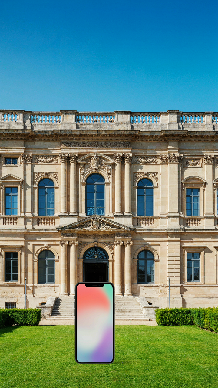
You want permission to break the rule without looking like you don’t know it. Here’s the mechanism: the rule of thirds works because it creates tension between subject and space. Center composition works because it eliminates that tension entirely, forcing the viewer to confront the subject without escape routes. They’re opposite tools for opposite jobs. Use centering when your subject is so visually complete or psychologically powerful that off-axis placement dilutes its impact. A portrait dead center on iPhone feels confrontational. That’s intentional. A symmetrical architecture shot centered communicates order and authority. A lone figure centered in negative space creates isolation, not weakness.

The grid on your iPhone screen becomes a liability when you’re chasing psychological effect instead of compositional balance. Symmetrical subjects like faces, buildings, or reflections often demand center placement because the rule of thirds would bisect them awkwardly, creating visual conflict instead of clarity. Turn off the grid momentarily and center. Assess whether the shot gains force or loses it. If centering makes the image feel locked in, deliberate, and impossible to misread, you’ve found your moment. Tap to focus on center, hold steady, and shoot.
Symmetry And Negative Space Beyond The Lines
Visual design borrows from mathematics, and the golden ratio’s closest cousin is the symmetry axis. The rule of thirds grid assumes asymmetry is always preferable. It isn’t. Symmetrical composition uses the center vertical line as your primary anchor, with negative space distributed equally on both sides. This approach contradicts grid-based thinking because it treats balance as a mirror, not as weighted tension. Your iPhone grid suggests placing the horizon on the top or bottom third line. Symmetrical negative space composition places it dead center, letting the reflected or mirrored elements anchor the frame.
Negative space only functions as compositional tool if you control it deliberately. The rule of thirds teaches you to leave space opposite your subject’s direction of gaze or movement. Symmetrical negative space flips this: you’re using emptiness as a design element that’s visually equivalent to the subject itself. Shoot a reflection or a perfectly centered scene with equal void on all sides. The emptiness becomes as loaded as the subject. This requires you to stop consulting the grid and start consulting your intent. Compose symmetrically, tap to lock exposure on the subject, and shoot from a stable position to prevent drift.
The “Flow State” Method: Intuitive Composition On IPhone

Balance Without The Grid
You want the grid off because you think you’ll look like an amateur if you rely on it. That’s not the real problem. The real mechanism is this: your brain learns patterns through repetition, not rules. The grid is a training wheel. Once you’ve internalized where the intersections live on your phone’s frame, you stop needing to see them. Your eye develops a spatial memory of the thirds without conscious calculation.

This is how design works in any field. You train the pattern until your nervous system recognizes it automatically. Pianists don’t think about finger placement after ten thousand hours. Designers don’t calculate ratios. Your iPhone screen is finite and fixed. After shooting fifty photos with the grid on, you’ve mapped the thirds into your visual cortex. The grid becomes invisible because it’s now part of how you see.
Observation Over Rules
The common advice here is backwards. Most guides tell you to practice applying the rule of thirds to every shot. That builds rigidity, not intuition. What actually works is shooting without pressure to follow anything, then reviewing your best shots to find the patterns you naturally created. You’re not imposing the rule. You’re discovering where your eye already places emphasis.
Start shooting subjects you find genuinely interesting without thinking about composition rules at all. Take fifty photos. Open them in your camera roll. Look at which ones feel balanced. Zoom in on where your subject sits in the frame. You’ll notice the thirds show up in your best work without you forcing it. Repeat this cycle and your intuitive sense sharpens. This is active observation, not rigid application.
How To Use IPhone Camera Grid: Beyond The Basics

Turning The Grid On And Off Without Friction
You want the grid because you think it makes you look competent. Here’s what actually matters: the grid is a toggle, not a permanent fixture, and most photographers waste mental energy deciding when to use it. Open Settings, tap Camera, toggle Grid on. That’s it. The grid appears every time you open the camera until you toggle it off the same way. No app switching, no three-tap sequences.

The real mechanism is this: the grid should vanish from your thinking once you’ve internalized the lines. You activate it during deliberate composition work, then deactivate it when you’re shooting intuitively. Muscle memory doesn’t form while the grid is always visible because your brain stops learning the spatial relationships underneath. Turn it on for a shoot, turn it off for the next one.
The Grid As Training Wheels, Then Gone
Psychology borrowed from habit formation tells us that scaffolding works only if you remove it. The grid is your external reference point until your eyes learn the intersections on their own. Most advice says “keep the grid on always,” which is wrong. You’re building dependency, not skill.
- Week one to two: Grid on for every shot. Force yourself to place subjects on lines and intersections deliberately. Notice how the frame tightens.
- Week three to four: Grid on for composition planning, off during actual shooting. Review your shots after to check alignment against memory.
- Week five to six: Alternate shoots with and without the grid. Mix deliberate framing with instinctive placement to test your internalization.
- Week seven onward: Shoot grid-off as default. Activate it only when you’re stuck or experimenting with a new scene type.
- Ongoing check: Every few months, shoot an entire roll with the grid on to audit whether your intuition has drifted toward center-weighted framing.
The grid teaches you to see division. Once you see it, you don’t need the lines anymore. The mechanism is simple: visual training requires removing the training tool before it becomes a crutch that limits your range.
Mastering The Rule Of Thirds Aesthetic For Mobile
Phone Screens Demand Different Grid Placement
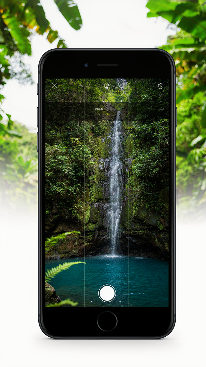
You want this to work because you’re tired of your photos looking flat compared to what you see online. The mechanism is aspect ratio. Desktop design lives in 16:9 or wider. iPhone’s 9:16 portrait format compresses horizontal space and stretches vertical space, which means the traditional rule of thirds grid doesn’t land where your eye expects it. The vertical lines move inward. The horizontal lines sit higher and lower than they would on a landscape canvas.

The grid overlay built into iPhone’s native camera shows you exactly where those lines fall on your specific screen. When you enable it in Settings, Camera, Grid, you’re seeing the actual intersection points your phone’s sensor will capture. This isn’t theoretical. A subject placed at the left vertical third on iPhone occupies a different visual weight than the same subject on a 4:3 DSLR frame. Adjust your composition to where the phone’s lines actually are, not where you remember them from other mediums.
Foreground Depth Changes The Third You Choose
People treat rule of thirds like a fixed formula. It’s not. Composition is about visual weight distribution, borrowed from graphic design. The rule of thirds is really just a weight-balancing protocol. On iPhone, foreground objects create perspective compression that desktop compositions don’t fight with. A close object in the lower third takes up more visual real estate than the same object would on a wider sensor.
If your subject is near the camera, place it on the lower third instead of the middle. If it’s distant, the traditional center-left or upper third placement works. The phone’s narrow field of view amplifies whatever sits closest to the lens. Test this: shoot the same scene with an object one foot away versus ten feet away. Notice how the close object dominates the frame differently. Adjust which third you use based on distance, not habit. This single adjustment separates phone photographers who understand depth from those just following a rule.
The Unspoken Truth About Rules Of Thirds Photography

When The Grid Actually Matters
You want permission to stop thinking about composition and just know you’re doing it right. Here’s the mechanism: the rule of thirds works because it forces your eye away from the center—where most amateur photographers default—and distributes visual weight across the frame. Your iPhone’s grid overlay isn’t a law. It’s a training wheel that teaches you where tension lives in an image.

The grid divides your screen into nine sections using two horizontal and two vertical lines. Objects placed on these lines or at their intersections create dynamic balance instead of the static, bull’s-eye feeling of center composition. This isn’t arbitrary. It mirrors how human attention naturally travels across a scene. Once you internalize where those lines sit, you stop needing the grid turned on. Your eye knows the map.
Breaking Composition Through Pattern Recognition
Borrowing from martial arts, the rule of thirds is a kata—a form you master before you break it. You learn the structure so thoroughly that breaking it becomes deliberate rather than accidental. Most photographers never reach this stage. They either follow the grid rigidly or ignore it entirely, missing the actual skill: understanding why the rule exists so you can know when violating it strengthens the shot.
Breaking composition intentionally means you’ve already absorbed the default. Center your subject when you want to emphasize isolation or power. Abandon the grid when the image demands symmetry, repetition, or tension that sits outside the thirds. The mechanism is simple: shoot dozens of images using the grid until placement becomes instinct, then consciously experiment with frames that break it and observe what changes in the viewer’s reaction. Document which breaks work and why they work before you claim mastery.
Your Camera Isn’t The Problem; Your Obedience To Arbitrary Rules Is

The rule of thirds exists to stop you from centering everything like a robot. Once you understand why it works, break it. Your iPhone doesn’t care about rules. It captures light. Master the grid, then delete it from your mind and shoot what actually compels you. The best photographers know the rules well enough to ignore them intentionally. Stop treating composition like law and start treating it like language.