The Myth Of The “Natural” Preset: Why Your IPhone Lies To You

Default Settings Hide What The Camera Actually Captured
You want to believe your phone shows you reality because admitting otherwise means you’ve been sharing flattering lies. The default iPhone camera applies saturation and contrast boost before you even see the image. Apple’s processing pipeline pumps color intensity by default, making skin tones pop but oversaturate. This isn’t neutral. This is marketing dressed as default.
The mechanism matters here: every iPhone applies a built-in tone curve and color lookup table the moment you press the shutter. Warm tones get warmer. Reds intensify. Shadows crush slightly. You’re not seeing the raw sensor data, you’re seeing Apple’s interpretation of what looks “good” to most people. That interpretation flatters some skin tones and washes out others.
The Color Temperature Trap
Physics calls it Planckian locus, the relationship between light source and perceived warmth. Apply this to iPhones: your camera locks a default white balance that assumes daylight conditions, which pushes skin tones toward yellow if you’re shooting indoors or at golden hour. The fallacy everyone spreads is that “warmer equals more flattering.” Wrong. Warmer equals more orange and muddy on certain complexions.
Your iPhone’s auto white balance doesn’t know what skin tone you’re correcting for, so it defaults to a middle ground that serves nobody perfectly. The real move is manual white balance override through the native Camera app’s exposure compensation, or switching to a manual control app that lets you set Kelvin temperature explicitly. This single control determines whether skin looks alive or jaundiced.
White Balance As Your First Line Of Defense: IPhone Color Grading
Neutralizing Environmental Color Casts
You care about this because bad white balance makes you look sick, and nobody wants that in photos they share. White balance is physics applied to optics: your camera interprets light wavelengths and decides what counts as “neutral.” iPhone’s auto white balance reads the dominant light source in a frame and shifts colors to compensate. It fails when mixed lighting exists or when a single color dominates the scene.

The real problem: auto white balance optimizes for objects, not skin. It will neutralize a blue wall and leave your face carrying that same blue tint because the algorithm considers the wall the priority. You fix this by understanding that white balance isn’t about making the image look “correct” to your eye. It’s about isolating skin tone as the reference point, then building the rest of the image around it.
Manual Adjustments Bypassing Auto Correction
Stop trusting auto. The common advice to “let the iPhone figure it out” works for landscapes and objects. Skin tones demand intention. Open your photo in the native Photos app and tap Edit, then the three-slider icon to access the color tools. The Temperature slider is your actual control here. Drag it right to add warmth (counteracting blue casts from shade or fluorescent light), or left to reduce warmth (cooling orange casts from incandescent bulbs).
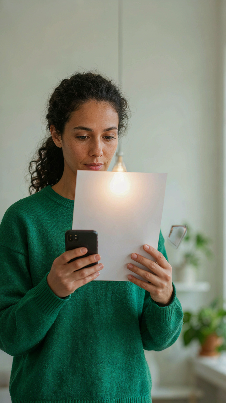
The protocol: take a reference shot of white paper or a neutral gray under your actual lighting before shooting portraits. Open that reference photo later and note where the Temperature slider lands to neutralize it. Use that number as your baseline for all photos from that session. This removes guesswork and produces consistency. Adjust in 10-to-20-point increments, check skin tone specifically, and stop when the person’s complexion looks like it did to your eye in the room.
The Saturation Squeeze: Avoiding Overcooked Skin Tones With Photo Editing In Iphone

When Saturation Becomes A Liability
You want people to think your photos look professional, not filtered. That’s the real fear here. Saturation is borrowed language from color science, where it measures how far a color sits from neutral gray. On iPhone, pushing saturation too high on skin moves flesh tones toward artificial reds and oranges instead of holding their natural hue. Most people crank saturation thinking it makes skin pop. It actually makes skin look painted.

The mechanism is simple: skin reflects light across a specific range of wavelengths. When you oversaturate, you’re forcing that wavelength range to extreme positions the human eye recognizes as unnatural immediately. Your phone’s editing tools make this too easy. Saturation sliders sit right there, begging you to drag them past the point where skin still reads as skin. Stop before that point, not after.
The Half Step Rule For Desaturation
Desaturation sounds counterintuitive when people talk about making photos “pop,” but it’s the fastest way to build trust in an image. The common advice says to adjust saturation last. Wrong. Desaturation works because skin tones contain a specific ratio of saturation that human faces expect. Exceed it slightly and skin reads as filtered. Drop it one half step below default and skin reads as refined.
Open the Saturation slider in iPhone’s native Photos app or a third-party editor like Lightroom Mobile. Start at zero, meaning no adjustment. Move the slider left by 5 to 10 points, not more. The adjustment should feel invisible to you. If you notice it, you’ve gone too far. This small reduction removes the oversaturated cast that makes modern phone photos feel cheap while keeping skin tone depth intact.
Contrast Control: The Hidden Key To Realistic Skin With Best Photo Settings Iphone

Where Highlights And Shadows Actually Live
You want skin to look alive in photos, not flat or washed out. The real mechanism is tonal separation. In photography optics, contrast is the ratio between the brightest and darkest values in your frame. On iPhone, this ratio determines whether skin reads as dimensional or like a pancake. Most people obsess over saturation and miss this entirely.

The highlights on skin sit around 70-85% brightness on your histogram. The shadows underneath cheekbones, under the chin, and around the eyes sit 20-40% brightness. iPhone’s native Camera app doesn’t show you the histogram live, but the Exposure slider actually compresses this range. When you raise exposure uniformly, you’re collapsing contrast by pushing shadows up and limiting how bright highlights can get before clipping. The edit happens after capture, but the damage starts here.
Open your shot in Photos or a raw editor like Lightroom Mobile. Find the Shadows and Highlights sliders, not Exposure. Pull Shadows up 10-20 points to lift detail in the darker areas under eyes and jawline. Pull Highlights down 15-25 points to recover detail in forehead and cheekbone gloss. This preserves the ratio between light and dark values while keeping skin readable. The contrast stays there, but now every tonal value holds information instead of turning to noise or blank space.
Protecting The Endpoints Without Clipping
The common advice is “just watch the histogram and don’t let it go too far right or left.” That’s incomplete and ignores how iPhone actually renders. Crushed blacks happen when shadow detail falls below 2-3% brightness and the phone rounds it to pure black. Blown whites happen when highlights exceed 97-98% brightness and become pure white. Between those endpoints is where your skin detail lives, and it disappears fast once you cross them.
iPhone’s metering system biases toward midtones by default, which means it often underexposes skin slightly to protect sky or background. You then compensate by raising exposure in post, which does push blacks down and whites up simultaneously. Use the Exposure slider only for 2-3 stops of correction. Beyond that, use Shadows and Highlights to recover specific areas without crushing the full tonal range into the danger zones.
In Lightroom Mobile or Photos, enable the clipping indicators if available. Shadows show in blue where blacks crush. Highlights show in red where whites blow. Adjust your Blacks slider to where clipping just barely touches shadow areas on skin, then pull back 3-5 points. Do the same with Whites on the highlight side. This keeps the actual skin tones in the safe zone where color information survives and contrast reads as dimension instead of posterization.

The “Exposure Lock” Protocol: Pre Capture Color Correction

Locking Exposure Before You Shoot
You want to avoid looking like an amateur who relies on filters to fix what should have been captured right. The mechanism is simple: your iPhone’s sensor records data based on what it meters as the brightest part of your frame. That meter point determines everything downstream—your skin tone accuracy, shadow detail, and whether you’ll spend thirty minutes in post-production chasing a color cast that was baked in at capture.
Press and hold on your subject’s face until you see “AE/AF Lock” appear on screen. This locks both auto exposure and auto focus to that point. The iPhone stops hunting for exposure and commits to that reading. For skin tones, lock on the cheek or forehead, never on a bright window or dark shadow behind your subject. This single step prevents the phone from reexposing mid-shot and creating the color inconsistency that makes correction nearly impossible later.
Preventing The Post Production Spiral
Every stop of exposure you correct in post costs you color information you can’t recover. This isn’t opinion—it’s how digital sensors work. When you underexpose in camera and then push brightness in Lightroom or Photos, you’re amplifying sensor noise and compressing your available color range. Skin tones become muddy or blown out depending on which way you had to push.
Lock your exposure correctly at capture and your skin tones hold their natural saturation and dimension. You’ll need minimal adjustment, not heroic recovery. The protocol: lock exposure, shoot, check the histogram in your camera app (swipe up to see it), and if the peak sits right of center without clipping the right edge, you’ve won. Everything after that is refinement, not reconstruction.

Demystifying The Tone Curve: Advanced Ios Photo Edit For Depth

How Light Remaps Through The Curve
You want to look like you know what you’re doing in post. That’s the real reason you’re reading this. The tone curve is where that happens, because it’s the only tool that lets you lie about exposure while keeping skin looking real. Think of the curve as a translation layer between what the camera captured and what people perceive as depth. Photography borrows from tonal mapping in digital rendering: both remap input values to output values across the full dynamic range. On iPhone, the curve axis works left to right (shadows to highlights) and bottom to top (darker to brighter). Moving a point on that curve doesn’t just brighten or darken—it compresses or expands how much information occupies each tonal band.
The mistake most people make is dragging points around randomly. Don’t do that. Anchor your shadow point slightly up from the bottom left corner and your highlight point slightly down from the top right. This kills crushed blacks and blown highlights before they wreck skin detail. Your midtones stay where they are unless you have a specific reason to move them. When you pull the curve up in shadows, you recover detail in dark areas under eyes and jawlines without affecting everything else. Pull down slightly in highlights to preserve texture in foreheads and cheekbones that would otherwise flatten into blown-out zones.
The Midtone Sweet Spot For Skin
Skin lives in the midtones. Push this wrong and you either lose dimension or introduce a gray, washed-out look that no amount of saturation fixes. The midtone section of the curve—roughly the center third—controls how much separation exists between your subject and background, and how much sculptural quality their face retains. A gentle S-curve does this: pull the midtones up slightly while keeping shadows anchored down. This adds contrast without harsh transitions. The curve becomes a scalpel instead of a sledgehammer.
The common advice to “add an S-curve for contrast” is incomplete because it ignores skin texture. An aggressive S burns out pore detail and makes faces look artificial. Instead, create a subtle rise that peaks around where Caucasian skin typically lives tonally (roughly 40-50% gray), then flatten slightly before highlights. This holds dimension in cheeks and jawlines while protecting the delicate zones around eyes. Make your curve adjustment in the Photos app’s Curve tool, zoom in on the image preview, and stop adjusting the moment skin looks like it has light falling across it rather than flat and uniform.

Beyond The App: External Lighting As Your Perfect Camera Settings

Natural Light And The Physics Of Reflection
You want to skip the editing app because you think that proves you’re a real photographer. Here’s what actually matters: light quality determines whether your iPhone’s sensor captures accurate skin tone data in the first place. Physics calls this reflectance, and in photography it means the wavelengths bouncing off skin depend entirely on what light source is hitting it. Golden hour works not because it’s pretty, but because low-angle sunlight scatters through the atmosphere, removing harsh blue wavelengths that turn skin tones sickly on camera.
Direct midday sun creates contrast so extreme that your iPhone’s sensor clips highlights on foreheads and cheeks while shadows go muddy. Position your subject with the sun at a 45-degree angle, never directly overhead or directly behind. Window light from the north side of a building stays consistent all day because it never receives direct sun, giving you stable color temperature around 6500K—close to what your iPhone expects. Avoid mixed light sources in the same frame when possible, because your phone can only white balance for one color temperature at a time.
Artificial Sources And Preventing Color Shifts
The advice to “just use natural light” ignores that artificial light gives you control. Most indoor bulbs emit 2700K to 3000K, reading as orange on your iPhone’s sensor unless you compensate. Tungsten bulbs, LED panels, and fluorescent tubes have different spectral signatures, meaning they reflect different wavelengths from skin. A room lit by warm LED bulbs and cool window light creates a split that no post-processing fully fixes because the data itself is compromised.
If you must use artificial light, pick one source and commit to it. Tungsten balanced video lights (3200K) are predictable and read consistently across skin tones when shot on iPhone. Position them at least six feet from the subject to reduce hotspots. Skip mixing bulb types in the same room, because your iPhone’s auto white balance will hunt between them and lock onto the dominant source, leaving skin tones either too warm or too cool. Shoot your test frame, check the histogram, and adjust source position before shooting the final take.

The “Human Eye” Calibration: Visual Acuity For Iphone Edit Photo

Train Your Perception Of True Color
You want to believe your phone screen shows you reality. It doesn’t. The real mechanism here is that your eye adapts to whatever light source surrounds it, a phenomenon called chromatic adaptation. Your brain doesn’t see absolute color—it sees relative color. The iPhone display lies systematically. Until you know what actual skin looks like outside the screen, your edits will drift toward whatever your phone’s color temperature has trained you to accept.
Start by shooting the same person indoors and outdoors on the same day. Don’t edit either one yet. Look at them side by side on your phone, then look at the actual person in the actual space they were photographed in. The gap between what your screen showed and what your eyes now see is the distance you’ve been editing blind. This gap shrinks only through repetition. You’re training your eye to catch the phone’s systematic bias before it embeds itself in your edit.
Comparing Edited To Real World Observation
Stop comparing your edits only to other edited photos. This is how mediocrity compounds. Every color choice you make should get stress-tested against an unedited reference—either the original shot, a photo you took of the same subject in good light, or better, the person themselves if they’re available. Your phone screen will always make warm tones look richer and cooler tones look muted compared to how they actually appear in front of you.
The protocol: After you finish an edit, open your original file beside the edited version. Step away from your phone. Look at the person’s skin in natural window light or daylight. Come back to your screen. If the edited version looks substantially warmer or cooler than what you just observed, adjust it down by 5 to 10 points on temperature before you think you’re done. The edit that feels “finished” on screen almost always needs restraint.

Avoiding The Filter Trap: Real World Photo Editing Hack

When Filters Work Against You
You use filters because you think they save time. They don’t. They destroy skin tone work before you start it. The mechanism is simple: filters apply broad color shifts across the entire tonal range, which means they crush midtones where skin lives and create artificial saturation that fights natural correction.
Filters are blunt instruments. They were designed for social media acceleration, not accuracy. Once applied, you’re fighting the filter’s logic instead of building your own. Delete every preset filter from your phone. You won’t miss them.
- Portrait presets: Force warm tones that make skin look orange or muddy, destroying midtone detail and making correction harder downstream.
- Cool tone filters: Over saturate shadows and push skin toward gray, collapsing the contrast you need for dimension.
- Vintage filters: Add color casts that favor certain skin tones while making others look sallow or unnatural.
- High contrast filters: Blow out highlights on foreheads and cheekbones, removing gradation where skin tone subtlety matters.
- Saturation boost presets: Amplify existing color imbalances in skin, making spots, redness, and uneven tone more visible.
The real move is recognizing that filters close off options instead of opening them. When you start with a clean original file, you make decisions based on what’s actually in front of you. When you start with a filter applied, you’re starting with someone else’s guess about your photo. That’s not editing. That’s hoping.
Building Subtle Adjustments That Hold
Manual adjustment works because you control which tonal range shifts and by how much. Use the iPhone’s native tools: exposure, highlights, shadows, and color temperature. Start with temperature first because it’s the foundation all other corrections sit on top of.
Move temperature in small increments. One or two notches warm or cool makes the difference between natural and processed. Then hit shadows with a slight warm bump to add depth without flatness. Lift highlights only if blown out areas exist. The goal is never to make skin pop or glow. The goal is to make skin look like skin under the light that actually hit it. After temperature and shadow adjustment, check your work against the original by toggling before and after. If you can’t see a meaningful difference, you’ve probably nailed it. If the difference looks obvious, you’ve overcorrected. Reset and try smaller moves.
Understanding Histograms: The Data Behind Photo Edit Settings IPhone

What The Histogram Actually Shows
You want the histogram because you think it makes you look technical. What it actually does is show you what your phone’s sensor captured before your brain lies to you about it. A histogram is a graph mapping pixel brightness from black (left) to white (right). The height of each peak tells you how many pixels exist at that brightness level. This is pure data. Your eye adjusts to ambient light and lies constantly. The histogram doesn’t.
Open the Curves or Levels tool in the Photos app or a third-party editor like Lightroom. You’ll see a graph appear. The left wall is pure black (0 brightness). The right wall is pure white (255 brightness). A skin tone histogram for natural correction clusters in the midtones and upper midtones, roughly between 100 and 180 on the brightness scale. If your histogram bunches hard against either wall, you’ve either crushed shadows or blown highlights. Neither recovers well.
Spotting Problems Before They Become Unfixable
Everyone says “don’t blow the highlights.” That’s incomplete. You need to know what blown highlights look like in the histogram so you catch them before shooting, not after. A histogram that smashes against the right edge with a hard spike means those pixels hit 255 brightness and have no detail left to recover. On skin, this produces flat, dead zones that no amount of post-editing resurrects.
Color channel histograms matter more for skin tone correction than the overall brightness histogram. RGB mode in most iPhone editing apps shows three overlapping curves: red, green, and blue. Skin tones require these channels to stay balanced in the midtone range. If the red channel spikes higher than green and blue in that zone, your skin looks artificially warm or even orange. If blue dominates, skin reads sallow or ill. Check individual channels, not just the combined histogram, to catch color casts before they embed themselves in your image.
Your IPhone Photography Isn’t Lacking A Filter; It’s Lacking An Understanding Of Light. Fix The Light, Fix The Tone

Most people blame their phone for bad skin tones. They don’t. Your camera captures what’s actually there. If the light is flat and harsh, no color correction tool fixes that problem. You fix it before you shoot. Position your subject near a window. Shoot during golden hour. Bounce light off a white wall. Then use your phone’s color correction as refinement, not rescue. Light is the foundation. Everything else is just detail work on top of something that was already broken.