
The Faceless Bookstagram Fallacy: Why Anonymity Is Your Only True Niche
When Your Face Becomes The Liability
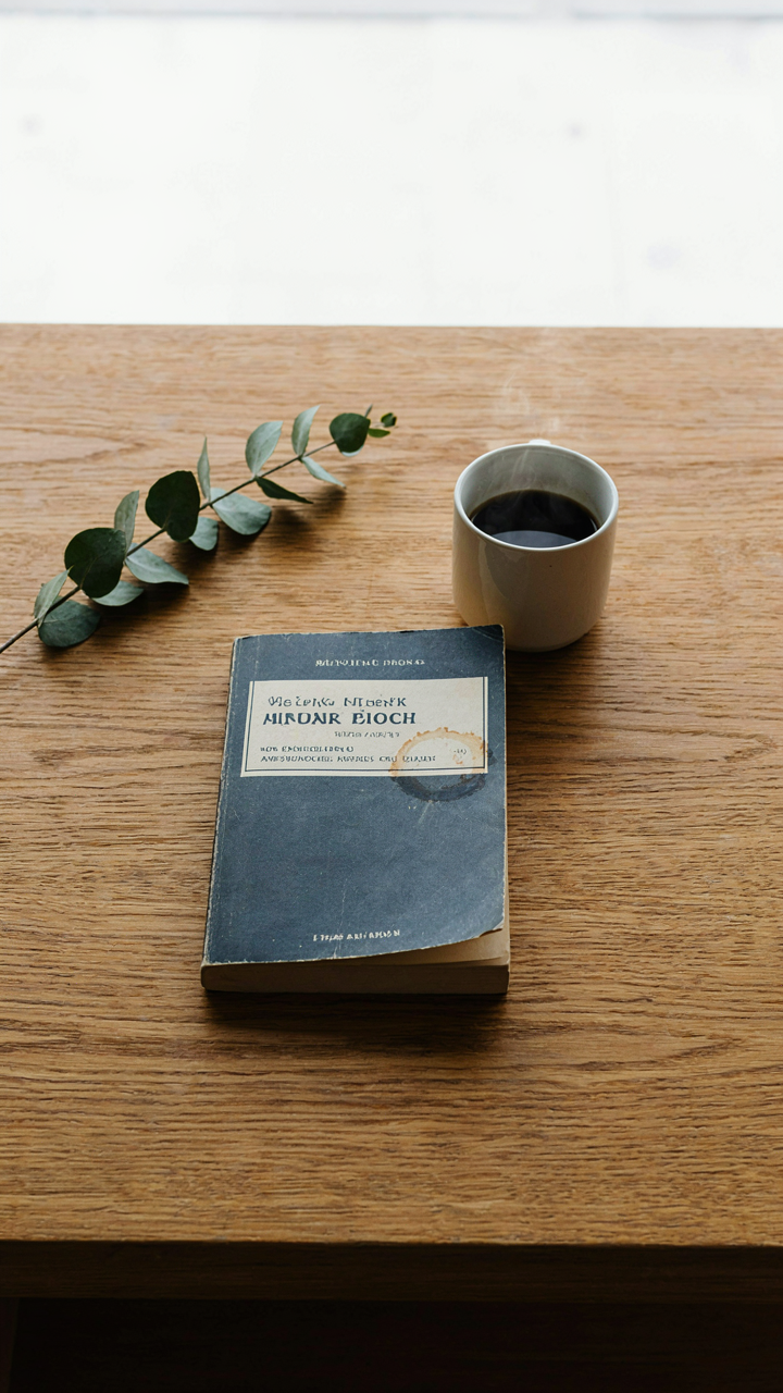
You want to show your face because you think visibility builds authority. It doesn’t. It builds comparison. The moment your cheekbones or lighting setup enter the frame, the viewer stops evaluating your reading taste and starts evaluating you. Psychology calls this the spotlight effect in reverse: you believe exposure generates trust, but exposure actually generates scrutiny. Remove yourself entirely from iPhone book photography and you flip the entire dynamic. The books, the coffee ring, the page texture, the ambient light become the subjects. The viewer projects themselves into the frame instead of judging the person already occupying it.
Faceless doesn’t mean mysterious or distant. It means the image communicates through objects, light, and composition instead of through facial expression or physical presence. Your iPhone captures the evidence of a reading moment, not a performance of one. This shift determines whether your photos feel curated for external validation or documented from internal experience. The technical advantage runs deeper: you control all variables when no human face demands proper exposure, flattering angles, or skin tone correction. Your constraint becomes your competitive edge.
The Raw Material Speaks Louder Than The Person Behind It
Most book photography advice tells you to be authentic. Then it instructs you to smile naturally, find your best angle, and maintain consistent lighting on your face. That’s not authenticity. That’s performance with a conscience. The real mechanism comes from material design and environmental psychology. An open book positioned against afternoon window light has inherent visual weight. The paper catch, the shadow gradient across the spine, the coffee cup positioned off-center these elements carry information about how someone actually reads. They need no face to communicate context.
When you remove yourself, you’re free to photograph the conditions that shaped your reading experience rather than the person experiencing it. A desk cluttered with research notes. A bookmark resting mid-page. The corner of a worn paperback. These details accumulate into a pattern that readers recognize as genuine because the photographer gained nothing by faking it. Your iPhone’s camera sees what’s there without flattening it into a portrait. The image becomes documentary evidence of taste and attention rather than a statement about identity.
Beyond The Filters: The Unfiltered Reality Of Ideas For Book Photography

Light Controls The Shot, Not Your Phone
You want to believe the iPhone camera is the limiting factor because that lets you off the hook—but it isn’t. Every mediocre book photo you see suffers from the same problem: the photographer treated light as whatever was already there. Light is the raw material. Without it, you have nothing but a sensor recording darkness. The physics principle here is simple: contrast ratio. In optics, contrast determines how much visual separation exists between your subject and its environment. On an iPhone, contrast is what makes a book pop or disappear into background noise. Artificial light—whether a desk lamp, window reflection, or ring light—isn’t cheating. It’s the foundation of the entire shot.

The real work starts before you open the Camera app. Position your light source 45 degrees from your book’s spine, not directly overhead or behind it. This angle creates definition on the pages and cover without flattening the image. Natural window light works if it’s diffused and consistent, but most indoor spaces require you to add fill light on the shadow side. Your iPhone’s dynamic range will crush the darker areas if you don’t balance the light intentionally. The mechanism is exposure metering: your phone reads the brightest part of the frame and exposes for it, leaving shadows to fall into underexposed mud. You control this by adding light to the dark side before you shoot.
Shadows Build Depth, Not Weakness
Most iPhone photographers treat shadows as problems to eliminate, which is why their book photos look flat and disposable. Shadows are the opposite. They create visual hierarchy. A sharp shadow cast by the book’s edge onto the surface beneath it tells the viewer exactly where the book sits in three-dimensional space. Without that shadow, the book looks pasted onto the background. This is a fundamental principle from cinematography: the shadow line is where depth lives.
The practical approach: position your light so the book casts a defined shadow away from the main light. That shadow should be dark enough to read, not so dark it disappears into black. On your iPhone, use spot metering on the shadow area to prevent the phone from crushing it into nothing. Adjust your overall exposure so the shadow retains detail but still reads as shadow. The quotable mechanism here is this: shadows prove distance. They anchor your subject in physical space instead of leaving it floating. Your final step is reviewing the shot at full screen size to confirm the shadow adds depth rather than confusion.
The 3 Second Story: Crafting Book Story Ideas That Resonate

What The Book Says To You
You want proof that your taste matters. That’s why this section exists. But the real mechanism is simpler: your iPhone captures meaning only when you’ve already decided what the book means to you first. Most people photograph the book as an object. They miss that the photo’s job is to encode your interpretation into a single frame.

The book isn’t the subject. Your relationship to it is. Before you frame a single shot, name one sentence the book whispered to you that nobody else would hear the same way. This isn’t about being original. It’s about being honest. Your phone’s camera will betray vague thinking instantly. Specificity is what reads as authenticity on screen.
Details That Replace Description
Show a dog eared page corner instead of saying the book gripped you. Show a coffee ring on the dust jacket instead of claiming the read was immersive. The mechanism here borrows from forensics: let physical evidence testify. Your iPhone’s camera excels at macro depth. Use it. A bent spine, a margin note, a bookmark placed at a pivotal chapter, a highlighted sentence casting a shadow these details do the narrative work that captions cannot.
The common advice is to stage “cozy” settings. Wrong. Cozy is invisible to a camera. What’s visible is wear, use, and consequence. Photograph the book as an artifact of your actual reading life, not a prop in a staged life you don’t have. Frame tight on the friction point: where the book shows signs of being read by you specifically.
The Serendipity Protocol: Capturing Unstaged Book Post Ideas

The Accident Is The Only Truly Original Moment
You want permission to stop planning every shot because planning feels like work. Here’s the mechanism: your iPhone’s computational photography destroys the value of over-rehearsed setups. The camera compensates for bad light, motion, and imperfect framing automatically, which means the only variable left that matters is authenticity. A staged book photo looks staged because you removed all friction from the composition.

The best book photos happen when you’re not thinking about the shot. You reach for a book, light hits it differently than expected, your hand catches the edge of a coffee cup at an angle that creates depth. Your brain registers this as worth capturing before your planning mind kills it. Stop waiting for ideal conditions. Shoot the moment your eye notices something changed in the frame.
Anticipate The Moment, Don’t Force Composition
Physics calls this temporal positioning, and it applies directly to iPhone book photography: you’re not creating the shot, you’re predicting where it will exist. The real skill isn’t pressing the shutter. It’s having your phone ready two seconds before the moment becomes photogenic.
Watch how light moves across a surface for thirty seconds before you touch the camera. Notice where your hand naturally falls when you pick up the book. See which shadows intersect with the pages. Then position yourself so your phone is already framing that intersection. When the moment arrives, you press. You’re not composing in real time. You’re intercepting a composition that’s already forming. The difference between these approaches determines whether your feed looks like everyone else’s or whether people actually stop scrolling.
The ‘Books Instagram’ Deception: Why Less Staged Is More Viral
Clutter Kills The Shot Before Light Does
You want the photo to look effortless because you’re afraid showing effort makes you look desperate for engagement. That’s the real game. The mechanism is simple: your eye processes clutter as decision fatigue. The iPhone camera sensor has finite resolution. Every mug, candle, plant, and throw blanket competes for that bandwidth. Clutter doesn’t add coziness—it adds noise.

Professional product and lifestyle photographers learned this decades ago. Remove everything that doesn’t direct attention to the book. The background should recede, not perform. One texture. One light source. One point of focus. Your iPhone’s camera treats visual information as pixels, not emotions. Fewer elements mean sharper rendering of what matters. Start by removing three things from your frame that aren’t the book or essential context.
The Rule Of Thirds Is Negotiable When Symmetry Wins
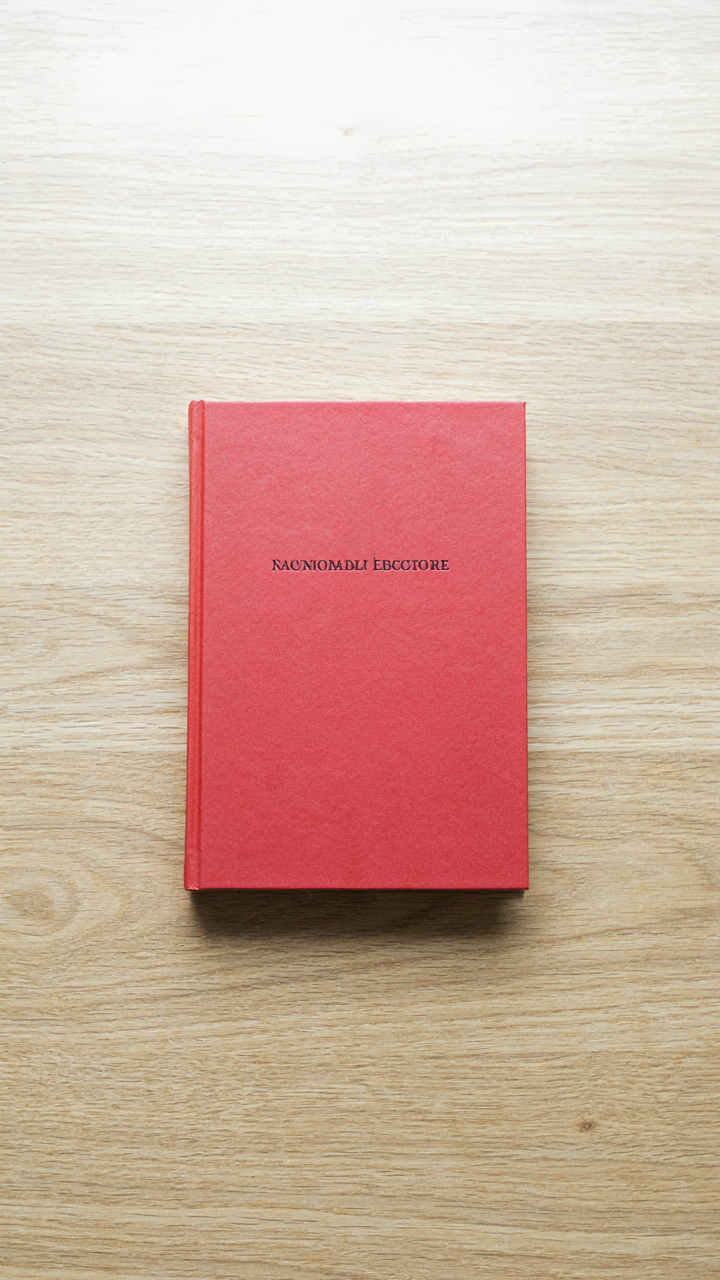
The rule of thirds dominates beginner iPhone photography advice because it’s teachable and safe. But that’s advice for people taking generic travel photos. When your subject is a book, symmetry often outperforms thirds-based composition. A centered book on a centered table with centered lighting creates visual stability that your eye trusts instantly. The thirds rule assumes you need tension. You don’t.
Test both approaches on the same subject in the same light. Shoot the book centered. Then shift it to a thirds intersection. One will feel immediate. The other forced. Your iPhone’s one-inch sensor captures enough detail that composition rules matter less than clarity and contrast. Stop treating the rule of thirds like doctrine. Treat your specific shot like data.
The ‘Book Photography Ideas’ Myth: Stop Chasing Trends, Start Observing

Patterns Hide In Plain Sight
You want a framework because frameworks feel safe. They promise that if you follow steps A through C, you’ll produce images people will like. Here’s the mechanism: biomimicry in composition teaches us that nature solves problems through repetition and variation of simple rules, not through complexity. Your iPhone already captures light accurately. What it doesn’t capture is restraint. The real competitive advantage isn’t finding new angles. It’s noticing what light does to paper texture, how shadows fall across a spine, where your eye actually settles when you’re not performing for the internet.

Stop treating “book photography ideas” like a shopping list. The cozy reading shot works because it observes a specific pattern: how morning light hits matte paper at a shallow angle, how a human hand creates scale without dominating the frame, how negative space makes the book breathe instead of perform. These aren’t trends. They’re physical realities. Start a camera roll labeled “observed patterns” and fill it with screenshots of light hitting surfaces in your actual home. The algorithm doesn’t create these patterns. You extract them by paying attention.
Your Perspective Is The Only Lever
Generic advice says “find your style.” That’s incomplete. Style is the output of obsessive observation applied through constraints you choose. Your iPhone has the same sensor as millions of others. Your room has different light, different objects, different times you wake up. That gap is where work happens, not talent. When you photograph books in your space consistently, you’re building a visual language that can’t be replicated because replication requires living your life.
The mechanism is simple: constraint plus repetition creates recognizable patterns faster than novelty chasing ever will. Shoot the same corner of your room for thirty days. Notice how the light changes. Notice what surfaces reflect, what absorbs, what creates visual weight. Your unique perspective isn’t mysterious or lucky. It’s the direct result of showing up to the same problem repeatedly and refusing to copy someone else’s solution. Post the work. The people who respond aren’t responding to a trend. They’re responding to consistency they can trust.
The Anti Props Playbook: Essentialism For Book Post Authenticity

When Everything Serves The Story
You want people to think your life is curated, not staged. That fear drives the urge to clutter a frame with props. The mechanism is simple: your brain mistakes quantity for authenticity. Add a coffee cup, a candle, a blanket, a plant, and suddenly the shot feels “real.” It doesn’t. It feels like you’re trying. The book is the subject. Everything else either reinforces why someone should care about it or it competes for attention.

Borrowing from visual hierarchy in graphic design, treat your frame like a newspaper page. The headline gets the real estate. Supporting elements enhance the story, not decorate it. Your book is the headline. A hand holding it, morning light, a specific surface beneath it—these are the subheading. The decorative props are the ads nobody clicks. Strip them out. What remains is what actually matters to the narrative you’re telling.
What Actually Stays In Frame
You’ve heard “less is more.” That’s lazy advice. What matters is subtraction with intent. Kill anything that doesn’t answer one question: does this object tell me why this book matters right now?
- The Reading Surface: A specific table, desk, or lap positions the book in a real context. A generic white background removes all context and reads as artificial effort.
- Natural Light Direction: Window light or morning sun creates mood without being an object. It shapes the narrative without stealing focus from the cover or pages.
- A Hand or Hands: Actual human engagement signals. Holding, turning, pointing, or resting on the page proves someone is reading, not just displaying.
- Negative Space: The empty area around the book. This is not absence. It’s breathing room that forces the viewer’s eye exactly where you want it.
- One Contextual Element: A coffee mug because you’re reading before work, or a notebook because you’re taking notes. One object that serves a reason, not decoration.
The frame works because each element serves the central claim: this book is worth your time right now. Every object you consider adding should pass this filter. If it doesn’t move that narrative forward, delete it before you shoot. The constraint forces better composition and stops you from hiding behind visual noise.
Beyond The Book Spine: Books Pictures Ideas That Go Deeper
The Wear Pattern: Where Story Lives
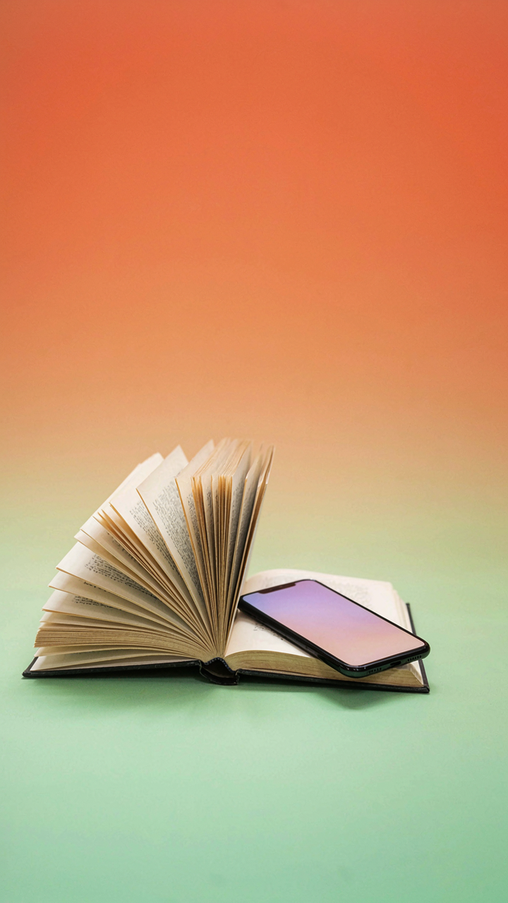
You want your shot to feel authentic because you’re afraid generic book flatlays scream “I staged this.” The mechanism is simple: decay tells a story your iPhone’s sensor can capture better than pristine perfection. Worn pages, creased spines, and dog-eared corners contain information about how a book was actually read. That friction between paper and fingertip creates texture the camera translates into credibility.

Your iPhone’s computational photography excels at rendering surface detail in close range. Shoot from 4 to 8 inches away with your macro mode or native camera app in normal mode. The texture becomes tactile on screen because the sensor captures micro-shadows in the paper fibers. Damage is data. Use it.
Breathing Room: The Void Does Work
Most advice says fill the frame. That’s wrong. The real principle comes from figure-ground theory in visual design, where the empty space around an object carries equal weight to the object itself. The negative space isn’t absence. It’s contrast that makes the book legible to the viewer’s eye.
Your iPhone processes the entire frame. If you crowd it, the app or social feed compresses your image into visual noise. A book with 40 to 50 percent empty space around it survives compression and holds attention. That void forces the viewer’s eye to the subject instead of scanning chaos. Compose for the crop, not the full frame.
The Reading Aesthetic: Capturing The Unseen Book Reading Aesthetic Photos

Light Sculpts The Moment, Not The Filter
You want people to see the shot and feel something—to believe the scene is real instead of manufactured. That’s what matters here, not the algorithm. The mechanism is simple: light creates depth and mood before any app touches the image. iPhone cameras capture what exists in front of them. Filters are band-aids for bad light. Position your subject near a window, not in the center of the room. Side-light creates shadow. Shadow creates narrative. The book becomes a prop in a story the viewer actually believes happened.

Overcast days and diffused window light eliminate harsh shadows without turning the image flat. Golden hour works, but it’s predictable—everyone knows that move. The real leverage is using whatever light is already there and positioning it to reveal texture: paper, skin, the wear on a book’s spine. Adjust your angle until the light catches the edge of a page or illuminates one side of the reader’s face. This is physics applied to a frame. Luminosity doesn’t need processing when you’ve placed it correctly. Take the shot when the mechanism is already built into the scene.
Motion As Information, Not Accident
Everyone treats motion blur like a mistake they tolerate. It’s actually a signal that something is happening. The distinction matters because it changes how you frame the shot. A slight blur of a hand turning a page or the subtle movement of looking down at text tells the viewer this is a living moment, not a posed portrait. You’re not going for full motion blur—that’s lazy. You’re hinting at it. One element stays sharp. One element moves just enough to suggest time passing.
Lock your iPhone’s focus on the reader’s face or the book’s text. Let the turning hand or shifting body create a soft trail at the edges. Shutter speed on iPhones adjusts automatically in standard mode, but you control it by managing light. Darker scenes create longer exposures naturally. Brighter scenes shorten them. This is the trade-off: dim the environment slightly to give motion room to register, or accept that very bright light will freeze everything dead. The mechanism is exposure time. Use it to separate static from dynamic in a single frame.
The ‘Faceless Bookstagram’ Advantage: Your Story, Not Your Image

The Book Is The Star, Your Presence Is Merely Implied
You’re worried that without your face in the frame, people won’t connect with you. That’s the real fear underneath this. Here’s the mechanism: when you remove the person, you force the viewer’s attention onto the object and the moment. The book becomes the anchor. Your absence creates space for the reader scrolling past to insert themselves into the scene instead of evaluating your appearance. This is basic figure-ground psychology from Gestalt design. The background becomes the foreground when you strip away the obvious focal point.
Faceless book photography works because it solves a problem the algorithm doesn’t reward: it makes content about the experience, not the influencer. Your iPhone captures the book’s spine, the pages, the hands holding it, the coffee cup beside it, the light hitting the cover. None of that requires your face. The viewer projects their own reading ritual into the frame. You become the implied subject, not the visible one. This shifts perception from “person I’m looking at” to “moment I want to be part of.”
Cultivate Intrigue By Revealing Only What Truly Matters
Common advice says to “show personality through styling.” That’s incomplete. Personality shows in what you choose to exclude, not what you stack into the frame. Every element you include competes for attention and intention. Your iPhone’s camera sees everything at once. Reveal only the details that serve the story: the book’s pages, fingers turning them, the texture of paper, ambient light, maybe a beverage. Cut out the background clutter, the unnecessary accessories, the “styled” elements that scream effort instead of authenticity.
The constraint creates the shot. When you limit what the iPhone captures, you force decisiveness about composition. This is how you shoot images that feel discovered, not constructed. Frame a single hand on a book spine. Capture the page number and nothing else. Shoot the book’s edge against a plain wall. These minimal frames work because they don’t compete with themselves. The viewer’s eye knows exactly where to go. Your iPhone’s simplicity as a tool becomes your strength when you use limitation as a design principle, not a limitation.
Your Feed Isn’t A Library, It’s A Billboard. Stop Selling A Lifestyle You Don’t Live

The real move? Stop performing coziness and start documenting your actual reading life. Pick up your phone right now and shoot one book photo exactly as it exists in your space today, messy lamp cord and all. Your audience doesn’t want another filtered fantasy. They want proof that someone like them actually reads. Authenticity isn’t a filter you apply. It’s the only thing that converts.