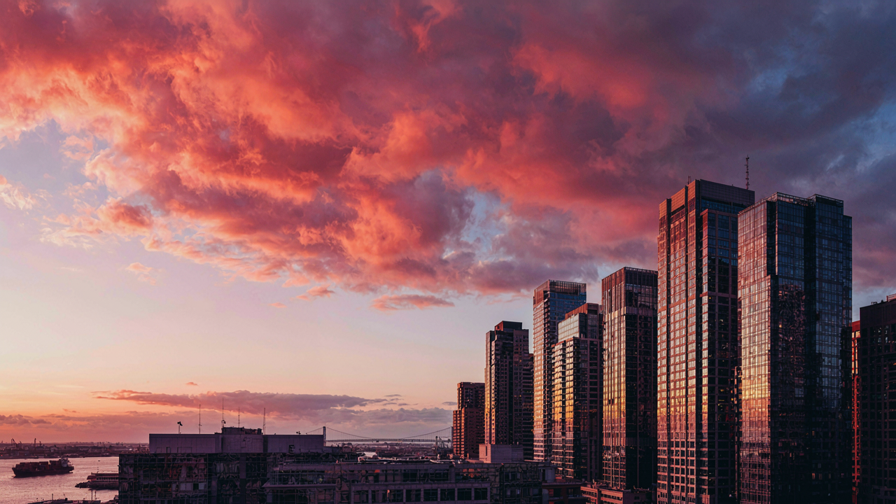
The Pre Capture Mandate: Why Filters Are For Amateurs
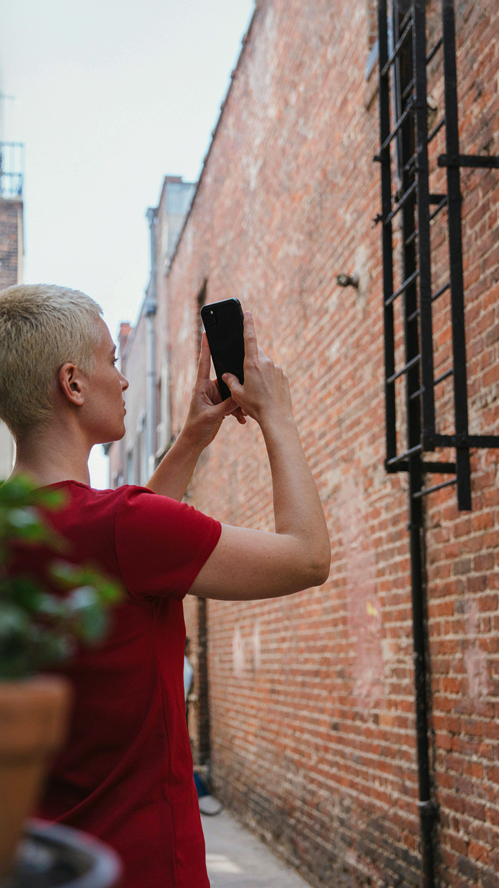
Lighting Conditions Dictate Contrast, Not App Presets
You want the shortcut. You want the preset that makes you look like you know what you’re doing. That’s not how contrast works. Lighting is physics. It’s the inverse square law in action: light intensity drops predictably as distance increases. The iPhone’s sensor captures what’s actually there. No filter rewrites reality after the fact.
Black and white iPhone photos live or die on light placement before you press the shutter. Direct sunlight creates hard shadows and separation. Overcast light flattens contrast. Backlit subjects punch through gray tones. Side light sculpts dimension into faces and objects. The camera records luminance values. Filters only crush or stretch what already exists in those values. If the light is mediocre, the preset saves nothing.
Composition Is Mood. See Monochrome Before You Shoot
Most people shoot in color, then convert to black and white hoping mood appears automatically. Backward. Mood in monochrome comes from what you exclude and what you emphasize. When you remove color information, contrast, texture, shape, and tone become the entire message. The eye reads these elements differently in grayscale than it does with color present.
Before you shoot, toggle your iPhone to black and white in the camera app or use the monochrome filter in live view. Compose through that lens. Watch how contrast shifts. Notice which elements disappear into gray soup and which stand alone. This forces you to see structure instead of relying on color to do the emotional work. Shoot only after the frame reads clean in monochrome. That discipline prevents wasting frames on compositions that looked fine in color but collapse without it.
Beyond The Black And White Aesthetic: The Raw Light Advantage
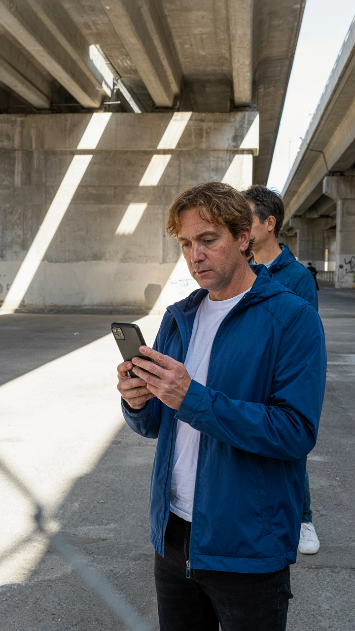
Shoot In Color, Convert In Post
You want the shortcut to looking like you know what you’re doing without the actual technical work. Here’s the mechanism: color files contain more data. When you shoot color on your iPhone and convert to black and white later, you preserve tonal information that the camera’s native black and white mode discards in real time. The iPhone’s monochrome filter is a destructive process that happens before the file is saved. You lose detail the moment you tap the filter.

Shoot everything in standard color mode, then convert in Lightroom or your editing app of choice. This gives you control over the conversion curve instead of accepting the iPhone’s preset interpretation. You can push contrast, protect shadows, and recover highlights because the underlying data exists. Native black and white mode locks you into a single rendering with no recovery options. The file size stays identical, and you gain flexibility that matters when mood depends on precise tonal control.
Harsh Light Creates The Contrast You Need
Light behaves like currency in photography, and black and white photos are where you spend it most efficiently. Soft, diffused light flattens contrast because it reduces the ratio between shadow and highlight. Hard light from direct sun or unobstructed sources creates the separation that makes monochrome images read with impact. The iPhone sensor performs better with defined shadows and bright highlights than it does with muddy midtones.
Shoot during golden hour or midday when the sun is high and unfiltered. Position your subject so light and shadow fall on different planes of the scene. Avoid backlit situations unless you deliberately want silhouettes. Let the sun create geometric shadows across surfaces. This isn’t aesthetic preference, it’s physics: high contrast ratios compress into black and white more effectively than flat lighting, and the iPhone’s dynamic range limitations become a feature instead of a liability when you work with strong directional light.
The ‘Contrast Code’: Engineering Depth, Not Painting It On
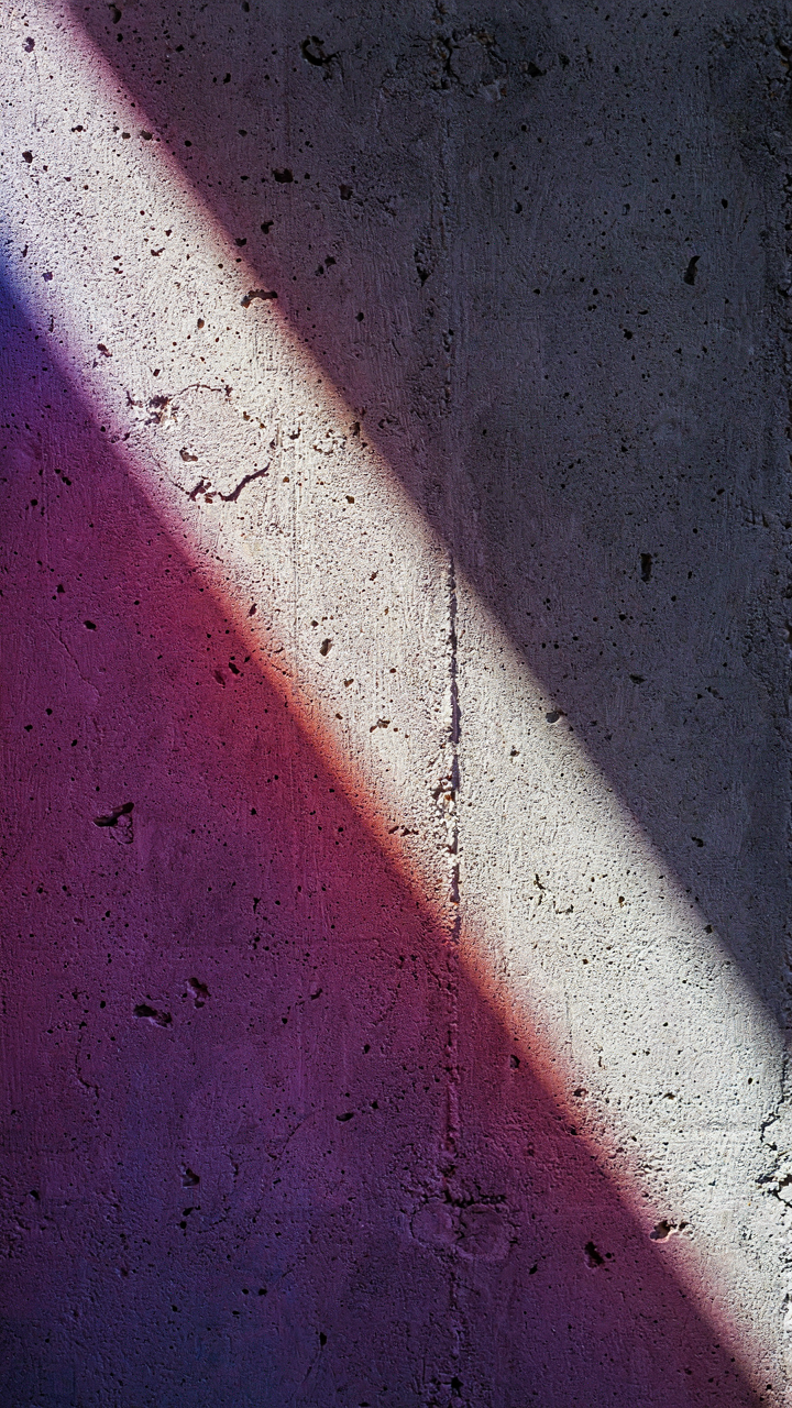
Where Light Hits First
You want contrast because it signals depth, and depth signals competence. But most people chase it backward by cranking sliders after the shot. The real mechanism is physics. In optics, contrast isn’t created in post—it’s engineered at the moment of capture through light direction and subject placement. Your iPhone sensor records what hits it. If nothing dramatic hits it, no slider fixes that.

Identify your primary light source before you frame anything. This is directional. Not “lighting in the room”—the single strongest beam hitting your subject. On iPhone, this is usually window light, street light, or sun. Study how it strikes the subject’s edges and planes. The iPhone’s sensor captures detail best where light transitions from highlight to shadow, not in flat-lit areas. Position yourself so that light source illuminates one side of the subject while the other side falls into shadow. That’s where contrast lives.
Surface Texture Against Darkness
Texture demands shadow. The conventional advice says “use the blacks filter” or “bump contrast in post.” Both miss the point. Cinematography teaches us that texture visibility depends on the angle between light, surface, and camera—what’s called the “key-to-fill ratio” in the trade. On iPhone, you control this by moving, not by editing.
Place your subject so side-lighting rakes across its surface at a shallow angle. Fabric weave, skin pores, weathered wood, rough concrete—all become visible only when light glances across them. Direct overhead or flat frontal light erases texture completely. Move until the primary light source hits the subject’s surface at roughly 45 degrees or steeper. Shoot in monochrome mode on iPhone (not converting later) so you’re working with actual black-and-white data from the sensor, not RGB information reduced to gray. This tightens your contrast because the sensor isn’t averaging color values into muddy middle tones.
The Dan Koe Method: Finding Your Unique Black And White Vision

Stop Copying What Works For Others
You want a formula because formulas feel safe. Here’s the mechanism: most iPhone black and white photographers copy the last person who got engagement, which means the market floods with the same contrast ratios, the same shadow placement, the same emotional manipulation. You’re competing against everyone using identical visual grammar. The real move is inverse—develop a constraint so specific to your eye that it becomes unreplicable. Not a style. A fingerprint.

Your signature doesn’t come from learning what everyone learned. It comes from deciding what you’ll refuse to do. Some photographers shoot only window light and crush blacks to near-total shadow. Others preserve midtone detail and use flat, architectural frames. Pick your limitation and commit to it for fifty shots minimum. The iPhone’s sensor will force you to work within real boundaries—limited dynamic range, fixed focal length—which actually accelerates style development instead of slowing it. Constraints are the opposite of creative death.
Study The Originals, Not The Copies
Look at Ansel Adams or Henri Cartier-Bresson not because their techniques port directly to your phone, but because their choices reveal decision trees you’ve never considered. Adams obsessed over zone system metering—how to place tones across the full range of black to white. Cartier-Bresson obsessed over decisive moment framing within fixed geometry. Neither was chasing emotion. Both were solving structural problems. Your iPhone’s exposure compensation and focus-tap mechanics map onto those same problems.
The mistake is treating historical masters as style inspiration. They’re decision architects. When you study Adams’ luminous shadows or Bresson’s negative space rhythm, you’re not absorbing an aesthetic. You’re learning the mechanical relationships between subject placement, tonal separation, and viewer attention. Apply this directly: shoot the same subject five different ways by shifting exposure, reframing, or changing your distance. Document which tonal choices force the eye where. Study works that repel you as much as the ones that attract you. The contrast between what moves you and what doesn’t reveals your actual visual logic.
Dark City Photos & Urban Grit: Capturing The Soul Of The Street
Where Light Becomes Weapon
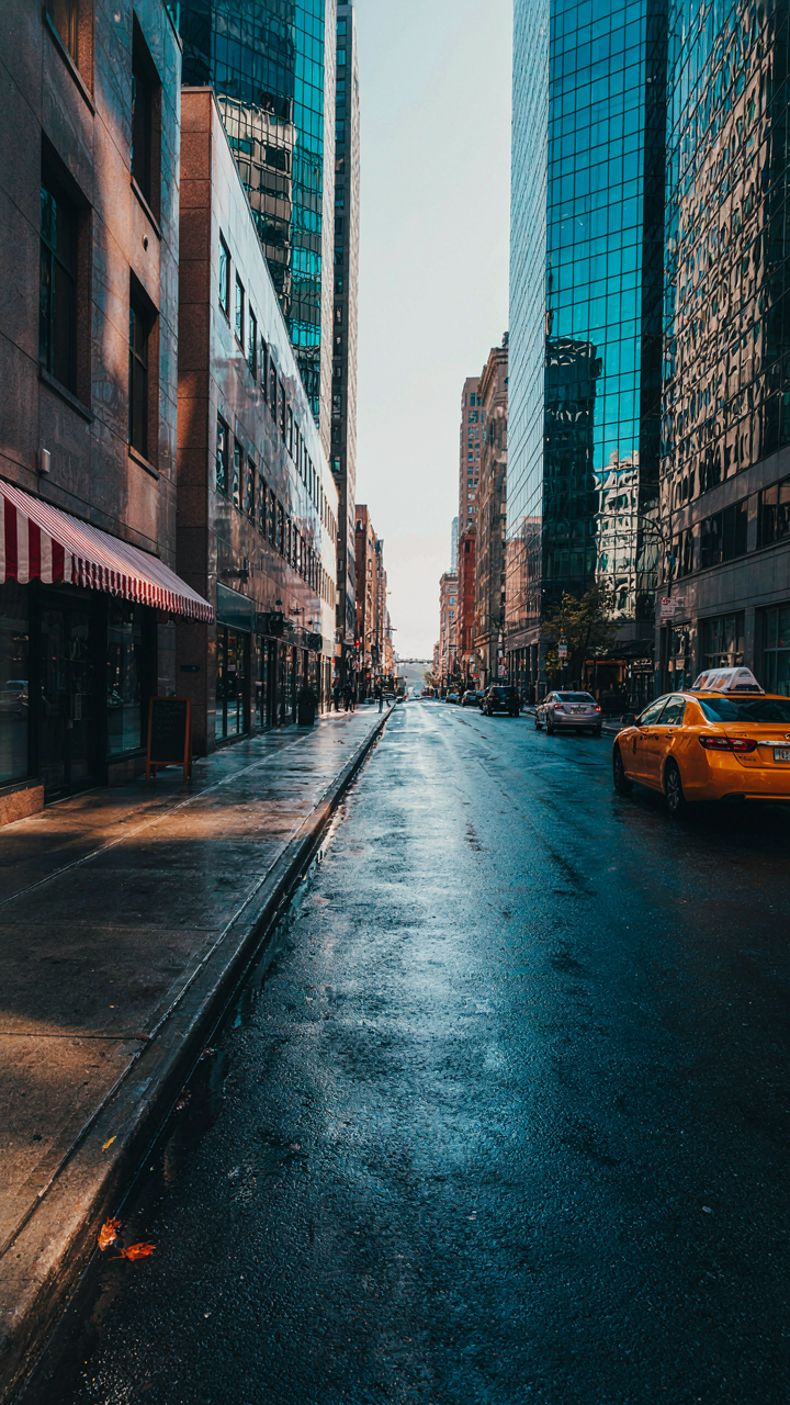
You want urban black and white photos because they feel authentic in a way color never does. The mechanism is contrast ratio. In optics, contrast ratio measures the difference between the brightest and darkest points in an image. Your iPhone sensor captures this difference, but harsh urban light creates the extremes that black and white rendering needs to survive. Midday sun hitting concrete and shadow creates a 10:1 ratio minimum. That ratio is your actual material. Without it, black and white urban work looks flat.

Street photography in black and white demands you hunt for light geometry, not subject matter. Buildings create geometry. Sun position determines whether that geometry reads. Shoot between 10am and 2pm when shadows cut deep and precise. The iPhone’s HDR mode flattens contrast, so turn it off. Manual exposure lets you lock on the shadow detail or the highlight, forcing you to choose what matters. The choice creates mood. One decision: expose for shadows, and the highlights blow white and graphic. Expose for highlights, and the blacks hold weight and mystery.
Surfaces That Carry Weight
Most photographers obsess over composition and miss the real leverage: what surface the light hits. A brick wall isn’t interesting because it’s old. It’s interesting because brick has geometric texture that light rakes across at acute angles, creating micro-shadows. Concrete does the same but with different grain scale. Weathered metal adds the dimension of rust pattern and oxidation. The iPhone camera sees these textures if light angle is sharp enough.
Position yourself so light grazes the surface, never hits it straight-on. Forty-five degree angles work. Extreme side-light at dawn or dusk works better. The texture must cast its own shadow. If it doesn’t, you’re looking at flat tone, not surface. Wet streets after rain increase reflectivity, which reads as bright tonal separation in black and white. Shoot the same wall dry, then wet, in identical light. The wet version has more apparent texture because reflection adds highlight value. This is your protocol: identify surface, determine light angle, position camera perpendicular to that angle.
The ‘Luxury Widgets’ Of Light: Crafting Intentional Shadowscapes

Dominant Position Controls The Frame
You want people to feel something when they see your black and white iPhone photo, and you think that means emotion. It doesn’t. It means control. Military strategists call this terrain advantage, and it’s the exact same principle that makes one shadow dominate an image while another disappears. The photographer who understands light positioning doesn’t chase mood. They engineer it through placement and hierarchy.

On your iPhone, this translates to a single rule: identify which light source will own the scene, then position it to create an unambiguous focal point. Not multiple light sources competing for attention. One dominant light, one shadow structure, one visual path. The contrast in black and white amplifies this advantage because there’s no color to distract from the geometry of light and dark. The light either controls the composition or it doesn’t.
Sight Lines Through Shadow
Most iPhone photographers treat shadows as blank space. Wrong. Shadows function as visual corridors that direct the viewer’s eye precisely where you want it. Think of each shadow as a line of sight, a deliberate pathway that either leads somewhere or leads nowhere. The emotional impact doesn’t come from the darkness itself but from what the shadow reveals by contrast.
When you frame a shot, map where the shadows fall and ask whether they guide attention or scatter it. A shadow that cuts diagonally across a face creates tension. A shadow that frames the edges of the frame creates containment. On your iPhone, use the native black and white filter to preview how shadows behave before you shoot. Adjust your subject position so the shadow becomes a design element, not an accident. The protocol is simple: light position first, subject position second, then confirm the shadow serves the narrative you’re building.
Monochrome Mastery: Beyond The Iphone Black Default Settings
Lock Exposure Before You Shoot
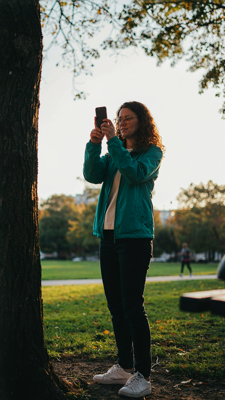
You want to believe the iPhone’s automatic system handles this for you so you don’t have to think about it. It doesn’t. The real mechanism is this: the camera meters the entire frame and sets exposure for the average brightness, which tanks your blacks and flattens your contrast. You fix this by tapping and holding on the darkest area you want to preserve detail in, then sliding the exposure compensation down slightly before you shoot.
- Tap and hold the shadow: Press on the darkest element in your frame for two seconds until the AE/AF lock icon appears and holds position.
- Slide exposure down: After locking, drag your finger up or down to adjust the exposure slider to minus 0.3 to minus 0.7 to deepen blacks.
- Watch the histogram: Open the grid overlay in settings and enable the live exposure preview to see real-time tonal shifts as you adjust.
- Lock before reframing: Once locked, you can move the phone slightly to recompose without the meter resetting to center.
- Reset between shots: If your subject or light changes, release the lock by tapping elsewhere and lock again on a new reference point.

This approach treats exposure like signal processing in audio engineering: you’re setting a baseline reference point instead of letting the system find an average. The difference between flat blacks and true blacks in monochrome is whether you controlled the meter or let it control you.
The Sensor Works Against Your Contrast Goal
iPhone cameras have smaller sensors than dedicated cameras, which means they capture less dynamic range in a single exposure. This isn’t a flaw you overcome with settings. It’s a constraint you design around. The iPhone’s strength is in shadow detail recovery through computational photography, not in raw sensor size. In black and white, this means you’re trading tonal separation in the midtones for cleaner blacks if you expose slightly underexposed and let the software recover shadow information.
The Pros and Max models use larger sensors than the standard iPhone, giving you marginally more tonal range before the blacks crush. The difference is real but small. What matters more is your shooting technique: move closer to reduce the distance light travels, use directional light to sculpt contrast, and shoot during golden hour or overcast conditions where the sun doesn’t blow out highlights into a single white mass. Proximity and light direction control contrast more than any sensor upgrade.
Black And White Scenery: Elevating Nature’s Drama

Stripping Away Color To Reveal Structure
You want this section because you think removing color makes photos automatically look intentional and professional. It doesn’t. What actually happens is this: black and white forces you to compose with light, shadow, and line instead of relying on color to do the emotional heavy lifting. The iPhone’s sensor captures tonal information across the full frame. When you remove the RGB data, you’re left with pure luminance values. This means texture, depth, and spatial relationships become your only tools. A flat landscape with mediocre light stays flat and mediocre. A landscape with directional light, clear foreground-to-background separation, and tonal contrast becomes something worth shooting.

The mechanism is geometric. Landscape photography in black and white requires you to identify the actual shapes and edges in a scene before you even raise the camera. Look for ridgelines against sky. Rock formations that create shadow patterns. Trees that break the horizontal plane. The iPhone’s 1x lens captures a roughly 50-degree field of view, which means you’re working with natural perspective—not too wide, not too compressed. Your job is to position yourself so that tonal transitions happen along compositional lines. Shoot during golden hour or overcast conditions, not midday, because midday light flattens everything into sameness. The most common mistake is treating black and white as a filter applied in post. It’s the opposite. You compose for black and white before you take the shot.
Atmosphere Born From Weather, Not Filters
Weather creates the tonal separation that makes black and white landscapes work. Dramatic skies aren’t about drama—they’re about contrast. An overcast sky records as medium gray. A clear sky records as nearly white. Storm clouds record as dark gray to near-black. These tonal shifts are data, not aesthetics. When you shoot before a storm rolls in, you get cloud formations with genuine tonal separation from the landscape below. The iPhone camera meter averages the entire frame, so in these conditions, you’ll need to tap and hold on your subject to lock exposure on it, not the sky, or you’ll blow out highlights in the clouds.
Rain and mist create a different mechanism: they reduce tonal range and increase contrast by obscuring distant elements. A misty landscape removes background detail, which pushes the midtones and shadows forward. This forces the viewer’s eye to the nearest elements, which should be your strongest compositional lines. Golden hour light through breaking clouds creates rim lighting on terrain features. This is pure physics—light hitting surfaces at shallow angles. Shoot these moments because they last maybe fifteen minutes. The protocol is simple: scout the location beforehand, know where the sun will be, position yourself to intercept that light hitting your subject, and frame with your strongest lines in the foreground. Don’t wait for the moment to be perfect. The moment is already there.
Post Processing Protocol: Refinement, Not Creation (Black And White Pic)

Curves And Levels For Surgical Contrast
You want post-processing to feel like discovery, not work. Here’s the mechanism: curves and levels function as a tonal remapping system borrowed from darkroom chemistry. Instead of burning and dodging physical paper, you’re repositioning where the histogram sits. The iPhone’s native editing tools use both, but they work differently, and most people conflate them into one muddy adjustment.

Levels lets you set black point, midpoint, and white point as fixed anchors. Curves lets you bend the tonal response across the entire range simultaneously. Use levels first to establish baseline contrast, then curves to sculpt specific zones. A proper black and white iPhone photo needs deliberate clipping at the blacks, not accidental crush. Adjust curves in small increments. One movement at a time reveals whether you’re enhancing the actual image or fighting it.
Targeted Adjustments Where Attention Lives
Local adjustments solve the real problem: global contrast settings flatten areas you want to protect. On an iPhone, use selective editing masks to isolate shadows or highlights in specific regions. The mechanism here is selective occlusion. You’re not processing the whole frame; you’re processing only the zones where mood concentrates.
Dodging a face slightly lifts it from shadow. Burning an edge darkens it back into the frame. The iPhone’s adjustment brush lets you target these zones without touching the rest. Set opacity low on each pass rather than one aggressive swipe. Stack multiple small adjustments instead. This prevents the artificial look that signals over-processing. Stop when the image reads faster, not when it looks technically perfect.
The Folly Of Black And White Wallpaper Trends: Substance Over Style

Timeless Over Trendy
You care about this because you’re afraid your work will feel dated in six months. Here’s the mechanism: trends in iPhone black and white photography operate like fashion cycles. They spike, saturate, then collapse. What looks “bold” today becomes generic visual noise by next season. The algorithm rewards novelty, not depth. Most photographers chase the trend wave instead of building a visual language that survives the cycle.
The timeless approach abandons trend forecasting entirely. Instead, focus on contrast ratios, tonal separation, and compositional clarity. These fundamentals don’t expire. A well-executed black and white iPhone photo from 2015 still reads as strong today because it was built on principle, not aesthetic momentum. The constraint of black and white forces you to master light and shadow before you can hide behind color. This is where real skill lives.
Authentic Vision Beats Viral Mechanics
The common advice says consistency builds an audience. That’s incomplete. Consistency without authenticity builds a hollow following. People sense when you’re optimizing for the algorithm rather than solving a real visual problem. With iPhone black and white photography, this becomes obvious. Either you’re capturing moments because the subject demands monochrome treatment, or you’re converting to black and white because it feels more “artistic.”
Authenticity trumps viral appeal for lasting impact. When you shoot black and white because the color information distracts from composition or emotion, not because the format is trendy, your work develops a distinct point of view. This point of view becomes your brand, not the algorithm’s preference. The protocol: ask yourself before every shot whether monochrome serves the image, or whether you’re serving the trend. Only shoot black and white when the answer is the former.
The Pursuit Of A Compelling Black And White Image Reveals Your Mastery Of Light, Not Your App Literacy
Most photographers chase settings when they should chase shadows. Your iPhone shoots black and white photos better than your skill at seeing contrast. Today, shoot one frame where you move nothing but yourself. Step left. Step right. Find where light breaks the frame in half. The tool was never the problem. Your eye was.