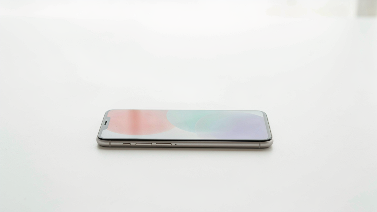
The Illusion Of Better Gear
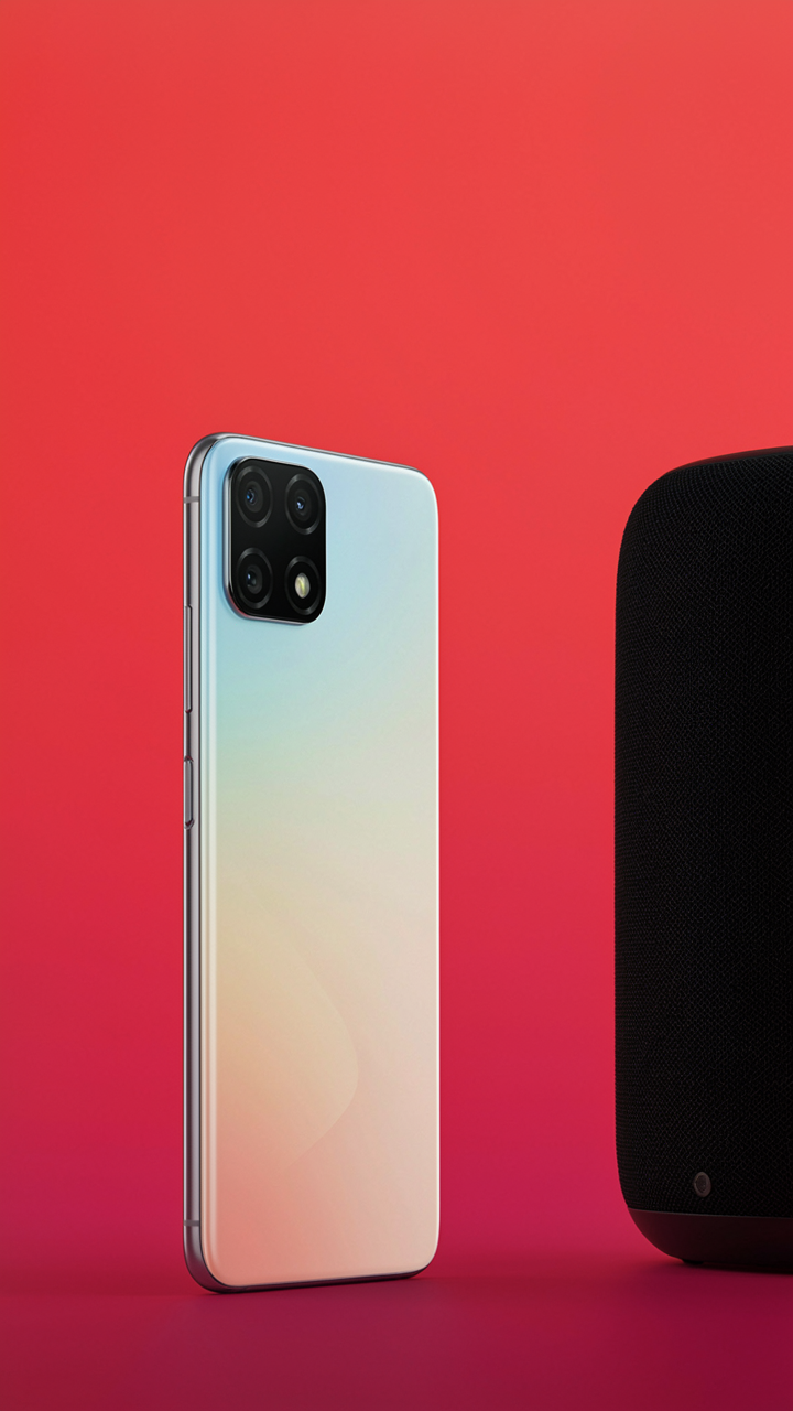
Specs Don’t Predict Output
You want to believe that upgrading your camera will fix your photos because admitting the real problem takes work. The truth: camera specifications measure inputs, not results. A 48-megapixel sensor tells you nothing about dynamic range compression, color accuracy under mixed lighting, or how the device processes shadows. Manufacturers list megapixels because they’re easy to market, not because they matter for gadget review photography.
iPhone cameras ship with computational photography built into the pipeline. This means the processor interprets the scene, stacks frames, and makes rendering decisions before you touch the image. A DSLR with higher raw specs often produces duller gadget photos because its output depends entirely on your post-processing skill. The specification that actually matters for clean product shots is not resolution or sensor size, but the consistency of the camera’s color science and how predictably it handles backlighting.
Why IPhone Wins The Format
Computational photography operates like signal processing in radio engineering: the iPhone doesn’t just capture photons, it filters and reconstructs the signal in real time. For gadget photography, this mechanism solves the problem most gear fails to address. Consumer phones photograph objects at close range under artificial light without requiring manual white balance correction, lens calibration, or exposure compensation. DSLRs excel at subjects that sit still in controlled studios, but they don’t excel at the portable, repeatable workflow that review photos demand.
The iPhone’s advantage isn’t philosophical or aspirational. It’s mechanical. The device locks exposure and color temperature during the frame capture itself, meaning your aluminum laptop, stainless steel phone, or matte black speaker arrives with accurate tonality every time. You point, shoot, and move forward. Professional cameras require you to nail metering mode, ISO strategy, and focal length before the shot even exists. Most people skip this work and wonder why their gadget shots look flat or underexposed.
The Unseen Value: Tech Aesthetic
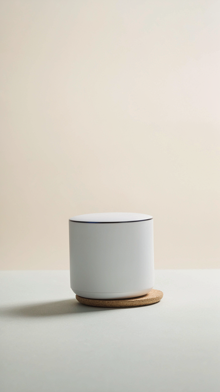
Minimalism As Visual Authority
You want your gadget to look expensive without saying so. That’s the real game here. Minimalism in tech photography isn’t about empty space or zen vibes. It’s about visual hierarchy from information design. Remove everything that doesn’t clarify what the product is. Every object in frame either proves a claim about the gadget or it clutters the message.

The mistake most people make is confusing emptiness with minimalism. True minimalism means strategic presence. A single shadow line that defines product edges. A background tone that makes the device read in three dimensions. A single prop that establishes scale or use case. Each element earns its pixel. This is how premium brands photograph gadgets on iPhones: they subtract until the product becomes undeniable.
Clean Visual Language Through Constraint
Build a system, not a shot-by-shot improvisation. Constraint generates consistency faster than intention ever will. Your iPhone camera sees light and color exactly the same way each time you shoot. Use this. Pick one lighting angle. One background surface. One distance from subject. One white balance setting. Repeat these choices across every product photo.
The constraint forces you to understand the gadget’s actual visual strengths instead of hiding behind variety. You notice which angles reveal texture. Which distances show scale relationships. Which lighting makes buttons legible. After ten identical setups with different gadgets, you develop an eye for what works. This repetition is how professional product photographers train themselves on any device, including the iPhone. The system becomes the style.
The “Less Is More” Protocol For Iphone Design
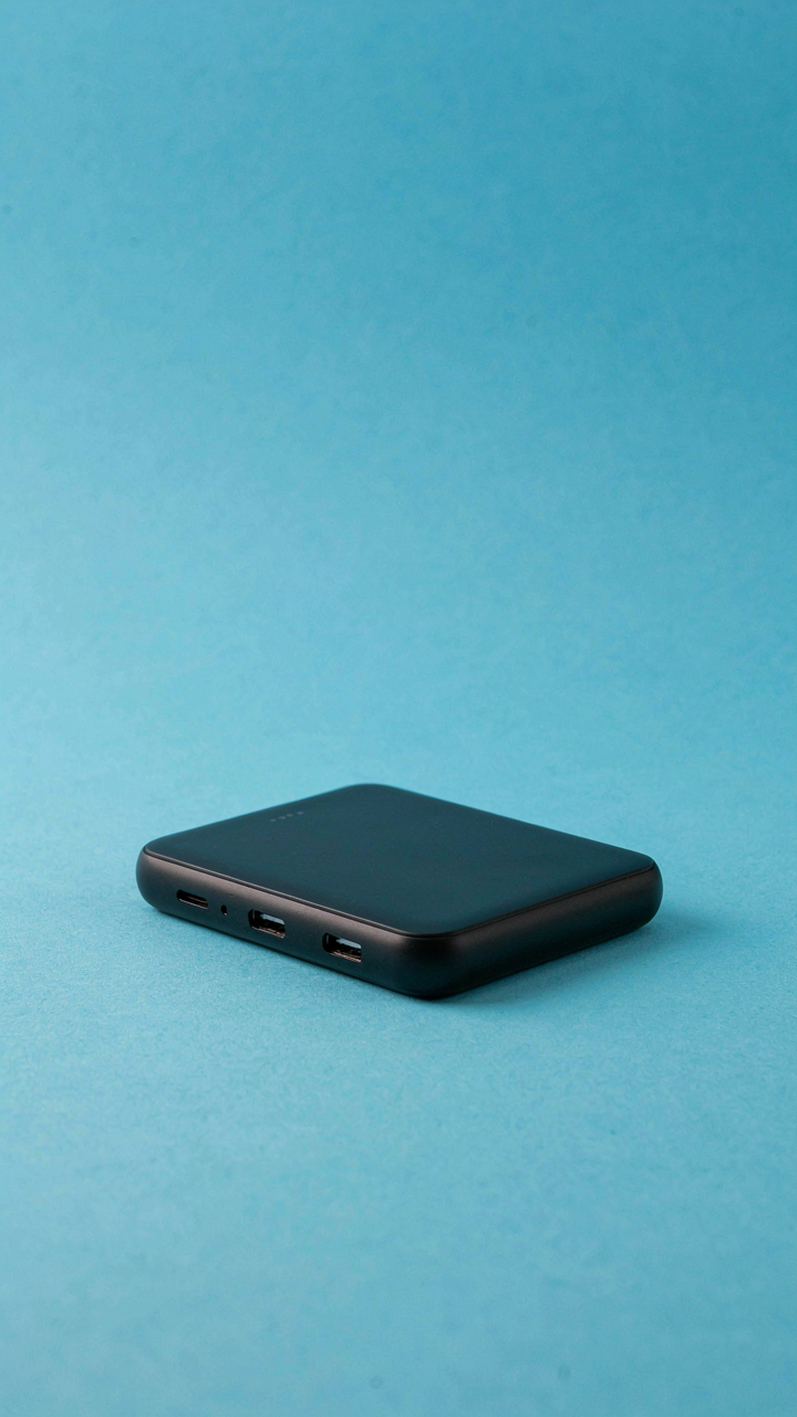
Empty Space Is Your Competitor
You want your gadget to look expensive in the frame because you think that signals credibility. It doesn’t. Signal credibility by removing everything that isn’t the gadget. Negative space operates like contrast in graphic design: the more surrounding emptiness you create, the more the object demands attention. Your iPhone camera has no special sensor advantage here. It’s a framing problem.

Place your gadget off-center with 60 to 70 percent of the frame as clean background. Solid colors work better than patterns because patterns compete. The gadget becomes the only visual anchor. Light reflects differently across empty space, which creates depth without props. This is the mechanism: constraint forces hierarchy.
One Object, One Angle
Most people photograph gadgets from multiple angles in one frame hoping to show versatility. This is confusion disguised as thoroughness. One gadget, one lighting direction, one camera angle per shot. Your viewer’s eye needs nowhere else to go. The product becomes unmistakable.
Shoot the gadget’s strongest visual feature dead-on or at a 45-degree angle to the lens. Let the back camera on your iPhone sit 12 to 18 inches from the subject. Move only the light source, not the product, between takes. This isolates the variable you’re testing and makes editing simpler. You capture what the gadget actually does, not what you hoped it would do.
Lighting: The Single Non Negotiable
Window Light Is Your Baseline
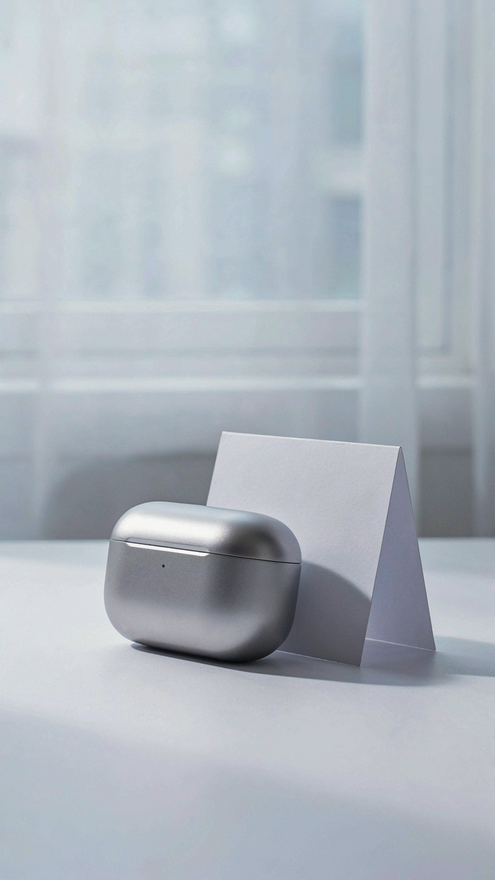
You want clean review photos because clean photos signal professionalism, and professionalism signals you’re someone worth listening to. Here’s the mechanism: your iPhone camera sensor captures light the way physics describes it—in inverse square law terms, meaning light intensity drops exponentially the farther you move from the source. Window light works because it’s diffuse, directional, and free. Position your gadget perpendicular to a north or east-facing window on an overcast day. This eliminates the sun’s direct glare while maintaining consistent illumination across the product’s surface.

Direct sunlight creates hot spots on metal and plastic that destroy detail. Overcast conditions and north-facing windows solve this without equipment. Shoot between two and four hours after sunrise or before sunset on clear days. The angle matters more than intensity. Place the gadget at a forty-five degree angle to the window so light wraps around the front face. This reveals texture, buttons, and ports without creating blown-out highlights that flatten the image.
Eliminate The Contrast Trap
The common advice says bounce light with white foam board or paper. That’s incomplete. The real problem isn’t shadow existence—it’s shadow ratio. In lighting terminology, contrast ratio is the gap between your brightest and darkest areas. Your iPhone sensor captures roughly twelve stops of dynamic range in standard mode, but once a shadow drops below a certain threshold, it becomes pure black with no recoverable detail. You need a fill source on the opposite side of the main light to compress that ratio.
Use a white wall, poster board, or even a sheet as a fill bounce on the shadow side. Position it twelve to eighteen inches from the gadget. This doesn’t eliminate shadows, it controlled them. Take a test shot, check the histogram on your iPhone, and confirm no dark areas are clipped to pure black. Adjust the fill position forward or back by inches until the shadow detail reads at least thirty percent gray in the preview. This single step separates review photos from careless product shots.
The “Design Thinking” Framework For Phone Photography

Know Who Actually Views Your Shot
You want permission to skip the work of understanding your audience because that feels like marketing speak. But the mechanism is simple: the person viewing your gadget photo has a specific context and constraint that determines which angle, lighting, and framing will actually register. Without mapping that, you shoot blind.

Your photo serves a function for a specific viewer in a specific moment. A reviewer scrolling Instagram has 1.2 seconds. A potential buyer on a product page has 8 seconds and wants to see dimensions relative to a hand. A design-focused account wants to isolate material texture. Each viewer needs different information. Frame your shot around what that viewer actually needs to decide, not what feels aesthetically complete.
Shoot Multiple Angles Like A/B Testing
The common advice is to “try different angles and see what works.” That’s incomplete. Design iteration isn’t random—it’s systematic hypothesis testing. Treat each angle as a test: front view tests the product’s frontal presence, 45-degree tests volume and form, side profile tests thickness and proportion, overhead tests symmetry and top-surface detail.
Shoot the same gadget from 12 distinct angles in one session, keeping lighting and background constant. You’ll see which angles reveal information fastest. The angle that makes a viewer understand the product’s primary value in under two seconds is the one that works. Your job is to identify which angle does that work, then execute it flawlessly.
Composition: The Unwritten Rules
The Grid Trap
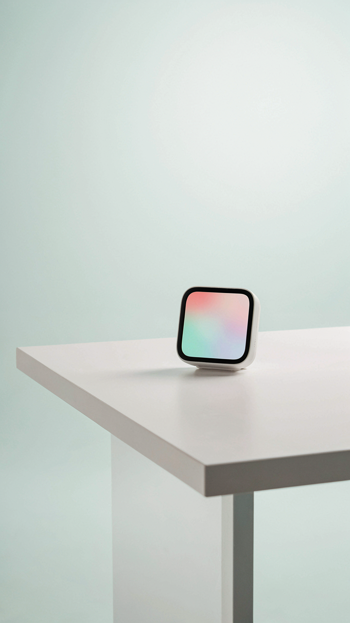
You want the rule of thirds to validate your framing because it sounds authoritative and it lets you stop thinking. Here’s the reality: the rule of thirds is a starting point, not a destination. In visual hierarchy, what matters is tension—the rule creates it by offsetting subjects from center, which your eye reads as intentional rather than accidental. On iPhone, the grid overlay trains your eye to recognize asymmetry fast.

The mechanism is this: use the grid to place your gadget off-center, then break the rule when the shot demands it. A perfectly centered device can read as confident, not lazy—especially for minimalist product angles or direct overhead shots. The grid should disappear once you understand what it teaches. Shoot the same gadget three ways: thirds, center, then wherever your instinct lands. You’ll feel the difference immediately.
Vision Lines That Work
Physics calls it the vector—a line that carries force across space. In gadget photography, leading lines function the same way: they move the viewer’s eye toward the subject, not away from it. The mistake most people make is treating any line as valid. A cable, a shadow, a reflection—they only work if they point toward the device, not past it.
On iPhone, your most accessible leading lines come from surfaces: a desk edge, a table corner, a shadow cast by the device itself. Compose so these lines converge on the gadget’s most important feature—usually the screen or the distinctive edge that defines it. Shoot a phone at a 45-degree angle where the shadow of the edge runs diagonal across the frame. The eye follows the shadow straight to the device.
Beyond The Pixel: The IPhone Obsession Narrative
Angle Matters More Than The Camera
You want permission to believe your iPhone can compete with expensive gear because admitting otherwise means money wasted. Here’s the actual mechanism: framing transforms perception. In photography, framing is what designers call negative space allocation, borrowed directly from graphic design. Your iPhone’s sensor isn’t the limiting factor on gadget shots. The angle is.

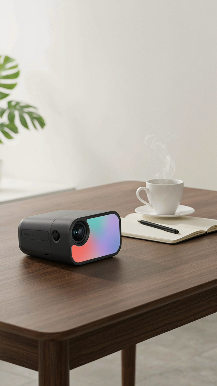
A gadget photographed from directly above looks flat and corporate. Shot from a 35-degree angle with one edge closer to the lens, it gains dimension. The iPhone’s wider field of view actually forces better composition decisions than premium cameras. Tilt the product so light hits one face and falls away on the other. This creates read-ability without looking staged.
Experience Lives In Context, Not Resolution
Most advice says shoot in clean white rooms. That’s backward. A product isolated on white is forgettable. You’re not selling resolution. You’re selling what owning this thing feels like.
Place the gadget in a hand. Show it near coffee, a notebook, a desk. The iPhone’s computational photography handles mixed lighting better than you think because the algorithm prioritizes natural tones over technical accuracy. This context shot sells faster than any detail shot ever will. Buyers don’t want specs. They want proof someone like them already uses it and has space for it in their life.
The Post Processing Illusion: Real Editing

Subtle Enhancements, Not Overhauls
You want people to think you didn’t edit at all. That’s the real game here. The fear is that visible editing makes your gadget look fake, so you overcompensate by doing nothing, which makes it look worse. Editing in gadget photography operates like signal amplification in audio engineering: you’re boosting what’s already there, not inventing what isn’t.

Start in Lightroom or the native iPhone Photos app. The difference between amateur and professional gadget shots lives in three mechanical adjustments most people skip or bungle.
- Exposure compensation: Add 0.3 to 0.7 stops if the gadget sits in shadow or mid-tone. Don’t crush the blacks chasing brightness.
- Contrast: Increase by 5 to 15 points. Gadgets need separation from their background. This isn’t optional.
- Clarity: Raise it 10 to 25 points. You’re sharpening micro-details like screen bezels and texture without oversharpening edges.
- Saturation: Lower by 3 to 8 points if you shot under tungsten or LED. Devices photograph warm. Dial it back to neutral.
- Shadows: Lift shadows 10 to 20 points to recover detail in recessed areas like ports, vents, or logo depressions.
The mistake everyone makes: they treat the whole image as one object. Gadget editing demands selective work. Use local adjustment brushes on the product itself, leaving the background untouched. This maintains depth and prevents the flat, processed look that kills credibility with reviewers and buyers.
The Power Of True White Balance
White balance isn’t about making things look whiter. It’s about removing the color cast your light source imposed, which every iPhone captures whether you see it or not. Most gadget shots fail here because people assume “auto” white balance works. It doesn’t, not consistently.
The iPhone camera records reality through the lens of whatever light hit it. Tungsten bulbs add yellow and orange. LEDs add cyan or magenta depending on their rated Kelvin temperature. You can’t unsee a color cast once you notice it, and reviewers notice immediately. Adjust white balance in post by moving the temperature slider until the device’s natural finish shows, not the light’s fingerprint. Then move the tint slider to neutralize any remaining green or magenta shift. This single step separates review photos from snapshot clutter.
Minimal Desk Setup Photography: A Case Study
One Object, Perfectly Isolated
You want to look professional without looking like you’re trying, which means restraint reads as expertise. The real mechanism is isolation. In visual hierarchy terms borrowed from graphic design, isolation is the inverse of competition: remove everything that fights for attention and the object becomes unavoidable. Your iPhone’s camera sees contrast and detail. It doesn’t see “nice setup.” It sees what dominates the frame.

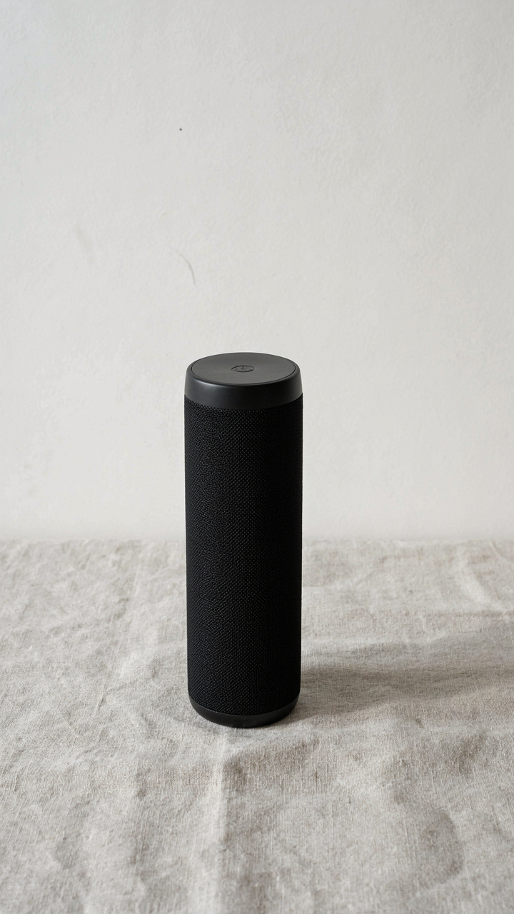
Position the single gadget off-center, leaving negative space on at least two sides. Use your iPhone’s native camera app in standard mode, not portrait. Shoot at eye level to the object, not down at an angle, which flattens dimensionality. The object must cast a shadow or sit on a surface with visible texture. No floating. Texture gives scale without adding visual noise.
Neutral Surfaces That Work
The common advice is “use white or gray.” That’s incomplete. What actually matters is that the background removes competing information, not that it matches a color palette. Surfaces that disappear are surfaces with zero texture variance or surfaces with consistent, repeating texture that the eye stops processing after one second. Paper, fabric, and laminate work. Wood grain, patterns, and glossy finishes don’t.
Use a large sheet of white poster board, seamless paper, or linen fabric angled away from direct light. Position it so it fills the frame behind and to the sides of your gadget but never touches the object itself. Shoot from low enough that the background occupies sixty to seventy percent of the frame. This ratio keeps the object prominent while the background becomes visual silence.
Your Biggest Obstacle Isn’t The IPhone’s Camera; It’s Your Desire To Imitate, Not Innovate

Every gadget photographer copies the same three-point lighting setup. Same angles. Same shadows. Same boring. Your iPhone doesn’t need permission to break that mold. Stop studying how others shoot and start studying what makes your products different. Shoot one product today using only natural light from a weird angle nobody uses. Break the template. The camera isn’t holding you back. Your obedience to convention is.