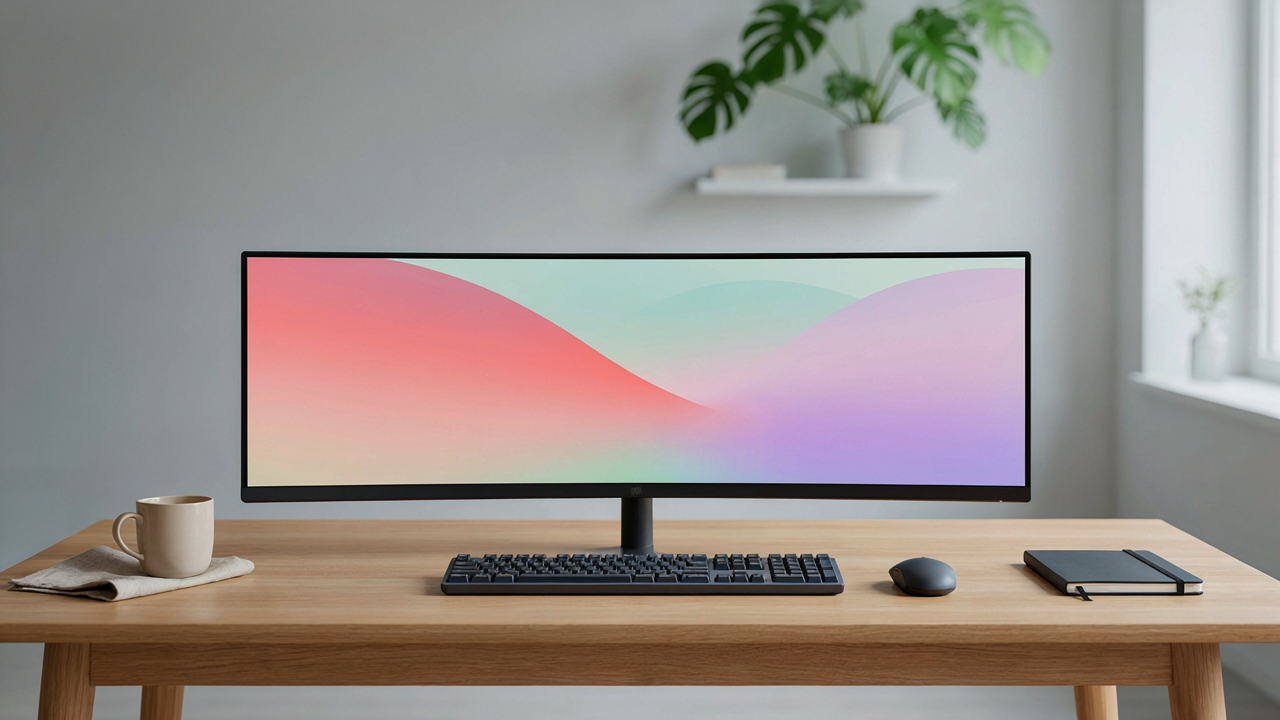
The Illusion Of The Aesthetic Table For Affiliate

What The Photo Hides
You want people to believe you work in that environment. That’s the real reason you care about desk setup photos. Here’s what nobody admits: a single photo captures maybe two hours of actual staging, while the other 4,758 hours of your year happen in chaos. The camera angle, the timing, the props arranged just so—these are theater. The mechanism mirrors museum curation. Museums don’t show storage rooms; they show the lit, arranged pieces. Your desk photo does the same thing. It presents the 0.1% of your space that matters visually, not the 99.9% where actual work happens.
The gap between the shot and reality widens because we’ve normalized the illusion. You see a desk setup photo and assume that’s where someone produces. It isn’t. That desk holds the minimum viable toolkit for the image. The real work happens earlier, messier, and usually on that same desk when nobody’s looking. The photo doesn’t lie. It just tells a fragment of truth so polished it reads as the whole thing. That’s the problem worth naming.
The Curated Moment Versus The Actual Workflow
People mistake desk aesthetics for productivity. Wrong framework. Think of it through signal theory: a signal carries information, but noise obscures it. Your desk setup photo is pure signal—no noise. Real work is both signal and noise combined. The photo removes the noise: the half-empty coffee cup, the browser tab carnage, the document you’ve edited six times, the cable you jury-rigged that works fine. That removed noise was doing something. It was actual evidence of process.
The daily grind lives in that noise. You don’t produce at a clean desk with three thoughtfully placed objects. You produce at a desk with sixteen things happening, most of them invisible in photos. When you build a desk setup for photography, you’re not optimizing for output. You’re optimizing for appearance. These are separate problems. A desk that photographs well might actually slow your work down because you can’t use it the way you need to. The real protocol: take the photo for external credibility, then restore your desk to its functional chaos.
The Minimal Workspace Fallacy
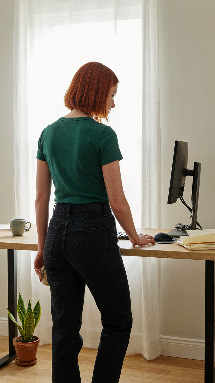
Minimalism Is Not Your Actual Problem
You want people to see your desk and think you’re disciplined, but you’re actually terrified that showing tools makes you look unprofessional or scattered. Here’s the mechanism: minimalism became a status signal because wealthy people can afford to hide their work. A surgeon doesn’t photograph their operating room. A trader doesn’t showcase their Bloomberg terminals. But you’re not them. You work on a desk. The gap between “looks clean” and “actually functions” is where most desk setup photos fail.

Minimalism as a design movement emerged in the 1960s as a reaction against consumer excess, but it got weaponized by tech marketing to suggest that fewer visible objects equals higher intelligence. This isn’t true in practice. A minimal desk in a photograph often means your actual tools live in drawers, off-camera, creating cognitive friction every time you work. You’ve optimized for the photo, not the workflow. That’s backwards. Your desk should photograph well because it works well, not the reverse.
The Strategic Hoarding Of The Effective
Functional abundance looks cluttered only to people who don’t understand what each object does. In systems thinking, this is called “apparent complexity” masking operational efficiency. Your desk isn’t cluttered if every item reduces friction in your actual work. A monitor arm, a second display, a mechanical keyboard, a pen holder with the pens you actually use, a document holder, a cable management box: these aren’t clutter. They’re infrastructure. They disappear in the photo because they’re not decorative. They work.
The photos that actually convert viewers aren’t the sparse ones. They’re the ones where every object has visible purpose. A standing desk converter with papers stacked nearby tells a story of active work. A monitor with a keyboard tray and ergonomic mouse shows someone who understands repetitive strain. Cables bundled with velcro wraps and routed behind a monitor arm signal intentional design, not obsessive tidiness. Build your desk for eight hours of daily use first. Photograph it second. That sequence reversal is what separates setups that inspire action from setups that inspire envy and nothing else.
The Cozy Table Aesthetic Background Protocol
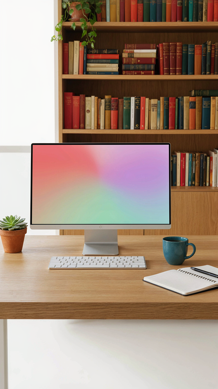
What You’re Actually Selling
You want people to believe you work in comfort, not chaos. That’s the real motive here. The cozy table aesthetic borrows from interior design’s concept of “layering”—stacking textures, light, and objects to create perceived depth and intentionality. Your desk photo isn’t about the desk. It’s about signaling that your environment supports focus, which allegedly means your work output does too.

The background does the heavy lifting in desk setup photos because viewers spend milliseconds processing it before they even notice your monitor. A cluttered, harsh, or sterile background reads as unstable. A considered one reads as controlled. You’re not decorating. You’re engineering perception through environmental cues that your brain learned to trust from watching films, magazines, and other people’s spaces for decades.
Realness Beats The Staged Shot Every Time
The mistake most people make is treating the background like a stage set. They add props, rearrange plants, blur backgrounds artificially, or light scenes like a product shoot. That’s backwards. The photos that actually convert—that build credibility, not just engagement—show the space you actually work in, untouched except for basic cleaning.
People have spent enough time online to spot constructed comfort. The moment a background looks “designed for the photo,” it reads as insecure. Your real background, even if it’s plain or imperfect, signals confidence. You’re not selling the aesthetic. You’re showing work happens here. Take the photo in natural light without rearranging anything. Let the background speak through function, not curation.
The Signal To Noise Ratio Method (Cybernetics)
Remove What Doesn’t Work
You want people to believe your setup is intentional, not accidental. Cybernetics teaches us that systems self-regulate through feedback loops: output depends on what you remove, not what you add. In desk photography, signal is the tech that matters to your work. Noise is everything else competing for attention. Most setups fail because they show both equally.

The common advice says “make it clean.” That’s lazy. Real optimization means identifying which objects actively distract from your core message, then removing them systematically. A cable running across your desk isn’t a detail. It’s visual friction that weakens every other element. Your monitor stand isn’t background. It either supports the narrative or breaks it. Photograph your current setup, then ask: does this object make the tech clearer or murkier?
Performance Over Aesthetics
Most desk setup photos fail because they optimize for how things look instead of what they prove. A perfectly staged monitor at forty-five degrees looks nice. It proves nothing about capability. Your desk should show output evidence: the software running, the work in progress, the peripherals that enable output. Aesthetic choices block that signal.
The mechanical rule is simple: every object in frame must answer one question: does this help me work better? If the answer is no, remove it before shooting. A plant on the desk is decoration. Your actual workspace doesn’t care about decoration. Your monitor shows what you produce. Your keyboard shows your input method. Your lighting shows your working conditions. These elements work because they’re functional, not because they’re composed artfully. Shoot what remains after you strip away everything non-essential.
Beyond ‘Table With Things’: The Tool To Task Mapping
Every Item Earns Its Frame
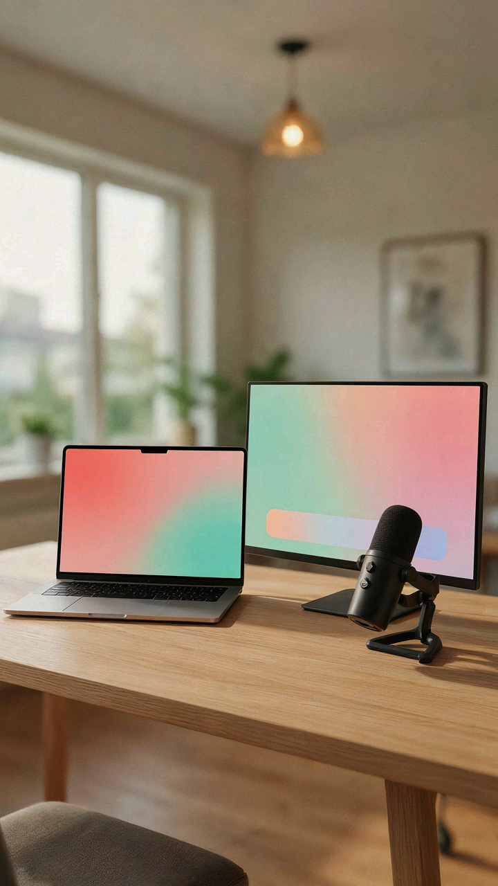
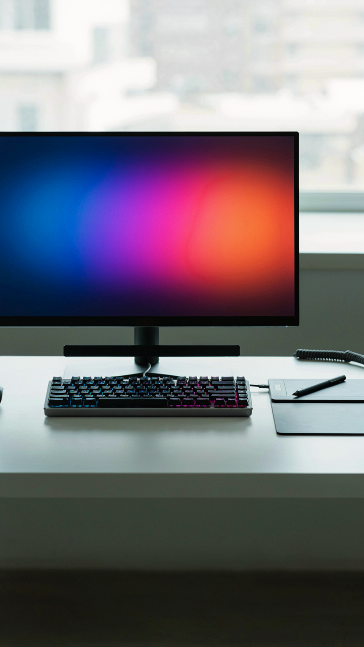
You want people to think you’re productive and intentional. The real mechanism is simpler: a desk setup photo that works makes viewers understand what you actually do. This requires ruthless alignment between tool and task. A microphone belongs in your frame only if you record audio. A monitor arm belongs only if you use multiple screens. A cable management system belongs only if the cables matter to your workflow. Every object must answer one question: what specific output does this enable?

The difference between “setup that looks busy” and “setup that reads clear” is whether each item has a direct function. When someone views your desk photo, they either see intentional work or they see consumption. A $400 keyboard sitting unused looks the same as a $40 one to a viewer who knows nothing about mechanical switches. What reads as intentional is the keyboard paired with the software you actually use it for. The monitor paired with the work you display on it. Intention is visible only when the tool-to-task chain is obvious.
Decorative Objects Have No Place Here
Common advice says a plant or a figurine “adds personality.” That’s wrong. Adding objects for aesthetic softness dilutes the message of your setup. Every non-functional item competes for attention and makes the photo harder to parse. A desk setup photo isn’t a lifestyle blog aesthetic. It’s a communication tool that says “here’s how I work.” Decoration interrupts that signal.
Remove anything that doesn’t directly support a work output. This includes cable organizers that aren’t functional, monitor risers that aren’t needed for ergonomics or sight lines, desk pads that exist solely for color coordination, and personal items unrelated to your craft. The constraint forces clarity. When you photograph your desk with only essential tools, viewers see the actual stack you use to produce. That specificity builds credibility far more than a curated aesthetic ever will. Photograph only what you use on days you’re actually working.
The ‘Affiliate Table’ Trap: Selling The Dream
When Aspiration Becomes Currency
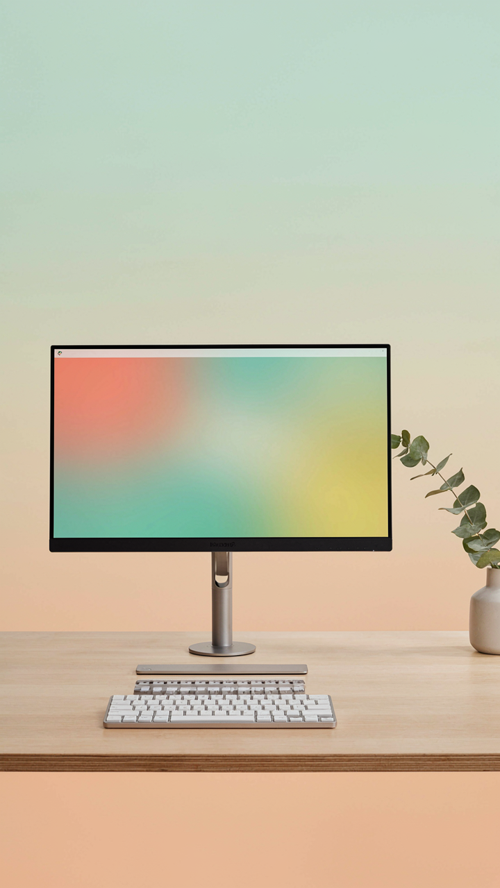
You care about this section because you’ve already bought something based on a desk setup photo, and you’re worried you got played. Here’s what actually happens: aspiration is the oldest sales mechanism in existence. Desk setup photos exploit it by showing a curated environment that triggers status anxiety. The photographer positions products strategically—monitor arms at eye level, keyboard centered, lighting that makes everything look intentional. Every element is staged to make you believe owning those same items will transfer the feeling of control and mastery to your space.

The mechanism works because desk setup photos collapse two separate things: the system someone built and the products they’re selling. A setup that took months to refine and troubleshoot gets compressed into a single image. You see the result, not the iteration. You see the monitor, not the three months of neck pain that preceded buying it. Affiliate links live in this gap between perception and reality, monetizing your desire to skip the messy middle.
Real Recommendations Don’t Need Staging
The common advice says “just be authentic.” That’s incomplete. Authentic doesn’t mean useful. You need to distinguish between products someone uses because they solve a real problem and products someone uses because they look good in photos. Here’s the difference: a genuine recommendation includes the friction it solves or the mistake it corrects. An affiliate endorsement just shows the final state.
Test this by asking a simple question: would the person use this product if nobody would ever see their desk? Monitor arms, proper lighting, and cable management all pass this test because they address ergonomics, visibility, and workflow efficiency. A monitor that looks sleek but causes glare failure. A chair that photographs well but doesn’t support your spine for eight hours. These fail the test. A recommendation becomes forced the moment the product’s primary value is how it appears in a photo rather than what it enables you to do.
The Unseen Advantage: An Effective Cozy Workspace

Comfort Built For Focus, Not Display
You want people to think your workspace is comfortable because you believe comfort equals productivity, when really you’re worried yours looks cold and corporate. The mechanism is this: discomfort breaks focus through constant micro-corrections your body makes to find relief. A desk setup photo that shows genuine comfort signals the opposite of what most people think it does. It reveals someone who chose function over Instagram aesthetics.

Real comfort in a workspace means your spine stays neutral, your arms rest at ninety degrees, and your eyes land on the screen without neck strain. When a photo captures this, it shows restraint. No extreme angles, no dramatic lighting to hide poor positioning, no unnecessary props. The setup proves you optimized for eight hours of work, not eight seconds of scrolling.
Ergonomics: The True Luxury
Ergonomics borrowed from industrial engineering teaches us the concept of load path: the route stress travels through a system. In desk setup photos, the load path is your skeletal alignment under sustained tension. Most setups break this path immediately. They stack strain on your wrists, compress your shoulders, and tilt your head forward. The photos that matter show load distributed evenly across your structure.
- Monitor Height: Position the top of your screen at or slightly below eye level when seated. This prevents neck flexion that compounds over hours and becomes visible as poor posture in photos.
- Chair Support: The backrest should contact your lumbar spine, not float behind it. A gap between chair and back forces muscles to compensate, degrading focus and showing tension in your shoulders on camera.
- Desk Depth: Your keyboard and mouse sit close enough that your elbows stay near your torso. Distance forces you to reach, which loads your shoulders and anterior chain, visible as rounded shoulders in any photo.
- Footrest Engagement: Your feet either plant on the floor or rest on a footrest with hips slightly higher than knees. Dangling feet create pelvic tilt that cascades up your spine and reads as slouching.
- Keyboard Angle: Your keyboard stays flat or slightly negative pitched, never positive. Positive pitch forces wrist extension, which fatigues your forearms and shows as tension in your hands and arms during extended work sessions.
The setup photos that stand out aren’t the ones with the most expensive chair. They’re the ones where someone clearly sits for six to ten hours without moving to adjust position. That stillness only happens when alignment is correct from the start. Photograph your actual work posture after two hours at the desk, not your first five minutes.
The Productivity Paradox: Why Less Is Actually Less
One Monitor Is A Lie You Tell Yourself
You want the desk setup photo that signals restraint and discipline because you think minimalism proves you’re serious. It doesn’t. The single-monitor setup became a status symbol precisely because it’s easy to photograph and easier to defend as “focused.” But this confuses the aesthetic with the output.

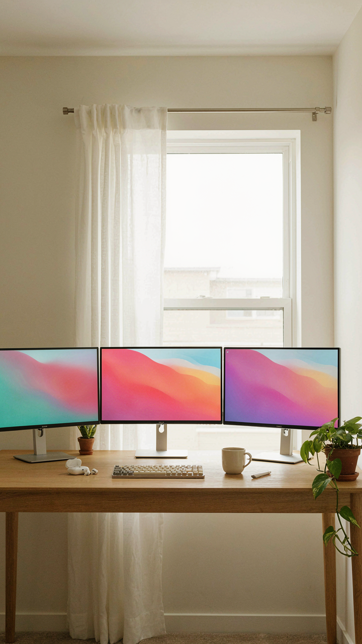
The mechanism is simple: visual field determines cognitive load distribution. A single monitor forces serial processing of information. You alt-tab between windows, losing context each time you switch. Multiple monitors enable parallel processing—your eye moves across the same visual plane instead of erasing and reloading what you just saw. This isn’t preference. This is neurology. The setup photo showing one pristine display is showing you someone who either doesn’t produce much or produces it slowly.
Building Stacks That Actually Compound
Systems thinking applies to desk layouts the same way it applies to business. In systems theory, you measure leverage by output per unit of input. A three-monitor setup isn’t three times better than one monitor because the relationship isn’t linear—it’s exponential when you structure what displays what.
Place research and reference material on monitor one, execution work on monitor two, communication and feedback on monitor three. This architecture eliminates the cognitive cost of hunting for information mid-task. Your brain stays in flow because the system does the filtering. The desk setup photo that looks chaotic is often the one generating the actual output. Arrange your monitors by information flow, not by what photographs well. Then take the photo anyway—it won’t look like much, but the work will speak for itself.
Your Fear Of Being Irrelevant Is Louder Than Your Actual Work

You post desk setup photos because you think visibility equals value. It doesn’t. The mechanism that actually works is this: you build something real, document it honestly, and let the work speak instead of the aesthetics. Stop chasing the angle. Post your setup because it reflects what you actually do, not because you’re terrified nobody notices you exist. Your work doesn’t need a beautiful backdrop to matter.