
The “No Excuses” Principle: Why Home Is Your Best Studio

Constraints Force Better Decisions
You want permission to skip the hard part. A studio feels like the barrier between you and “real” photography, so you’ve made limited space your excuse. Here’s the mechanism: constraint is a filter that removes bad ideas before you shoot them. A 12×12 room forces you to move the camera instead of the subject. You learn composition faster because you have no choice. You stop wasting time on setup logistics and start solving actual visual problems. The photographer who shoots in one corner of their bedroom develops stronger fundamentals than the one paralyzed by infinite options in a rented studio.
Your home already contains everything you need to learn the core skill: seeing light and positioning objects within a frame. The walls are your studio backdrop. The windows are your lighting department. The furniture is your subject library. Stop treating your space as a limitation and start treating it as a constraint that clarifies priorities. Every professional photographer you admire started by shooting in confined spaces because that’s where you learn fastest. The mechanism is simple: fewer variables equals faster feedback on what actually works.
Tension, Contrast, And The Frame
Cinematography teaches us about negative space and depth cues, and your iPhone needs both to separate subjects from their background. Most people shoot flat because they position the subject parallel to the camera and wall. Move the camera to the side. Create diagonal lines with your body position relative to the subject. This introduces tension into the frame, even in a still room. The viewer’s eye moves through the image instead of stopping at the center. Depth happens through positioning, not through owning more gear.
Shadow plays the same role as line in drawing. Light hits one side of your subject while the other falls into shadow, creating definition and dimension. Shoot near a window during midday and position your subject perpendicular to the light source. One side gets bright, the other recedes. Your iPhone’s camera captures this contrast naturally without any filter or editing. Composition is just the deliberate placement of light and dark areas within the frame. Start here: position one light source, move until you see shadow on your subject, then frame it so the shadow takes up meaningful space in the image.
The Light Harvesting Protocol: Beyond Artificial Illumination
Where Your Window Actually Points
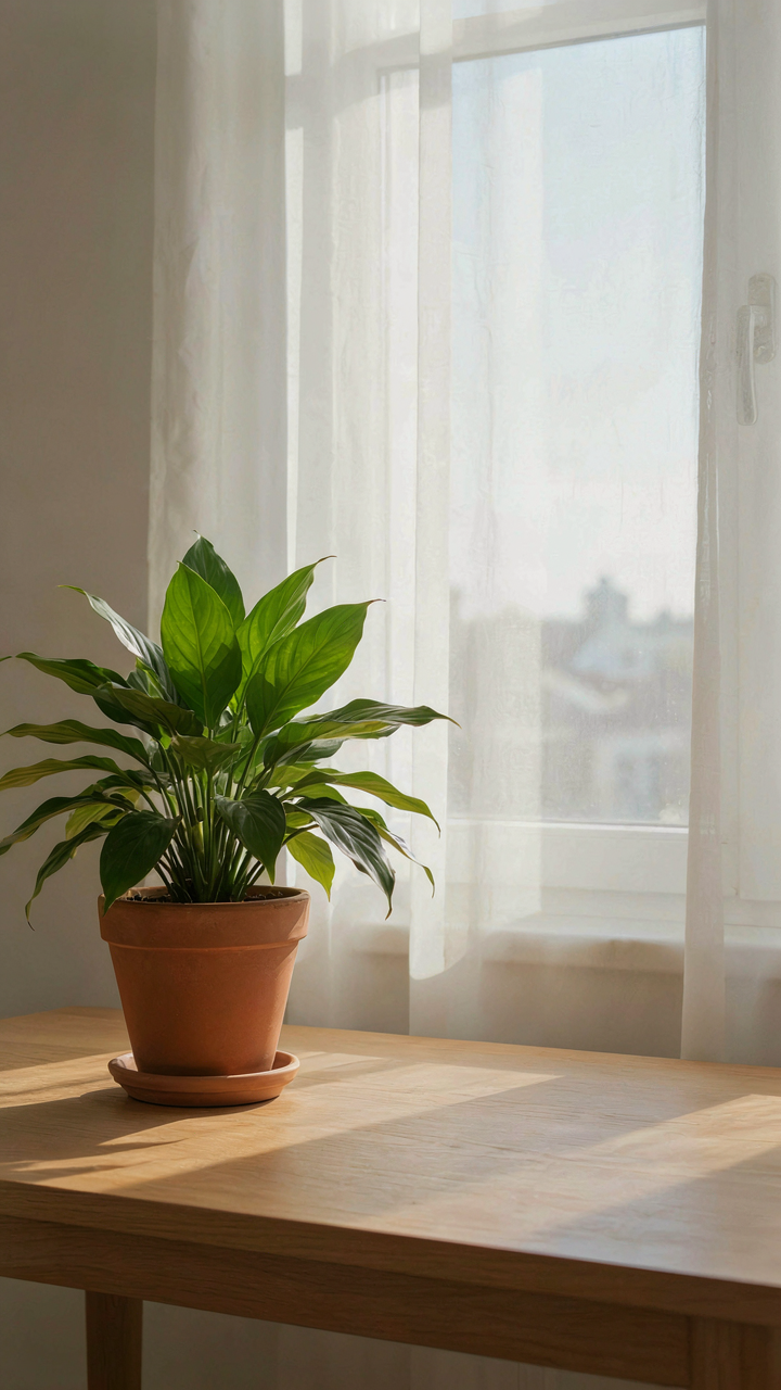
You want a shortcut to professional-looking photos without buying gear. That’s not happening. The mechanism is this: light direction determines shadow placement, and shadow placement controls whether your subject reads as flat or dimensional. iPhone cameras excel at this, but only if you stop treating light as a commodity you flip on and off. Think in terms of directional vectors from physics. A north-facing window delivers consistent, diffuse light. East-facing delivers warm, directional light in morning hours. West-facing delivers harsh, golden light in afternoon. South-facing (in Northern Hemisphere) delivers the most variable range throughout the day. Time your shoots to when the sun angle matches your subject’s geometry. Don’t shoot at noon unless you want flat, shadowed features.

The real work is observation, not equipment. Spend three days noting how light moves across your shooting space at different times. Where does it hit your desk? Where does it create pools of shadow? Position subjects in relation to that movement, not in relation to where you think they should go. Move your backdrop, not your light source. Your iPhone sensor reads highlight and shadow detail better when you’re using natural directional light than when you’re fighting overhead fixtures with fill-flash. This is a constraint that becomes an advantage once you stop resisting it.
Bounce And Block With What You Have
Everyone says use a reflector. Reflectors work, but you don’t need to buy one. The mechanism is simple: light bounces off surfaces at angles equal to the angle of incidence, and any matte white surface interrupts that geometry enough to fill shadows. A white bedsheet taped to a cardboard box becomes a reflector. A poster board leans against your chair. A roll of white paper from your printer works. The mistake most people make is positioning these too close or too far. A reflector positioned twelve to eighteen inches from your subject’s shadow side fills without erasing the original light direction. Too close and you lose dimensionality. Too far and it does nothing.
Diffusion works the same way: interrupt the directional light before it hits your subject. A white sheet stretched between your subject and the window softens harsh shadows and reduces contrast. This matters most during midday shoots or with strong west-facing afternoon light. A thin white curtain already hanging in your home does this automatically. Position your subject between the window and the diffuser, not behind either one. The iPhone’s computational photography actually preserves more detail in diffused light than in direct light because it doesn’t have to fight blown highlights and crushed shadows simultaneously. Your job is to place the subject in the optimized light direction, then leave the camera processing alone.
Deconstructing The Mundane: Objects As Storytellers

The Objects Nobody Photographs
You want permission to believe your surroundings are interesting enough. They’re not, until you force them to be. The mechanism is constraint. In design, constraint drives innovation because it eliminates options and forces specificity. Your iPhone’s camera works the same way: the more limited your subject pool, the more intentional your frame must become. A coffee mug isn’t inherently photogenic. Your angle, light, and framing make it one. That’s where the work lives.

Most people photograph objects the way they see them: straight-on, flat, obvious. This produces nothing. Instead, isolate one detail. Shoot the handle of a mug from inside the cup looking out. Shoot the wear pattern on a book spine. Shoot steam rising from a surface. These aren’t attempts at “pretty.” They’re attempts at revealing what’s always been invisible. The object becomes a vehicle for showing how light behaves, how texture communicates use, how time leaves marks. Your iPhone sees this better than your eye because the screen forces abstraction.
Macro Range And Hidden Geometry
Macro photography borrows from entomology—the science of insects—where magnification reveals structure invisible to casual observation. Your iPhone can’t true macro without a clip-on lens, but iOS 17 and later phones get close enough with the native camera’s close-focus range. Position your subject 4-6 inches from the lens. The shallow depth of field isolates texture. A wrinkled bedsheet becomes a landscape. A wooden table becomes geology.
The real leverage isn’t magnification itself. It’s what magnification forces you to notice. Texture communicates material authenticity. Grain patterns tell you whether wood is oak or pine. Fabric weave density shows manufacturing quality. Dust particles catch light and create depth. When you zoom into the mundane, you’re not making it interesting—you’re documenting the information it already contains. Set your iPhone to macro mode, find one object in arm’s reach, and shoot from 5 inches away until you see something that wasn’t visible from normal distance.
The “At Home Iphone Photoshoot” Blueprint: Self Portrait As Practice
Angles, Expressions, And Wardrobe Choices
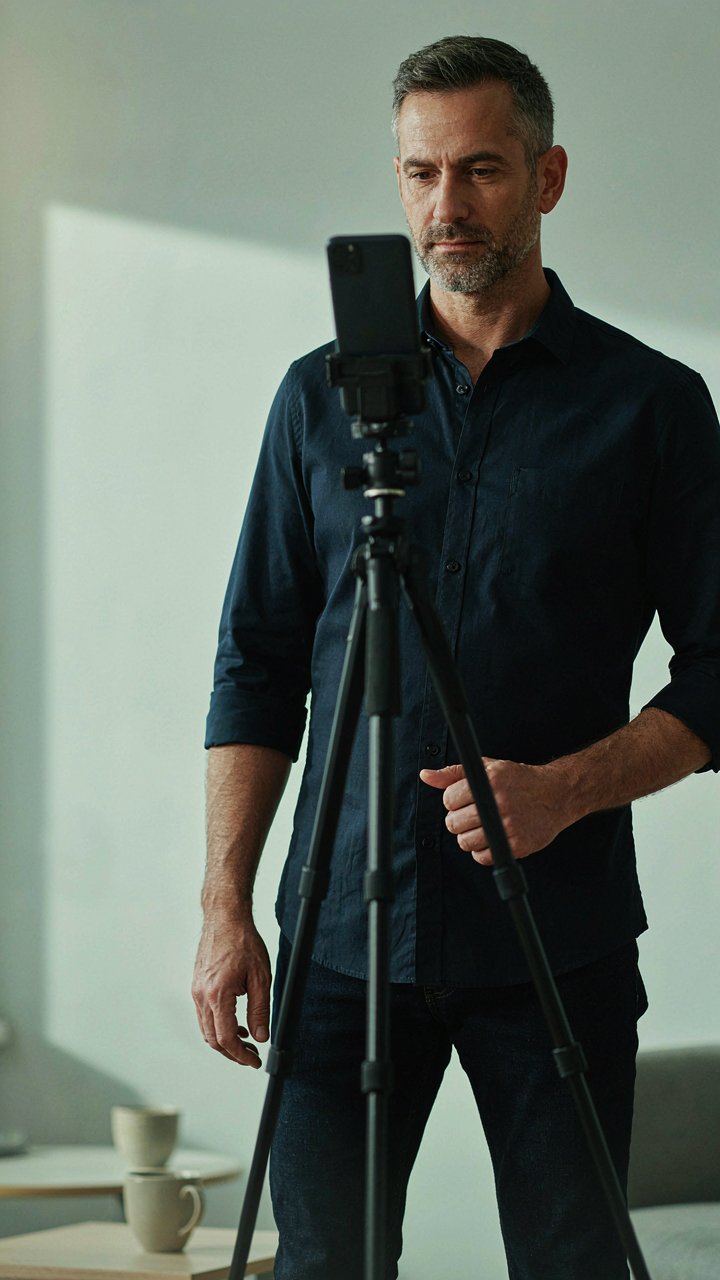
You want to look good because you’re afraid your actual face won’t cut it in frame. That’s not the real problem. The mechanism is this: your iPhone’s lens distorts reality based on distance and angle, so you’re not learning to look good for a camera—you’re learning to read how the camera lies. Borrowing from optics, your face is the subject, but the lens is the filter that determines whether you’re stock photo or compelling. A 12-millimeter focal length from six inches away inflates your nose and compresses your forehead. Move back two feet and everything normalizes. Tilt your chin down five degrees and your jawline sharpens. These aren’t cosmetic tricks. They’re mechanical compensations.

Wardrobe matters less than contrast and fit. Solid colors dominate because patterns compete with your face for attention. Dark shirts push your face forward in the frame. Light shirts do the opposite. Wear what fits your actual body, not what you think photographs well. Test one outfit across five different angles before moving to the next. Track which angle plus which expression plus which lighting hits the target. That combination becomes your repeatable formula.
Remote Shutter And Timer Techniques
Most people waste timer shots because they don’t know when to actually press the button. The real advantage of remote shutter isn’t convenience—it’s consistency. When you tap the physical button, your finger motion creates micro-vibration that degrades sharpness. A wireless trigger eliminates that. Apple’s native Voice Control works if you’re alone. Say “Take a photo” and the phone listens. Wired earbuds with play button controls also function as triggers since the iPhone registers them as shutter presses.
Timer mode works best when you pre-frame the shot and rehearse your movement into position. Don’t rely on the three or ten second countdown to figure out where to stand. Walk the path twice before the timer starts. Identify your exact mark on the floor. This prevents rushed expressions and off-center framing. Save the timer for sequences where you need multiple takes in rapid succession—same angle, different expressions. That’s where the ten-second intervals earn their weight.
Indoor Pictures: The Art Of Staging Your Environment

Negative Space Works Because Your Eye Needs Rest
You want to look intentional, not chaotic. That’s what draws you here. The mechanism is visual hierarchy: your brain processes images by filtering signal from noise, and clutter forces your viewer to work harder to find the subject. Minimalist backgrounds remove this friction. A plain wall, a single shelf, or an empty corner becomes a tool, not a limitation. The iPhone camera sees what you see, so remove everything that competes with your actual subject.

Most advice tells you to “keep it simple.” That’s incomplete. Simple isn’t enough if the remaining objects have no relationship to each other. Intentional emptiness requires one decision: what single element justifies occupying the frame? Remove the rest. Photograph a coffee cup against a bare wall at an angle that shows the cup’s form clearly. Photograph a book on a desk with only the book and the desk surface visible. The constraint forces clarity. This is how you avoid looking like someone who just found a clean corner by accident.
Layering Objects Creates The Illusion Of Dimension
Physics teaches us about depth through the principle of perspective: objects farther away appear smaller, and layering creates a visual recession that mimics 3D space on a 2D screen. Your iPhone camera flattens reality, so you must rebuild that depth manually through object placement. Put a small object in the foreground, a medium object in the middle, and something in the background. The iPhone’s limited depth of field will blur the background naturally, and your subject pops. This isn’t styling. It’s compensating for a technical limitation with intentional staging.
Foreground objects should be close enough to the lens to feel present but not so close they distract. A pen resting near the edge of a notebook, a plant leaf entering the frame from the side, a coffee cup handle catching light in the lower third. These elements work because they create stops for the eye. Your viewer enters at the foreground, moves through the subject, and exits at the background. Without this layering, the image feels flat and disposable. Arrange objects so a viewer’s gaze follows a path through the frame, not just landing on a single point and stopping.
The “Aesthetic Photo Ideas At Home Selfie” Playbook: Beyond Vanity

Mood Over Mirror Image
You want people to think you’re interesting without looking like you’re trying. That’s the real play here. The mechanism is simple: a selfie with narrative beats vanity every time because it gives the viewer something to interpret instead of something to judge. Mood is the difference between a photo and a moment. You build mood through three variables: light direction, background depth, and facial positioning. None of these require beauty. They require intention.

Start by killing the straight-on angle. Tilt the camera fifteen degrees downward, position yourself off-center in the frame, and use window light hitting one side of your face. This creates shadow and definition without flattery. The background should have layers—not clutter, but visual information. A bookshelf, a plant, a door frame. Your eyes should look at something slightly beyond the camera, not into it. This single shift moves the image from self-portrait to captured moment.
Contrast Beats Clarity
Most people think editing means making everything sharper and brighter. That’s backward. Editing for impact means increasing the gap between your subject and everything else. This is basic visual hierarchy from graphic design: contrast is the tool that directs attention. Boost shadows instead of highlights. Crush blacks slightly. Reduce overall saturation, then push a single color—your eye color, your shirt, a background element. The camera sees flat. Editing adds dimension.
Open your iPhone’s native editing tool and stop using filters. Filters flatten everything to the same aesthetic. Instead, lower exposure by one to two points, increase contrast by three to five points, and adjust shadows upward. Drop vibrance slightly, then selectively increase saturation on one element only. This creates tension. The viewer’s eye lands where you want it. Save this as a preset. Every selfie-with-narrative photo you shoot gets the same treatment. Consistency trains the viewer’s brain to recognize your work instantly.
The “Insta Pic Inspo At Home” Algorithm: Curating Your Feed
Repetition Builds Recognition, Not Variety
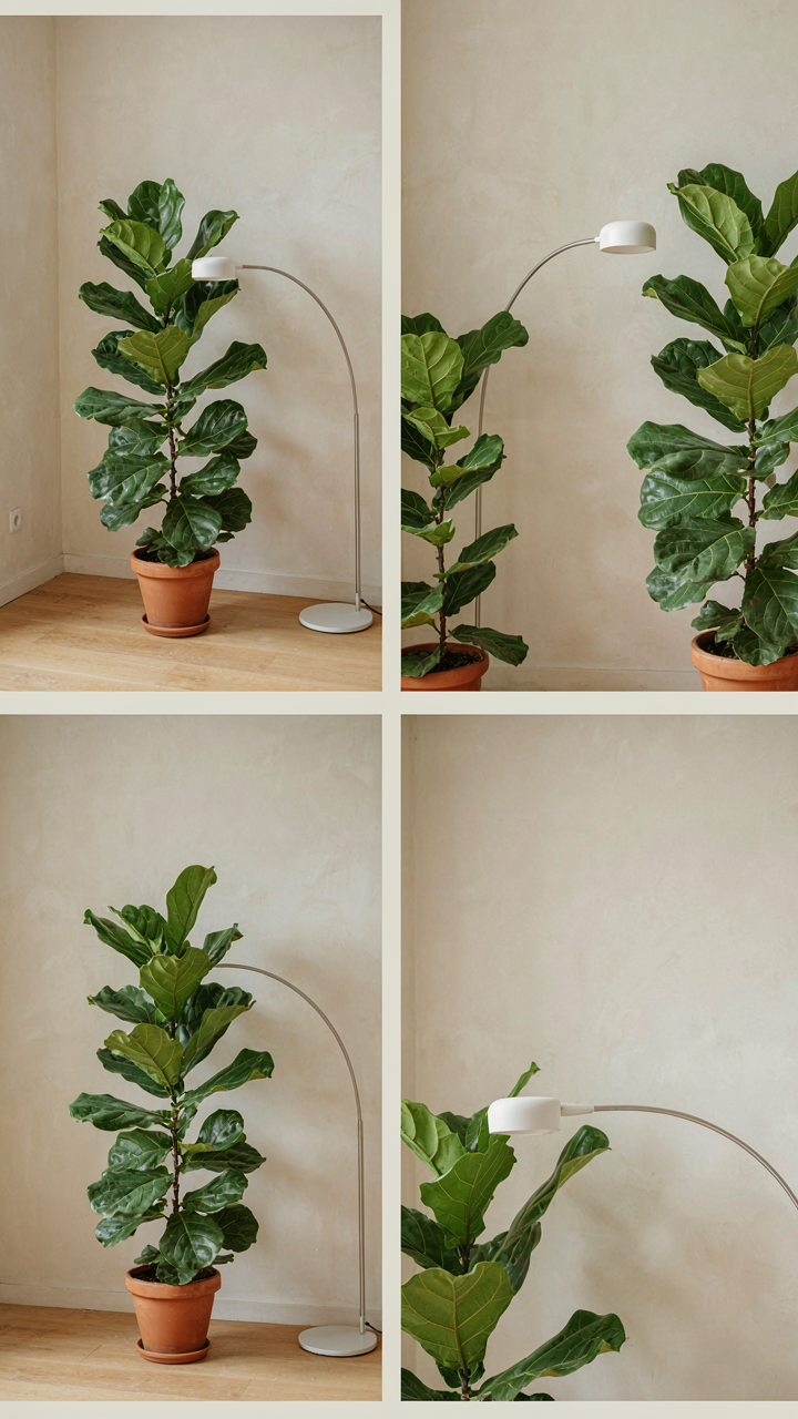
You want your feed to look intentional because you’re afraid it looks random. Here’s the mechanism: your brain recognizes patterns faster than it processes individual images. Visual coherence isn’t about matching filters or aesthetics—it’s about constraint. Limit your color palette to three dominant tones across your home shoots. Shoot from the same two or three angles repeatedly. Use consistent light sources: window light, desk lamp, overhead. Your iPhone’s camera app doesn’t change. Your hand’s height and distance shouldn’t either. This creates a visual signature that signals control, not accident.

The algorithm Instagram uses favors consistency over variety because consistency signals intent to the platform. Post images shot under identical conditions: same room, same time of day, same distance from subject. Your followers see the pattern and stop scrolling. They stop because they recognize you before they recognize the content. This is the opposite of what generic advice says. Most people think variety keeps feeds fresh. It doesn’t. Repetition with purpose builds a brand faster than fifty different ideas ever will.
Extracting New Angles From Existing Moments
Most at-home shoots waste their raw material on one post. You shot five images in the same location under the same light, then posted one. That’s not strategy—that’s leaving money on the table. Each image you capture at home contains multiple narratives depending on crop, caption, and timing. The same coffee cup shot from above tells one story. Cropped tight to show just the handle and your hand, it tells another. Posted Monday it’s a productivity angle. Posted Saturday it’s a slow morning angle. Edited with one filter it’s professional. Edited warmer it’s nostalgic.
Document the entire context of each shoot: full frame, close crops, detail shots of texture, shots with your hands in frame, shots without. Shoot your iPhone’s native 4:3 ratio, then crop it multiple ways—square for grid posts, vertical for Stories, ultra-tight for close-ups. One afternoon of deliberate shooting at home yields seven to ten usable posts across different formats. The mechanism is simple: reframing changes meaning without requiring new content. Your feed stops being a calendar of isolated moments and becomes a coherent narrative you control through selection and timing.
The Easy Instagram Picture Ideas At Home System: The Cynefin Framework For Creativity

When A Photo Idea Stays Stuck
You want a system because you’re afraid you’ll waste time on shots that don’t work. The mechanism is this: not all photo problems require the same thinking. Dave Snowden’s Cynefin framework from complexity science separates problems into domains. Simple photos have predictable inputs and outputs. Complicated photos need expertise but still follow rules. Complex photos demand experimentation because cause and effect only become clear afterward.

Your phone camera sits in all three domains simultaneously. A flatlay of coffee and a book is simple—good light plus composition equals the shot. Capturing movement or emotion is complicated—you need technique. But finding what resonates with your specific audience is complex. You can’t predict it. Most advice ignores this split and treats every home photo like it’s simple, which wastes your time.
Structured Chaos Over Random Shooting
The real problem with home photography isn’t lack of ideas. It’s that you treat every session like starting from zero instead of building a practice.
- Simple repeats: Shoot the same setup three ways (different angles, times of day, objects). This trains your eye without decision fatigue and creates recognizable patterns your feed needs.
- Complicated study sessions: Pick one technique per week (shadow play, depth of field, color isolation). Follow it deliberately for five days, then audit what worked and what didn’t.
- Complex experimentation blocks: Dedicate one shoot weekly to shots you don’t know if will work. No framework, no rules. Let failure teach you what your audience actually engages with versus what you think it will.
- Constraint rotation: Limit yourself to one room, one light source, or one subject category per month. Constraints force creative depth instead of endless shallow variation.
- Feedback integration: Screenshot comments and saves for shots you uploaded. Track which simple, complicated, and complex photos actually performed. Update your practice the following week.
The structure isn’t creative handcuffs. It’s the opposite. Knowing exactly which domain each shoot belongs to eliminates decision paralysis. When you stop treating every session like it needs to be perfect, you actually take better photos. The protocol: categorize your next ten photo ideas into simple, complicated, or complex before you shoot. Schedule them differently. Simple shots fill dead time. Complicated shots get focused morning light. Complex experiments get one dedicated session weekly when you’re not mentally drained.
IPhone Photoshoot Ideas At Home: Unlocking Advanced Features
Native Modes That Actually Work
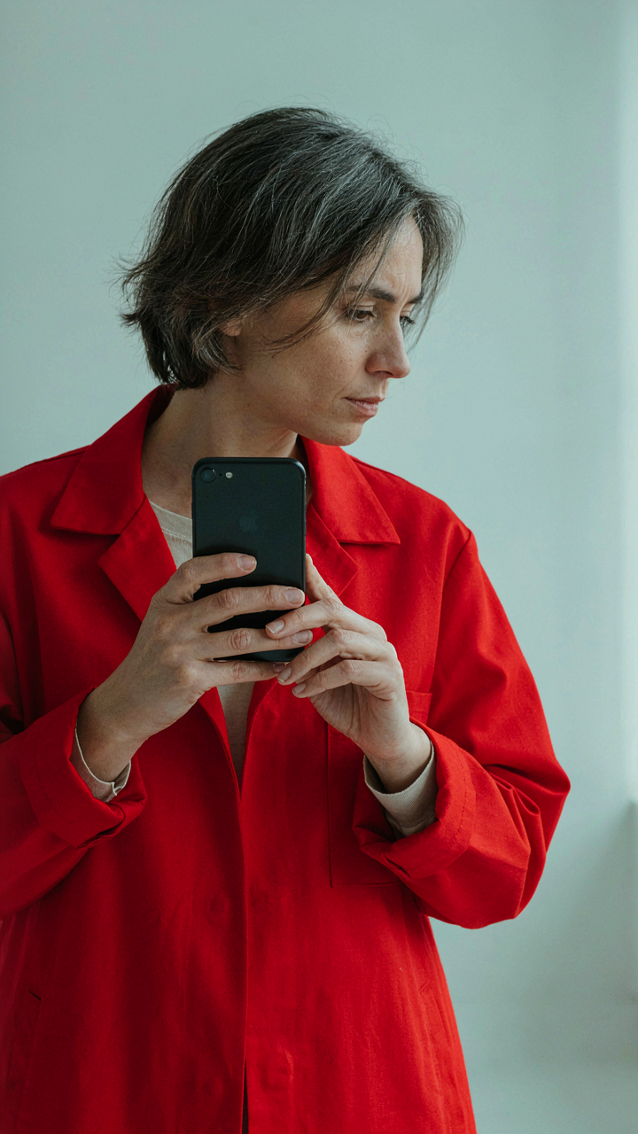
You want these features because they make your phone look expensive without you learning anything about light. Here’s the mechanism: Portrait mode uses computational photography to map depth and blur the background in real time, mimicking what a telephoto lens does optically. Cinematic mode takes that further by tracking focus on faces and objects as they move, adding shallow depth of field dynamically. ProRes on newer iPhones records video at higher bit rates, preserving detail in color grading during editing.

Portrait mode works best with subjects two to eight feet away in decent light. Cinematic mode requires sufficient ambient light to track movement accurately. ProRes demands storage space and processing power, so test it before shooting long clips. These aren’t settings to toggle and forget. You must understand that each mode has operating conditions. Use them within those boundaries or you’ll waste storage on blurry clips and unusable stills.
Manual Control Through Third Party Apps
The common advice tells you the phone’s built-in Camera app is enough. It isn’t for anyone serious about composition. Apps like Halide, ProCam, and Adobe Lightroom Mobile give you manual ISO, shutter speed, white balance, and focus control separately. This shifts photography from automatic to intentional. You control exposure and color temperature instead of letting the phone guess. The phone’s standard app locks these values together, forcing compromise.
Manual controls reveal why your photos look amateur: you’ve been letting the camera overexpose bright windows or underexpose dark corners. Halide lets you meter off skin tone and lock exposure there. ProCam lets you shoot RAW directly, meaning you capture unprocessed data for editing later. Adobe Lightroom Mobile syncs to the desktop version, connecting your phone work to professional finishing. Download one app and spend thirty minutes learning ISO, aperture simulation, and white balance presets. That one hour replaces months of frustration with automatic settings.
The Perpetual Evolution Of Your Lens: Beyond The Obvious
Seeing Like A Photographer, Not A Tourist
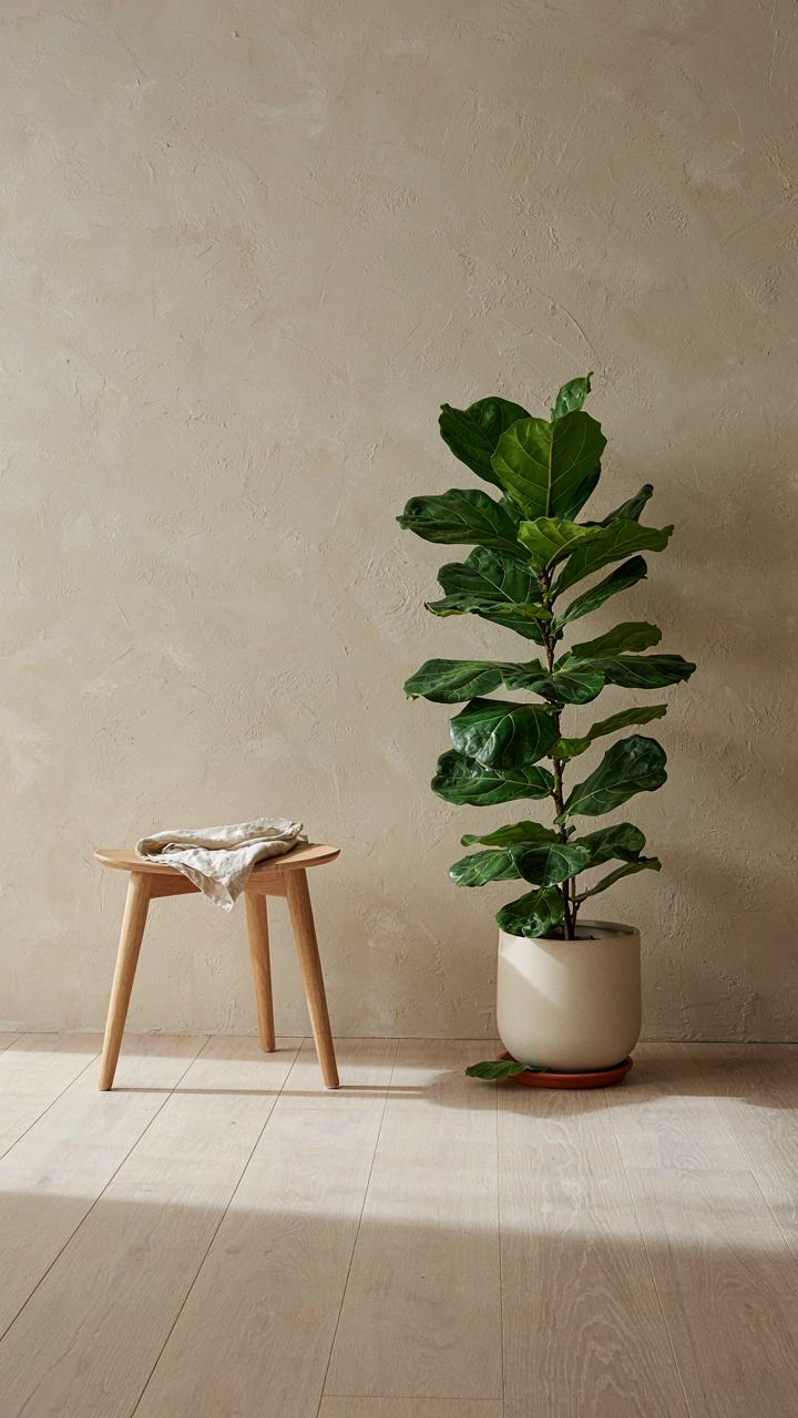
You want permission to believe your eye matters more than your gear. Here’s the truth: it doesn’t. Your eye is the only thing that matters. Composition—borrowed from visual design—is the deliberate placement of elements to control what a viewer’s attention hits first, second, third. Most people shoot what’s in front of them. Photographers shoot for what stays behind when the subject moves. Train yourself to notice negative space, symmetry breaking, the moment light stops being neutral and becomes directional. Your iPhone’s constraints actually force this. You cannot rely on telephoto or shallow depth of field to bail you out of weak framing.
Spend one week shooting the same corner of your home from ten different angles. Not different moments. Same location, different frames. You’ll notice patterns in what feels wrong before you consciously name why. A wall that reads as dead space becomes a reference plane. A shadow that seemed like a problem becomes contrast. This isn’t mystical. You’re training your brain to separate signal from noise, which is what composition does.
The Work Behind The Work
Most advice says document your results. That’s incomplete. You need to document the experiments that failed, the angles you rejected, the lighting you killed. This creates a visual journal of your decision-making, not your aesthetic. When you shoot five frames of the same subject with different angles, then delete four of them, you’re not throwing away failures. You’re building the decision architecture that separates amateurs from people with a point of view.
Shoot in series. Not bursts. Series means intentional variation. After each shot, review it for one second. Adjust something: move six inches left, lower the angle by ten degrees, wait for the light to shift. Write down what you changed and why. After two weeks of this, you stop shooting randomly. You start testing hypotheses about what makes an image work. This method transforms your phone from a capture device into a research tool.
The Real Obstacle Isn’t Your Environment; It’s Your Inability To See The Extraordinary In The Mundane
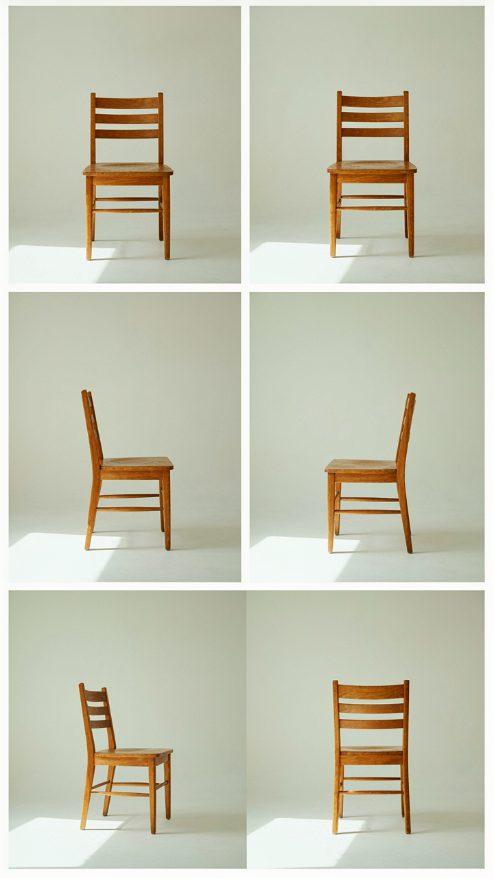
You don’t need better gear or a different location. You need to stop seeing your home as boring. Pick one object in your room right now. Photograph it from five different angles without moving it. The shift happens when you realize limitation forces creativity. Most people never discover this because they wait for the perfect setup. You won’t. Start today and watch your perspective change faster than any travel could. Your phone is not the problem, your imagination is.