The Unseen Blueprint: Light As Your Primary Tool
How Light Reveals What Geometry Hides
You want clean lines and strong angles in your iPhone architecture photos because they signal precision and control—the visual language of competence. But most photographers mistake this for a technical problem when it’s actually a light problem. Borrow from sculpture: light is the chisel that separates form from surface. Without directional light, even the sharpest architectural geometry reads flat. The angle of incidence matters more than the angle of the building.
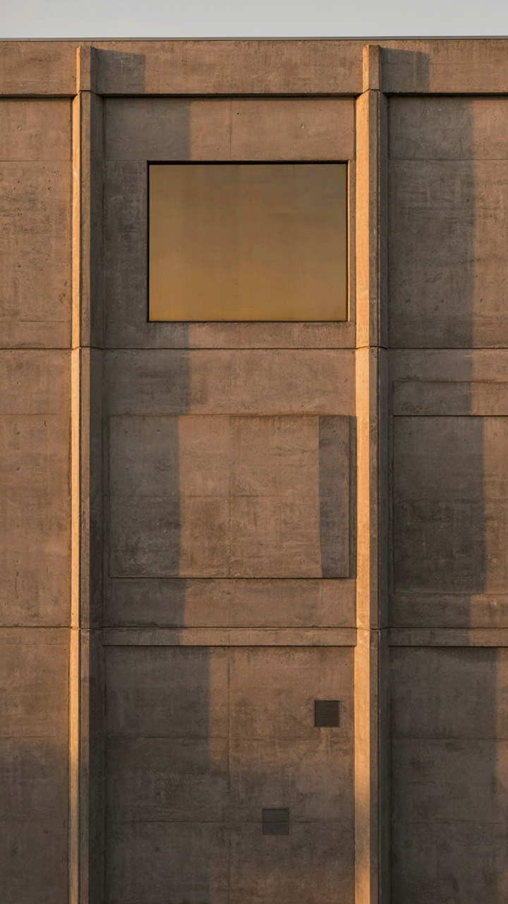
Position your light source to graze across facade planes at low angles. This creates visible contrast between lit and shadowed surfaces, which your eye reads as edge definition. North-facing buildings during golden hour, or direct sun hitting glass at acute angles, accomplish this automatically. The mechanism is simple: your camera captures the light ratio between adjacent planes. Higher contrast equals stronger perceived angles. Lower contrast collapses form into visual noise.
Where Shadows Become The Real Subject
Most advice tells you to fill shadows with reflectors or diffusers. That’s backwards for architecture. Shadows don’t need rescue—they need precision. The edge where light stops and shadow begins is where your lines gain teeth. This boundary creates what painters call “lost and found edges.” Sharp shadow lines compress depth and amplify geometric tension on a 2D phone screen.
Position yourself so shadow edges align with architectural edges. This stacking effect makes a single line read twice as strong because light and shadow create it together, not the building alone. Overcast days erase this. Direct sun at 45 degrees to your subject plane is the minimum threshold. Without this shadow definition, your angles look accidental rather than intentional.
The Urban Predator Method: Hunting Unique Angles
Shoot From The Ground Up
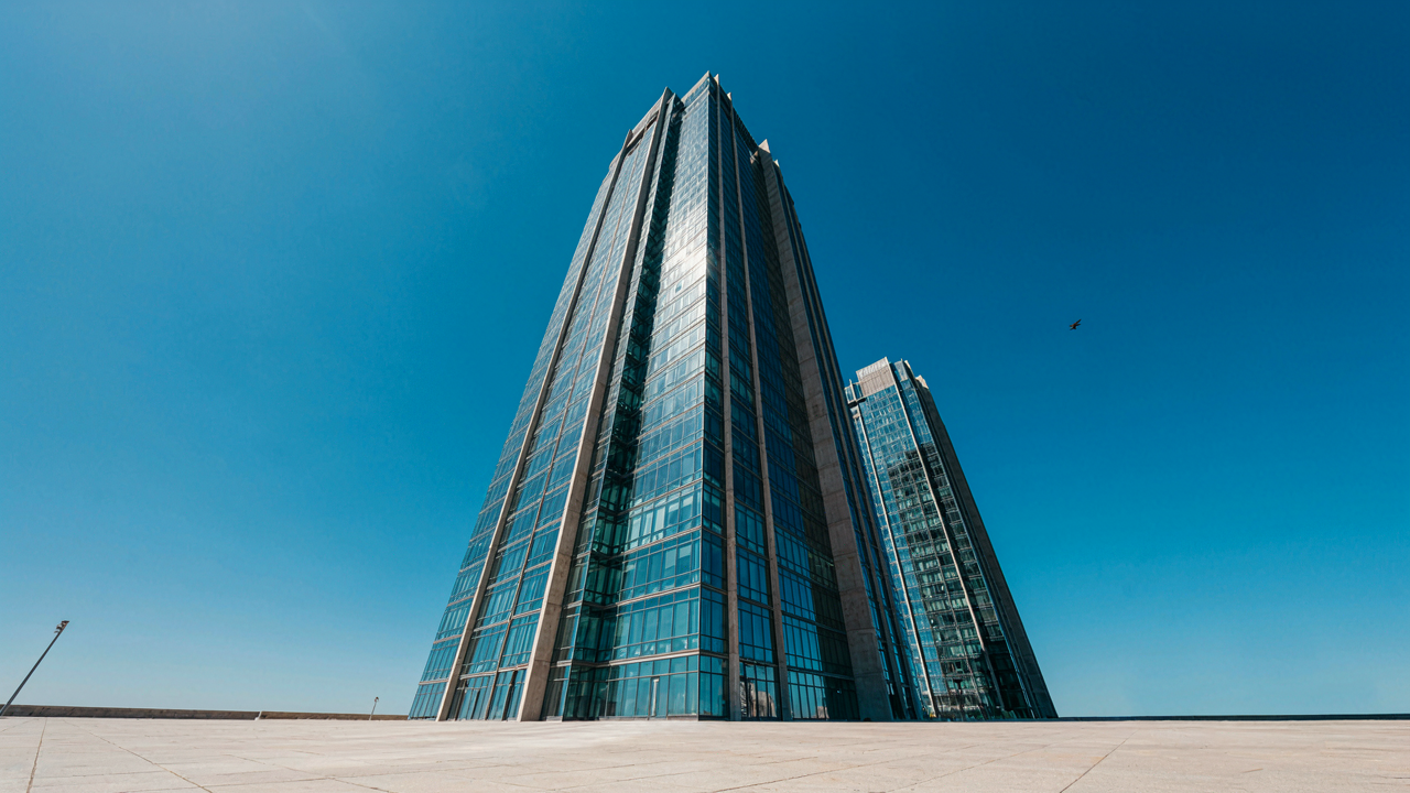
You want your photos to feel rare because you’re afraid they won’t stand out. The mechanism is simple: low vantage points compress distance and make ordinary buildings look monumental. Shoot from ground level, and a five-story office tower becomes a skyscraper. Your iPhone’s sensor sits at a fixed focal length, so position matters more than gear. The lower you crouch, the more vertical lines converge toward a vanishing point. This isn’t accident. It’s geometry.

Most iPhone users shoot from chest or eye level because it’s comfortable. That’s exactly why their compositions feel flat. Drop to ankle height and frame upward. Let the building’s lines run toward the top edge of your frame. The iPhone’s wide-angle lens exaggerates this effect. The distortion that usually feels cheap becomes your primary tool. Shoot with the sun behind or to the side of the structure. Shadows on the façade gain depth and texture that flat midday light erases.
Reflections As Mirror Language
Borrowed from optics, the concept of inverted symmetry mirrors how light behaves with surfaces. When you photograph architecture reflected in glass or water, you’re not capturing the building twice—you’re fragmenting it. Your iPhone’s camera sees what light carries to the sensor. A reflection on a storefront window splits the frame: real structure above, distorted version below. The distortion matters. It breaks the building into abstract geometry that reads faster than the straight thing.
The mistake most photographers make is centering the reflection. That’s teaching the viewer’s eye to compare two versions and judge which is “real.” Instead, let the reflection occupy one third or one quarter of the frame. Let the building itself dominate. The glass or water surface becomes a line that divides planes. Shoot at 45 degrees to the reflecting surface so you catch both the architecture and the distortion without them fighting for attention. This creates visual tension that holds the eye.
Deconstructing The Grid: Lines And Repetition
Where Your Eye Actually Enters The Frame
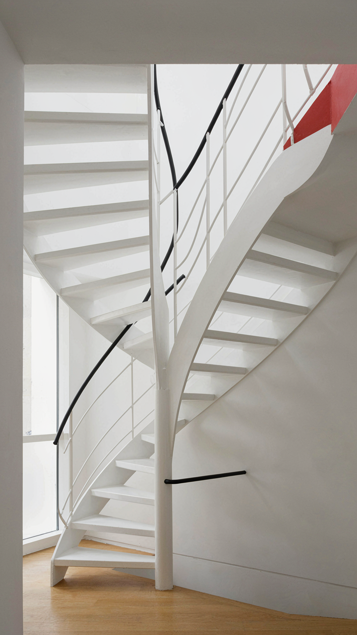
You want to know how to make people look at your photo instead of scrolling. That’s the real question underneath this. Leading lines work because they function as a vector in geometry—a force with direction. iPhone architecture gives you vectors everywhere: the edge of a building corner, a shadow cast by a column, the perspective of a hallway receding. The viewer’s eye doesn’t wander randomly. It follows the path you set.

The mistake most people make is assuming any line works. It doesn’t. A line needs to start somewhere the eye naturally lands, then push toward the subject. Vertical lines in architecture create tension but don’t move the eye anywhere. Diagonal lines move it. Converging lines move it fastest. When you shoot an iPhone photo of a staircase or a façade with receding depth, you’re not just capturing geometry—you’re directing attention. Frame the shot so the line begins at the frame’s edge and terminates at your focal point. That’s the protocol.
The Anchor Of Visual Pause
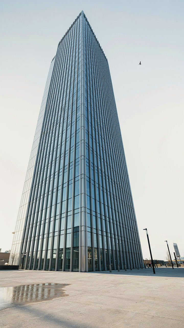
Repetition doesn’t just look clean—it establishes rhythm, which is a principle borrowed from music theory. In music, rhythm creates expectation and resolution. In iPhone architecture photos, repetitive elements like repeated windows, columns, or balconies create visual rhythm that trains the viewer’s eye to anticipate the next element. But here’s what separates strong shots from weak ones: disruption. A pattern becomes powerful only when you break it or emphasize it deliberately. Shoot a row of identical windows, then frame one that’s different—lit differently, opened differently, or positioned at an odd angle relative to the others.
The second move is tighter framing. Zoom in close enough that the repetition fills the entire frame, leaving no distracting negative space. This forces the pattern to dominate the composition and makes the visual rhythm unavoidable. When repetition occupies the full frame with clean edges, the viewer’s brain recognizes the pattern immediately and rests there. The eye stops searching. That’s when you’ve captured something worth showing.
The Architect’s Eye: Perspective Distortion Control
Correcting Lens Distortion In Post
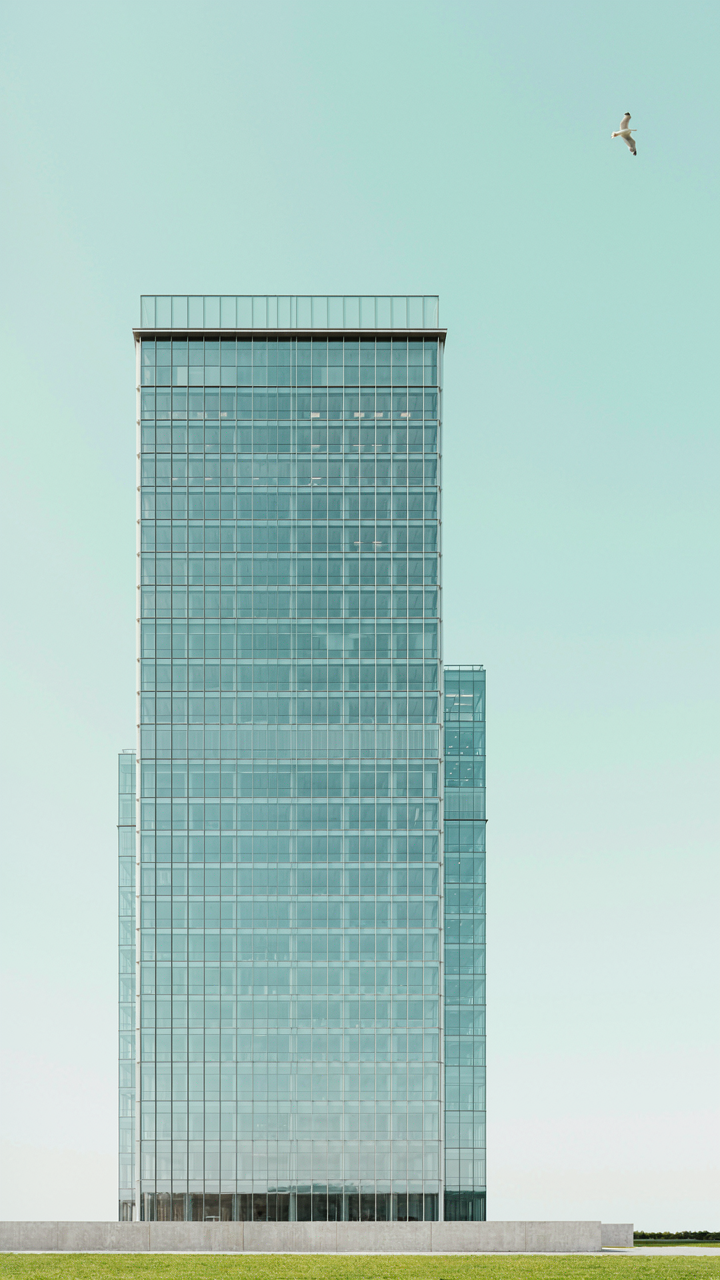
You want your photos to look authoritative, not warped like an amateur shot them from a phone. This is where lens correction matters: it’s optical physics applied backward. Every iPhone lens introduces barrel or pincushion distortion—the curved bending of straight lines at frame edges. Software can’t remove this, but it can mathematically reverse it by remapping pixels back to their geometric truth.

Adobe Lightroom and Capture One both ship with iPhone lens profiles baked in. Load your raw image, check the “Enable Lens Corrections” toggle, and the app pulls the exact optical signature of your iPhone model’s lens, then inverts it. Architectural lines that bow inward or bulge outward snap back to straight. This single step separates professional work from the rest. Apply lens correction before any other adjustment to avoid correcting already-warped pixel data.
Aligning Walls To The Grid
The grid overlay on your iPhone camera isn’t decoration. Most photographers ignore it and frame by feel, then wonder why their verticals lean. Architecture demands precision: a tilted wall reads as incompetence or carelessness, not artistic choice. Enable the grid in your camera settings, then use it as a reference frame for your composition before you shoot.
Place dominant vertical lines—building edges, columns, window frames—directly on the grid’s vertical lines. Do the same with horizontal elements like rooflines and floor planes. This locks in correct alignment at capture time, meaning post-processing correction becomes a minor tweak instead of salvage work. When you nail alignment in-camera, lens correction software has clean data to work with, producing sharper results than correcting sloppy composition later.
Color Theory In Concrete: Mood And Impact

When Gray Actually Means Something
You want monochromatic schemes because they feel safe and you think they’ll age well. That’s half true. The real mechanism comes from physics: when you remove chromatic noise, the human eye processes contrast faster. In architecture photography, a single-color palette forces your viewer to read depth through light and shadow alone. Concrete photographs in grays, blacks, and whites don’t need permission to look serious. They just do.

Brutalist structures demand this restraint. Shooting a concrete building in full color dilutes the form. The eye gets confused between the material’s actual texture and whatever accent color you introduced. Strip it down to luminance values only and the geometry becomes unavoidable. This isn’t about timelessness as much as it’s about honesty. The building’s bones speak louder when nothing competes with them.
When One Color Breaks The Rule
The advice that contrast equals emphasis is true but incomplete. You need to know the specific mechanism: color contrast creates visual priority because the brain treats deviation as signal. In architecture photography, a single warm or saturated element in a cool, neutral frame doesn’t just stand out—it becomes the stated subject. You’re not adding color. You’re naming what matters.
A red door in a gray concrete facade works because it violates expectation. The surrounding space must stay disciplined for this to work. If you scatter warm tones across the frame, nothing becomes the focal point and you’ve wasted the move. Place one contrasting element deliberately, shoot from an angle that isolates it against the neutral background, and let the geometry reinforce it. That’s the protocol.
The Art Of Cropping: Eliminating Distraction, Enhancing Focus
Remove What Doesn’t Belong
You want permission to ignore the messy parts of reality. Cropping gives it to you. The real mechanism is signal-to-noise ratio: your eye processes everything in the frame, and clutter forces your brain to work harder to find the subject. iPhone architecture photography demands ruthlessness here. Every element outside your intended focal point competes for attention and weakens the geometric story you’re telling.

Start by identifying what the frame must contain to communicate the architectural idea. A clean line, a repeating pattern, the tension between two surfaces. Then remove everything else. Power lines, parked cars, signage, vegetation, people. Not because they’re ugly, but because they dilute the contrast between your subject and its context. Tighter framing creates stronger presence. The crop is where intention becomes visible.
Emphasize The Geometry Underneath
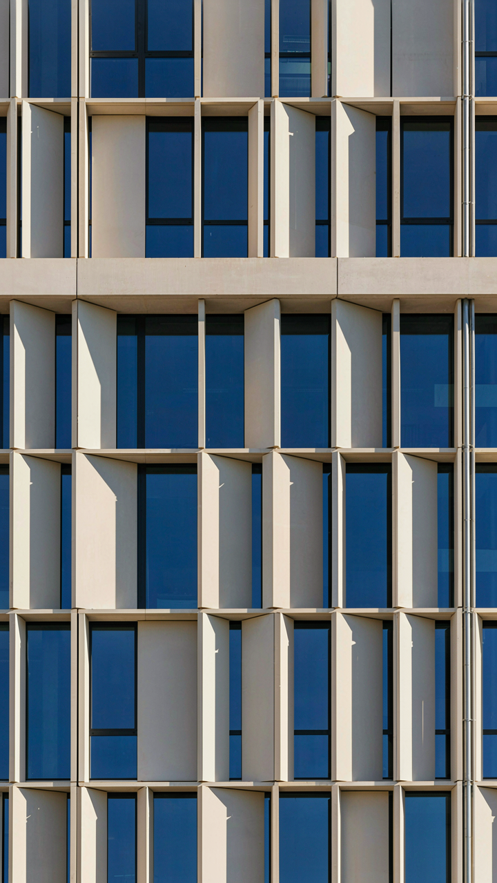
Cropping functions like a lens in optics: it isolates wavelengths of information. In architecture, those wavelengths are angles, planes, and proportions. Your job is to crop until the geometry screams. A building facade becomes a grid. A stairwell becomes a rhythm. The crop determines which geometric truth dominates the frame and which recedes.
Look for crops that amplify one dominant form. A vertical line becomes more vertical when horizontal elements leave the frame. A diagonal gains power when the composition tightens around it. The strongest architecture photos often feel slightly claustrophobic because the subject has nowhere to hide. Crop aggressively enough that the geometry feels unavoidable, then stop one step before it feels cramped. That tension is where the image lives.
Post Processing Protocol: Refining Your Vision

Exposure, Contrast, And Highlights
You want to fix a weak shot in post because admitting the exposure was wrong on set feels like failure. Here’s what actually matters: exposure correction works like a lever arm in physics—small adjustments at the shadow and highlight end create massive tonal shifts without blowing out detail. Start there instead of crushing midtones.
- Exposure slider first: Lift or drop the overall image by 0.3 to 0.7 stops. Don’t chase perfection. Architecture reveals itself through tonal separation, not brightness alone.
- Highlights to the left: Pull highlights down by 10 to 30 points. This preserves blown-out sky detail and concrete texture without flattening the image.
- Shadows to the right: Lift shadows 20 to 40 points to recover geometry in recessed areas. Modern sensors hold this data. Use it.
- Contrast last, not first: Add 5 to 15 points of contrast only after exposure and highlights sit right. Premature contrast darkens shadows and clips highlights before you see what you’re working with.
- Whites and blacks separately: Adjust whites up 5 to 10 points to brighten the image without clipping. Leave blacks alone unless the entire frame needs anchor weight.

The order you move these sliders determines whether an image reads as intentional or salvaged. Work from macro to micro: overall brightness, then range compression, then micro-contrast. Finalize in Lightroom or Capture One before moving to any plugin. The histogram is your only reliable feedback—your eye adjusts faster than the edits actually work.
Clarity Through Noise And Sharpness
This is where amateurs waste hours. The common move—max the sharpening, then panic-reduce noise—destroys the edges you came to photograph. Noise reduction comes first. It smooths the signal. Sharpening amplifies whatever remains, clean or noisy.
Start with luminance noise reduction at 20 to 40 depending on ISO. This reduces grayscale speckle without color shifts. Color noise reduction sits lower—5 to 15 points—since color speckle is less visible and aggressive color reduction can mute tonal transitions on metal and stone. Only after noise reduction sits stable do you sharpen. Use Unsharp Mask at 0.8 to 1.2 radius with 100 to 130 amount on architectural detail. The radius matters more than amount—wider halos kill the clean lines you’re after. Finish with clarity at 5 to 15 points to deepen micro-contrast in rendered surfaces without creating artifacts around edges.
Framing The Sky: Architecture Perspective Photography For Instagram
Symmetry As A Constraint, Not A Goal
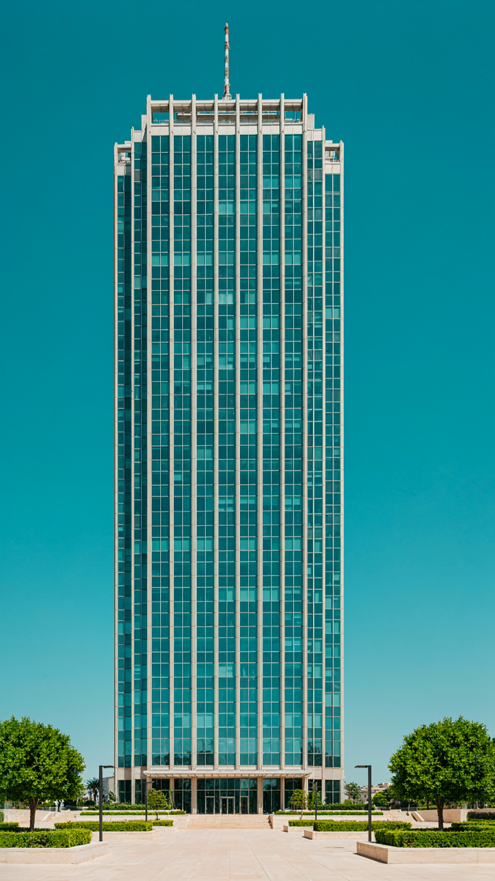
You want symmetry in your shots because it feels safe—it looks composed, finished, ready for likes. That’s the real reason. But symmetry is actually a physics problem. In optics, the iPhone’s computational photography engine processes symmetrical data more efficiently than chaotic data. Your camera processes balanced compositions faster, which means the ISP allocates resources better and you get cleaner detail retention in shadows and highlights. Symmetry isn’t an aesthetic choice. It’s an optimization path your sensor takes.

Vertical lines matter because they anchor the frame against the sky. Shoot buildings straight-on when the sun is behind you or diffused. The iPhone’s wide camera at 24mm has natural barrel distortion that actually corrects itself when you align verticals. Keep horizon lines level. Don’t tilt for drama. Let the building geometry do the work. The cleaner your vertical alignment in-camera, the less correction you need in post, and the less information you lose.
Angle Selection For Maximum Detail Retention
The common advice says “shoot from unique angles.” That’s incomplete. The real mechanism is about maximizing the distance between you and the subject while keeping detail sharp. Shoot from lower angles, farther back. The iPhone’s computational photography stacks frames automatically when light is moderate to dim. From a distance, your phone holds focus across the entire facade because you’re working with greater depth of field. Close angles blow out the sky and crush shadow detail simultaneously.
Choose positions where clean lines appear as hard edges against contrasting sky or surfaces. The iPhone’s edge-detection algorithms rely on contrast. Strong angles between building planes and sky create the contrast your sensor needs to preserve line detail without over-processing. Position yourself so the main subject occupies the center third of the frame. This keeps the telephoto and wide cameras aligned on the same focal plane. Shoot in portrait orientation. It forces you to use height, not width, and buildings are vertical subjects.
Your Camera Is Not The Bottleneck; Your Perception Is

Most photographers blame their iPhone. They want a better sensor, a sharper lens, more megapixels. Meanwhile, the real problem sits behind the lens. You’ve trained your eye to see flat. Clean lines and strong angles demand you stop looking at buildings and start seeing geometry. Today, photograph one structure. Don’t move until you find three different angles that transform the same subject into something unrecognizable. Your iPhone already captures what you can see. The question is whether you’re actually looking.