The Proximity Principle: Why Distance Dominates Depth
How The Lens Sees Distance
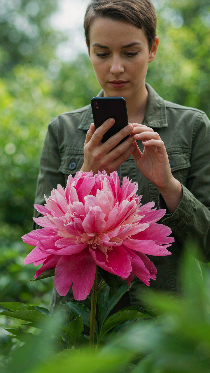
You want shallow depth of field because it makes you look like you know what you’re doing. Here’s what actually controls it: aperture size, focal length, and subject distance. Physics governs this, not editing. The iPhone’s primary camera uses a fixed aperture around f/1.5 to f/1.8 depending on model year. That aperture is narrow compared to dedicated cameras, which means the iPhone relies heavily on one variable you control—how close you stand to the flower.
Focal length on iPhone remains fixed at roughly 26mm on the standard lens. This matters because shorter focal lengths naturally produce deeper depth of field. A flower shot from two feet away at 26mm keeps more background in focus than the same flower at 50mm from two feet away. The iPhone cannot change this constraint. Distance from subject becomes your only real lever for controlling what stays sharp and what blurs.
Close Enough To Isolate The Blur
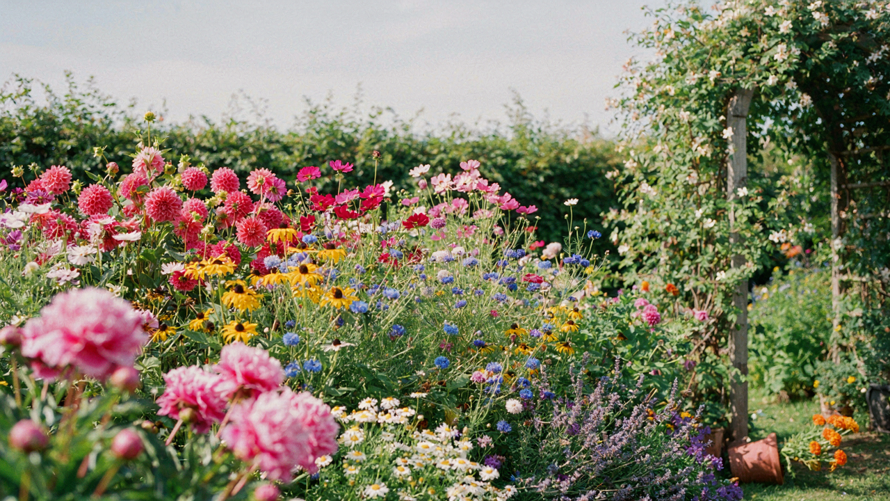
Move within six inches of the flower and the background separation becomes obvious and involuntary. The closer you position the phone to the bloom, the steeper the plane of focus becomes. At macro distances, even slight background objects blur dramatically because they exist far enough behind your focal plane. This is optical compression, not a filter. The background doesn’t just blur—it separates from the flower with dimensional clarity.
The mistake most people make is shooting from normal viewing distance, then expecting software to fix the background later. Computational photography cannot create depth information that the lens never captured. Your first shot determines everything. Position the iPhone’s camera lens between four and eight inches from the flower petal, keep the subject centered in frame, and let the physics of focal planes handle the rest. The background blur emerges automatically.
Natural Light’s Unseen Hand: The ‘Golden Hour’ Fallacy
When Light Quality Matters More Than Time
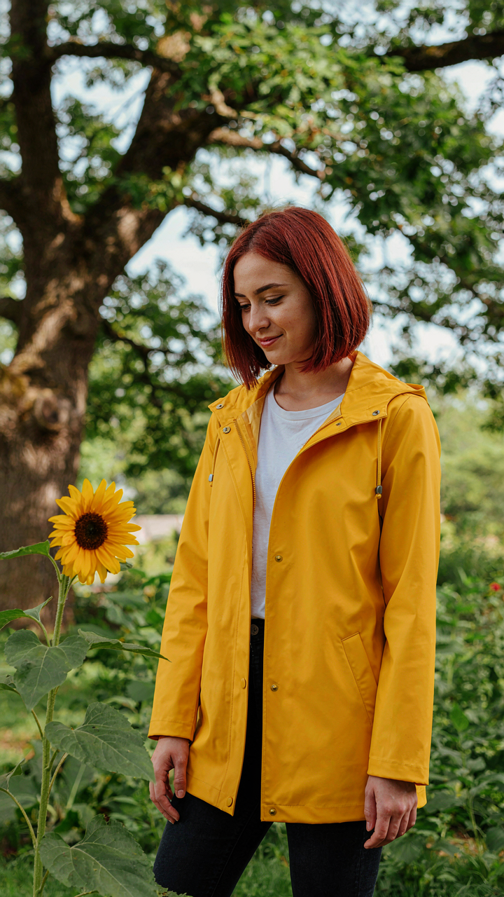
You want golden hour because you’ve seen the photos. That’s the real reason. It signals taste, and you’re afraid your midday shots won’t measure up. Here’s what actually happens: light quality is a physics problem, not a clock problem. The iPhone’s sensor responds to wavelength and direction, not sentiment. Golden hour works because the sun sits low, creating directional side-light that separates subject from background. Time of day is just the mechanism that produces that angle. Shoot at noon with directional light and you get the same result. Shoot at golden hour with flat, diffused light and you fail.

The consensus tells you to chase the golden hour. That’s incomplete. What you’re actually hunting is the angle of incidence where light hits your flower at a low angle relative to your camera position. The iPhone’s computational photography then reads that contrast and enriches color saturation. The time is irrelevant. A cloudy morning at 10am with side-light beating your flower will beat a flat, hazy golden hour. Most photographers blame the clock when they should blame their positioning.
Diffuse Light Builds Color Density
Soft light doesn’t mean weak light. Soft light means scattered light, which is a thermodynamics concept applied to optics. When photons bounce off particles in the air before hitting your subject, they arrive from multiple angles instead of one. Your iPhone’s color processing thrives on this. The sensor interprets diffused light as information-rich data because it’s reading reflected light from multiple bounce paths. Harsh direct sun creates blown highlights and crushed shadows, which compress your iPhone’s 8-bit color data. Diffuse light gives the sensor a fuller tonal range to work with, so it allocates more bit depth to color nuance.
Cloud cover is the easiest diffuser, but it’s not the only one. Shade from trees, buildings, or overhangs works identically. Position your flower in open shade on a bright day and the light has already been scattered by the atmosphere and nearby structures. Your iPhone’s color science then has room to push saturation and depth without fighting blown pixels. The mechanism is simple: more tonal range to work with means more processing headroom for color grading. Shoot your flowers in diffuse light, and the phone’s computational engine rewards you with richer hues automatically.
The Unseen Aperture: IPhone Lens Simulation Secrets

What Your Phone Is Actually Doing
You want people to think your iPhone photo came from a real camera. That’s the actual reason this matters. Here’s the mechanism: iPhones don’t have a physical aperture that opens and closes like a DSLR. They simulate depth of field through computational photography. The camera captures multiple exposures and depth data, then software masks the background and applies blur algorithmically. This isn’t optical—it’s mathematical. The phone identifies the subject plane and blurs everything behind it based on distance estimation.

Portrait Mode was Apple’s first mainstream implementation of this in 2016 with the dual-camera iPhone 7 Plus. One camera acts as a depth sensor while the other captures the main image. Newer single-camera iPhones use machine learning to estimate depth from a single frame instead. The blur you see isn’t a camera property. It’s a post-processing layer the phone renders after capture. The distinction matters because you control it differently than you would a real lens.
Controlling The Blur Layer For Actual Depth
Most people treat Portrait Mode as an on-off switch. That’s incomplete. You can dial the depth effect up or down in real time before you shoot, and critically, you can adjust it after the photo is taken in the Photos app. Slide the dial toward the minus sign to reduce blur and bring background detail back. Slide it toward the plus to deepen the effect. This control exists because the phone stored depth information at capture time.
The real leverage is understanding that you’re not fighting optical limitations. You’re navigating a slider. Move it to where the background drops into softness without losing the flowers themselves to the blur. Most people either apply too much blur and destroy texture, or too little and keep distracting background elements. Find the threshold where the bloom remains sharp while the background recedes cleanly. Adjust the depth effect slider to minus 20 or plus 30 depending on the scene, then check if the subject stays defined and the separation reads clearly.
Color Theory: Beyond The Saturation Slider
The Three Dimensions That Actually Matter
You want your flower photos to look professional because you sense that color separates amateurs from people whose work gets shared. Stop cranking saturation. Saturation is one axis of three. The real system comes from color science: hue is the color itself, saturation is how much of that color exists in the pixel, and luminance is how bright or dark it reads. Your iPhone’s camera captures all three simultaneously. Most phone editors let you wreck saturation while leaving the other two untouched, which is why boosted flower photos look fake.

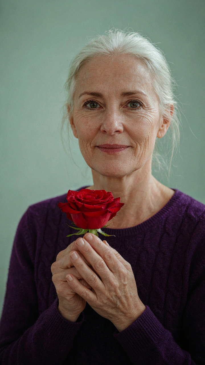
Luminance is the mechanism that sells the image. A red flower against a green background pops not because red is more saturated but because the luminance values differ enough to create separation. Your eye reads contrast in brightness before it reads contrast in color temperature. When you edit, adjust luminance first through exposure and shadows, then bring saturation up only enough to recover what the phone’s processing flattened. This order matters because luminance changes affect perceived saturation automatically.
Color Contrast Without The Noise
Harmony in composition is borrowed from graphic design, which calls this principle “figure-ground separation.” In flower photography, your subject is the figure and the background is the ground. The separation happens when hue, saturation, and luminance all work against each other at once. A magenta flower on a green leaf works because magenta and green sit opposite on the color wheel, but it only reads as intentional if the luminance also breaks apart.
Complementary colors placed at equal saturation and brightness create visual static, not tension. Tone one down or shift one slightly toward a tertiary hue. The iPhone’s Hue slider lets you rotate the color wheel by degrees rather than picking from presets. Rotate the background colors away from the flower’s hue by 15 to 30 degrees, and keep the flower’s saturation 10 to 20 points higher than the background. This creates the read your brain wants: subject dominant, context recessed.
The Bokeh Blueprint: Engineering Background Softness

Distance Creates Separation, Not Settings
You want the background to disappear because it makes you look like you know what you’re doing with a phone camera. Here’s the mechanism: bokeh isn’t a camera feature. It’s physics. Optics teaches us that depth of field—the zone where objects stay sharp—shrinks as subject-to-background distance increases. Move your flower close to the lens and push the background far away. The iPhone’s sensor can’t render both planes in focus, so it defaults to rendering one. That’s your soft background.

The iPhone’s computational photography doesn’t create bokeh. It recognizes depth and softens what’s behind your subject after capture. This works only if you engineer the actual spatial relationship first. Position flowers six inches from the camera and a wall or garden twelve feet behind it. The math handles the rest. Tighter subject distance plus greater background distance equals sharper depth separation, which means more aggressive background blur. This ratio matters more than any app or filter you’ll touch.
Lines That Compress Space
Photographers borrow a framing principle from architecture: leading lines guide the viewer’s eye toward a focal point and compress perceived depth. Use this on iPhone flowers by positioning stems, petals, or foreground branches to point toward your subject while creating layers between camera and background. A curved stem leading into the bloom or an out-of-focus branch crossing the frame establishes a visual pathway that isolates your flower and softens everything else.
When lines converge toward your subject, the background becomes visual noise rather than competition for attention. Angle the phone so stems or garden elements create diagonal or curved paths into the flower itself. These lines don’t need to be perfect or obvious. They train the viewer’s attention in one direction, which makes the soft background feel intentional rather than accidental. The result reads as deliberate composition, not luck.
Reflectance Management: Manipulating Light Sources
Block Harsh Light, Amplify Soft Light
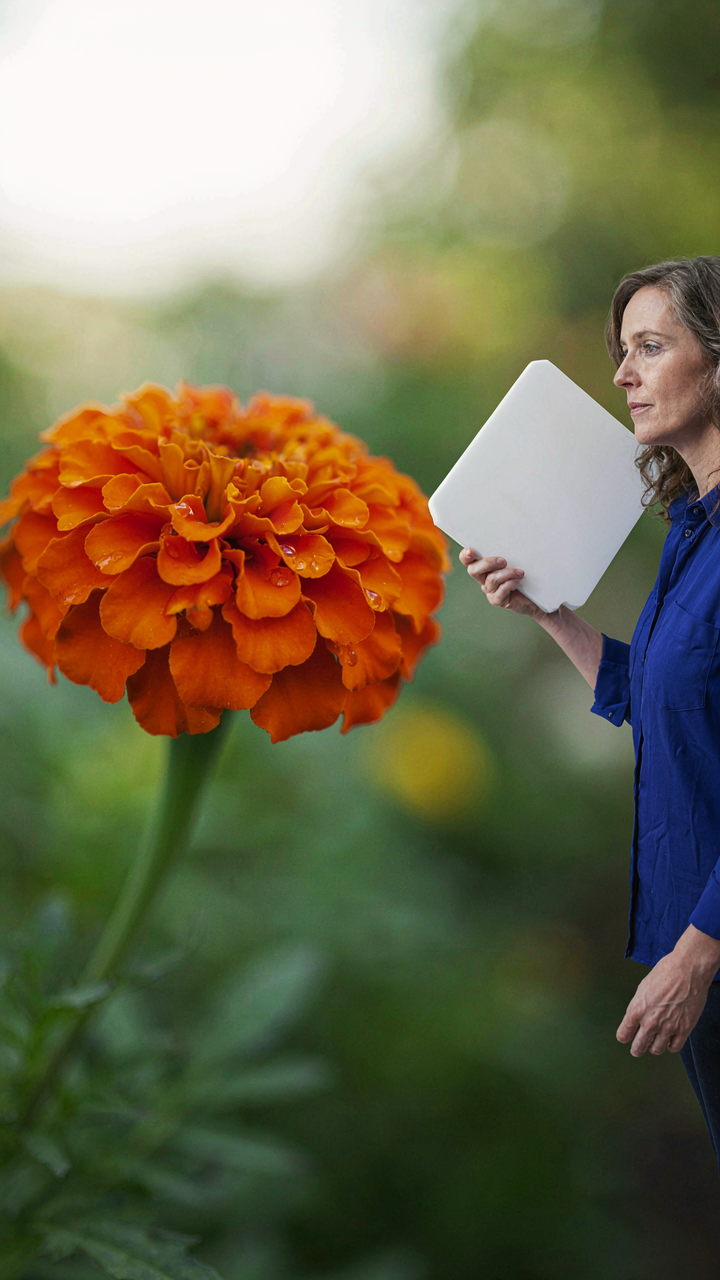
You want this section to work because you’re tired of blown-out petals and flat color that screams phone camera. Here’s the mechanism: light behaves like a weapon in optics—it either penetrates or bounces. Harsh direct sun creates specular reflection (mirror-like glare on petals). Soft, diffused light creates diffuse reflection (color absorbs evenly across surfaces). Your iPhone sensor cannot recover blown highlights. Control the light source before you press the shutter.

Blocking harsh light doesn’t mean finding shade and hoping. It means positioning your body or an object between the sun and the flower so the light wraps around the subject instead of hitting it head-on. The petals stay saturated. Colors hold detail instead of washing white. Even overcast days benefit from strategic blocking—you’re reducing the contrast ratio between shadow and highlight, which gives the iPhone’s sensor room to render color accurately without clipping.
- Direct sun to diffused sun: Move the flower into open shade or position yourself as the blocker to create soft directional light without the harsh edge.
- Golden hour positioning: Shoot during early morning or late afternoon when the sun angle is low and naturally softer, then block the remaining harsh rays with your hand or torso.
- Overcast conditions: Clouds act as natural diffusers, but position the flower so backlight or side light still defines the petals without flattening depth.
- Reflective surfaces nearby: Use a light-colored wall, pavement, or building to bounce softer ambient light back onto shadowed petal areas.
- Window light indoors: Position potted flowers near a north-facing or diffused window and block direct beam with translucent material like frosted plastic or parchment paper.
The iPhone 14 and later models have slightly improved highlight recovery in computational photography, but you cannot rely on it. Block the light source aggressively. The petals will show color depth that post-processing cannot add later. This is the difference between a salvageable image and one that looks processed.
Reflectors: Building Precision Without Gear
DIY reflectors solve a real problem that amateurs skip: shadows. When you block harsh light, you create shadows on the opposite side of the flower. A reflector bounces ambient light back into those shadows, creating dimensional separation without a second light source. You do not need professional equipment. Cheap materials work because the physics of reflection doesn’t care about price tags.
White foam board, aluminum foil on cardboard, or even a white t-shirt held at 45 degrees will bounce light predictably. Position the reflector opposite your main light direction so it fills shadows while preserving the soft highlight you worked to create. Angle matters—the reflector should sit lower than the flower to lift light upward and avoid creating a second harsh shadow. Move it incrementally closer or farther to adjust fill intensity. The goal is shadow detail without flattening the depth the directional light created.
The Fibonacci Focus: Compositional Laws For Impact
Where The Golden Ratio Actually Works
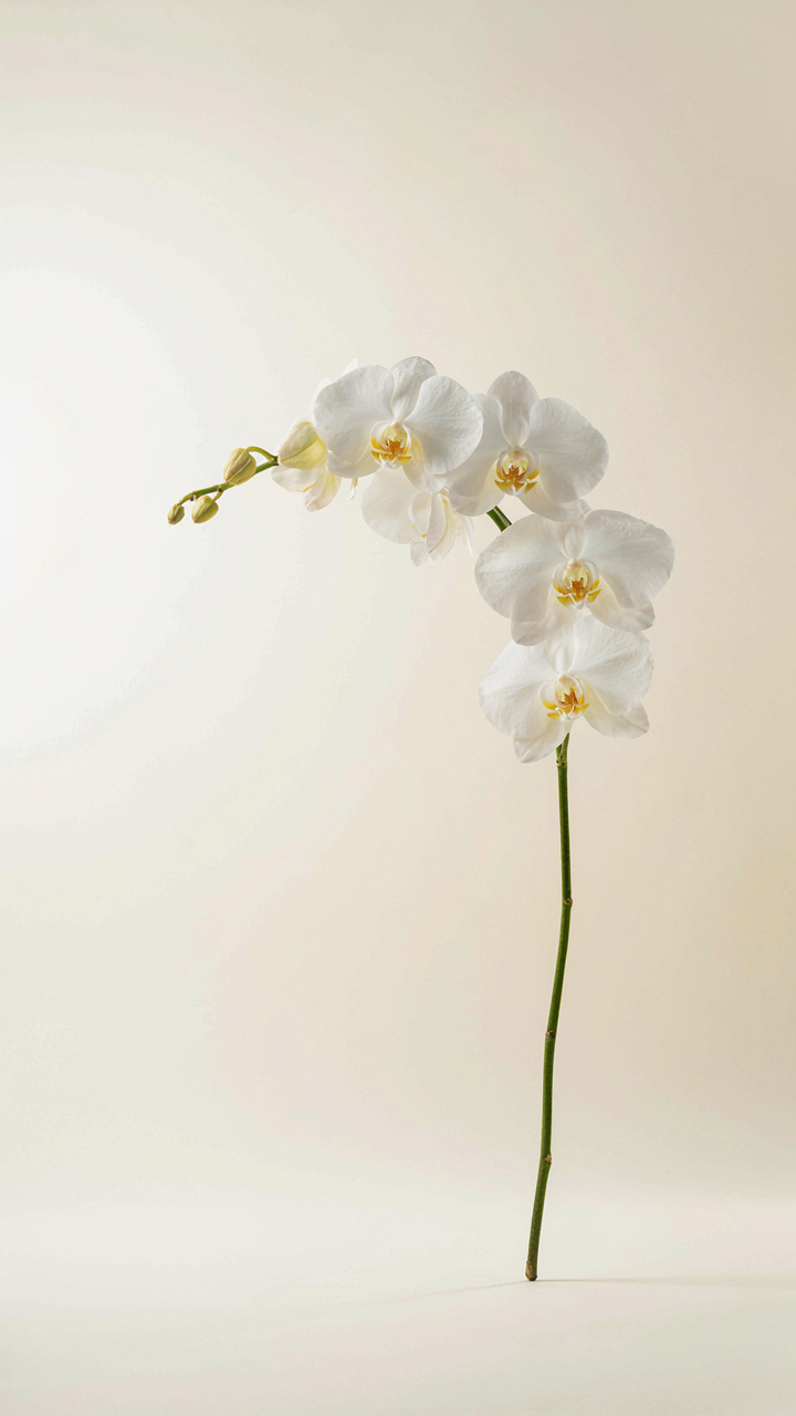
You want people to feel like your flower photo is objectively beautiful, not just lucky. The golden ratio sounds like design mysticism until you realize it’s just a ratio your eye recognizes without thinking. In mathematics, the golden ratio describes proportional relationships that appear throughout nature. In iPhone flower photography, it’s the principle that guides where you place the focal point so it arrests attention without looking forced.

The mechanism is simple: position your flower’s center or leading edge at 1.618 intervals across your frame. iPhone’s native grid tools don’t mark this precisely, but you can use third-party camera apps that overlay the golden spiral. Most photographers skip this because the rule of thirds feels easier. The truth is that golden ratio placement creates deeper visual tension because it sits slightly off the intuitive third-line grid, which makes the composition feel resolved rather than symmetrical.
Tension Through Offset Placement
Rule of thirds isn’t wrong, it’s just incomplete. Most iPhone flower guides tell you to put the bloom on a third line and call it done. What they don’t tell you is that dynamic visual interest requires the flower to compete with negative space, not occupy it passively. The mechanism here is contrast: your subject commands attention when it breaks the predictability of its placement.
Position your flower slightly off the intersection point where two third-line grids meet. Let empty space dominate the frame. This asymmetry forces the viewer’s eye to work, which registers as engagement rather than decoration. The moment you stop centering flowers and start using thirds as a guide for negative space instead, your images shift from pleasant to deliberate. Compose this way consistently until offset placement becomes automatic.
Post Processing Protocol: Surgical Enhancements Only
Exposure And Contrast First
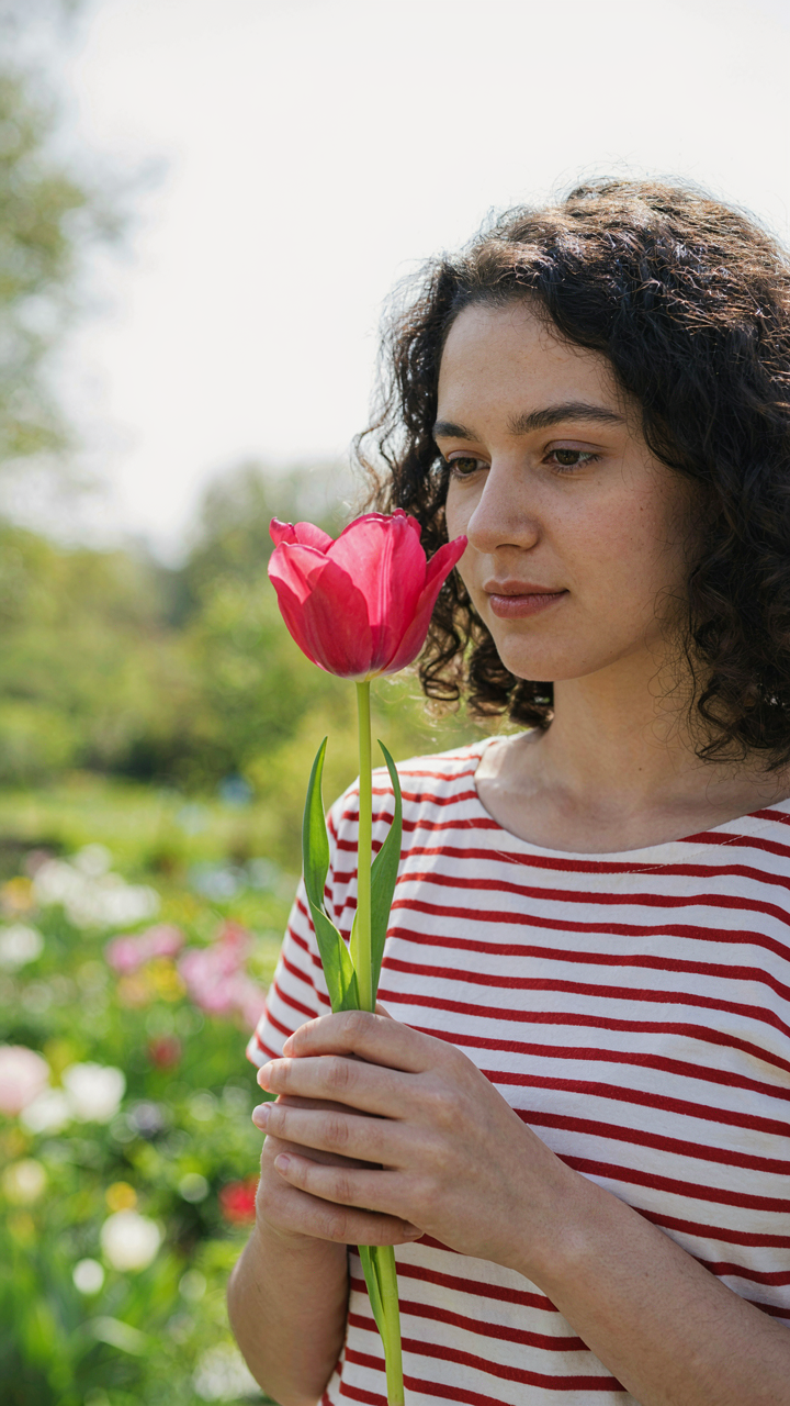
You want to believe editing is about adding, not subtracting. It’s not. The real move comes from restraint, which feels like weakness until you see the result. iPhone flower photos live or die on whether you crush the blacks or blow out the highlights in post. Start with exposure: pull it up 0.3 to 0.7 stops if the flower reads flat. Then contrast. A 10 to 15 point bump separates a washed phone photo from something that commands attention. Stop there before you touch saturation or any color slider.

The temptation is to make the flower pop by flooding it with color. Wrong direction. Contrast does the work saturation gets credit for. When you increase contrast on an iPhone flower photo, the petals gain dimension, shadows deepen, and color appears richer without looking processed. Your editing app matters less than your discipline here. Stick to Lightroom Mobile, Snapseed, or native Photos app adjustments. Apply exposure and contrast, then walk away. That restraint is the entire protocol.
Saturation Kills The Realism
The advice about “bringing out the natural color” is incomplete. It misses why saturation fails on flower photography. Phones already boost saturation at the sensor level to compensate for dynamic range limitations. When you add more in post, you’re doubling an error, not fixing one. Most iPhone flower photos that look fake aren’t over-exposed or poorly lit. They’re over-saturated. Pull saturation down 5 to 10 points from the default before you even think about raising it. Vibrance is a better tool on iPhone apps because it boosts only the muted tones, leaving already-vivid petals alone.
The mechanism: saturation flatters colors. Vibrance preserves them. On a pink peony or red rose shot on an iPhone, vibrance adds nuance where saturation adds cartoon. Adjust vibrance up 8 to 12 points instead of saturation, then check the greens. Green foliage absorbs saturation changes hardest, often turning neon or muddy. If stems or leaves look wrong after your vibrance bump, dial vibrance back 2 to 3 points. The goal is a photo that someone seeing it in person recognizes immediately, not a version that makes them suspect filters.
Stop Chasing The Perfect App; Master The Light, Master The Lens, Or Remain An Amateur
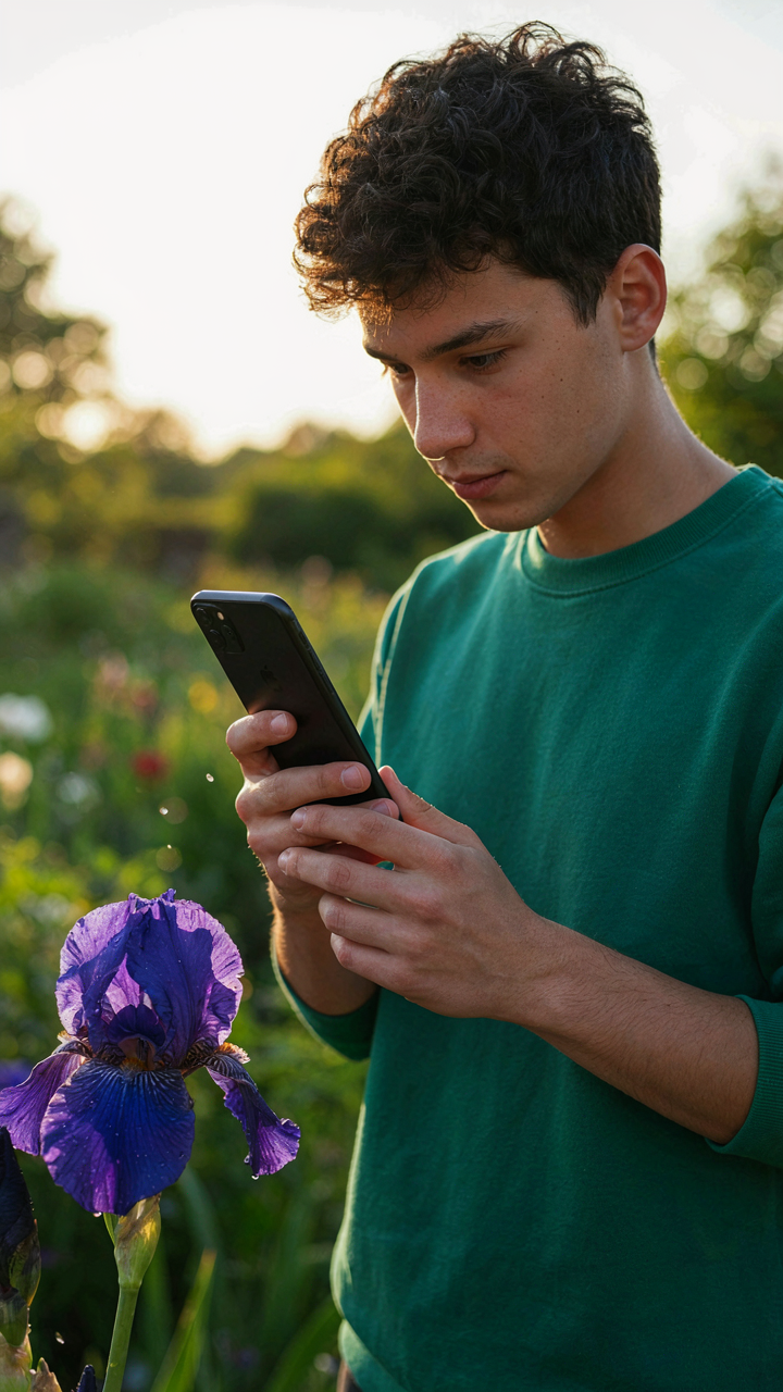
Every photographer blames their tools. You blame your phone. You blame the app. You blame the algorithm. The real problem sits between your ears. Light creates iphone flower photos. Not software. Not filters. Not settings. Today, shoot one flower during golden hour with zero editing. Watch what actually happens. Most people won’t because they’d rather stay comfortable hunting for the next app. Your phone didn’t fail you. Your attention did.