The Illusion Of The “Magic” Filter

Presets Stop You From Seeing
You want the filter to do the work so you don’t have to think about light, contrast, and color. That’s the real reason you’re here. But presets are training wheels that never come off, and they atrophy the one skill that actually matters: seeing what’s broken in your image before you touch anything.
Every iPhone filter applies the same adjustment curve and color shift to every photo. This works on maybe four out of ten shots. On the rest, the filter either crushes your shadows, blows out highlights, or shifts skin tones toward orange or magenta depending on the preset’s base algorithm. You end up with consistent mediocrity instead of shots that look intentional. The mechanism is simple: a preset is a locked formula. Your photo is a variable. When they don’t match, you get visual noise.
The Shortcut Trap
Economics calls this diminishing returns. You get massive gains from the first tool, then smaller gains from each tool after. iPhone filters exploit this psychology perfectly. The first filter you apply feels like a 40% improvement. You stop looking. You hit share. But that first filter only fixed one problem while creating two others you didn’t notice because you were comparing it to the unedited version, not to what the image actually needed.
The real cost isn’t time. It’s learned helplessness. Every time you default to a preset instead of adjusting exposure or saturation yourself, you train your brain to outsource judgment. After six months of this, you can’t edit a photo without a filter because you’ve never learned the underlying mechanics. Start with no filter. Identify what’s actually wrong. Then adjust one variable at a time until it’s fixed.
Beyond Presets: The Exposure Triangle Method

What Your IPhone Actually Controls
You want filters to work because you’re scared your raw material is broken. Here’s what’s actually happening: your iPhone’s camera app lets you adjust three variables before you ever touch a filter. Exposure compensation, which you access by tapping and sliding up or down on the screen, directly controls how much light the sensor captures. This single move determines whether a filter rescues or ruins your shot.

The exposure triangle borrowed from traditional photography maps perfectly to iPhone capture. Your three points are exposure (light amount), focus point (where sharpness concentrates), and white balance (color temperature). Filters live downstream of these decisions. Nail exposure first, and filters enhance. Get it wrong, and no preset saves you. iPhone Photos app shows exposure compensation as a slider right on the capture screen, yet most users ignore it entirely.
How Your Starting Image Predicts Filter Success
A filter’s job is to shift color relationships and contrast in an already-captured image. It cannot recover blown highlights or pull detail from crushed blacks. The mechanics are straightforward: your sensor captures raw light data, your iPhone processes it into a JPEG or ProRAW file, then a filter applies mathematical transformations to pixel values across that frozen data set.
If you start with proper exposure, filters amplify strengths. If you start with underexposed murk or overexposed haze, filters spread the damage across the entire frame. This is why composition tutorials obsess over “getting it right in camera.” The filter is not a do-over tool. It’s a styling layer applied to whatever technical foundation you built before pressing the shutter button. Adjust exposure first, then choose your filter, not the reverse.
The Light’s Dictate: Not The Filter’s Fancy
Hard Light Vs Soft Light Changes Everything
You think a filter makes a photo work. It doesn’t. You’re hoping the algorithm will fix what the light already ruined. Here’s the mechanism: light quality determines contrast ratio and shadow detail before any filter touches the sensor. Photography borrows from physics the concept of luminous intensity distribution. On iPhone, a filter amplifies or compresses whatever light information already exists in the frame.

Hard light creates defined shadows and high contrast. Soft light wraps around subjects and fills shadow areas. Most iPhone filters look terrible on hard light because they crush shadows into pure black or blow highlights into white noise. Soft light, by contrast, gives filters something to work with. The Noir or Dramatic filters work on soft light because the tonal range hasn’t collapsed. The filter then shapes what’s already there instead of fighting compression artifacts.
Shoot During The Transitional Hours
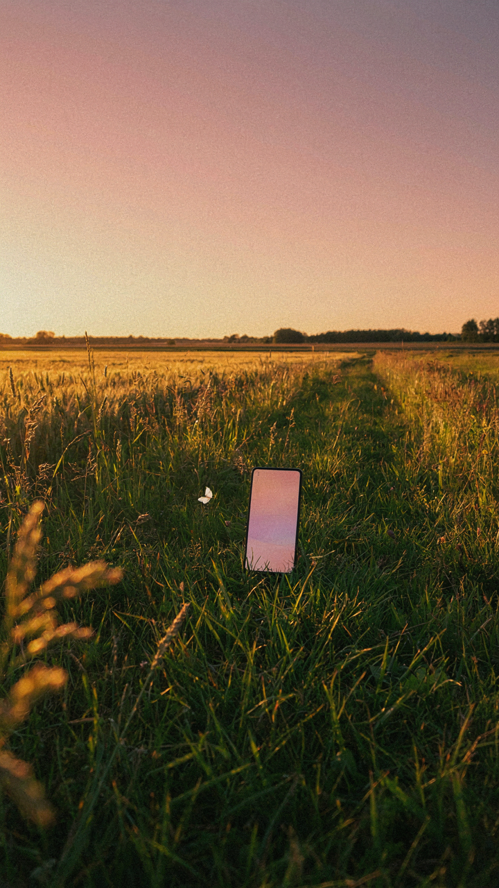
Golden hour and blue hour aren’t romantic concepts. They’re technical windows where light quality matches how filters actually process color information. During these hours, the sun sits low enough to scatter through atmosphere, reducing contrast and warming or cooling the entire frame uniformly. This uniformity is what filters need to look intentional rather than garish.
Golden hour creates warm color casts that most iPhone filters enhance without clipping. Blue hour does the inverse with cooler tones. If you shoot at noon under direct sun, no filter recovers the collapsed midtones or restores shadow detail. The light physics are fixed by the time you open editing software. Shoot during golden hour or blue hour, apply a filter within 30 seconds of capture, then stop adjusting. The filter choice matters only after light quality is already correct.
Color Theory As Your Editing Compass, Not VSCO Crutch
Opposite Colors Enhance Each Other
You want filters that work universally because you don’t want to think about editing. That’s the real problem here. Color science borrowed from physics shows us something concrete: complementary colors sit opposite each other on the color wheel and amplify contrast when placed together. iPhone filters that shift your image toward one color family automatically suppress its opposite, which is why Warm and Cool filters feel like they work on almost anything.

The mechanism is simple. If your photo skews blue (cool), adding warmth pushes the orange and yellow forward while neutralizing the blue cast. The iPhone’s standard filters like Vivid Warm and Cool operate on this principle directly. You’re not creating beauty through mystery. You’re applying optical fact. When a filter boosts magenta, it dims green simultaneously. This isn’t opinion. It’s how light works on a screen.
Color Harmony Creates Visual Rest
Most people chase saturation when they should chase coherence. A photo with clashing colors reads as chaotic regardless of technical quality. Your phone’s filters that unify color temperature work because they force your image into a single harmonic space instead of pulling in three directions at once.
The Noir and Mono filters work universally because they eliminate color conflict entirely. But for color work, filters like Sepia and Warm Tone succeed because they push every color family toward a shared temperature. Start by identifying which temperature dominates your shot. Then apply a filter that extends that temperature rather than fights it. This is the protocol: assess, align, apply. Everything else is decoration.
The Contrast Protocol: Sculpting With Shadows And Highlights

Global Versus Selective Control
You want contrast to fix everything at once because you don’t want to admit your composition was weak to begin with. Here’s the mechanism: iPhone’s Contrast slider in the Photos app applies adjustment uniformly across the entire tonal range, meaning it lifts shadows and crushes highlights equally. Selective contrast manipulation, found in tools like Curves or in third-party apps, lets you target only the midtones, only the shadows, or only the highlights independently. One creates a flat poster. The other creates a photograph.

Global adjustments save time but sacrifice control. When you push Contrast up on a backlit subject, you blow out the sky while trying to lift the face. Selective tools let you preserve detail where it matters. This distinction separates filters that work on everything from filters that work on almost everything. The trade-off is simple: speed versus precision. iPhone’s native Exposure and Highlights sliders approximate selective control without the full UI complexity, making them tactically superior to the raw Contrast slider for most shooting conditions.
Creating Depth Through Targeted Editing
Depth in photography mirrors optical physics: objects recede when they’re darker and less saturated. On iPhone, you engineer this illusion by darkening background shadows while keeping foreground midtones bright. The Shadows slider in editing directly controls this perception.
- Shadows slider: Lifts or darkens only the darkest 30 percent of the image, preserving midtone detail and controlling atmospheric separation between subject and background.
- Highlights slider: Recovers blown-out sky detail or prevents overexposure in bright areas without affecting darker regions of the frame.
- Black point adjustment: Creates mood by defining where pure black begins, making the image feel either airy or moody without losing detail across the board.
- Clarity or structure: Increases contrast in the midtones specifically, adding three-dimensionality to faces and textures without harsh edge enhancement.
- Vibrance over saturation: Boosts color intensity in muted tones while protecting already-saturated colors from clipping, creating richer depth without artificial appearance.
Mood lives in the shadows and how you define them. A portrait with crushed blacks feels dramatic. One with lifted blacks feels airy. iPhone’s Exposure tool raises or lowers everything, but the Shadows slider does surgical work. Push Shadows up by 20 to 30 points and watch a flat image gain presence. The depth comes from controlling which parts of the image stay dark and which brighten. This is the single highest-leverage move in filter selection: does the filter preserve shadow detail or destroy it?
Vintage IPhone Photo Edit: Beyond The Fad
What Film Photography Actually Was
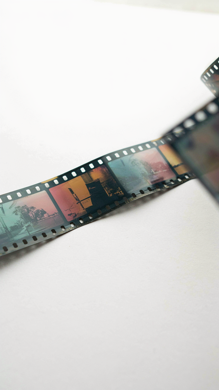
You want vintage to work because it signals taste and authenticity. Here’s what actually happened: film cameras didn’t have one “look”—they had physical constraints. Film stock had specific color curves, grain structure, and dynamic range based on its chemical composition. Different emulsions rendered skin tones, shadows, and highlights in measurably different ways. The Kodak Portra line crushed blacks differently than Fujifilm stocks. Most iPhone vintage filters ignore this entirely and just add orange and grain randomly.

The mechanism is simple. Film grain wasn’t aesthetic decoration—it was the byproduct of silver halide crystals capturing light. Slower film stocks produced finer grain. Faster stocks produced larger grain. Pushing film in development increased contrast and grain simultaneously. You cannot separate these variables. iPhone filters that slap grain on top of crushed blacks without adjusting color temperature or shadow detail are faking the effect, not recreating it.
Color Grading Replaces The Filter Shortcut
Every advice column says apply a filter then tweak it. That’s incomplete. Real vintage edits require you to abandon the preset and work with three specific adjustments: temperature shift, shadow lift, and selective desaturation.
Temperature sits first. Older film stocks drifted toward warm—not because it looked nice, but because tungsten lighting was standard indoors and daylight film in those conditions created a cast. In iPhone’s Edit menu, increase warmth by 10 to 20 points. Don’t overshoot. Next, lift shadows by 15 to 25 points in the Shadows slider. Film stock couldn’t crush blacks into pure black—shadow detail remained. Finally, reduce saturation in specific colors. In HSL adjustments, drop blue and cyan saturation by 8 to 15 points. This mimics how film stocks muted cool tones. Apply these three moves sequentially, then add grain only after. The order matters because the grain sits on top of a framework that actually matches film behavior.
The “Less Is More” Principle: A Stoic Approach To Editing
Removing Clutter To Expose What Matters
You want people to notice your subject, not your editing skills. Here’s the mechanism: every filter adjustment competes for attention in the viewer’s brain. Military strategy calls this “economy of force”—concentrate resources where they decide the outcome. Apply this to iPhone filters by identifying the one element that matters, then strip everything else away.

Most iPhone users over-filter. They crank Contrast, add Warmth, boost Vibrance, and wonder why the image feels chaotic. The real move is inverse: use filters to eliminate visual noise instead of adding drama. If your subject is a face, neutral tones and slight clarity work. If it’s a landscape, reduce saturation in the background and let the foreground breathe. The filter becomes invisible when it serves removal, not embellishment.
Restraint Amplifies What You’re Trying To Say
Underediting reads as confidence. A single well-placed filter adjustment—say, a 10-point increase in Black Point through the Exposure filter—stops the eye exactly where you want it. Compare this to aggressive editing: high saturation, maxed contrast, crushed blacks. The heavy-handed version screams desperation. The restrained version commands attention.
This works because contrast itself is a filter. When everyone else pushes every slider to 60, your image at 15 stands out. The Blacks filter, Contrast filter, and Highlights filter all work best at their minimum effective dose. Start at zero and increase until the image changes visibly. Stop immediately. Overshooting kills the impact you’re building.
Your Personal Aesthetic: The Un Filterable Signature

Consistency Beats The Algorithm
You want a filter that works on everything because you’re afraid your eye isn’t trained enough to make decisions. The mechanism is simple: filters are shortcuts that hide the real problem, which is that you haven’t decided what you’re actually making yet. A consistent aesthetic isn’t a preset you download. It’s a constraint you choose and repeat until it becomes recognizable.

The difference between someone with a real style and someone chasing trends is that one person applies the same decision-making logic to every frame. Not the same filter. The same logic. iPhone’s exposure, shadow, highlight, and saturation tools become your grammar once you stop looking for the magic preset. Mastery means returning to the same three adjustments repeatedly because they reflect how you see, not how an algorithm thinks you should see.
Master Three Settings, Ignore The Rest
The common advice tells you to experiment with every slider. That’s how you waste six months learning nothing. Instead, pick one color cast, one contrast style, and one saturation point that match your subject matter, then adjust only those three across every photo you take for a month.
- Exposure: The single most important variable. Master underexposure by 0.3 to 0.7 stops on bright days. This prevents blown highlights and gives your images automatic depth without filters.
- Shadows: Lifting shadows slightly (plus 15 to 30) creates separation between your subject and background without looking artificial or over-processed.
- Saturation: Reducing saturation by minus 10 to 20 makes iPhone photos look intentional rather than auto-generated. Consistency here builds recognition faster than any filter.
- Warmth: A slight warm tint (plus 5 to 15) or cool tint (minus 5 to 10) creates your color signature. Lock this in and never change it across all photos.
- Contrast: Light adjustments (plus 10 to 20) add visual weight without crushing details or looking posterized like most Instagram filters.
Your personal aesthetic emerges not from novelty but from the specific adjustments you repeat. After two weeks of using only these three settings, your photos become recognizable before anyone reads the caption. That’s when you’ve moved past filters into actual style.
Decoding Your Obsession With “Good” Filters

The Validation Trap
You want the filter to do the work so you don’t have to admit your photo isn’t strong enough on its own. You’re hoping a trending edit masks weak composition, poor lighting, or unfocused subject matter. This is backwards. The filter market thrives on this exact fear, selling you the promise that the right preset solves a fundamentals problem. It doesn’t. A filter amplifies what’s already there. Blur stays blur. Flat stays flat.

The real cost isn’t the dollar you spend on a filter pack. It’s the time you waste testing presets instead of learning why your image fails. Every minute scrolling through Clarendon, Valencia, or whatever Instagram made popular is a minute you’re not studying light, composition, or subject selection. The filter becomes a crutch that prevents you from developing the actual skill that makes photos work.
Mastering Light Before Presets
Think of exposure like signal-to-noise ratio from electrical engineering. Your image contains signal (the subject, the detail you want) and noise (distractions, poor exposure, color cast). A filter can’t amplify signal that wasn’t captured. It can only reshape what exists. The iPhone’s native exposure controls and white balance settings are your real tools because they fix the signal itself before any edit touches it.
Here’s what nobody says plainly: most “good” filters work because they correct exposure problems, not because they’re creative. Warm filters hide blown highlights. Desaturated filters reduce color noise from poor lighting. Cool filters make underexposed images readable. You’re paying for a workaround to a shooting problem. Learn to expose correctly in the camera app first. Set white balance. Tap to focus. Then, if the image needs personality, add a filter. The order matters more than which filter you choose.
Your Filter Obsession Isn’t About Aesthetics; It’s About Your Inability To See The Underlying Structure
You don’t need a better filter. You need to stop hiding behind filters and learn to compose a shot worth looking at. Open your camera right now, find the worst-lit corner of your room, and take ten photos with zero editing. Don’t make it pretty. Make it intentional. The filter obsession dies the moment you realize filters amplify what’s already there, they don’t create it. Stop chasing the tool that makes bad light look acceptable.