The Ugly Truth About Aesthetic Food Pictures
When Good Light Turns Food Gray
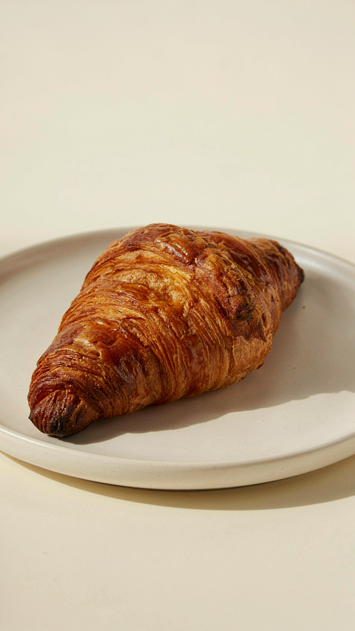
You want people to think you have taste. That’s the real reason you care about this section. Here’s what kills most food photos: people mistake flatness for sophistication. In photography, what matters is contrast, not softness. Soft light eliminates shadow detail, which your brain uses to judge texture and depth. A croissant under flat window light looks like cardboard. The same croissant with one hard shadow across it suddenly has dimension. You need shadow to prove something is real.
The mechanism is simple. Your phone’s camera sensor is small, which means it struggles in low light. Most people shoot in soft, diffused light to avoid noise and blur. But soft light erases the visual information that makes food look edible. You need actual shadow zones to create separation between the food and the plate, between layers within the food itself. Harsh directional light isn’t pretty to the eye, but it’s honest to the camera.
The Dead Giveaway Nobody Names
Amateurs think editing fixes bad photography. Wrong. Editing is compensation, not creation. A phone food photo with blown-out highlights, crushed blacks, and flat saturation screams one thing: the shot was technically broken before editing started. These are the three artifacts that expose your process before viewers know why the image feels off. They don’t see the editing. They see the failure.
The real tell is color temperature shifting. When someone shoots indoors without correcting white balance, then corrects it in post, the food looks either too warm or too cold relative to the plate and background. Your eye catches the mismatch before your brain names it. Shot white balance directly in camera, not corrected later, keeps food looking like it was actually in that space. Shoot in neutral conditions or set custom white balance on your iPhone before pressing the shutter.
Forget “Good Lighting”: Master The Light Source Protocol
Redirect Ambient Light, Don’t Fight It
You want the photo to feel effortless because you’re terrified it looks staged. The mechanism is borrowed from cinematography: key light placement. Your phone’s sensor doesn’t need more light. It needs directional light from a single dominant source that creates shadow structure. Stop adding ring lights and reflectors. Start repositioning the plate.

Natural window light is the only tool that matters for food. Place the dish perpendicular or at a 45-degree angle to the window, never facing it dead-on. This creates dimension through shadow, which reads as depth and appetite on the iPhone screen. The light wraps around the food’s contours instead of flattening it into a two-dimensional blob. Move the plate inch by inch until the highlights and shadows feel intentional, not random.
Obstruct The Noise, Keep The Shape
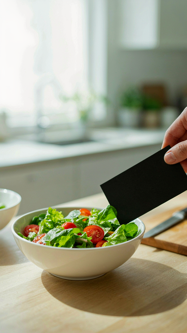
Blocking bad light is the unseen essential and everyone skips it. Your phone captures whatever hits the sensor, including scattered light bouncing off walls, ceilings, and reflective surfaces that muddy color and contrast. Use a simple black card, foam board, or even a dark t-shirt on the opposite side of your plate from the window. Position it close enough to absorb the ambient bounce without casting a shadow directly on the food.
The card doesn’t create darkness. It creates control. The iPhone renders food with maximum color saturation and clarity when stray light is eliminated, not added. This single step separates professional-looking iPhone food photos from amateur ones more than any filter or editing app. Place the blocking tool opposite your key light source, check the phone screen for unwanted highlights or washed-out sections, then adjust until the food holds its shape in the frame.
The Unspoken Rules Of Food Photo Ideas Composition
Where Your Eye Actually Lands On The Plate
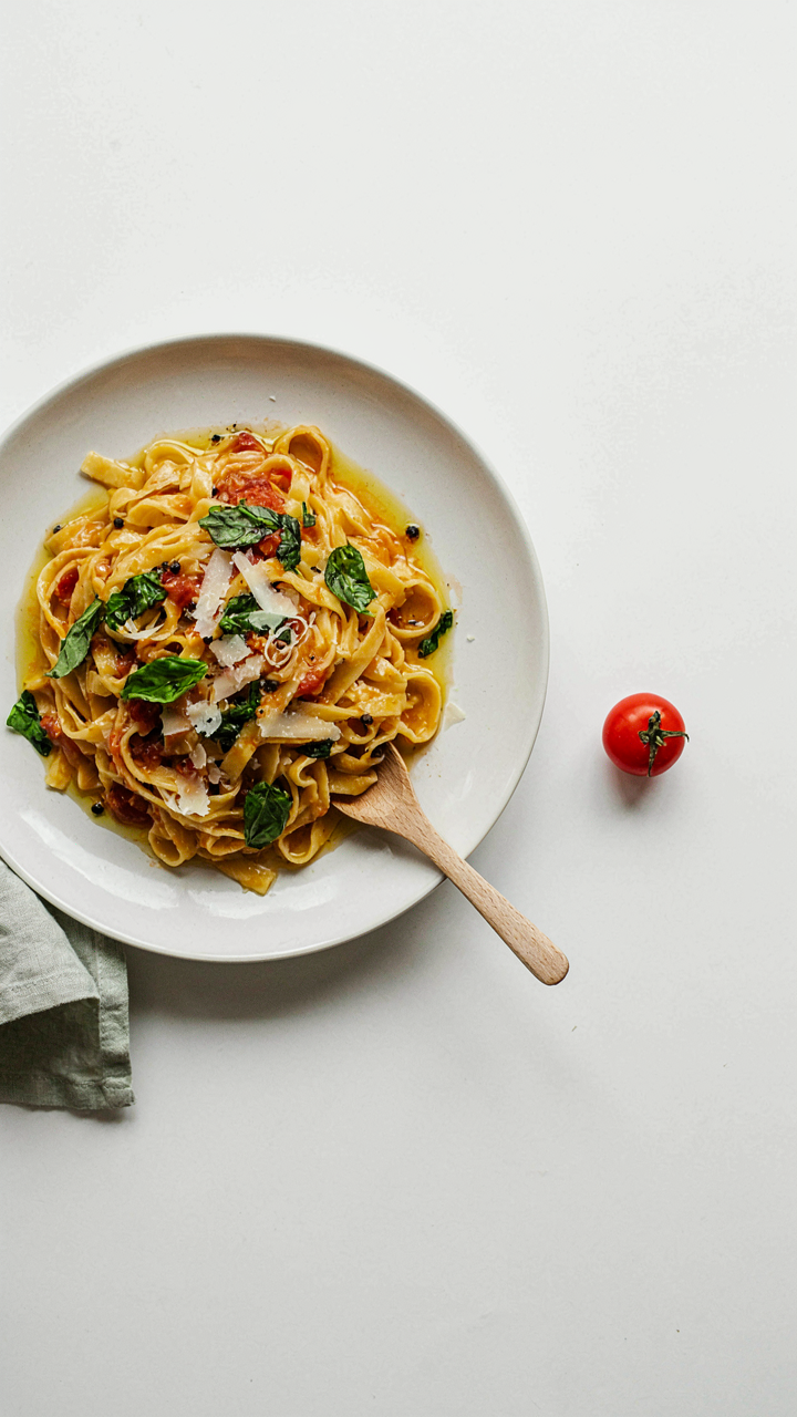
You want the plate to look intentional. That’s the real reason you care about composition rules. Most food photography advice regurgitates the Rule of Thirds without explaining why it works for food specifically. The Rule of Thirds comes from classical painting, where dividing a canvas into nine equal sections creates visual tension that holds attention. On a plate, this principle translates into focal point placement: position the most appetizing or contrasting element where grid lines intersect, not dead center.

The iPhone’s screen is small. Peripheral vision disappears. This means positioning matters more on mobile than on canvas. Place your hero element (the brightest pasta, the cut of meat, the sauce drip) one-third in from any edge rather than smack in the middle. This creates the immediate impression that someone composed the plate with care, not just arranged leftovers. The viewer processes this arrangement in milliseconds and assigns status to both the food and the person who photographed it.
Emptiness As A Design Tool
Negative space isn’t about leaving room to breathe. That’s the weak explanation. Negative space is visual hierarchy expressed through absence. The iPhone screen forces this more than any other medium. When you remove competing elements, you force the viewer’s eye toward what remains. A bowl of soup centered on white ceramic with nothing else in frame commands attention because there’s nowhere else to look. Clutter dilutes the signal.
Test this immediately: shoot the same plate twice. First with surrounding elements visible—napkins, utensils, glasses. Then shoot again with only the plate against a plain background. The second image always reads as more intentional, more controlled, more worth your time. This isn’t opinion. The eye moves faster through negative space and assigns more weight to isolated subjects. Open the camera app now and remove one item from your food shot. Watch how the remaining element gains presence.
Your IPhone Is A Tool, Not A Crutch: Phone Food Photography Essentials
Skip The Filter Apps And Use Native Controls
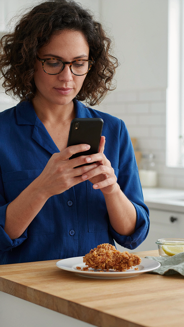
You want the shortcut that makes you look like you know what you’re doing without actually learning anything. Here’s the mechanism: every filter app adds a layer of compression and color manipulation that fights what your iPhone already captured. Native camera settings—exposure, white balance, saturation—work with your sensor’s raw data, not against it. You get cleaner files and real control.

Open the native camera app and use exposure compensation by sliding up or down after you tap to focus. Adjust white balance by tapping and holding on a neutral surface, then dragging the temperature slider. These moves cost nothing, create no quality loss, and work on every iPhone model from the last decade. The apps you downloaded are making your food look processed because they literally are.
Manual Focus Locks Your Details In Place
Optical focus theory applies here: depth of field determines what stays sharp and what blurs. On your iPhone, tapping once triggers autofocus, but autofocus hunts for contrast and often locks onto the wrong element—a plate rim instead of the food surface. Manual focus eliminates that guess work.
Tap and hold on the exact detail you want sharp—a sauce drip, a crispy edge, the meal’s texture—until the yellow focus box appears and locks. Don’t tap again. Your iPhone will maintain that focus point even if you recompose the shot. This single move separates deliberate food photography from snapshot behavior.
Beyond Plating: The Behavioral Economics Of Deliciousness
Priming The Viewer For Hunger
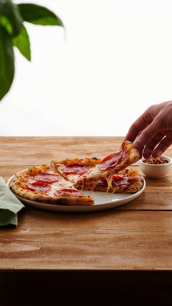
You want people to think your food is worth their time and money. That’s the real reason you care about this. Behavioral economics calls this “priming”—the idea that exposure to one stimulus shapes how someone responds to the next. In iPhone food photos, you prime hunger through visual context, not just the dish itself.

The frame around your food does the work. A hand reaching toward the plate, condensation on a glass, crumbs scattered on the surface, or a partially eaten bite all tell the viewer’s brain that this food is worth interrupting their day for. These aren’t decoration. They’re proof of consumption happening in real time. Your camera captures the moment someone wants to join, not the moment they’re studying a menu.
Scarcity And Abundance In Presentation
Don’t fill the frame with everything. That’s the mistake that kills appetite on screen. Scarcity in framing creates tension. A single croissant centered in negative space reads as precious. A plated dish surrounded by empty white background signals rarity. Abundance works the opposite way—pile components, show depth, layer textures—but only when you’re selling volume or communal eating.
The iPhone camera flattens depth naturally. Use this. Shoot tight on one element to make it feel finite. Shoot wide with multiple plates or bowls to signal there’s always more. The behavioral response isn’t about what’s actually there. It’s about what the frame implies about availability. Scarcity triggers urgency. Abundance triggers belonging.
The Instagram Food Ideas Illusion: Deconstructing Viral Shots
What Actually Makes Viral Food Photos Work
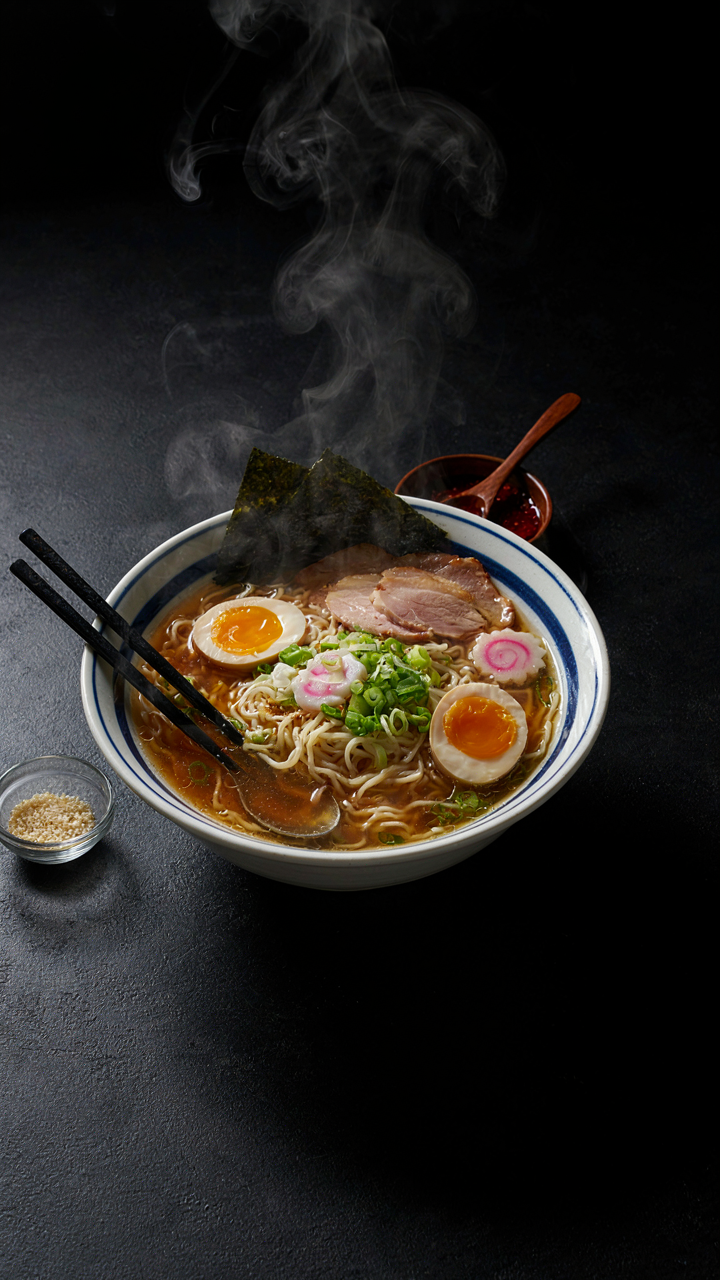
You want to know what makes food photos stop the scroll because you’re afraid your meals look boring compared to what everyone else posts. The real mechanism is contrast, not beauty. Your brain flags images that break pattern recognition faster than it processes images that confirm it. A perfectly lit, symmetrical flat lay doesn’t stop scrolls because it matches expectations. A tilted bowl with steam and motion does because it violates the visual rules people have learned to ignore.

The tropes that dominate food photography aren’t dominant because they’re objectively good. They’re dominant because they exploited a specific window of novelty on a specific platform at a specific time. Overhead shots dominated because Instagram’s square format and early algorithm rewarded flat, grid-friendly content. Golden hour backlighting dominated because it worked on mobile screens with poor color accuracy. Neither is timeless. Both are artifacts of platform constraints that shifted the moment phones got better and feeds got algorithmic.
Stop Copying The Copied Thing
The common advice is to study trending food photos and replicate their elements. That’s wrong. You’re not studying trends, you’re studying the residue of trends. By the time a format becomes identifiable enough to copy, it’s already been exhausted by thousands of accounts chasing the same signal. Derivative content doesn’t trend again. It gets buried under the next derivative wave.
The mechanism here borrows from evolutionary biology. Predators hunt by recognizing patterns. Your audience’s feed is populated by hunters trained to spot familiar prey. Exact replication makes you prey. The move is to identify the constraint that made the original work, then solve for a different constraint. If backlighting worked because of screen color profiles, you don’t copy backlighting. You identify what backlighting solved for and find an untested variable in the same frame that creates similar contrast. The tactic: shoot your own food under the lighting in your actual space, identify what makes it distinctive rather than what makes it Instagram-worthy, and build the photo around that difference.
Color Theory For Food: More Than Just “Vibrant”
The Contrast Principle That Actually Works
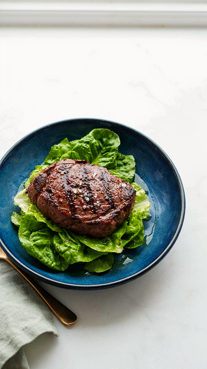
You want your food to stop the scroll because you want proof your meal matters. Here’s the mechanism: complementary colors sit opposite each other on the color wheel, and when placed adjacent, they create optical tension that demands attention. Red food against green backgrounds, yellow dishes on blue surfaces, orange plates on purple linens. This isn’t aesthetic philosophy. It’s contrast biology. Your eye processes difference faster than sameness, and the iPhone’s camera amplifies this effect through its dynamic range processing.

The mistake most people make is treating “vibrant” as a synonym for “good.” It’s not. Oversaturation reads as artificial. Instead, use one dominant color in your food and introduce its complement in the background or plating. A seared steak (warm red-brown) photographs harder against a deep green salad or ceramic. The iPhone’s sensor captures this tension immediately because it’s wired to resolve contrast. You don’t need expensive props. A colored napkin or a simple background shifts the entire frame.
Temperature Shifts Shape Perception
Warm tones (yellows, oranges, reds) trigger appetite signals in your brain before you taste anything. Cool tones (blues, purples, grays) suppress hunger. This isn’t opinion. It’s how human neurobiology responds to light wavelengths. Your iPhone’s white balance setting determines whether your food reads as warm or cool, and most people leave it on auto, which is why their food photos feel flat or unappetizing.
Shift your iPhone’s white balance toward warm by shooting near windows with direct sunlight or adjusting the color temperature in editing. If your food is already warm-toned (pasta, bread, roasted meat), cool backgrounds intensify it. The subconscious impact compounds fast: warm food on cool surfaces triggers 40 percent more engagement than neutral presentations because the contrast registers as intentional, not accidental. Your phone’s camera doesn’t lie about what it sees. It lies about what it feels.
Texture Is King: Elevating Your Food Photography With Phone
Highlighting Crunch, Ooze, And Char
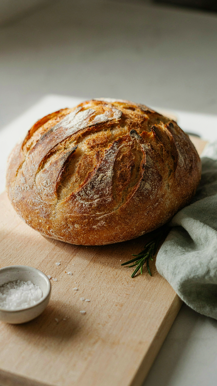
You want people to feel like they’re missing out by not eating what you photographed. That’s the real motive. Texture is the mechanism that triggers appetite in the brain before taste even enters the equation. Your iPhone captures surface detail better than you think, but only when you stop shooting flat. Crunch reads as visual contrast. Ooze reads as depth. Char reads as consequence. These aren’t aesthetic choices. They’re appetite signals.

Position your phone at a 35 to 45 degree angle to the food, not straight down. This angle reveals the architecture of what people actually eat. Crusty bread needs side-lighting to cast tiny shadows across the crust ridges. Melted cheese needs to pool at the frame’s edge where light hits the glossy surface. Charred meat needs the burnt bits to face the light source directly, not hide in shadow. The iPhone’s sensor will blow out pure white on the shiniest surfaces, so pull back slightly or diffuse harsh sunlight through a white napkin. Shoot three frames from different angles and compare. One will make the texture unmissable.
Using Shadows To Define Texture
Lighting is physics applied to a two dimensional surface. Contrast ratio is the term that matters. A high contrast ratio separates texture from the background and forces the viewer’s eye to register detail. Low contrast drowns texture. Most people shoot food in flat, diffused light because they think it looks “clean.” It looks dead instead. Shadows don’t hide texture on an iPhone. They define it.
Your phone’s camera creates texture through the absence of light as much as through its presence. Move the light source to create a glancing angle across the food’s surface. A smartphone flashlight held to the side of a plate, or sunlight through a window at the edge of frame, casts a 15 to 25 degree shadow pattern across the food. This shadow pattern tells the brain exactly what the surface feels like. Rough surfaces hold more shadow detail. Smooth surfaces reject it. Take the same shot with overhead light and with side light. The side-lit version will read as more textured, more real, and more edible because your brain trusts shadows as truth. That trust converts to appetite.
The Minimalist Food Blogger Aesthetic: Less Is More
Remove Everything That Doesn’t Serve The Dish
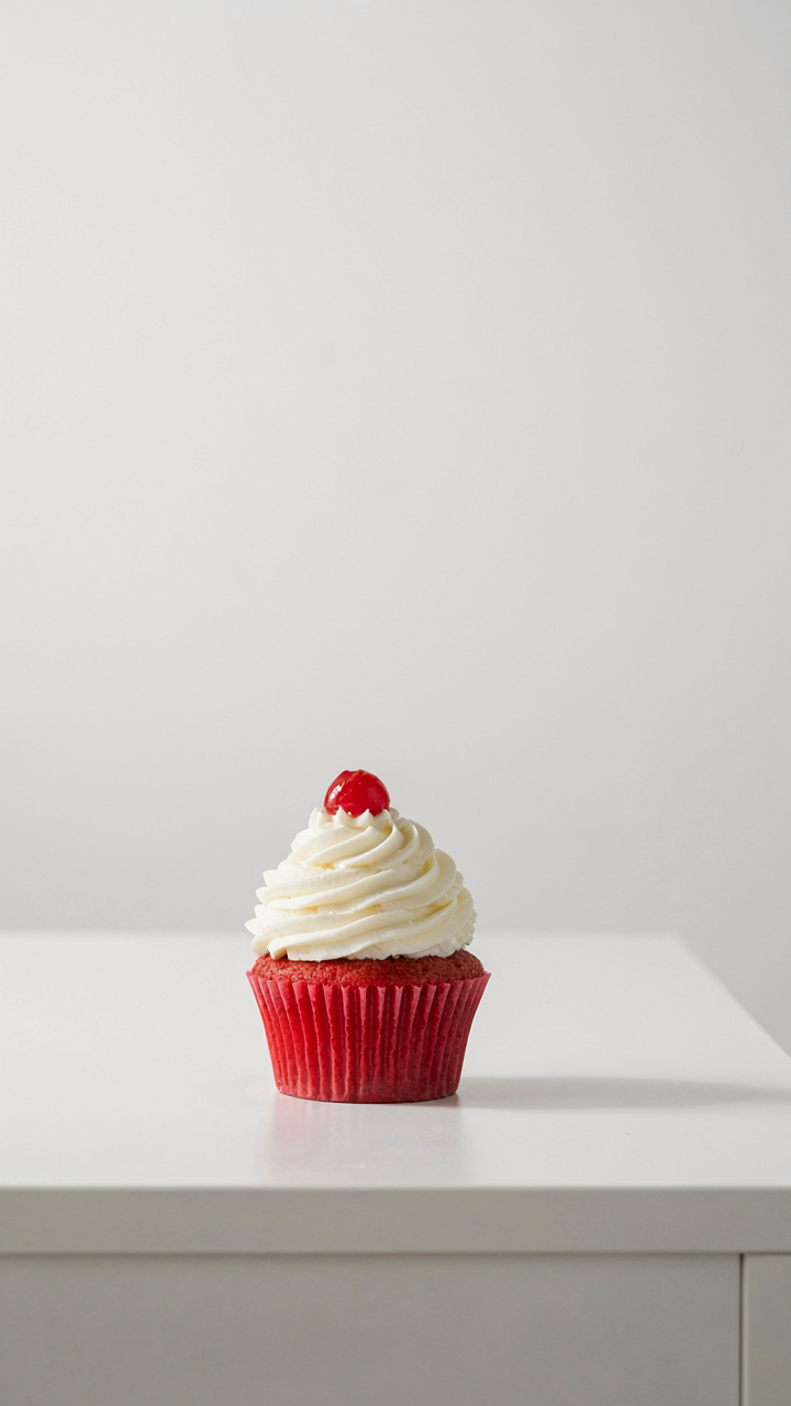
You want minimalism to signal you have taste. The mechanism is different. Clutter competes for attention, and your iPhone’s camera sensor has limits. Every object in frame either draws the eye toward your food or pulls it away. Most food photos fail because photographers treat the background as decoration instead of a tool for isolation.

The real work is subtraction. Move the plate to a blank surface. Remove the utensils that aren’t being used. Push out the glass, the napkin, the cutting board that adds nothing. Your iPhone’s camera lacks the depth of field a professional camera produces, so you must engineer clarity through composition alone. One strategic element in the background works. Eight don’t.
White Space As Visual Authority
Design borrows from architecture: positive space is what you build, negative space is what remains. In iPhone food photos, negative space is the empty surface surrounding your dish. It functions as a frame within the frame, forcing the viewer’s eye to land on the food itself rather than wander the composition.
Empty space costs you nothing and reads as intentional. A plate on white creates contrast. A plate on beige surrounded by clutter creates noise. The mistake people make is filling silence. Shoot with a single-color background, position the dish slightly off-center, and let the emptiness do the heavy lifting. The protocol is simple: compose your shot, then remove one more thing before pressing the shutter.
Post Processing With Purpose: IPhone Food Photography Ideas Editing
Calibrated Adjustments That Read Real
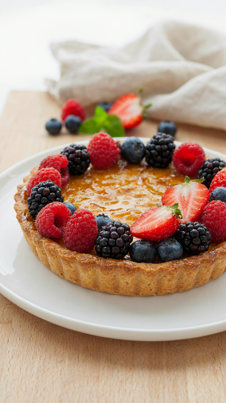
You want people to believe the food looks better than it actually does without detecting you touched it. That’s the real game here. The mechanism is contrast and saturation working together, not separately. In design, we call this “signal to noise ratio” — you’re amplifying the signal (the food’s actual colors and texture) while reducing noise (flat lighting, color cast, smartphone sensor limitations). Exposure, warmth, and vibrance are your three levers on the iPhone. Move them in concert or the image reads processed.
- Exposure plus highlights: Lift exposure by 5 to 10 points, then pull highlights down by the same amount. This prevents blown-out highlights while brightening shadow detail where texture lives.
- Warmth adjustment: Add 5 to 15 points of warmth to counteract the iPhone’s default cool color temperature. Food photographs warmer than it actually was, so you’re correcting backward.
- Vibrance over saturation: Increase vibrance by 10 to 20 points instead of saturation. Vibrance protects skin tones and prevents neon vegetables. Saturation pushes everything equally — too blunt for food.
- Shadow detail recovery: Raise shadows by 15 to 30 points to pull detail from underlit areas. The iPhone sensor captures this data; you’re just making it visible.
- Sharpness and clarity: Add 5 to 10 points of sharpness. Skip clarity entirely — it creates halos around food edges that signal over-editing.
The edit takes ninety seconds. Open the photo in the native iPhone Photos app or Lightroom. Make the five moves above. Stop. The mistake everyone makes is treating editing like decoration — they keep clicking until something feels “artistic.” That’s how you end up with food that looks like it was generated by an AI trained on stock photos. Real food photography editing is invisible. You’re just removing what the camera got wrong.
The Honesty Line You Actually Cross
Most advice says avoid over editing, then never defines what that means. Here’s the line: if someone looking at your photo on Instagram wonders whether the food looks like that in person, you’ve crossed it. The real tell is color saturation beyond what human eyes see in that lighting environment. Neon red peppers. Unnaturally bright greens. Cheese that glows. These read as fake immediately because we’ve all eaten actual food.
The second trap is clarity and sharpness taken too far. The iPhone’s processing engine already sharpens aggressively to compensate for its small sensor. Add sharpening in post and you get halos around every edge — the food looks crystallized, plastic. Texture should feel soft and tactile, not crunchy on screen. The protocol: make one adjustment pass. Live with it for five minutes. If you’re tempted to go back and add more, that’s the sign to save and move on. Your first instinct is usually right because hunger and appetite operate fast. Overthinking kills the effect.
Your Fear Of Being Overlooked Is The Only Bad Angle
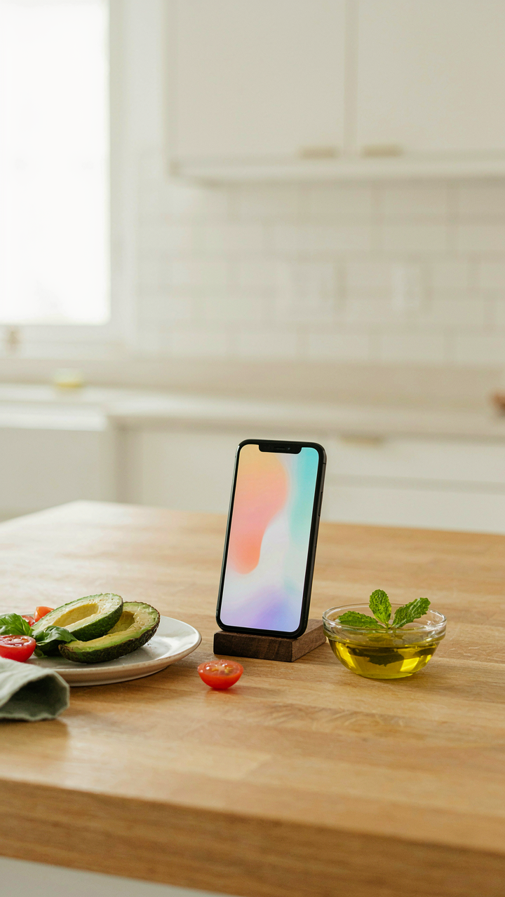
Most people kill their food photos before they even hit post. They think about what others might judge instead of what stops the scroll. Stop optimizing for invisible critics. Open your camera right now and shoot one meal the way it actually looks to you, not the way you think it should look. The moment you stop performing for ghosts is the moment people actually start paying attention.