Introduction
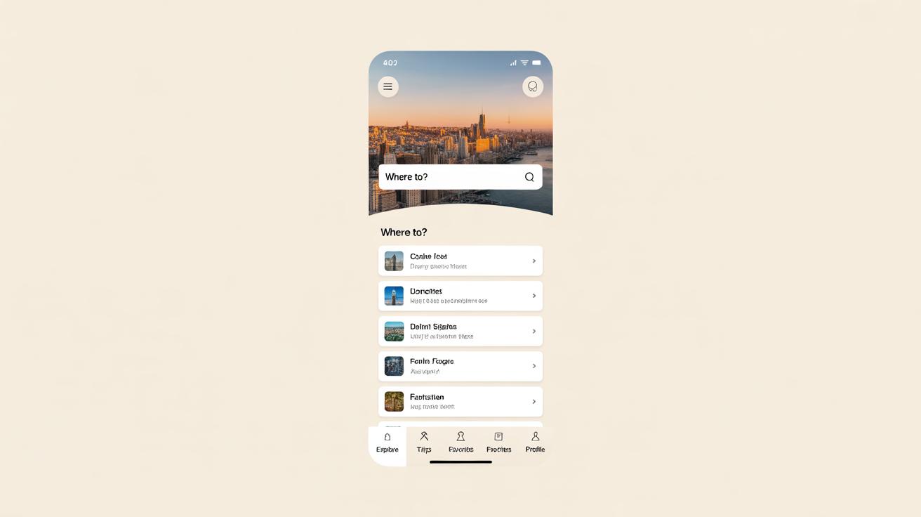
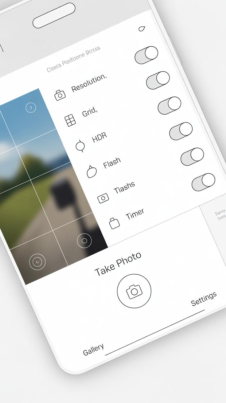
Screen Design Grid Overlays help you arrange elements on a phone screen. These grids guide the placement and alignment of texts, images, and buttons to create a balanced look. A well-organized screen makes your app or website easier to use and more appealing.
In this article, you will learn what grid overlays are and why they matter. You will explore how to use grids effectively to improve phone screen composition. By understanding grids, you can design screens that look clear and work well for your audience.
Understanding Screen Design Grid Overlays
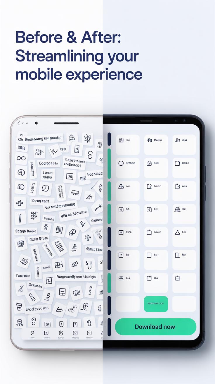
Screen design grid overlays are visual frameworks that divide a phone’s screen into structured sections. They help designers organize content within defined limits, making the layout look cleaner and more intentional than if elements were placed randomly. Think of them as invisible guides shaping where text, images, and buttons sit on the screen.

You might wonder why grids matter in such small spaces. The answer lies in consistency and balance. Without grids, elements risk looking cramped or oddly spaced, which can confuse users or distract from the app’s purpose. With a grid, you can maintain alignment and rhythm, even when your content changes or scales across devices.
Common grid types include:
- Column grids: Divide the screen vertically into equal sections. Most often you’ll see 4, 6, or 12 columns. These help distribute content evenly, letting you stack or place elements side by side.
- Modular grids: Combine columns and rows, forming a matrix of squares or rectangles. This structure supports complex layouts, such as dashboards or multi-content screens, with consistent spacing.
- Baseline grids: Focus on horizontal alignment, ensuring text lines up precisely across sections. This subtle guide improves readability, especially on text-heavy interfaces.
Each type serves different needs but they often overlap. You might start with a column grid, then layer a baseline grid for text alignment. It’s tricky sometimes to decide which fits a project best, but experimenting with these grids often reveals the right balance between structure and flexibility for your design.
Why Grid Overlays Matter in Phone Composition
Grids quietly shape how you see and interact with phone screens. They’re more than just invisible lines; they create order. When you arrange buttons, text, and images, grids help avoid chaos. It might seem obvious, but without a grid, designs often feel off—like something’s just not quite right. Visual balance isn’t about symmetry alone, but about making things easier to understand at a glance.
Think about it: when elements line up or relate visually, your eye moves naturally. Nothing distracts or confuses. A grid provides that structure. Here’s what that means for you:
- Grids control where to place content so no part feels too heavy or neglected.
- They make reading easier—texts fall into clear columns or blocks rather than floating randomly.
- Users can predict where to find what they need, making interactions smoother.
Sometimes, a rigid grid might seem limiting, but it’s really a guideline that supports creativity. You’re not locked in; you just get a framework to build on thoughtfully. When your design nudges a user’s attention subtly, guiding their eyes and taps, you’ve probably used grids well—even if you don’t realize it.
Does your latest project feel natural to navigate, or do elements clash? Maybe a grid overlay could uncover overlooked balance, helping you craft a screen people want to use. At least, that’s what I found whenever I gave grids a chance—they often change how you think about layout altogether.
Setting Up Your Grid Overlay for Mobile Screens
Creating a grid overlay tailored for mobile screen designs starts with choosing the right number of columns. Typically, mobile layouts use between 4 to 6 columns. Fewer columns give you more flexibility for larger elements, while more columns allow finer control, but might feel cramped on smaller phones.

Margins and gutters play a big role too. Margins—the empty space at screen edges—should be wide enough to prevent elements from feeling squished or awkwardly close to the edge. A margin of around 16 to 24 pixels often works for most devices, but this can vary depending on the screen size. Gutters—the space between columns—usually range from 8 to 16 pixels to separate content without fragmenting it.
Next, setting up horizontal rows helps organize your content vertically. You can create rows based on typical UI element heights, like buttons or text fields. Adding a baseline grid is useful for aligning text and interface components consistently. The baseline usually matches your body text line-height, perhaps 18 or 20 pixels on mobile, which helps avoid uneven vertical spacing.
As you set your grid, ask yourself: Does this spacing feel natural on the intended device? You might tweak the gutters or switch from 4 to 5 columns after seeing how your elements fit. There’s no one-size-fits-all, but the key is balancing structure with flexibility.
Aligning Visual Elements Using Grid Overlays

Using grid lines to place images and text creates a much cleaner, more organized look for your screen. When you nudge a photo or a paragraph so that its edge rests exactly on a grid line, the layout feels balanced—not forced. For example, aligning a headline’s left edge with a vertical grid line can create a natural reading flow. It’s subtle but noticeable. You might find that centering an image between two vertical lines gives a better sense of stability than eyeballing it.
When working with text blocks, try aligning their baselines or margins to horizontal grid lines. It helps improve readability and makes the content feel less cramped. Sure, sometimes a little offset works if the design calls for emphasis, but starting from a clean grid alignment usually saves headaches later.
Buttons deserve extra care, too. Placing clickable elements along a grid helps users find and tap them comfortably. A common practice is to line buttons up on a vertical column, spaced evenly by grid rows, so fingers don’t need to stretch awkwardly. Position buttons where they naturally fall within the grid, often near the bottom or center-right of the screen, depending on typical thumb reach zones. This placement encourages easy use without clutter.
Have you ever noticed that when buttons are off-grid, the entire interface feels off—not broken, just… wrong? That’s what happens when alignment falters. Getting those interactive parts right using grids makes phone screens feel intuitive, even if users don’t consciously realize why.
Using Grids to Create Consistent Spacing

Grids act like a silent guide, helping you keep the space between elements just right. If you rely on eyeballing distances, you risk uneven gaps that can make your design feel off or rushed. When you use a grid, each button, text block, or image respects consistent spacing rules. This doesn’t only make things visually tidy but also creates a rhythm that users can pick up on without realizing it.
When setting margins and paddings, grids offer a simple way to standardize these spaces around your components. Say you decide that each side of a button should have the same amount of padding—grids make it easy to apply that across the board, preventing random shifts that look sloppy. You get uniformity without needing to measure each time, which saves you a lot of hassle.
Another benefit is avoiding clutter. When spacing is uneven, screens might look crowded in some places but oddly empty in others. I’ve noticed that screens with balanced spacing feel less overwhelming, giving users clear breathing room to focus. Sometimes you might feel tempted to squeeze in extra info, but consistent gaps remind you to step back and simplify. So, grids indirectly nudge you toward cleaner, less confusing layouts.
Working with Responsive Grids for Different Devices

When you design grids for phone screens, you can’t just rely on fixed measurements. Phones come in all sorts of sizes and shapes. So, the grid layout has to shift and stretch to fit each screen’s unique width and height. I’ve noticed that even slight tweaks in screen size can throw off your entire design if the grid isn’t flexible enough.
Responsive grids often adapt by changing the number of columns or adjusting gutter spaces. Sometimes, this means fewer columns for smaller screens or wider columns on taller devices. You might wonder, “Does this make things inconsistent?” Maybe a bit. But the goal is to keep the overall balance while letting the layout breathe.
And what about when people flip their phones? Designing grids that react to portrait and landscape modes isn’t simple. You need a system that rearranges content without breaking the flow. For example, a 12-column grid in portrait might shift to 8 wider columns in landscape, maintaining visual order but fitting the new shape. It feels a bit like solving a puzzle where pieces must still fit no matter how you turn it.
Here are some practical thoughts on handling these shifts:
- Build grids with percentages or relative units, not fixed pixels.
- Test designs on various screen sizes early—you’ll catch oddities sooner.
- Consider user habits—do they often switch orientations? What content changes?
- Use flexible gutters and margins to avoid cramped or overly spaced layouts.
- Sometimes, simplify your grid in landscape—less complexity often works better there.
These approaches help keep your designs adaptable without losing character, even as the screen changes. It’s a bit of a balancing act but focusing on flexibility makes the difference. Have you tried bending grids this way? It can be frustrating but surprisingly rewarding once it clicks.
Tools and Software for Creating Grid Overlays
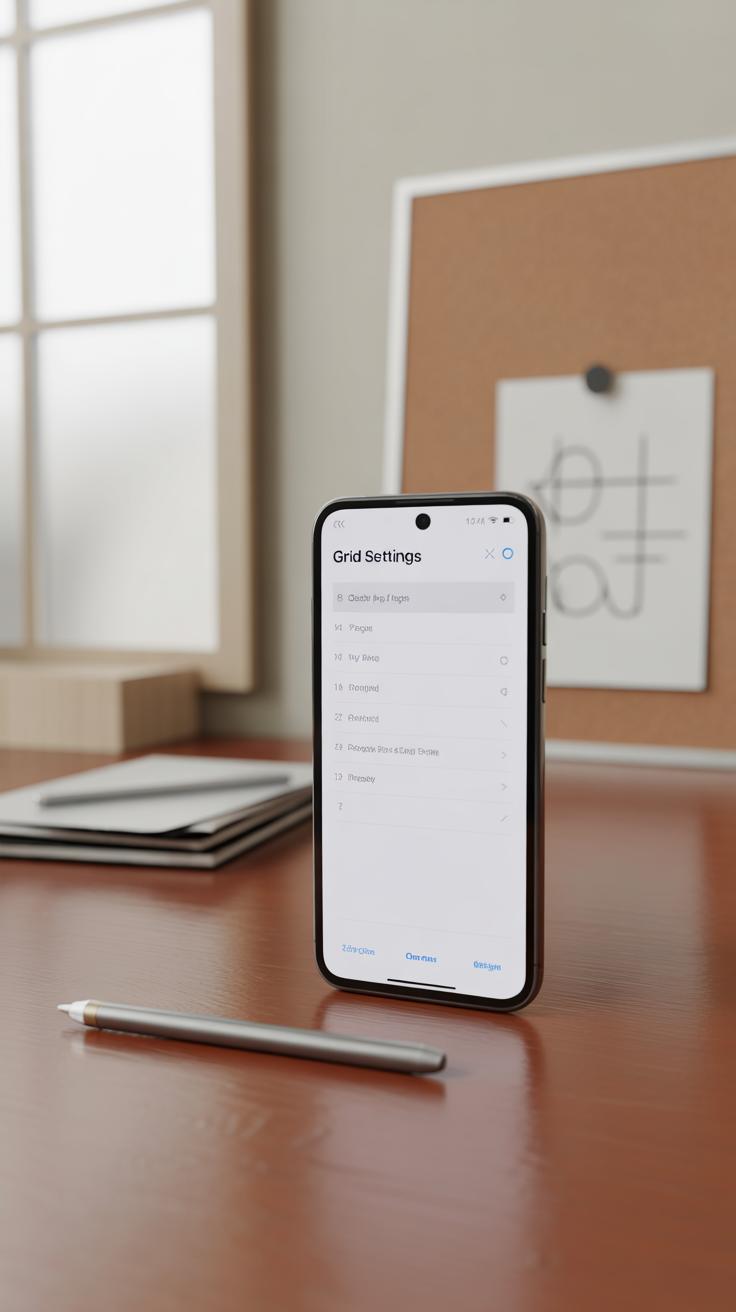
When you’re working on phone screen designs, having the right tools for grid overlays really makes a difference. Popular design software like Figma, Adobe XD, and Sketch each offer solid built-in grid systems. In Figma, for example, you can easily toggle layout grids on and off, customize columns, rows, and margins, which helps you experiment quickly. Adobe XD has similar features but feels a bit more limited when it comes to complex grid setups.
Sketch’s grid system is simple but practical. It lets you create flexible column layouts which is handy for responsive phone design. You might find yourself switching between these apps depending on the project or team preferences, which can be a bit frustrating if grids don’t transfer perfectly.
Beyond the basics, plugins and extensions push grid capabilities further. In Figma, plugins like “Grid Buddy” or “Golden Ratio Grid” let you generate grids based on different rules or proportions, sometimes saving a surprising amount of time. For Sketch, “Sketch Grid Maker” adds customizable grids beyond what the native tool offers. Adobe XD users might try “Griddy” to create more advanced layouts.

Sometimes, I wonder if relying on plugins might complicate things more than help, especially if you’re juggling client expectations and deadlines. Yet, for layered phone interfaces, these tools often deliver just the right boost without bogging you down. Have you tried any grid plugins yourself? Do they change your workflow noticeably or just add another step?
Common Mistakes When Using Grid Overlays
Over-relying on grids can be tempting. After all, grids provide a clear structure, which feels safe when designing for phone screens. But sticking too rigidly to them can make your designs look predictable and uninspired. It’s easy to fall into the trap of following every line and intersection without questioning if it really enhances the composition.
Creativity doesn’t always fit neatly into boxes or columns. Sometimes breaking the grid—or bending it a little—brings more interest and engagement to your design. Think of grids as guides, not strict rules. It’s kind of like having a set of rails to keep you on track but allowing yourself to jump off when the design calls for it.
Another common misstep is ignoring how users actually interact with your design. Grids help layout elements consistently, but if you don’t consider how people hold or scroll on their phones, you might place important buttons or content in awkward spots. For example, putting interactive elements too close to screen edges or unreachable with thumbs undermines usability, no matter how neat the grid looks.

When designing with grids in mind, ask yourself these questions:
- Does every element need to fit the grid perfectly, or could some break free to improve clarity or flow?
- How does the user’s hand position affect which parts of the screen are easiest to reach?
- Am I designing for screen proportions, or am I thinking about actual phone usage scenarios?
Balancing structure with flexibility and user behavior usually makes grid-based compositions better. It’s not always easy to get this right, and sometimes you might feel torn between following the grid and following intuition. But that tension can actually lead to more thoughtful and functional designs.
Practicing Grid Overlay Design for Improvement

Using grid overlays isn’t something you get perfect immediately. It takes practice to develop a comfortable rhythm of placing elements according to the grid without overthinking each move. Try simple exercises like designing a basic app home screen using just a three-column grid. Focus on placing buttons and text blocks strictly along the lines and intersections.
Another useful task is reworking an existing screen design by overlaying a grid and adjusting misaligned items. Notice how balance shifts when elements snap to the grid, and where the original design might have ignored subtle alignment cues.
After completing a design, pause and assess it from a grid perspective. Ask yourself:
- Do the visual elements consistently fall along grid lines or intersections?
- Is there unnecessary crowding in some areas?
- Which parts feel off-balance or forced?
Gather feedback as well, even from non-designers. Sometimes, small misalignments bother the eye more than you expect. Refining designs based on these observations builds your intuition for when to bend or follow the grid rules strictly.
Over time, you might find your own subtle modifications of grid layouts that enhance clarity without rigidly sticking to every line. That’s where true skill begins—knowing when to use a grid and when to deviate thoughtfully.
Conclusions
Grid overlays bring order to phone screen designs. They help you position screen parts in a neat way. This leads to easier-to-use interfaces and better user experiences. When you follow grid lines, your design looks tidy and professional.
Using grids changes how you work on screen design. It breaks down the process to simple steps. As you practice, you will see how grids make your designs stronger and your users happier. Start using grid overlays today to improve your phone screen compositions.