The Unseen Engine: How IPhone Photographic Styles Reshape Pixels

What Happens Before You See The Image
You want to believe your phone captures reality. It doesn’t. The real mechanism nobody admits: Photographic Styles intercept raw sensor data before your brain processes it, rewriting color and contrast decisions that used to require desktop software. This is computational photography doing its job—not enhancing a finished photo, but deciding what finished means while the shutter’s still open.
Apple’s ISP (Image Signal Processor) applies Styles during the computational pipeline, not after. The moment light hits the sensor, algorithms layer in your chosen Style’s color matrices and tonal curves before the JPEG even exists. You’re not filtering a photo. You’re baking a look into the foundation.
The Grammar Of Color, Not Decoration
Color science isn’t taste. It’s a system of relationships—borrowed from colorimetry, the field that measures and specifies color objectively. Each Photographic Style operates like a color matrix in that system: it shifts hue relationships, adjusts saturation curves, and rebalances white point according to preset rules. When you pick “Rich Contrast,” you’re not adding drama. You’re remapping how the sensor’s RGB channels report back to the processor.
Standard advice treats Styles like Instagram filters. Wrong. Filters layer on top of finished images and degrade data. Styles work upstream, in the RAW processing layer, which means they preserve detail while fundamentally changing how color information gets encoded. This is why Styles look stable across different lighting—they’re not fighting the image. They’re translating it into a different color dialect from the start.
The Style Spectrum: Unpacking Tone And Warmth For Signature IPhone Photos
Contrast, Brightness, And Shadow Control
You want your photos to look intentional because you’re terrified they look like everyone else’s. The real mechanism is this: tone works like dynamic range compression in audio engineering. You’re controlling which details stay visible and which disappear into black or blow into white. This is the skeleton of recognition.

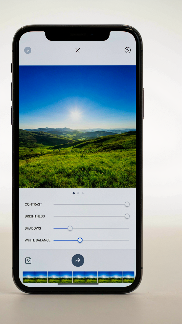
iPhone Photographic Styles let you manipulate contrast by shifting how the phone interprets mid-tones relative to highlights and shadows. Higher contrast pushes blacks darker and whites brighter, collapsing the mid-range. Lower contrast does the opposite, flattening separation. Brightness is the offset that moves the entire tonal curve up or down. Shadow detail gets controlled separately through the Shadows slider, which recovers information in dark areas without affecting highlights. Master these three and you control what your viewer’s eye actually lands on.
White Balance And Emotional Temperature
Most advice says warm tones feel inviting and cool tones feel modern. That’s incomplete. Warmth doesn’t create emotion, it creates context recognition. Your brain uses color temperature as a cue for light source and time of day. Shift the white balance toward yellow and your photo reads as golden hour or artificial indoor light. Shift toward blue and it reads as overcast or tungsten correction gone wrong.
iPhone Styles lock white balance into a preset that stays consistent across shots, which is the actual value. The Warm, Neutral, and Cool options in Styles aren’t suggestions. Warm pushes the color temperature toward 3500K (incandescent range), Neutral holds around 5500K (daylight), and Cool drops to 7500K plus (shade or overcast). When you pick one style and shoot twenty frames, your phone applies the same white balance math to all of them. This creates visual coherence that looks deliberate instead of reactive. Use the white balance slider in post if you need micro-adjustments, but lock it in Styles first so your eye trains on consistent output.
The Visual Thesis Protocol For Deliberate Photography Settings
Start With What You Actually Want
You want people to recognize your work instantly. That’s the real reason you care about consistency. Most photographers skip this step entirely and chase settings like they’re collecting features instead of building identity. The mechanism is simple: your aesthetic thesis is the constraint that makes every decision downstream automatic.

Define your desired aesthetic outcome before you touch a single slider. Ask yourself what emotional response or visual pattern you want viewers to experience in every frame. This isn’t about following trends. It’s about reverse-engineering the look you’re trying to achieve, then finding which Photographic Styles setting gets you closest to that north star. Without this clarity, you’ll keep switching styles based on lighting conditions instead of building a recognizable voice.
Map Your Vision To Style Parameters
Photography borrows from signal processing: you choose a filter that emphasizes certain frequencies while dampening others. In iPhone Photographic Styles, you’re doing exactly that—boosting certain tonal ranges and color channels while reducing others. The five standard styles (Standard, Rich Contrast, Vibrant, Warm, Cool) each emphasize different frequencies in your image data. Rich Contrast amplifies mid-tone separation. Vibrant pushes saturation in specific color bands. This is mechanically different from editing the same image later.
Pick one style and commit to it for a shooting season. Test it across different lighting conditions—golden hour, overcast, indoor, backlit. Watch how it renders skin tones, greens, and shadows. Your chosen style becomes the foundation. From there, fine-tune tone and color balance within that style’s framework rather than switching styles between shots. Consistency emerges when you stack constraints, not when you preserve flexibility. Apply your chosen style as your default in camera settings and override it only when the scene demands a deliberate break from your thesis.
Common Pitfalls: Why Your “Unique” Style Looks Generic
Relying On Factory Presets Without Modification
You want to believe a single setting choice makes you recognizable. It doesn’t. The mechanism is simple: Photographic Styles ship as starting points, not destinations. Apple designed them to please the median user, which means they flatten distinction by default. Warm, Standard, Rich Contrast, Vibrant—these are templates, not signatures. Most people apply one and call it done, which is exactly why your feed looks like everyone else’s.

The real work happens in the adjustments. A style becomes yours when you shift tone curve, temperature, or saturation away from the preset baseline. You’re not supposed to use Warm at Warm. You’re supposed to use Warm as a reference frame, then modify it until the output matches your actual visual intent. Photographers who look distinctive don’t find a style and stop. They find a style, then dismantle and rebuild it.
Ignoring The Actual Light You’re Shooting In
Light changes everything about how a style reads, and most people completely ignore this fact. The same Photographic Style produces different output in golden hour versus noon versus tungsten indoor light. You apply Rich Contrast in bright daylight and get harshness. You apply it indoors and get muddy blacks. The style itself didn’t change. The input data changed. Context determines whether a choice looks intentional or accidental.
This is why preset-shopping is a waste of time. You need a protocol: shoot the same subject under three distinct light conditions, apply your chosen style to each, then evaluate which light conditions let that style breathe. Some styles work only in specific lighting. Others demand you shift their parameters based on color temperature. Once you know your style’s dependencies, you stop fighting the light and start using it as a collaborator. Test your style against harsh sunlight, soft window light, and artificial tungsten before you call it yours.
The “Deep Work” Method: Mastering Custom Photographic Styles For Phone Photo Editing
The Feedback Loop That Actually Works
You want a signature look because you’re tired of blending into the feed. Here’s what nobody tells you: mastering custom photographic styles works like a feedback mechanism in engineering. You input a variable, measure the output, adjust the input, repeat. Most people tweak one slider, take one shot, move on. They never close the loop. The real work is systematic iteration on the same subject under the same lighting until you find the threshold where tone, color, and contrast stop fighting each other and start reinforcing a single visual statement.

Start with a single subject you control: your desk, your face in morning light, or a wall in your home. Apply a style preset. Take the shot. Open it in Photos and inspect the Tone Curve, Color Cast, and Saturation. Adjust one variable only. Shoot again. Document the exact numerical change you made. Repeat twenty times minimum. You’re not looking for perfection on iteration five. You’re building a map of cause and effect so specific that you stop guessing and start knowing what each adjustment does to your final image.
The System That Survives Beyond Today
Most photographers lose their custom styles because they never documented them. You tweak settings in the Photographic Styles interface, the image looks great, you move on. Six months later you need that exact setup and can’t recreate it. Write down everything. Open Notes on your iPhone. Create an entry for each style you build. Record the name, the subject type it works best on, the exact settings for Tone (warm or cool and by how many points), Color (hue shift), and Saturation values. Screenshot the preview too. Store this in a folder you actually check.
The documentation becomes your operating system. When you shoot in new lighting, you reference your notes instead of starting from zero. You also notice patterns: which settings work for indoor shots, which ones murder skin tones, which ones only work on specific iPhone models. This intelligence compounds. After fifty documented iterations, you’re not experimenting anymore. You’re executing. You’ve built a repeatable process that produces consistent output regardless of conditions.
Field Theory Of Iphone Photography: Anticipating Visual Impact
How Light Behaves Inside Your Style
You want to know which style makes you look intentional instead of lucky. The real mechanism: each photographic style alters how iPhone’s computational pipeline processes luminance and chrominance data before you even tap the shutter. This isn’t metaphorical. The style you select changes the sensor’s actual light interpretation in real time.

Standard style preserves measured light values with minimal manipulation. Vibrant and Rich Contrast styles compress the tonal range, forcing shadows darker and highlights brighter. Warm style shifts the color temperature calculation toward amber wavelengths. Cool style pulls toward blue. When you choose a style, you’re not adding a filter after capture. You’re reprogramming how the sensor and ISP (image signal processor) weight incoming photons. Shadows don’t darken by accident. Highlights don’t clip because of mood. They clip because the algorithm you selected decided to redistribute the exposure curve before the image is written to storage.
Reading The Scene Before You Shoot
A scene’s visual force field is the sum of what’s reflecting light, what’s absorbing it, and where the contrast breaks happen. High-contrast scenes (bright window next to dark shadow) demand different style logic than flat, even light. Most advice says “try them all and pick what feels right.” That’s avoidance disguised as exploration. The real read: analyze where your subject sits in the tonal spectrum and which style will position it correctly inside the iPhone’s processing range.
If your subject is in shadow and surrounded by bright background, Standard style preserves the shadow detail but risks losing the background. Rich Contrast style crushes the background to black, isolating your subject. Cool style in that setup makes the shadow feel dead. Warm style lifts it slightly. Before you shoot, ask: what tonal zone matters most? What does this style do to that zone? Then shoot. The mechanism is simple: choose the style that handles your scene’s dominant tonal challenge, not the one that feels trendy.
Integrating Styles With Advanced IPhone Camera Features
Photographic Styles And ProRAW Synergy
You want to believe that applying a style won’t lock you into that look forever, that you’re keeping your options open. That’s the real fear here: commitment. The mechanism is this: Photographic Styles and ProRAW operate on different capture layers, which means you can apply a style to a ProRAW file without baking the adjustments into the raw data itself. The style becomes metadata Apple reads at export, not embedded processing.

ProRAW captures unprocessed sensor data. When you enable a Photographic Style during ProRAW capture, iOS records your style choice as reference information, but the actual raw file stays untouched. You can change or remove the style later in post-production without quality loss. This separation is what makes ProRAW the only format where styles remain fully reversible.
Cinematic Mode And Photographic Styles Stacking
The mistake everyone makes is thinking cinematic video can’t use styles because the format already controls focus and depth. That’s backwards. Photographic Styles apply to cinematic footage the same way they apply to photos: they shift the color science and tonal response after the camera captures the frame. The cinematic engine handles focus tracking; the style handles how warm, saturated, or contrasty the captured video looks.
When you record in cinematic mode with a style enabled, the style processes every frame in real time. You see the color and tone shift happen during capture, not in post. This means your in-camera monitoring shows you the actual final look before you hit record. If you want to match your cinematic footage to your photographic style library, apply the identical style during filming, then any secondary color grading stays consistent across both mediums.
Beyond The Trend Cycle: Cultivating A Timeless Aesthetic
Your Visual Signature Matters More Than You Think
You’re reading this because you sense that following trends makes you indistinguishable, and that terrifies you. Here’s the mechanism: a photographic voice isn’t built by chasing what works for someone else. It’s built by isolating which iPhone Photographic Style amplifies what you naturally notice and eliminating everything that doesn’t. The Styles exist as constraints, not inspiration. Constraints force specificity. Specificity is what separates signal from noise in attention economies.

Most creators treat Styles as interchangeable tools. That’s backwards. Each Style bakes in a particular relationship between contrast, saturation, and tone curve. Standard and Vibrant fight for surface appeal. Rich Contrast and Warm compress information differently. Rich Tone and Cool frame emotion through density and temperature. Pick one. Shoot everything through it for ninety days. You’ll internalize the constraint so deeply that your eye stops filtering the world through trends and starts filtering it through your actual visual instinct.
The Algorithm Rewards Consistency, Not Conformity
Algorithmic homogenization sounds abstract until you map it onto signal processing, where it means exactly this: systems amplify frequency, not novelty. If everyone shoots Vibrant because the feed rewards saturation, Vibrant becomes noise. The algorithm then rewards the account that stands out within that noise, which means the one that doesn’t sound like everyone else. That account uses Rich Tone or Cool or Standard and actually means it.
Resisting homogenization isn’t about being contrarian for status. It’s about recognizing that algorithmic systems detect consistency of intent, not just consistency of output. When you use one Style and genuinely understand why, your images develop coherence. The algorithm picks up on coherence because it’s measurable: lower swipe-through rates, higher engagement depth, repeat visits to your profile. Your job is to embed a decision so deep it becomes invisible, then let the work speak for itself without commentary or apology.
The Real Obstacle To A Signature Look Isn’t Your IPhone, But Your Reluctance To Commit To A Vision

Most people toggle between five different iPhone photographic styles because commitment feels like limitation. It’s not. Pick one style today. Shoot everything with it for two weeks. You’ll either fall in love or know exactly why you won’t. The constraint forces your eye to sharpen instead of drift. Your phone doesn’t need permission to be boring. You do.