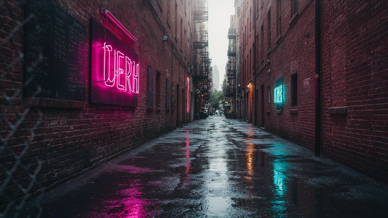
Beyond The Camera App: The True Capture Controls
Manual ISO And Shutter Speed Adjustments
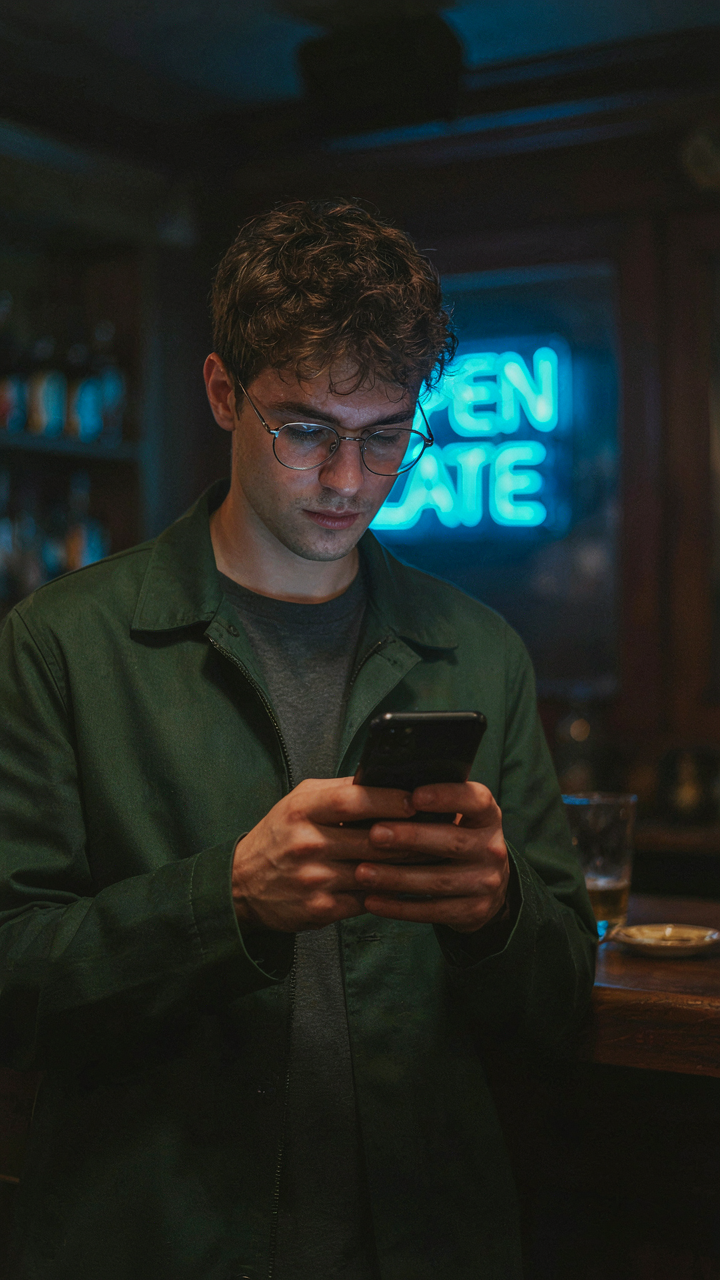
You want control because the default camera app treats neon like a problem to solve rather than a subject to expose for. The mechanism is simple: neon emits light, so your phone’s auto exposure reads it as “bright” and kills the color by underexposing everything else. Manual ISO and shutter speed let you override that logic.
ISO controls sensor sensitivity. Higher ISO brightens the frame but introduces noise. For neon, start at ISO 400 to 800 in low light, then adjust down if the surrounding environment blows out. Shutter speed determines how long light hits the sensor. Slower speeds gather more light but risk motion blur. Use 1/30th to 1/50th of a second for stationary neon signs. Apps like Halide and ProCam give you these controls the native camera app withholds.
Locking Exposure And Focus For Consistent Results
Most photographers waste time retaking shots because they didn’t lock exposure before pressing the shutter. Tap and hold on your subject in the native camera app to lock both exposure and focus simultaneously. This prevents the phone from recalculating mid-frame and losing the neon’s color saturation.
Locking exposure works because it holds the metering value constant across multiple shots. Frame your neon sign, lock on a mid-tone area of the neon itself not the dark sky, then shoot. This method removes the variable of your finger position triggering a recalculation. Do this every time before you shoot neon. No exceptions.
The Good Vibes Neon Luminance Leverage System
How Light Intensity Drops With Distance
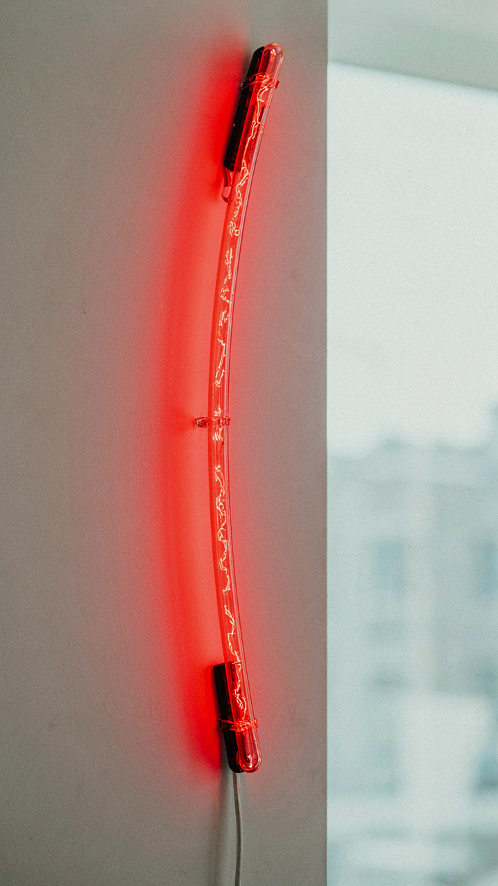
You want this shot to look effortless, like you found the perfect angle without trying. The real constraint is physics, not your phone. Light from a neon sign follows the inverse square law: intensity drops proportionally to the square of distance from the source. Double your distance, and the light hitting your sensor becomes one quarter as bright. This isn’t opinion. This is why proximity to the neon sign determines whether your iPhone captures saturation or gray mush.

Most people back away from neon thinking it will reduce glare. They’re wrong. Backing away starves your sensor of the photons that create color. At three feet, a neon tube reads as vivid. At eight feet, it reads as dim and washed out. Your iPhone’s computational photography then crushes the blacks to compensate, killing contrast entirely. The mechanism is simple: move closer to the neon, not further away.
Position And Angle Shape How Light Reaches The Lens
The angle between you, the neon, and ambient light determines whether color pops or flattens into the background. Physics calls this the angle of incidence. For neon photography, think of it as the angle at which direct neon photons hit your lens before they scatter into room light. Shoot perpendicular to the tube and you intercept pure neon. Shoot at shallow angles and you catch scattered light mixed with ambient glare. One creates separation. The other creates soup.
Distance and angle work together, not separately. Position yourself 12 to 18 inches from the neon, perpendicular to the tube’s length, with the sign slightly above your eye line. This geometry maximizes direct photons while minimizing reflected room light from bouncing back into your lens. Adjust your position by inches, not feet. Your iPhone’s sensor will respond immediately. Shoot at this distance and angle first, then test variations only after you confirm the baseline works.
Mastering Glare: The Anti Reflex Protocol
Polarizing Filter Hacks For IPhone Lenses
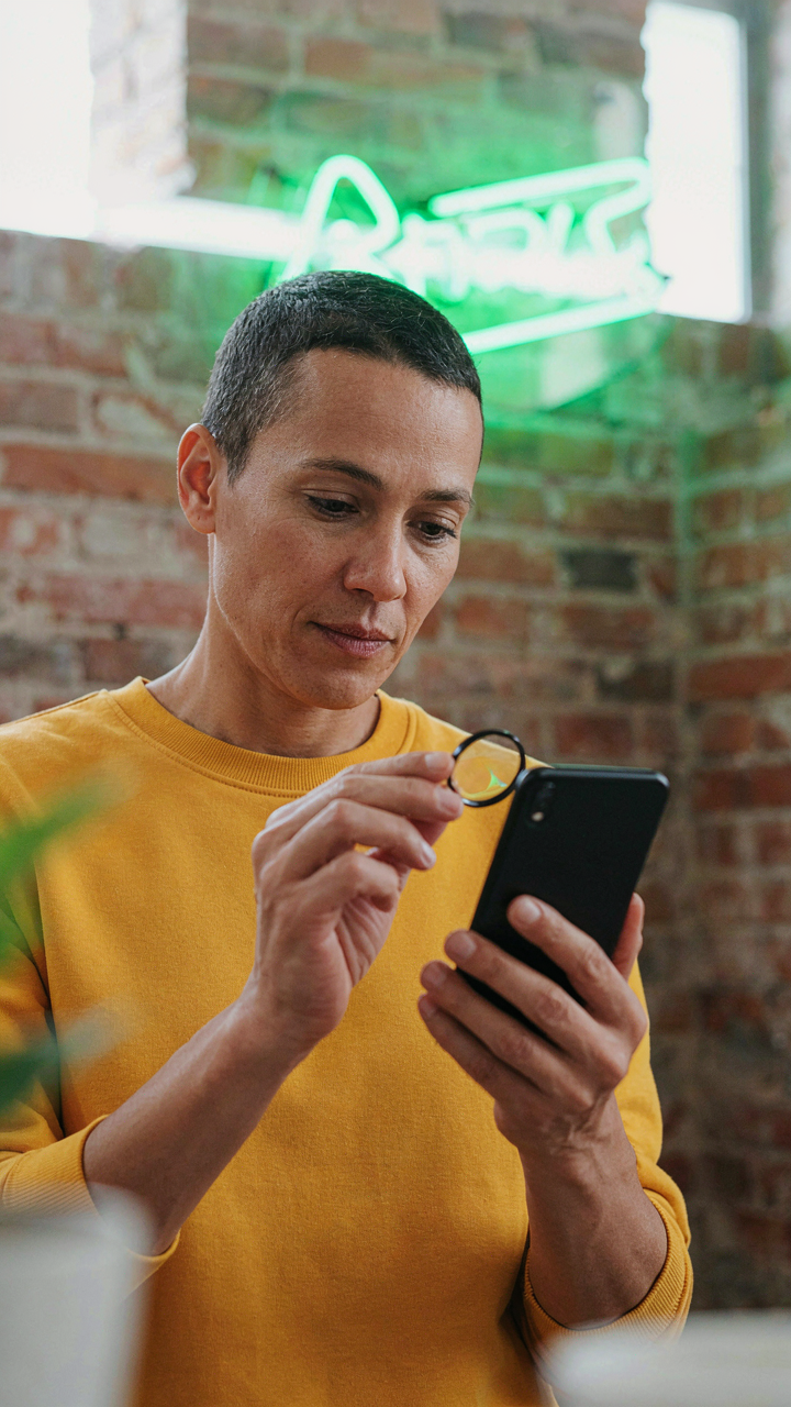
You want the shot to look professional so people believe you know what you’re doing. The real problem: iPhone lenses have no native polarization control, so reflections off neon glass bounce straight into your sensor unchecked. Optics calls this specular reflection, and neon signs are basically perfect mirrors for it. A clip on polarizing filter rotates light waves to block reflections at specific angles. Mount it over your iPhone camera and rotate it until the glare vanishes. The neon color stays vivid because you’re only blocking reflected light, not the light the neon actually emits.

Most people buy cheap filters and wonder why they still get washed out shots. Quality matters here because a weak polarizer leaves residual glare and kills contrast. Buy a circular polarizing filter designed for phones, not a square one meant for DSLRs. Position it flush against the lens with no gap. Rotate it slowly while looking at your screen preview, stopping when reflections disappear and color saturation peaks. This rotation is the mechanism. Stop when the neon pops.
Strategic Positioning To Avoid Direct Reflections
The common advice says shoot perpendicular to the sign. That’s incomplete. Physics tells us angle of incidence equals angle of reflection, meaning light bounces off a surface at the same angle it hits it. If you shoot straight at neon glass, reflections bounce straight back into your lens. Reposition yourself so the angle between your lens and the sign’s surface changes. Move left or right until your camera angle breaks the direct reflection path.
Shoot at roughly 35 to 45 degrees off perpendicular to the sign’s face. Your body or the wall behind you absorbs the reflected light instead of your sensor catching it. Combine this angle shift with your polarizing filter for maximum control. Step back and zoom in rather than moving closer, since zooming preserves your angle advantage while reducing the lens’s field of view to isolate the sign. Check your preview after every adjustment. The glare drops when positioning and filtration work together, not separately.
Color Theory In Practice: Beyond Basic Hues
Complementary And Analogous Color Schemes
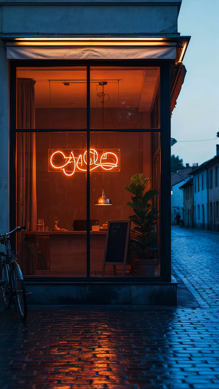
You want people to believe your neon photos are technically sophisticated, so you’re hunting for a framework that sounds credible. Here’s the mechanism: color theory borrowed from painting uses the color wheel to predict what combinations read as harmonious or electric. On your iPhone screen, complementary colors—those opposite each other on the wheel—create maximum contrast. A magenta neon sign against a cyan sky doesn’t need editing tricks to pop. It’s physics, not luck. Analogous schemes use colors next to each other on the wheel and feel intentional rather than accidental.

The mistake most people make is treating color harmony as decoration. It’s not. The neon sign’s actual hue determines what background or secondary light source will make it readable without glare. Red neon against warm orange ambient light dies. Red neon against cool blue shadows punches through the frame. Your iPhone’s camera sensor sees these relationships the same way human eyes do, which means you’re not fighting the device, you’re using its default behavior. Choose your location’s existing light palette first, then frame the neon sign within it.
White Balance As A Vibration Control
White balance is where most iPhone neon photography fails without anyone naming why. Your phone’s automatic white balance tries to neutralize color casts, which means it actively suppresses the neon’s saturation to hit a “correct” neutral gray reference. The solution isn’t better editing. The solution is manual white balance before you shoot. Open your camera app, tap to focus on the neon itself, then swipe up or down to adjust the temperature slider. Push it toward cool if you want the neon to read colder and more electric. Push it warm if the neon is already cool-toned and you want contrast.
The technical principle here: white balance doesn’t change the light hitting your sensor. It changes how the camera interprets which wavelengths count as neutral. By locking white balance to the neon rather than the scene, you’re telling the processor to treat the neon’s frequency as the reference point, not the surrounding darkness. This forces complementary colors in the frame to shift further apart, creating depth without saturation boosting in post. Tap the neon, adjust the slider until the secondary light sources look intentional rather than corrected, then lock that setting before you frame the shot.
The Dark Red Wallpaper Effect: Composing For Impact
Where The Neon Actually Lives In The Frame
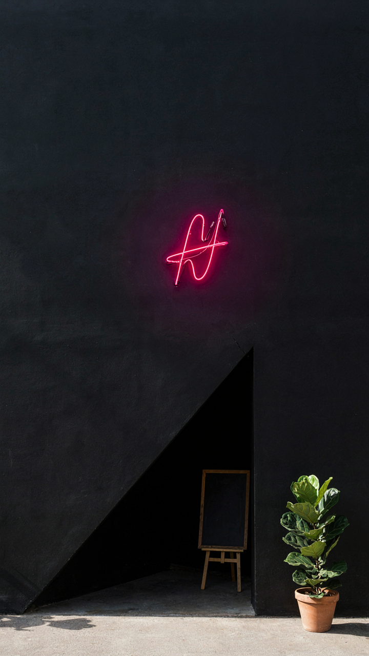
You want your neon to dominate the shot without looking staged. That’s the real motive here—control. Composition in photography borrows from architecture: load-bearing walls determine where structure goes, and in framing, visual weight determines where the viewer’s eye lands first. Your neon sign is the load-bearing element. The rule of thirds doesn’t make neon pop; it makes neon predictable. Negative space does the work. Place the sign off-center, leaving void around it. The darkness amplifies the glow.

Leading lines work backward in neon photography. You don’t guide the eye to the subject; you guide it away, then force it back through contrast. A dark doorway, a black wall, a shadow line—these create paths that terminate at your neon. The mechanism is simple: the eye tracks into darkness and hits color like a wall. Compose so the neon interrupts the path, not follows it. This reversal is why most neon shots feel flat. You’re fighting composition instead of weaponizing it.
Strategic Placement Beats Centering Every Time
Centering a neon sign reads as documentary, not intentional. The camera doesn’t care about symmetry—your viewer’s brain does, and it tunes out symmetry instantly. Offset the neon to one side of the frame, then stack visual weight on the opposite side with shadow or architectural depth. This imbalance triggers engagement because the eye searches for equilibrium. A centered neon sign wastes the frame’s real estate.
Framing determines how much context the viewer processes before hitting the neon. Tight framing isolates the sign and forces maximum contrast against black. Wide framing shows environment, which dilutes impact—useful only if the environment itself adds narrative weight. The decision hinges on one question: does the surroundings enhance the neon’s dominance, or compete with it? If it competes, crop it out. A tight frame around pure glow outperforms a wide shot every time. Your iPhone’s edge constraints become an asset, not a limitation.
Post Processing With Purpose: Neon App Logo Edits
Selective Color And Glow Recovery
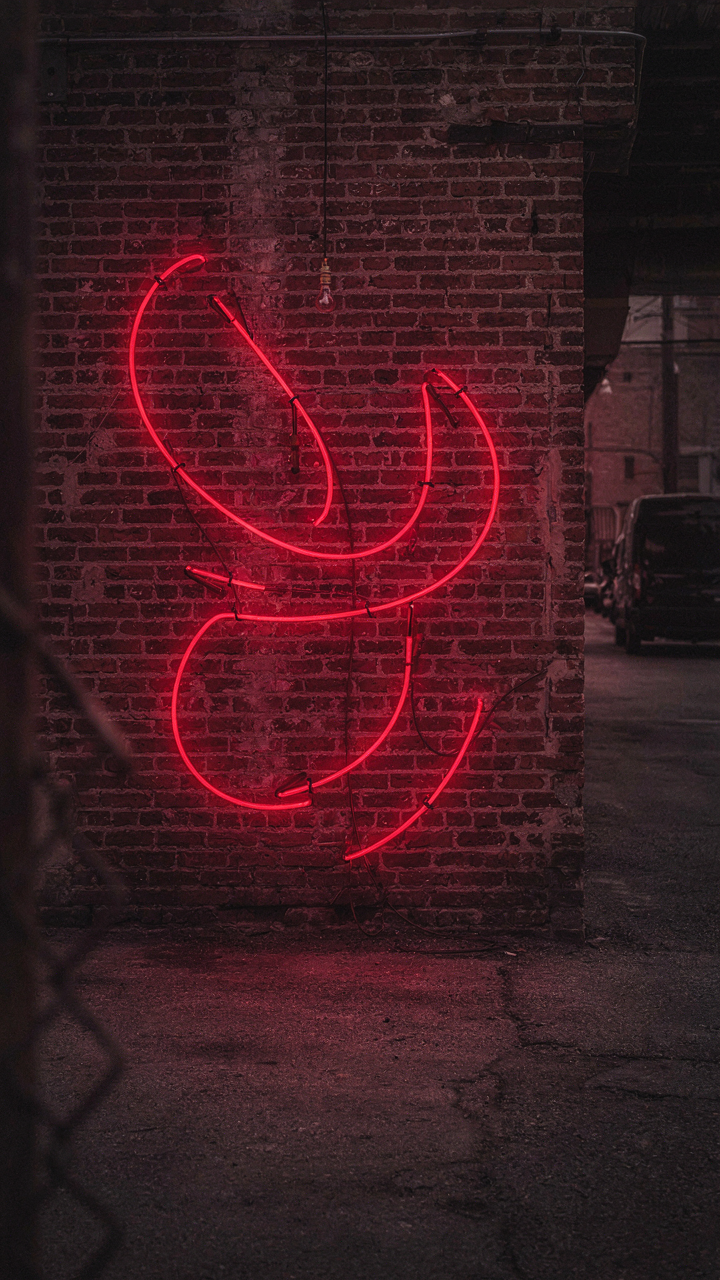
You want this section to validate that your phone can produce gallery-quality results. Here’s the truth: it can’t without surgical editing. The mechanism is simple. Your iPhone’s sensor captures neon accurately but its processing engine compresses dynamic range to protect highlights. You’re fighting its own decisions.

Start in Lightroom. Increase shadows by 15-25 points to pull detail from the dark areas around the neon tubes. Drop highlights by 10-15 to prevent the brightest neon from clipping into pure white. This counteracts the phone’s instinct to crush contrast. The glow isn’t added here. It’s revealed by restoring what the phone buried.
Saturation is where amateurs fail. The common advice says increase it uniformly. Don’t. Use Lightroom’s color range tool to target only the neon’s specific hue. Increase that channel by 20-35 points while leaving surrounding colors alone. This prevents the background from becoming artificial. The neon pops because it’s isolated, not because everything screams louder. If you lift global saturation, you’re broadcasting that the image is edited.
Vibrance is different from saturation and most photographers confuse them. Vibrance adds color intensity to muted tones while protecting skin tones and reds from oversaturation. For neon, increase vibrance by 10-20 points after you’ve handled selective saturation. This adds dimensionality without the flat, filter-app appearance. The neon reads as illuminated, not painted.
Noise And Detail Preservation
Noise reduction and sharpening feel contradictory because they fight each other, but they’re competing in different frequency ranges. Think in terms of signal to noise ratio from electrical engineering. Your neon signal is the edge definition and color information. The noise is random pixel variation from the phone’s sensor in low light. You remove one without destroying the other by working on separate layers.
- Luminance Noise Reduction: Lower values first. Start at 30-50 in Lightroom to target brightness noise without softening edges. Most photographers crush this slider too hard and create a plastic look.
- Color Noise Reduction: Set this to 70-90 immediately. Color noise is the random red, blue, and green speckles that destroy neon’s clean color appearance. It’s safe to be aggressive here without losing detail.
- Texture Sharpening: Increase to 1.2-1.5 after noise reduction completes. This targets mid-tone details and edge contrast. Too high and you’ll sharpen noise back into the image. Too low and the neon lacks punch.
- Masking In Lightroom: Use the masking slider set to 15-25. This tells Lightroom to sharpen only edges and skip flat color areas. Without it, sharpening adds grain to the smooth neon colors.
- Clarity For Glow Definition: Increase by 15-25 points to enhance the boundary between neon and background. This simulates the light halo effect without creating artificial contrast throughout the frame.
Apply these moves in order. Noise reduction first, then sharpening, then clarity. The sequence matters because each step builds on what came before. If you sharpen before removing noise, you’re sharpening the grain. If you apply clarity first, it can amplify luminance noise. After you finish these steps, export as JPEG at quality 90. Anything lower compresses the neon’s color information into visible bands. Anything higher wastes file size without improving the image beyond what your eye can detect.

The “Colorful Neon Flower Design” Principle Of Light Flow
How Photons Actually Behave On Glass And Phosphor
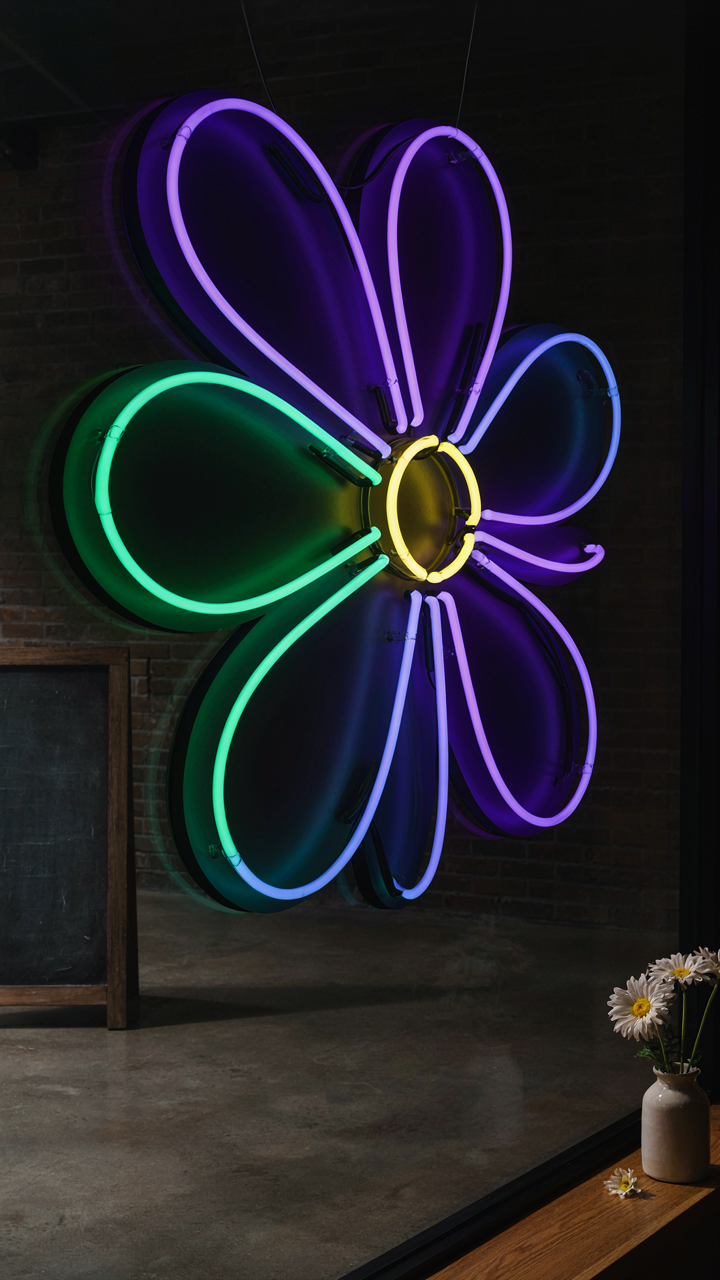
You want this section to validate that your iPhone can compete with professional equipment. It can’t without understanding what’s actually happening. Physics calls this the interaction of electromagnetic radiation with matter, and neon signs operate on the same principle: photons strike a surface and either absorb, scatter, or transmit through it. Your iPhone sensor captures whatever photons reach it. The tube’s phosphor coating doesn’t emit light uniformly in all directions. It sprays photons outward in a specific pattern based on the gas pressure inside and the electrode voltage. That pattern determines whether you get color saturation or blown-out white wash on your screen.
The glass tube itself acts as a secondary reflector. When photons hit the curved surface from inside, some escape directly to your lens. Others bounce internally before exiting, which delays their arrival and reduces contrast. This is why angle matters more than distance. Shoot perpendicular to the tube’s length and you intercept the densest photon stream before internal reflections scatter the signal. Shoot at an acute angle and you’re capturing bounced light mixed with direct emission, which flattens color and introduces glare into your frame.
Angle And Distance Control The Light Diffusion Pattern
Stop adjusting your phone’s exposure slider and move your position instead. The common advice treats lighting as a single variable you fix in post. It’s not. Distance from the neon directly controls photon density at your sensor. Closer proximity means more photons per unit area, which saturates your sensor faster and forces it to lower the exposure automatically. This kills detail in shadows and creates the washed-out look people blame on their iPhone.
The optimal setup is counterintuitive: move back until the neon occupies roughly 40 to 60 percent of your frame, then angle your phone so the tube runs diagonally across your viewfinder. This geometry spreads photon impact across more sensor pixels and prevents any single area from over-clustering. Your camera’s exposure algorithm now reads an average that preserves both the bright neon and the surrounding dim space. Lock exposure on the tube’s brightest point, then reframe. You’ve just inverted the standard workflow and gained direct control over how diffusion happens at the hardware level.

Beyond The Shot: Protecting Your Neon Photos App Icon Quality
Export Settings For Social Media And Print
You care about this because you want the neon shots you spent time perfecting to look identical everywhere they appear, and most people export wrong and never know it. Export is where compression destroys the color saturation and glow that made the neon worth shooting. iPhone’s native Photos app exports JPEG at 80% quality by default, which flattens the deep blacks that define neon contrast. That’s the mechanism: aggressive compression kills the halo effect and color punch the moment you share.
Use ProPhoto RGB color space when exporting to print, sRGB for social feeds. Print requires wider gamut because physical ink displays colors differently than screens. Social platforms compress further, so start with maximum quality on export then let the platform degrade it predictably. Export at 100% quality JPEG minimum for any permanent archive. The difference between 80% and 100% is invisible on screen but visible in print enlargements where neon glow flattens into muddy highlights.
Cloud Storage And Backup Strategies
The common advice to “backup everything” misses the real problem: not all backups preserve the metadata and color profile that neon photos depend on. iCloud Photos compresses to HEIC format by default, which strips embedded color space data. That matters because when you retrieve the file later, the neon colors shift because the device doesn’t know how to render them. The mechanism is metadata loss, not storage loss.
Store original RAW files in a service that preserves full color profiles without conversion. Backup Pro or similar tools that maintain EXIF and color space data cost nothing and prevent the silent corruption that happens in standard cloud backups. Keep a local copy on an external drive formatted to ExFAT so you can access the originals from any device without degradation. Test retrieval quarterly by pulling a file back and comparing it to the original on your phone before you need it.

The Obstacle Isn’t Your IPhone’s Camera; It’s Your Refusal To Master Light, Not Gear
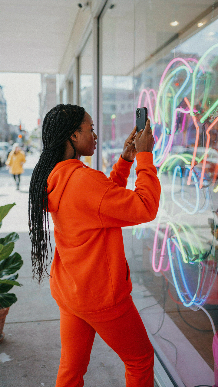
Stop waiting for a better phone. You already have the tool. What you lack is the discipline to understand how light behaves against neon, how angles kill glare, how positioning transforms ordinary shots into portfolio work. Tonight, find one neon sign near you. Shoot it from three different angles with your phone’s existing settings. Study what changes. This one small act of actual experimentation teaches you more than reading ten articles ever will. The camera doesn’t separate amateurs from professionals. Obsessive observation does.