The Archival Method: From Digital Clutter To Curated Legacy
Photos With Narrative Arcs
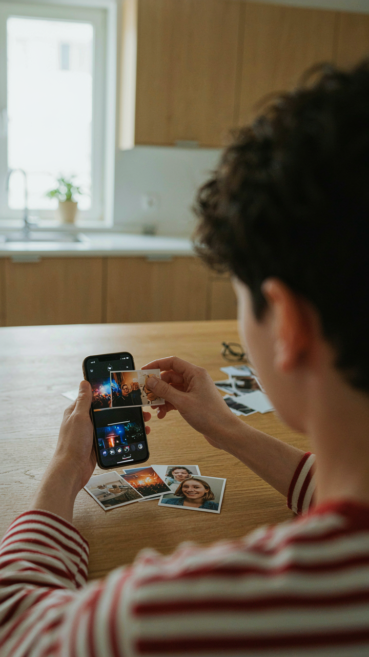
You want to believe your phone contains memories. The truth is simpler: it contains evidence of moments, most of which blur together into white noise. A collage forces you to pick the ones that actually meant something, which means confronting which moments didn’t. The mechanism is selection by consequence. You’re not just arranging photos—you’re deciding which moments changed the trajectory of a day, a relationship, a season.
Narrative arc is borrowed from storytelling, and it works identically in collage. Your photos need tension, shift, and resolution, not just chronological sequence. Start with the moment before something happened, place the moment it happened, end with the aftermath. This isn’t artistic—it’s how human memory actually works. Your brain doesn’t store random snapshots. It stores cause and effect.
Chronological Storytelling Through Layout
Most people arrange collages by aesthetic matching—colors next to colors, sizes by symmetry. This kills the story. Chronological layout preserves the actual sequence of events and forces viewers to read left to right, top to bottom, experiencing your narrative in real time rather than as decoration. Time has a direction. Your collage should respect it.
Use your phone’s grid-based collage tools to anchor photos to positions that mirror how readers consume visual information. Place the first frame top left, the climax in the center, the resolution bottom right. This isn’t random. Western readers process information directionally. When you align your photos to that direction, the story becomes invisible—people feel it rather than analyze it. The collage becomes a record instead of a collection.
Instagram Collage: Beyond The Highlight Reel
When Theme Overrides Randomness
You want people to think your life is curated and intentional. That’s the real reason you’re reading this. The mechanism is simple: Instagram’s algorithm favors posts with engagement velocity, but the actual engagement comes from coherence, not perfection. A collage without theme reads as clutter. With theme, it reads as narrative. Narrative drives stops, saves, and shares.

A themed collage uses constraint the way a sonnet uses meter. You’re not showing everything that happened. You’re showing everything that happened through one lens. This could be color, time of day, activity type, or emotional tone. The iPhone’s native Photos app lets you build collages in minutes, but most people skip the filtering step and dump eight random images together. That’s the lazy move. The effective move demands you delete aggressively first, then arrange what’s left.
Signal Versus Noise In Your Feed
People confuse “authentic” with “unfiltered.” That’s backwards. Authenticity isn’t about showing struggle or mess. It’s about showing consistency. A collage of five images where three are identical lighting conditions and two break the pattern reads as chaotic, not real. The common advice says “be yourself.” That’s incomplete. You need to be a version of yourself that holds shape. When you build a collage with intention, you’re not being fake. You’re being legible.
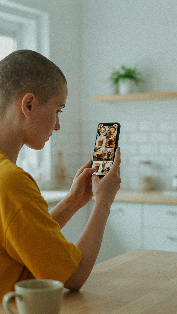
The tactical step is this: before you shoot, decide what the collage theme is. Then shoot variations of that theme, not variations of your day. Shoot the coffee cup from five angles. Shoot the location at different times. This creates visual consistency your audience registers as trustworthy. When you post the collage, the caption doesn’t need to explain the connection. People should see it immediately. If they don’t, you’ve built the collage wrong, not the caption.
Photo Collage Wallpaper: Your Daily Visual Manifesto
Design Wallpapers That Reinforce Personal Goals
You want your phone wallpaper to signal something about who you are to people who barely look at it. Here’s what actually works: psychology calls this “environmental priming,” and your collage wallpaper is a direct application of it. The mechanism is simple. Your brain processes visual information before conscious thought kicks in. A collage wallpaper placed where you see it dozens of times daily trains your attention toward specific patterns and associations. This isn’t motivation. This is rewiring.

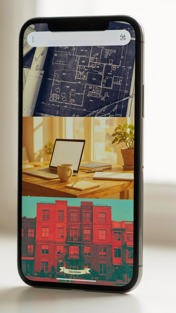
The tactical setup requires specificity. Pick three to five images that represent a concrete goal or identity trait you’re building, not vague aspirations. A collage mixing architecture photography with your own work projects reinforces a builder identity differently than generic “success” images. The arrangement matters. Place goal-related imagery in the upper third of the screen where notification badges and app icons won’t obscure it. Use iOS’s built-in Photos app to crop and arrange. Save it to your camera roll. Set it as your lock screen. Repetition is the only variable that drives the effect.
Imagery Priming Your Subconscious Choices
Priming works because your decisions follow patterns you don’t consciously track. Before you decide anything, you’ve already been influenced by what you’ve seen recently. A collage wallpaper operates as ambient decision architecture. If your wallpaper contains images of focused work environments, your phone becomes a cue that redirects your scrolling behavior. If it contains people mid-conversation or problem-solving, you’ll unconsciously gravitate toward collaborative tasks. The image selection is the whole game.
Build your collage around sensory contrasts, not emotional ones. Mix sharp lines with organic shapes. Combine bright areas with shadow. Include one element that makes you pause or question it slightly. This prevents habituation, the psychological phenomenon where your brain stops processing familiar stimuli. When habituation sets in, the priming effect drops to zero. Rotate your collage every three to four weeks using the same three to five core images but rearranging them. Change triggers recalibration. Your subconscious reengages with what it previously tuned out.
How To Make A Picture Collage On Phone: The Efficiency Protocol

Choose Before You Build
You want to believe the tool matters more than the decision. It doesn’t. Most people waste time in the app because they never decided which photos work together before opening it. This is a selection problem masquerading as a design problem. Borrowed from manufacturing, this is your “upstream quality control”—garbage input guarantees garbage output, no app fixes it.

Open your camera roll and mark three to six candidates before touching a collage app. Ask one question per image: does this photo tell part of the same story as the others? Remove anything that competes for attention or contradicts the mood. The app becomes a assembly line, not a brainstorming session. Speed happens when you’ve already won the hard part.
Navigate Template Logic Fast
Common advice tells you to “explore all the templates.” Wrong. Most templates do the same work with different layouts. Pick one template structure that matches your photo count, then stop browsing. Apps like Unfold, PicCollage, and Layout from Instagram all use grid-based or asymmetric systems. You’re not looking for inspiration. You’re looking for a container that doesn’t fight your images.
Open the app, select template, drop photos in order, adjust spacing if needed, export. That’s the protocol. Templates exist to eliminate decisions, not multiply them. When you treat a template as a starting point instead of a destination, you add steps that kill momentum. Lock in a template choice and move through execution without second-guessing the frame.
The Visual Hierarchy Framework: Influence Through Arrangement
How Grouping Controls What People See First
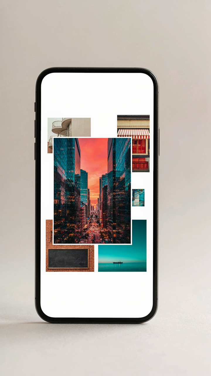
You want your collage to feel intentional because randomness reads as careless. The real mechanism comes from Gestalt psychology, which studies how brains organize visual information into patterns. In collage work, proximity is your primary tool: objects placed near each other get read as a single unit before the eye registers them as separate images. This isn’t decoration theory. This is how perception works.

Most people space photos evenly and call it balanced. That’s the opposite of what works. Cluster related images tight, then drop white space between clusters. Your brain groups the tight cluster as one idea, the separate cluster as another. The iPhone collage apps that force equal spacing are deliberately handicapping you. Ignore the presets and manually adjust spacing to create zones.
Where The Eye Lands First And Why
Composition doesn’t mean making things look nice. It means controlling the sequence of attention your viewer moves through. The top-left corner is where Western readers begin. A large or contrasting image there gets locked in as the entry point. From there, eyes travel right, then down and left in a Z pattern. You’re not creating a composition. You’re creating a navigation system.
Size contrast amplifies this effect harder than color contrast does. A single large photo surrounded by smaller ones acts as a visual anchor. The viewer has no choice but to process the large image first. After that, the smaller images feel supplementary, contextual. Stack your strongest image in the dominant position, then fill supporting positions with secondary content. This sequence determines whether someone understands your message or scrolls past confused.
Instagram Photo Dump Layout: Curated Chaos, Not Just Randomness

The Grid That Hides Its Rules
You want people to think you don’t care, which means you care more than anyone else about the layout. The mechanism here borrows from graphic design’s figure-ground principle: your eye needs anchors, not noise. A true photo dump on Instagram isn’t random images thrown together. It’s a deliberate constraint system where you choose which images dominate (figure) and which recede (ground). This separation creates the illusion of spontaneity while doing the actual work of directing attention.

Most advice says “just mix it up.” That’s lazy. What works is establishing a visual weight distribution before you shoot. Decide which 2-3 images will be larger or more saturated, then build smaller, duller shots around them. The iPhone’s native collage tools let you lock aspect ratios, but you control what goes where. That choice is everything. When you place a bright phone screen next to a dark coffee cup, the phone pulls focus. Build your layout around what you want seen first.
Creating Momentum Through Image Placement
The second mistake people make is treating each grid square as equal real estate. It isn’t. In reading patterns across Western layouts, the eye enters top-left and moves right, then drops to the next row. Use this. Place your strongest image in position one or two. Then use smaller, supporting shots to guide the viewer deeper into the story. Your third or fourth image should create a natural pause, a reason to stop scrolling and double-tap.
Rhythm in collages works like pacing in writing. Repetition builds familiarity, but breaks create interest. If you have five photos of the same subject, separate them. Put a texture shot or detail image between repeating elements. The iPhone’s photo grid editor lets you adjust spacing between images. Tighter spacing = tension. Looser spacing = breathing room. Alternate these to match your emotional intent. When you post, that pacing becomes the reason someone stops on your post instead of swiping past it.
Lots Of Photos In One Frame: The Narrative Density Hack
Compressing Time Into A Single Visual Statement
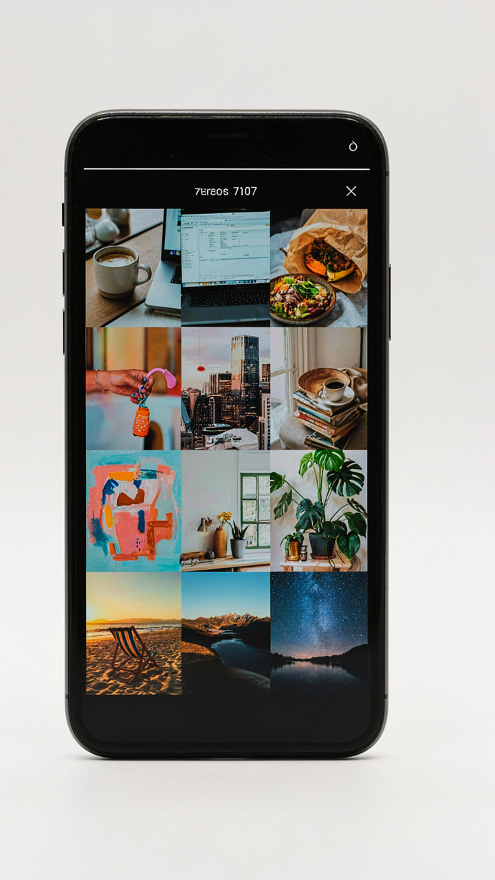
You want people to see your story without scrolling through ten individual posts. That’s the real driver here. The mechanism is narrative compression: borrowing from film editing, you’re treating each photo placement as a cut in a sequence, stacking temporal depth into spatial arrangement on one screen.

Most people throw random photos together and call it a collage. That’s lazy. When you compress a timeline intentionally, you force the viewer to read causation instead of just seeing moments. The iOS Photos app’s collage feature, or third-party tools like Unfold or Canva, lets you arrange shots in reading order—top to bottom, left to right—so the eye follows the arc of what happened. Each cell becomes a frame in a visual narrative.
Layering Feeling Through Concentrated Imagery
Emotion doesn’t live in single moments; it lives in the contrast between them. When you stack multiple shots in one frame, you’re not diluting impact—you’re amplifying it through juxtaposition. A wide shot of a location next to a close-up of a reaction creates cognitive friction that a solo image cannot.
The collage format forces selection. You cut the fluff and keep only the shots that carry emotional weight. This is different from a carousel post where weak photos can hide between strong ones. Every cell in a grid has equal visual real estate, so weak imagery screams. Arrange your strongest reaction shot last, offset it slightly larger if the tool allows, and let the preceding photos build toward that payoff. The viewer’s eye stops there.
Group Photo Collage Ideas: Beyond Faces, Towards Shared Purpose

Leverage Through Constraint, Not Volume
You want the collage to make you look like you belong to something bigger than yourself. That’s the real driver here. Military strategy calls this force multiplication: achieving disproportionate impact by channeling resources through a specific structure rather than spreading them thin. In iPhone collages, this means treating the frame as a constraint that forces intentional positioning, not a container you fill with bodies.

The mistake is assuming more faces equal more impact. They don’t. A tight 4-photo collage where each person occupies a distinct quadrant and serves a visual role outperforms a chaotic 9-photo dump every time. The constraint forces you to cut people who don’t advance the narrative. That friction is the mechanism. Position people by function within the frame—anchor figures at corners, secondary figures filling negative space—and the collage reads as organized rather than just collected.
Memory Structure Versus Random Assembly
Building shared memory requires deliberate sequencing, not alphabetizing faces or throwing images into a grid. This is the real work most people skip. You’re not just grouping—you’re encoding the hierarchy of moments and relationships into the visual order itself.
- Chronological Flow: Arrange photos left to right, top to bottom, following the actual timeline of the event. This mirrors how the eye reads and helps viewers reconstruct the narrative without explanation.
- Role-Based Positioning: Place people who initiated the gathering or hold central roles in primary visual positions—typically the center or dominant quadrant. Peripheral members occupy edge positions. This encodes status and function directly into layout.
- Emotional Peaks as Anchors: Identify the moment with the highest emotional charge or clearest shared expression and make it one of your primary images. Build the sequence around it, not away from it.
- Repeated Elements Across Frames: Include consistent visual markers—the same location, recurring gestures, matching clothing—across multiple images in the collage. This stitches disparate moments into a coherent whole and signals intentional curation.
- Before and After Pairs: Use two photos that show transformation or progression within the group, like arrival versus departure or serious versus celebratory states. This documents change and deepens the memory beyond static moments.
The second image you choose matters as much as the first because it establishes the interpretive frame for everything that follows. Social posts with collages that follow this structure get shared more because people recognize themselves in a structure, not just in a face. When you post, the collage becomes a map others can navigate and remember by.
Wallpaper With Pictures: A Daily Dose Of Deliberate Intention
Transform Your Screen Into Motivational Canvas
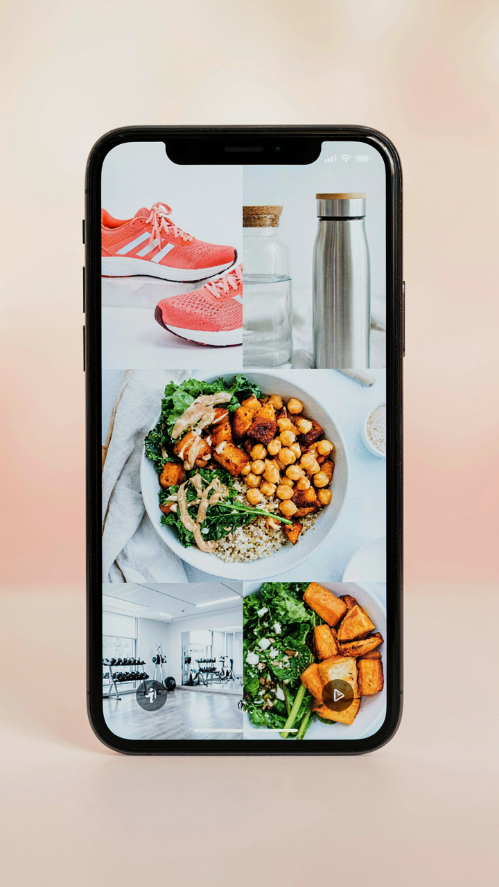
You want your lock screen to remind you who you’re becoming instead of who you were yesterday. Here’s the mechanism: your phone’s lock screen is real estate you see between 50 and 150 times per day. Most people waste it on a default Apple image or a random photo. A collage as your wallpaper works like a variable ratio schedule in behavioral psychology. Each unlock triggers exposure to your chosen visual hierarchy. The collage format multiplies this effect because multiple images create pattern recognition. Your brain stops filtering it as background noise and starts processing it as instruction.

Build your collage to mirror your stated priorities, not your aspirations. If you claim health matters but your wallpaper shows travel photos, the disconnect sabotages consistency. Use iPhone’s native collage tools or a third-party app to arrange 4 to 9 images in a grid. Include one anchor image representing your primary goal, then surround it with supporting visuals. Make the colors cohesive so the collage reads as one unified message rather than scattered inspiration. Your brain will reinforce this image thousands of times before you consciously notice it’s working.
Update Regularly For Evolving Purpose
The mistake most people make is treating wallpaper collages as permanent decorations. They become invisible within two weeks. Treat your wallpaper like a quarterly reset aligned to your actual goals, not your January fantasy. Every 60 to 90 days, audit what changed in your life and rebuild the collage. If you completed a project, remove it. If a new priority emerged, add it. This forces you to stay conscious of your direction instead of operating on autopilot.
The update cadence matters more than the aesthetics. Set a calendar reminder for the same day every quarter. When the reminder hits, spend 15 minutes rebuilding your collage from scratch. Don’t settle for rearranging the same images. Find new photos that represent your current position and next position. Screenshot it, set it as your lock screen wallpaper, and let the repetition rebuild your neural pathways around the updated priority. This single act kills the drift that happens when intention becomes passive.
The Real Obstacle Isn’t The App; It’s Your Inability To Define What Truly Matters

Every collage app floods you with filters and templates because most people don’t know what story they’re actually telling. You grab photos, throw them together, post it. Then nothing happens. The real work starts before you open your phone. Ask yourself what emotion you want people to feel when they see this. What do these specific images say about you? Most creators skip this step and wonder why their content gets ignored. Define your message first. Then build the collage around it. Your audience doesn’t care about perfect layouts; they care about why you made it at all.