
Introduction
Purple aesthetic ideas play an important role in creating eye-catching designs for digital marketing and electronics. Using purple themes helps grab attention and create a unique brand identity. Purple blends creativity and technology, making it suitable for online campaigns and electronic product design.
This article covers how you can use purple in digital marketing effectively and how electronics designers implement purple themes in their work. You will learn practical tips and see real-world examples that help you apply purple color smartly for your projects.
Purple Theme Benefits For Marketing

Purple is an interesting color for marketing because it carries quite a few powerful associations. Traditionally, purple symbolizes luxury, creativity, and mystery. In digital marketing, these qualities can shape how your audience perceives your brand. Customers may see purple-themed campaigns as more sophisticated or unique, which can grab attention where simpler colors might blend in.
But it’s not just about symbolism; purple can affect mood and decision-making. Studies have found that purple tends to evoke feelings of calmness and luxury, which might subtly push buyers toward premium products or services. For example, brands like Cadbury and Hallmark have used purple to convey richness and exclusivity in their advertising, supporting stronger brand recall.

Still, it’s worth asking: Does purple always work? It might depend on your audience’s preferences or industry expectations. Some data suggests purple-themed ads led to a 20% higher engagement rate in beauty and wellness sectors. So, using purple thoughtfully could enhance your outcomes, but it’s not a guaranteed fix across the board.
Uses Of Purple In Digital Marketing
Purple shows up in many digital marketing areas. Websites often incorporate purple for headers, buttons, or backgrounds to create a distinct look. Ads might feature purple hues to stand out in crowded feeds, especially on platforms like Instagram where color plays a big part in catching the eye. Social media pages use purple in logos or banners to reinforce brand identity.
Some industries lean into purple more than others. Beauty and fashion brands use it for its luxurious feel, while tech companies might choose purple to hint at innovation and creativity. For instance, Twitch, a major streaming platform, uses purple as its core brand color to appeal to a youthful, creative audience, making the channel feel vibrant and welcoming.
Examples Of Purple In Electronics Design
Purple isn’t confined to just marketing visuals; electronics designers incorporate it both in product design and interfaces. Some gadgets feature purple accents or cases to stand out on shelves—think of certain headphones or gaming peripherals boasting purple lights or shells. Interface designs use purple to highlight key elements or menus, helping users navigate intuitively while keeping the visuals fresh.
Examples include smart devices that use purple lighting to suggest calmness or futuristic vibes, which can help differentiate products in a competitive electronics market. Even wearable tech sometimes embraces purple in its display or strap designs, offering users a choice that feels both modern and stylish.
How To Create Purple Themes


Making a purple color scheme is usually easier than you might think, but it does invite some care. Start by deciding the mood you want to convey—purple’s range can feel regal, mysterious, or even playful.
When selecting shades, pick a base purple, then experiment with lighter and deeper tones for depth. Too many hues can clash, so limit your palette to 2 or 3 purple variations. Balance is key—don’t let purple dominate all space; introduce neutrals or subtle accents to avoid overwhelm.
Color pairing can enhance or soften the purple. Think about pairing purples with soft grays for tech designs or gold and cream for luxury marketing. Tools like Adobe Color or Coolors help you explore shades and harmonious pairings quickly. Even simpler apps like Canva offer premade purple palettes if you want a fast start.
It’s tempting to pick a bold purple and go wild. But hesitation can be good; test shades on different screen types. Purple changes a lot under various lights and displays, so checking your choice beyond your monitor ensures consistency.
Choosing Purple Shades

Purple isn’t just one color; it ranges from soft lavender to deep violet. Lighter purples often feel calming and gentle—great for wellness or feminine brands. Dark purples can emphasize luxury, mystery, or power; they’re useful when you want an elegant or serious tone.
Mid-range purples strike a balance, often feeling creative and imaginative. Keep your audience in mind. Electronics designs may benefit from cool-toned purples to imply high-tech reliability. Meanwhile, marketing targeting youth might lean toward brighter or more vibrant purples.
Be mindful of cultural associations too. Purple can imply spirituality or nostalgia, which might or might not suit your project’s goal. Also, watch the saturation—muted purples often feel more sophisticated than overly bright ones.
Purple Color Combinations
Pairing purple wisely makes it pop without feeling loud. Neutrals like white, gray, or black anchor the design, letting purple shine without overpowering users. You might also find purple and yellow offer a vibrant contrast, with yellow energizing the more subdued purple.
Think beyond basics—grey-green or teal with purple can feel surprisingly fresh and modern. Pastel purples combined with dusty pinks bring softness and warmth, perfect for lifestyle marketing or calm digital interfaces.

Some combinations work historically—purple and gold connote royalty or luxury. In electronics, purple with silver can feel futuristic. The key is to keep the balance right so colors complement rather than compete.
Have you tried experimenting with purple and unexpected colors? Sometimes, a slight shift from standard pairings creates unique appeal. Take your time exploring, and you might find a combo that resonates better than the usual choices.
Purple Themes Vs Other Colors

When you compare purple with other popular marketing colors like blue, red, or green, some clear distinctions emerge. Purple often evokes creativity, mystery, and luxury, which sets it apart from more conventional colors.
Advantages of purple:
- It stands out with a unique appeal—few brands use it, so it can feel fresh and special.
- It blends the calm stability of blue with the energy of red, giving a balanced yet intriguing vibe.
- In electronics design, purple can signal innovation and sophistication, making tech feel premium.
But purple isn’t flawless. Sometimes it might come across as less approachable or a bit extravagant, depending on cultural context.
Blue feels trustworthy and calming, ideal for corporate or healthcare sectors. Red grabs attention fast and triggers urgency or excitement, great for sales. Green ties closely to nature and health, often chosen for eco-friendly or wellness brands.
So, depending on what feeling you want to trigger, you might find purple isn’t always the perfect choice, but its distinctiveness can be a powerful asset in the right setting.
Purple Compared To Blue And Red
Purple interviews a mix of feelings you don’t quite get from blue or red alone. While blue tends to soothe and instill trust, purple intrigues and inspires, leaning toward luxury and imagination. It’s less “safe” than blue but more nuanced.
Red, on the other hand, is immediate and intense—great for urgency, danger, or passion. Purple feels more sophisticated, less impulsive, better for when you want to suggest creativity or exclusivity.

If you’re marketing a high-end gadget or artistic electronic design, purple might edge out blue and red by signaling innovation and aesthetic appeal rather than tradition or raw energy.
When To Avoid Purple Themes
Purple isn’t a one-size-fits-all. You probably want to steer clear when targeting mass audiences expecting familiarity and trust, like in financial services or healthcare. It can feel too dramatic or out of place there.
Also, in highly urgent or action-driven campaigns, purple’s more subdued, thoughtful tone might not spark the immediate response you need. Red or bright orange may work better.
When purple isn’t right, consider blue for trust, green for calm or growth, and red for urgency. Matching your color to your message and audience is key—no color, including purple, fits everywhere perfectly.
Setup Checklist For Purple Branding

When setting up purple themes in digital marketing and electronics projects, having a checklist helps avoid missing crucial steps. Start with defining your brand tone—is it playful, serious, or luxurious? Your purple hues should match that feeling. Next, pick a primary purple shade that feels right for your target audience; too bright might alienate some, too muted might go unnoticed.

For marketing materials, make sure items like logos, business cards, and banners incorporate your chosen purple consistently. This builds recognition. When designing websites, integrate purple into backgrounds, buttons, or headers but keep readability in mind—too much purple can tire the eyes.
In product design, subtle purple accents often work better than full coverings. Think along the lines of purple knobs, LED lights, or highlights that catch attention without overwhelming. Testing on multiple devices and in different lighting conditions is useful to see how purple presents.
Start simple, then grow more complex with purple elements once you gauge audience response. Have feedback loops to adjust shades or placement if the theme doesn’t feel right initially. Would you consider purple too bold for your market or just the right amount of distinctiveness?
Purple Branding Essentials
Key branding elements should use purple thoughtfully for cohesion. Your logo is usually the central piece, establishing color identity from the start. Purple logos can make brands feel creative or premium.
Banners and social media headers offer large spaces for purple to draw focus and drive thematic consistency. Retina display quality for these is critical, ensuring purple shades stay true across platforms.

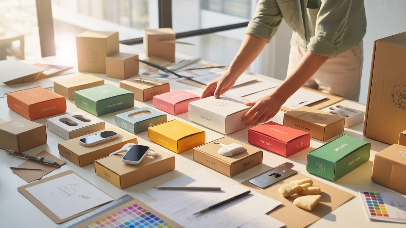
Product packaging is another major opportunity. A purple box or label isn’t just eye-catching; it creates an emotional connection if aligned well with your brand’s story. Don’t forget printed and digital collateral like brochures or email templates—these reinforce the brand voice.
Remember not to overuse purple; balance it with neutral colors like white, grey, or black for contrast. Where would purple make the most memorable impact in your brand assets?
Applying Purple To Websites And Ads
Integrating purple into websites and ads requires a mix of strategy and creativity. For websites, purple works well for call-to-action buttons or navigation bars, helping vital elements stand out without overwhelming the overall design.
Choose typography that complements purple. Sans-serif fonts tend to pair nicely, supporting readability and modern aesthetics. Avoid using purple text on dark backgrounds—it can strain the eyes. Instead, try white or light backgrounds with purple accents.
Imagery can boost the theme; photos with purple tones or overlays harmonize the visual experience. In ads, purple can highlight discount offers or new product launches, drawing buyer attention.
Ask yourself: does your purple feel consistent and purposeful, or does it clash with other colors or messages? Adjusting saturation or combining purples with analogous colors might improve appeal. Practical tests on different screen sizes will reveal nuances often missed initially.
Purple Theme Cost Breakdown

Design And Development Costs
When you decide to go for a purple theme in your digital marketing or electronics design, one of the early costs you’ll face is design and development. You might need to hire designers who are skilled in color theory and purple’s nuanced shades. Purple isn’t just one flat color—it spans reds and blues, as you may know, so finding someone who can play with these tones effectively might add a bit to your budget.
Alternatively, if you’re doing it in-house, investing in software that lets you experiment with purples can be a hit-or-miss expense. Tools like Adobe Illustrator or Photoshop typically come with subscription fees. You may also need plugins or color palettes focused on purple, which can be an extra charge.
Marketing And Product Adaptation Costs
Promoting a purple theme isn’t just about design; marketing campaigns built around this color also require funding. Think of purple-themed advertisements, social media posts, maybe even special packaging or product variants focusing on purple elements. These adaptations could demand a higher budget than usual, especially if you want consistency across platforms.
On the product side, changing the look of your electronics—like incorporating purple LEDs, casings, or interface accents—can raise production costs. Sometimes, the materials or processes for a purple finish cost more or take longer, and that might slow down deliveries or increase prices.
It’s curious how something as simple as a color shift can generate so many hidden expenses. Planning around these might help you avoid surprises down the line.
Common Failure Modes With Purple Themes

Overuse Of Purple
Using too much purple in your marketing or electronics designs can quickly overwhelm your audience. Purple is a strong color, and when it dominates a palette without relief, it can cause visual fatigue or even confusion. People might struggle to focus on key messages or important information. It’s like shouting too loudly; you lose the subtlety and impact. Balancing purple with neutral or softer tones can help prevent this sensory overload. Consider sprinkling in whites, greys, or light pastels to give the eyes a place to rest. If the purple saturates every corner, your design risks alienating rather than attracting attention.
Poor Contrast And Readability
Poor contrast is another common setback with purple themes, especially in text-heavy content or interface elements. Purple often struggles against dark backgrounds or clashes with certain fonts, making words hard to read. This decline in readability frustrates users and diminishes engagement. Enhancing contrast means pairing purple with either very light backgrounds or using lighter shades of purple for text. Think about users with visual impairments too; they’ll need clearer differentiation. It’s not just about aesthetics but about user experience as well. Testing your design on various devices and lighting conditions helps catch these issues early.
Metrics To Watch For Purple Effectiveness

When using purple themes in digital marketing and electronics design, it’s good to keep a close eye on certain metrics to see if your purple strategy is hitting the mark or missing it. These numbers help you understand how people are really reacting to your choices.
Engagement And Conversion Rates
Look at how many users interact with your content—clicks, likes, shares, and comments all matter. Are these numbers going up after switching to a purple theme? It suggests the color might be catching attention. Conversion rates are trickier but crucial; track if more visitors are taking the desired action, like signing up or buying something, when purple is part of the design. This shows whether purple supports the goal, or if it’s just decoration.
User Feedback And Preferences
Ask your audience what they think about the purple scheme—surveys, polls, or direct comments can offer insights you can’t get from numbers alone. Sometimes people’s preferences don’t match the data, which is interesting in itself. Watch out for common themes in feedback: Are users finding the purple too dark or too bright? Do they feel it fits the brand? This subjective input can guide tweaks that data won’t reveal on its own.
Purple Theme Implementation Process

Planning And Design Stage
When starting a purple theme project, first think about what purple means for your brand or message. Purple mixes the calm of blue with the energy of red, but how that balance fits your goal can differ. You might jot down feelings or ideas you want purple to bring out—luxury, creativity, or mystery, maybe.
Next up, pick the shades carefully. Purple has many hues, from lavender to deep plum. Your choice should match both your message and your audience’s reaction. Designing assets comes after—create your color palette, and make sure it works well with other visuals like typography or icons. Sketch out mockups or digital drafts of your layout, and try to maintain a cohesive look.
Don’t forget to gather feedback early. Perhaps share concepts with teammates or potential users to see if the purple resonates or feels off. At this stage, keep your options flexible—you may need to adjust shades or styles based on these initial reactions.
Testing And Launch Stage
Once your purple theme feels ready, it’s time to test it in real settings. This means putting your design in front of users or audiences and observing their responses. Try A/B testing with different purple variations, or conduct usability sessions if it’s an app or website. Watch for anything that feels uncomfortable to the eyes or confuses the message.
After refining based on feedback, plan your launch carefully. Roll out your purple-themed product or campaign, but keep monitoring how it performs. You may notice unexpected user reactions or areas needing polish. Don’t hesitate to tweak the purple elements post-launch if the vibe isn’t quite right.
Review the impact thoughtfully. Did purple help your message stick? Was the mood you aimed for conveyed? This reflection feeds into future projects and sharpens your sense of how purple can work best in marketing or electronics design.
Purple Theme Examples For Inspiration

Successful Digital Marketing Campaigns
You might find it interesting how some digital marketing campaigns have cleverly used purple to stand out. For example, brands aiming to evoke creativity and luxury have chosen purple backgrounds or accents effectively. One campaign included a deep purple color pallet that drew attention without overwhelming the viewer — this subtlety made customers focus on the message rather than just the color pop. The balance between bold and calm shades of purple seemed to engage users, maybe because purple isn’t as commonly used as blue or red, so it instantly grabbed attention.
Sometimes, the use of purple caught the eye because it contrasted well with white or gold lettering, increasing readability and perceived sophistication. These campaigns worked well not only by catching initial glances but by creating a memorable visual identity. That kind of lingering impression often nudges consumers toward action, like clicking a link or signing up for newsletters.
Innovative Electronics Design Uses
In the electronics world, purple themes have been less conventional but surprisingly effective. Certain handheld gadgets with purple casings or interface highlights naturally stood out on store shelves or online catalogs. The technology felt more personalized or even whimsical when purple toned displays or buttons were used. This use went beyond mere aesthetics; for some users, the purple hue made the device feel less clinical and more approachable.
For instance, some wearable devices incorporated soft purple lighting in notifications that appeared less intrusive than harsh whites or blues. This could improve user comfort over time, especially when worn for long hours. Electronics brands that took this approach often observed heightened user engagement, likely because the purple elements broke the mold of typical gadget design, offering something a bit more unique or human-friendly.
Conclusions
Purple themes offer valuable tools for digital marketing and electronics design. They can convey creativity, professionalism, and distinctiveness. By choosing the right shades of purple and combining them with other colors carefully, you can make your marketing campaigns and product designs stand out.
If you want to attract attention and create a memorable experience, try including purple in your design palette. Testing different purple tones and styles will help you discover what works best for your audience and goals.