Introduction
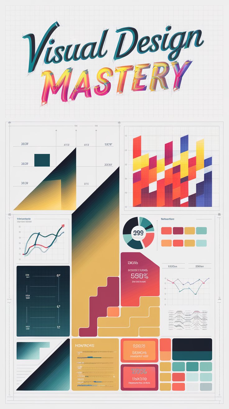
Infographics have transformed the way we convey information, making complex data easily digestible and engaging for audiences. In an era where visual content greatly impacts communication effectiveness, infographic design has emerged as a vital tool for storytelling. Each element, from color choices to layout, plays a critical role in enhancing viewer comprehension. This article delves into the essential components of designing captivating infographics that not only present data but also intrigue and inform the audience.
Understanding the historical evolution and methodologies of infographic design offers deeper insight into its effectiveness in today’s digital landscape. By exploring successful examples and innovative techniques, readers will learn how to create infographics that resonate with their target audience. The key lies in weaving a narrative that guides the viewer through the data while maintaining aesthetic appeal and clarity, ensuring that the message is conveyed powerfully and memorably.
Understanding Infographics: The Definition and Purpose in Visual Communication
Infographics are a potent visual communication tool that merges data, design, and storytelling. These graphic representations simplify complex information or data by transforming it into a format that is easily digestible. Infographics serve various purposes, from educating and informing to persuading and entertaining, making them versatile assets in both business and academia.
The origins of infographics can be traced back to antiquity, with early examples found in cave paintings that conveyed narratives or events. Across history, as society evolved, so did the methods of visual communication. The Age of Enlightenment saw the rise of more sophisticated representations such as maps, charts, and diagrams, illustrating statistical data and scientific research. These forms laid the foundation for modern infographics, which incorporate digital elements and innovative designs to engage audiences effectively.
In contemporary times, infographics take on various forms including statistical graphics, timeline infographics, process flows, and comparison charts. For instance, a statistical infographic might depict trends in climate change, utilizing visually appealing visuals like line graphs and highlighted statistics to convey urgency. Timelines may tell the story of a historical event, weaving dates and images into a coherent narrative. Each form serves to enhance understanding, evoke emotions, or provoke action, catering to the specific needs of diverse audiences.
The ongoing digital transformation has expanded the use of infographics in marketing and social media. In this context, infographics are crafted to capture immediate attention and sustain interest, streamlining content for platforms increasingly dominated by visual stimuli. They can enhance blog posts, email newsletters, and social media campaigns, providing viewers with quick insights that encourage further engagement.
Leveraging the visual aspects of infographics enables creators to highlight key messages, provoke thought, and bring clarity to dense information. As organizations and individuals navigate communication challenges, infographics remain a vital strategy for promoting understanding in a visually driven culture. The effectiveness of these tools in storytelling and information dissemination underpins their growing significance in both traditional and digital communication landscapes.
Core Principles of Infographic Design: Mastering Visual Communication
Fundamentals of Engaging Infographic Design
Creating a compelling infographic requires a deep understanding of essential design principles that drive effective visual communication. These foundational principles—balance, contrast, hierarchy, and alignment—play a crucial role in ensuring that the information is not only visually appealing but also easily digestible and engaging.
Balance refers to the distribution of visual weight within an infographic. Achieving balance is vital to maintain viewer interest and prevent any section from overwhelming others. This can be accomplished through symmetrical or asymmetrical arrangements. In a well-balanced design, heavier elements are countered by lighter ones, creating harmony that encourages the audience to explore the content further.
Contrast is another core principle that enhances readability and captures attention. By contrasting colors, sizes, and shapes, designers can guide viewers’ eyes to critical data points. For instance, using a bold shade against a neutral background can help highlight essential statistics or insights within the infographic. Thoughtful contrast ensures that key messages stand out, facilitating immediate comprehension.
Hierarchy organizes content in a way that naturally guides viewers through the data. It involves prioritizing information based on its significance, using size, color, and placement to emphasize different elements. The largest and boldest text typically draws immediate attention, while subtext and secondary information are displayed in smaller fonts. This graduated approach helps in storytelling, allowing the audience to absorb the narrative effectively while following the intended flow of information.
Alignment is pivotal for a cohesive design. Proper alignment ties elements together, creating a clean, professional look that enhances the overall impact of the infographic. Misaligned components can create a chaotic feel, leading to confusion and disengagement. To achieve effective alignment, designers should utilize grid structures, ensuring that all elements are cohesively arranged to support the overarching message.
By mastering these core principles—balance, contrast, hierarchy, and alignment—designers can create infographics that transcend mere visual appeal and serve as powerful storytelling tools, effectively engaging the audience and facilitating the communication of complex information with clarity and ease.
Crafting a Compelling Narrative
The Role of Storytelling in Infographic Design
Storytelling is an integral part of infographic design, serving as the backbone that transforms raw data into an engaging and meaningful narrative. When data is presented without context, it often fails to resonate with the audience. By weaving a narrative that connects various data points, designers can create a more compelling experience that captures attention and fosters understanding. Infographics that tell a story not only present information but also evoke emotions, guiding the viewer through a journey that enhances retention and comprehension.
The use of a narrative structure in infographics encourages the audience to relate personally to the information. For instance, starting with a relatable problem sets the stage for the subsequent data and solutions presented. This approach establishes a connection with the viewer, inviting them to invest emotionally in the story being told. By introducing characters, conflicts, and resolutions within the infographic, designers can effectively draw the viewer into the narrative, making the data not just informative but also engaging.
Weaving a Narrative That Connects Data Points
To craft a compelling story through an infographic, several key strategies can be employed to connect the data points seamlessly. First, identify a central theme or message that the data will support. This theme will serve as a guiding light throughout the infographic, ensuring that all elements contribute to the overarching story. Next, establish a logical flow; organize data in a way that feels natural and intuitive. For instance, chronological storytelling or problem-solution formats can enhance the progression of information.
Visual metaphors can also play a significant role in storytelling through infographics. Using imagery that epitomizes the theme encourages viewers to engage with the content on a deeper level. For example, incorporating a winding road to represent a journey not only illustrates a timeline but also evokes a sense of adventure. By using colors and illustrations that reflect the mood of the story, designers can further enhance emotional engagement.
A strong conclusion ties the narrative together, summarizing the key takeaways and reinforcing the main message. By ensuring that the story resonates with the intended audience and aligns with the data presented, infographic designers can create impactful visual stories that linger in the minds of viewers long after they have moved on.
Tools and Resources for Designers: Creating Engaging Infographics
Popular Tools for Infographic Design
In the journey of crafting engaging infographics that tell a story, selecting the right tools is paramount. Various software and online platforms cater to both novice and professional designers, making the infographic creation process more accessible and efficient. User-friendly tools, such as Canva and Visme, offer intuitive interfaces that allow individuals with limited design experience to create aesthetically pleasing infographics. These platforms provide a wide array of templates, icons, and graphic elements that can be easily customized to suit specific content and branding needs.
Canva, for instance, facilitates drag-and-drop functionality, enabling users to combine different visual elements seamlessly. Visme takes it a step further by incorporating data visualization features, allowing designers to create charts and graphs directly within their infographics. These platforms simplify the process, allowing users to focus on storytelling rather than grappling with complex design software.
Professional-Grade Tools for Advanced Design
On the other hand, professional-grade tools such as Adobe Illustrator and Tableau are tailored for those looking to push the boundaries of their design capabilities. Adobe Illustrator provides extensive design capabilities, granting designers complete control over every element of their infographic. It is ideal for those who want to create unique and intricate designs, although it may present a steeper learning curve for beginners.
Tableau, while primarily a data visualization tool, offers powerful features for representing complex datasets within infographics. It is essential for conveying statistical information in a visually compelling manner, making it easier for the audience to comprehend trends and insights derived from the data.
Numerous resources, such as Pinterest and Behance, serve as inspiration hubs for designers. These platforms allow users to discover innovative infographic designs and explore creative concepts that can influence their own work. Utilizing these tools and resources equips designers to not only create visually striking infographics but also tell compelling stories that resonate with their audience, reinforcing the significance of effective communication and design synergy.
Promoting Your Infographics: Strategies for Wider Audience Engagement
Utilizing Social Media for Distribution
One of the most effective methods for promoting your infographics is through social media platforms. Each platform has its unique audience and strengths, making it vital to tailor your approach accordingly. For instance, Twitter’s character-restricted environment benefits from succinct messaging paired with eye-catching visuals, making it a great place to share snippets or highlights from your infographic.
On platforms like Facebook and Instagram, where visuals dominate, infographics can be shared more extensively. By creating engaging posts that invite interaction—like asking questions or prompting discussions—you can significantly increase the visibility of your content. Instagram Stories or Reels can also be creatively utilized to share mini-infographics or behind-the-scenes process snippets, enticing followers to view the full version on your website.
Leveraging Blogs and Other Platforms
Incorporating infographics into your blog not only enhances your content but also drives traffic. When an infographic is embedded in a relevant blog post, it provides additional context and value to your readers. Optimize your blog for SEO by including alt text for images and relevant keywords, which may help your infographic appear in search engine results.
Guest blogging presents another avenue. Collaborating with other bloggers or websites in your niche can amplify your reach. By offering to create unique infographics tailored for their audience, you create reciprocal promotional opportunities that can introduce your work to a broader demographic.
Consider engaging with online communities and forums related to your niche. Platforms like Reddit, LinkedIn groups, or niche-specific forums can be excellent venues for sharing your infographic. Share it in relevant threads, ensuring you contribute meaningfully to discussions rather than simply self-promoting.
Utilizing email marketing is a powerful strategy. Creating visually appealing newsletters that feature your infographic can engage your current audience effectively. Encourage sharing within these newsletters, making it easy for subscribers to forward to their contacts, expanding your outreach organically.
By implementing these promotional strategies, you can enhance the visibility of your infographics and cultivate a broader audience, ensuring your storytelling transcends beyond mere visuals into impactful communication.
Measuring the Impact of Infographics
Evaluating Effectiveness in Infographic Design
To truly master the art of infographic design, it is vital to assess its impact following publication. Engaging infographics not only inform but also persuade, and understanding their effectiveness is essential for refining future projects. This evaluation process can reveal insights into audience engagement, comprehension, and reach, allowing designers to gauge how well their narrative is articulated through visuals.
Tracking user interaction is one of the fundamental strategies for measuring the success of an infographic. Metrics such as views, shares, and comments can offer substantial information about how widely the content resonates with the audience. Tools like Google Analytics provide valuable data on page views and user behavior, highlighting which segments of the infographic are most engaging. Understanding where users drop off can inform revisions, enhancing the storytelling aspects of future infographics.
Social media platforms are indispensable for impacting outreach and engagement. Platforms such as Facebook, Twitter, and LinkedIn provide analytics tools that measure likes, shares, and comments on infographics. These metrics serve as indicators of how well the infographic is performed in various demographics. For instance, a higher share count on a particular platform may suggest that audiences on that channel find the topic or design particularly compelling, which can guide future content strategy.
Tools for Measuring Engagement and Reach
There are various tools specifically designed for monitoring the performance of infographics. BuzzSumo, for example, enables users to analyze content performance across social platforms, offering insights into sharing patterns and audience preferences. This can assist in identifying influential voices for potential partnerships during future releases.
Services like Bitly can track link clicks when infographics are shared digitally, providing a clear picture of engagement levels. This information allows for the assessment of how effectively infographics drive traffic to websites, thereby enhancing the narrative storytelling component.
Evaluating the impact of infographics provides not just a measure of success but insights that can refine storytelling, improve audience engagement, and lead to more effective communication in future designs. Regularly revisiting and measuring these aspects ensures that infographics remain a powerful tool for conveying messages and captivating audiences.
Conclusions
In summary, engaging infographic design is an art that requires careful consideration of various design principles and storytelling techniques. By effectively utilizing data visualization methods, one can create infographics that not only attract attention but also foster understanding among viewers. The balance between clarity and creativity is essential in delivering a compelling narrative that resonates with the audience, illustrating the importance of thoughtful design in communication.
As the demand for visual content continues to soar, mastering infographic design is indispensable for anyone looking to enhance their information dissemination strategies. By applying the skills and insights covered in this article, individuals and organizations alike can elevate their messaging, turning ordinary data into captivating stories that inform and engage audiences across various platforms.


