Introduction
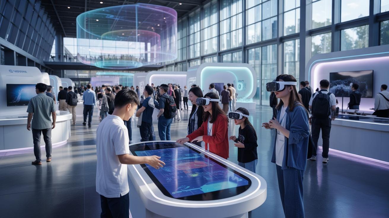
Interactive exhibitions in electronics have transformed public engagement by creating immersive experiences that blend the physical and digital worlds. These experiences use displays, sensors, and wearable technologies to captivate audiences and deliver educational content. Measuring their impact requires a clear understanding of specific metrics that indicate visitor engagement, satisfaction, and learning outcomes.
This article covers essential interactive exhibition metrics that help you evaluate immersive experiences in electronics. We examine the key data points, tools for collecting this data, and methods to analyze results effectively. Whether you manage a tech museum or organize interactive exhibits, this guide provides actionable insights to optimize your exhibitions for visitor impact.
Interactive Exhibition Metrics Basics
What Are Interactive Metrics
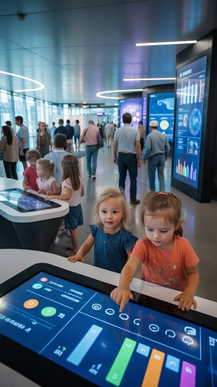
Interactive exhibition metrics are the measurements and data points collected to assess how visitors engage with exhibits, particularly in immersive electronics exhibitions. These metrics can capture various behaviors, such as the number of touch interactions on a display, time spent at a station, or the frequency of using interactive features like virtual reality headsets or gesture-controlled devices. For example, in an exhibit showcasing smart home technology, metrics might track how many visitors adjust settings on a simulated smart thermostat or use voice commands to control electronic appliances.
Why Metrics Matter
Tracking these metrics offers tangible benefits. They provide insight into what parts of the exhibit truly capture attention and which might be overlooked. Without these measurements, improvements become guesswork—almost like shooting in the dark. By analyzing visitor behavior, exhibitors can tweak interfaces to be more intuitive or add more engaging content where interest lags. Beyond refining exhibits, these metrics can help tailor experiences to different audience groups, such as shifting focus for tech-savvy visitors versus beginners. Ultimately, collecting and reviewing these data points can lead to more memorable visitor outcomes, encouraging learning and discovery in ways that passive exhibits rarely accomplish.
Most Important Metrics To Watch


When it comes to measuring the success of an immersive electronics exhibition, some numbers really stand out because they give you clues about how visitors are connecting with the experience. One key metric to keep an eye on is visitor dwell time. Simply put, this is how long someone stays at a particular exhibit. It might seem straightforward, but the seconds or minutes people spend lingering can reveal quite a bit about their engagement. Think about it: if visitors rush past a display, you might wonder if the content or technology failed to capture their interest. On the other hand, longer dwell times tend to show curiosity, enjoyment, or even a sense of discovery.
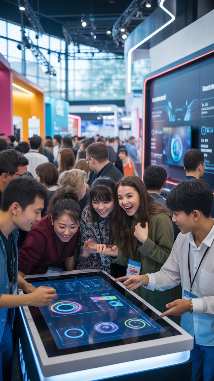
Another important figure is interaction counts. Tracking how often visitors physically engage with touchscreens, controllers, or other devices tells you how compelling the exhibit is. If a display invites interaction, but hardly anyone touches it, that’s a red flag. Conversely, a high number of interactions suggests visitors are drawn in and actively participating. But it’s not just about quantity; the quality of interactions matters too. Are users just pressing a button, or spending time exploring options? Such details can differentiate superficial interest from meaningful involvement.
In practice, these metrics work best when combined. For example, if visitors spend plenty of time at an exhibit but rarely interact, maybe they’re absorbing information passively rather than engaging deeply. Or if they interact a lot but leave quickly, they could be frustrated or simply experimenting briefly. So, by watching these numbers together, you get a fuller, more nuanced picture. You might even notice patterns that suggest which elements of your exhibition need refining or which are hitting the mark. Is your goal to educate, entertain, or inspire? These metrics can guide you to figure out where your efforts are really paying off.
Collecting Data With Tools

When it comes to collecting data in immersive exhibitions centered on electronics, choosing the right tools is, well, critical. You want devices and systems that capture not only what visitors do but how they feel and respond as they engage. It’s about more than counting heads or tracking foot traffic—it’s understanding movements, reactions, and choices in a surprisingly detailed way.
Sensor-Based Systems

Motion detectors and touchscreens often serve as the core of interactive data collection. Motion sensors can detect how visitors move through a space, where they linger, or when they lose interest. For example, infrared or ultrasonic sensors track presence and flow in ways cameras might miss, especially in darker or more complex settings.
Touchscreens add another layer—recording selections and touchpoints that reveal what visitors find most appealing. It’s not just about interaction but the nuances of timing and sequence that these systems log. You might discover, say, which buttons get pressed first or how long users hesitate before making a choice. These insights can feel subtle yet shape the whole narrative of visitor experience.
Wearable Devices
Wearables go beyond observation by monitoring physiological responses. Devices that measure heart rate, skin conductance, or even subtle muscle activity provide clues about engagement intensity and emotional states. It’s kind of like having a window into the visceral reactions of visitors without interrupting their immersion.
These tools raise questions too—how much data is too much? And can wearables influence visitor behavior simply by being there? Some guests might feel self-conscious, altering their natural interactions. Still, the real-time feedback from wearables offers a promising way to gauge not just participation but genuine emotional involvement, which is often the goal of these electronic-based immersive exhibits.
Evaluating Immersive Engagement

When trying to truly understand how visitors engage with immersive electronics exhibits, it’s not just about numbers—and yet, numbers do tell a lot. You might think qualitative feedback is soft data, but visitor surveys and interviews actually bring out the real human side behind those engagement statistics. People’s words often reveal surprises; unexpected emotions or thoughts that raw figures alone can’t capture. For example, asking visitors what moments felt most alive or confusing can highlight aspects that dry metrics miss.

On the flip side, quantifying visitor behavior provides a more concrete view. Techniques like averaging session lengths can hint at overall interest or fatigue thresholds. Heatmaps are particularly helpful—they show where people linger or bypass, acting as a visual pulse of the exhibit. Spotting trends over multiple visits, like rising curiosity about a specific feature, helps identify what’s working—or not. Still, interpreting trends requires care. A drop in visits to a station might mean it’s too complex, or simply that visitors have mastered it.
In essence, blending qualitative feedback with quantitative data offers a richer picture, though neither tells the entire story alone. It’s a mix that better informs design tweaks, lending depth and context to what the numbers mean in terms of actual experience.
Visitor Experience Vs Metrics

Exploring the balance between how visitors feel and what the numbers say is a tricky business. You might have a glowing survey rating, yet notice people spending less time at certain exhibits. Or maybe the data shows a crowd gathering, but the smiles aren’t quite there. This disconnect between subjective visitor experiences and objective metrics is where the real story often lies.
Capturing emotions goes beyond tick boxes and charts. Observations reveal subtle reactions—a furrowed brow, a quiet chuckle, or a look of wonder—which surveys may miss. It’s a reminder that data requires context, and emotions provide that nuance.

When you align metrics with the visitor’s actual experience, it opens a clearer window into both satisfaction and what visitors take away. For instance, a spike in dwell time combined with positive feedback might indicate engagement, while high bounce rates paired with confusion in comments suggest a disconnect. Striking this balance is less science and more art, asking you to trust both your data and your gut feeling, even when they don’t perfectly match.
Setting Up Your Measurement Checklist

Preparation Steps
First, decide which metrics really matter for your interactive exhibition. Are you focusing on visitor engagement, dwell time, or emotional response? Narrowing this down early saves headaches later. Then, choose the right equipment—cameras, sensors, or software tools—that match those metrics. It’s a bit of a guessing game at first, I admit, but lean on past case studies for guidance.
Training your staff is another big setup task. They need to understand not only how to use the tech, but also why collecting this data matters. It’s easy to overlook this part, but trust me, without proper training, all your fancy gear might just sit there.
Ongoing Monitoring
Data collection doesn’t stop once you launch. Set a routine for reviewing your metrics. Pick a schedule that fits—weekly, biweekly, or monthly—whatever feels practical for your team. Keep an eye out for unexpected trends or sudden drops in engagement; these often tell a story worth exploring.
Also, don’t hesitate to adjust your measurement approach as you go. Maybe a metric initially seems promising but turns out less useful than anticipated. Flexibility here can make the difference between collecting useful insights and drowning in irrelevant data.
Common Pitfalls To Avoid


Ignoring Data Quality
When measuring immersive experiences, the accuracy of your data matters more than you might think at first. Poor data collection methods can lead to misleading conclusions. For example, relying on outdated sensors or inconsistent survey techniques can skew results, making it hard to know what visitors truly experience. You could end up chasing false trends or missing the bigger picture.
Inaccurate measurements affect your ability to improve the exhibition and, ultimately, visitor satisfaction. Sometimes it’s tempting to cut corners for convenience or cost, but this rarely pays off. Imagine trying to assess emotional engagement with a device that malfunctions or software that glitches — your insights won’t hold up. Ensuring proper calibration, regular checks, and standardized data collection processes is crucial, even if it feels tedious.
Overlooking Visitor Diversity
Immersive exhibitions attract a wide range of visitors: different ages, backgrounds, tech-savviness levels, and even physical or cognitive abilities. Ignoring this diversity when analyzing data can leave you with an incomplete or biased understanding of the experience. For instance, what fascinates a young adult might not resonate the same way with older visitors or families.
Including all visitor types in your analysis means embracing complexity. It’s not just about averages but recognizing patterns in smaller segments. Are newcomers engaging as deeply as repeat visitors? How do first-time users of technology react compared to regular gamers or tech enthusiasts? Skipping this step risks alienating key audience groups and missing opportunities to tailor experiences more effectively.
Improving Exhibits Through Metrics


Using metric insights can really change the way immersive electronics exhibitions evolve over time. When you track visitor engagement, dwell time, and interaction points, patterns start to emerge that can guide what needs fixing or enhancing. For example, if metrics reveal visitors spend less time at certain displays, that might be a sign those exhibits aren’t captivating enough, or possibly the interactive elements need tweaking.
One way I’ve seen this play out is when an exhibit showed data indicating many visitors struggled with overly complex controls on a device. After simplifying the interface and observing a rise in interaction time, the exhibit became noticeably more engaging. It’s a bit like tuning a musical instrument: small changes yield measurable improvements, but only if you listen carefully to the data.
Data-Driven Changes
Consider this: you notice from heat maps that visitors cluster at one station but barely move deeper into the exhibit. A simple change, like repositioning the pathway or adding visual cues, can encourage more flow. Similarly, if sentiment analysis from feedback shows frustration with accessibility, redesigning that part of the exhibit could open it up to a wider audience.
- Adjust lighting to highlight key interactive elements that metrics suggest are missed.
- Include more audio explanations for exhibits where engagement time is low.
- Streamline menu options where data shows repeated indecision by visitors.
These aren’t wild guesses; they’re targeted responses to clear signals within the collected data. Still, it takes some trial and error to balance improvements without disrupting the exhibit’s narrative flow.
Testing New Features

Trying out new features calls for careful piloting. Start small—like testing a new touch interface on a single exhibit station while maintaining the original on others for comparison. Measure changes in user engagement and satisfaction. Did more visitors interact with the new feature? Were their interactions longer or more meaningful?
For instance, adding haptic feedback to an electronic display might initially intrigue visitors, but if it distracts from the learning goal or causes technical issues, metrics will reflect fewer successful interactions. This feedback loop helps you decide whether to expand, modify, or abandon that feature. It’s a bit like scientific experimentation happening live in your exhibition space.
Always remember, though, that metrics can’t capture everything. Sometimes visitor excitement, confusion, or frustration peek through only in direct observation or anecdotal feedback. Balancing quantitative and qualitative insights allows your immersive exhibitions not just to respond to data but to the unpredictable human experience behind it.
Examples From Electronics Exhibitions
At major electronics exhibitions like CES in Las Vegas and CEATEC in Japan, organizers have increasingly leaned on interactive metrics to gauge how visitors engage with exhibits. CES, one of the oldest and largest, attracts tens of thousands annually, with metrics often gathered via digital kiosks and mobile app interactions. This data helps identify which technologies captivate audiences the most, driving real-time adjustments—like repositioning popular displays or allocating more staff to busy areas.
CEATEC, known for showcasing Japan’s tech advances, uses beacon technology to track visitor flow through immersive setups. Observing where guests linger or pass quickly reveals which exhibits resonate and which might need rethinking. Such insights spark conversations amongst participants about exhibit design and visitor needs.
What strikes me about these fairs is how real-time feedback loops allow organizers to tweak experiences mid-event. Could this approach be adapted for smaller exhibitors? The dynamic nature of these shows certainly makes one wonder.
Museum Exhibits

Technology museums have a unique challenge: marrying static, historical displays with interactive, immersive experiences. Many museums now deploy sensors and engagement counters to measure how visitors interact with exhibits. For instance, motion sensors can monitor how long people spend exploring a particular interactive display. This method helps highlight engagement peaks or pinpoint when visitors lose interest.
Some museums incorporate augmented reality or virtual reality components and pair these with usage analytics, gathering not just how many tried the tech but also how deeply they engaged. It’s a nuanced picture—sometimes a visitor’s time doesn’t reflect interest but difficulty, prompting design reconsiderations.
While visitor numbers and dwell time remain core metrics, surveys collected on-site and through apps complement the data, offering insights into emotional responses and perceived learning. These layered metrics enable museums to refine exhibits iteratively, balancing education and engagement.
Trade Shows
Trade shows frequently harness a mix of qualitative and quantitative indicators to measure success. Interactive feedback stations allow attendees to rate sessions, demo new products, or ask questions, creating a rich source of data for exhibitors. Real-time analytics on booth traffic, coupled with lead retrieval systems, help companies understand what draws visitors and which contacts merit follow-up.
There is also an emerging trend to analyze social media activity tied to the event, providing broader sentiment analysis and uncovering trends beyond the physical venue. This can sometimes contradict in-person feedback, raising questions on the best way to gauge true engagement.
Importantly, the data doesn’t just measure visitor numbers but how effectively interactions convert into business or networking outcomes. This shift reflects a more outcome-focused view rather than mere presence, emphasizing quality over quantity.
Conclusions
Measuring interactive exhibition metrics is crucial to improve immersive experiences in electronics. Tracking visitor engagement, dwell time, and satisfaction reveals how well your exhibition connects with audiences and supports learning goals. Using the right tools ensures you gather accurate data to inform decisions.
By understanding and applying these metrics, you enhance your ability to create meaningful, effective exhibits that attract and retain visitors. Continuous assessment leads to targeted improvements, increasing both educational value and visitor enjoyment in your immersive electronics exhibitions.