Introduction
Cyberpunk female characters have become iconic in art and digital marketing. These characters combine futuristic and dystopian elements, often showcasing advanced technology and unique stylings. Learning how to create impactful cyberpunk female art helps marketers capture attention in a crowded digital space.
This article covers techniques specific to cyberpunk female art designs and how they can be applied effectively to digital marketing visuals. From crafting character details to using color and composition, each section aims to help you improve your visuals for better online engagement.
Cyberpunk Female Art Foundations
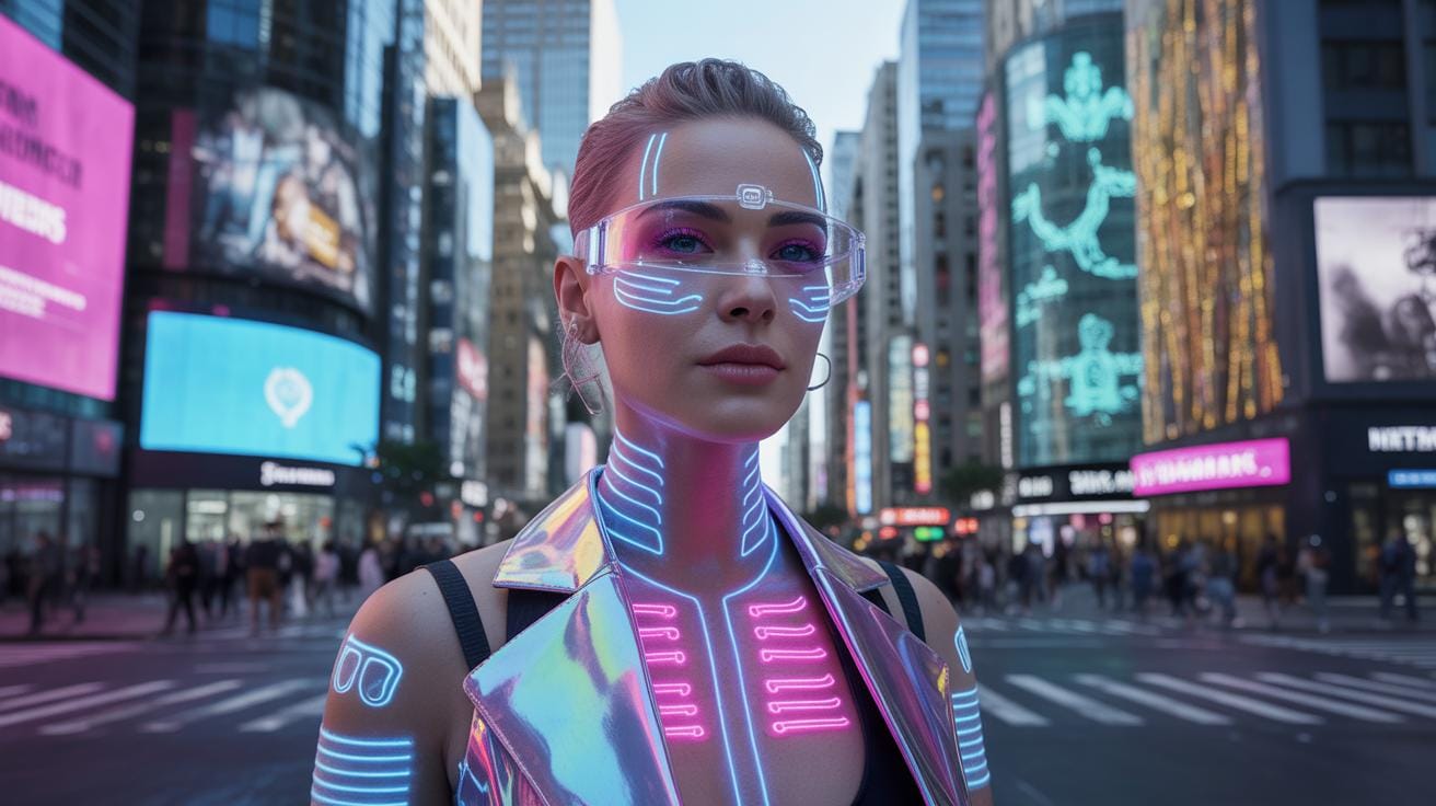
Cyberpunk female characters in art have roots deeply embedded in the genre’s dystopian vision. These characters often embody the clash between humanity and invasive technology. They are typically portrayed as individuals navigating a fractured society dominated by megacorporations and advanced technology, reflecting themes of alienation and resilience. I find it interesting how their look echoes this tension—blending gritty, worn elements with striking neon lights that scream future cityscapes.
Visually, you often see a mix of organic human features contrasted against obvious cybernetic enhancements—implanted circuits, glowing eyes, or mechanical limbs. These features aren’t just for show; they symbolize survival in a harsh environment where tech is both a tool and a trap. The neon lighting and muted dystopian backgrounds set a mood—sometimes hopeful, often unsettling. This creates the signature cyberpunk aesthetic, one that has been influenced by classic sci-fi and the punk spirit of rebellion.
Visual Features That Define Cyberpunk Females
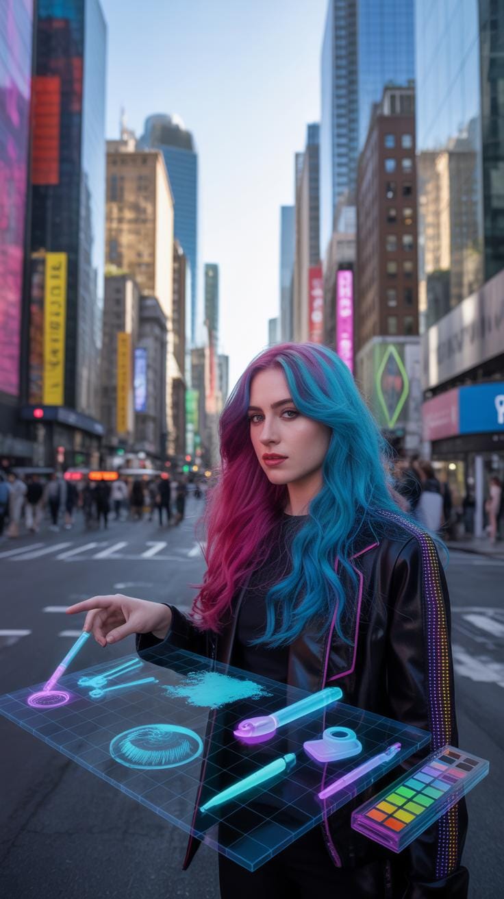
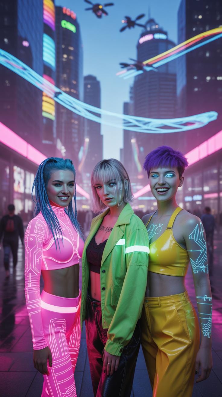
When you look at cyberpunk female character art, there are distinct visual patterns that stand out. Cybernetic enhancements are frequent—think mechanical arms with exposed wires or embedded LEDs. Often, the skin shows a mix of synthetic and natural textures, reflecting the blurred line between human and machine. Clothing tends to be utilitarian but edgy: leather jackets mixed with futuristic fabrics, asymmetrical cuts, and a palette leaning heavily on blacks and greys, punctuated by neon blues, pinks, or greens.

Hairstyles can be bold and unconventional—shaved sides, colored streaks, or even holographic effects. Tattoos and body modifications are common, suggesting a culture where self-expression melds with technological enhancement. The color schemes are not random; they serve to emphasize contrast and often symbolize the tension between humanity and technology. You can’t ignore how these artistic choices speak not just to style, but to the character’s identity within a chaotic, tech-dominated world.
Cultural Origins And Influence
The look and feel of cyberpunk females have been shaped largely by foundational literature and films from the 1980s onwards. For example, William Gibson’s “Neuromancer” and Ridley Scott’s “Blade Runner” introduced us to cyberpunk worlds where women were simultaneously powerful and vulnerable, often navigating male-dominated spaces with complexity and grit.
Movies like “Ghost in the Shell” and games such as “Cyberpunk 2077” further expanded these portrayals, bringing them into the mainstream and popular culture. These works highlighted themes of identity, agency, and transformation, which artists then translate visually through their work. It’s fascinating how the cultural influence extends beyond mere aesthetics; it shapes the very roles these characters play—hackers, rebels, or outcasts—making each piece not just art but a story steeped in the cyberpunk ethos.
Designing For Digital Marketing Impact

Cyberpunk female art offers a unique edge for digital marketing visuals, but it’s not just about slapping neon colors and tech accessories onto a character. To truly stand out, you have to think about how these visuals interact with your audience’s attention span online—which is notoriously short. A cyberpunk female character needs to strike a balance between boldness and clarity, so viewers aren’t overwhelmed but drawn in.

Placing a character with strong facial expression near the focal point works well. Eyes naturally follow where the character looks or gestures. You might want to experiment with asymmetry here—having the heroine off-center with glowing elements subtly guiding the gaze can keep engagement high without feeling static. Sometimes, too much detail or clutter can confuse rather than attract.
Furthermore, considering how your art scales across devices is crucial. A character packed with small, intricate tech details might lose impact on a phone screen where users spend most of their time. Simplifying without losing the essence can be tricky, but it pays off in brand recognition. Have you noticed how some campaigns with minimal yet striking cyberpunk females become instantly memorable? That’s no accident.
Eye-Catching Composition Techniques
Grabbing attention is part artistry, part psychology. Using rule-of-thirds layouts often helps because it makes visuals feel natural and easy to scan. But sometimes breaking that rule with a central figure glowing in neon works like a magnet on digital feeds packed with content.
A key trick is layering—foreground, midground, background. Position your cyberpunk female between shadows or light sources or use softly blurred cityscapes behind her. It gives depth and encourages viewers to look longer, discovering details bit by bit.
- Use contrast between dark shadows and vibrant neon glows.
- Balance negative space so the image doesn’t feel cramped.
- Play with diagonal lines from cybernetic limbs or light streaks to create movement.
You might notice that even with simple shapes, hints of tech and mystery can hold eyes far better than overly complex compositions.
Color Choices That Convert

Color influences emotions subtly but powerfully, especially in cyberpunk art where mood matters. Bright, saturated neons—think electric blues, hot pinks, acid greens—grab immediate attention. Yet, pairing these with carefully chosen dark tones grounds your character in a believable dystopia, avoiding a cartoonish feel.
Interestingly, some campaigns using cooler blues and purples create a calm yet mysterious aura, encouraging viewers to linger longer. Warmer neon tones activate energy and urgency but can cause visual fatigue if overused.
Try:
- Neon blues and purples for intrigue and trust.
- Accent neon orange or pink for calls to action.
- Muted shadows or smoky blacks to contrast brightness and maintain seriousness.
Ultimately, the right palette feels intentional rather than random—this subtle choice can sway how your audience feels about your brand’s message without them even realizing it.
Crafting Character Details

When you start on the face of a cyberpunk female character, try to focus on small, telling details that bring her to life. It’s not just about sharp lines or neon glows—think about how her eyes might hint at her past, or how a slight twitch in a brow could suggest distrust or determination. Subtlety matters. Drawing a barely noticeable crease, or a gentle shift in pupils, adds layers of emotion without shouting.
Facial expressions can be tricky in cyberpunk art. The balance between human and machine influences emotions. Some faces might show weariness; others, defiance, yet all should resonate on a human level. You might experiment with half-closed eyes conveying suspicion or a faint smile that suggests hidden motives.
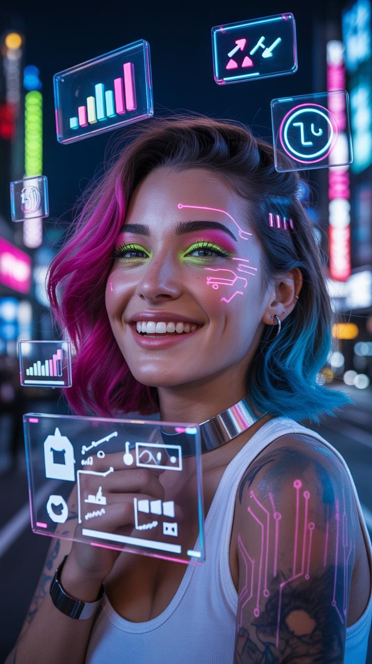
As for cybernetic enhancements, popular choices often include visible mechanical eyes, sleek neural implants running along the skull, or delicate wiring threading beneath translucent skin. When illustrating these, avoid overcrowding the face. Make each implant feel purposeful, not random. Reflect light on metal carefully—too shiny and it feels fake, too dull and it looks neglected.
Think about how these accessories might affect expressions too. A glowing eye implant could flicker subtly when the character feels something strongly. Tiny LEDs embedded around the temples might pulse gently, giving you an extra emotional cue to weave into your visuals.
The trick is keeping things real enough to connect with viewers but futuristic enough to capture the cyberpunk spirit. When you get this right, the character’s story starts shining through without a single word spoken.
Using Technology Themes Effectively


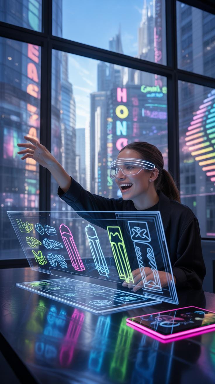
When you’re crafting cyberpunk female art for digital marketing visuals, some technology themes just seem to fit better than others. It’s not only about slapping on futuristic tech, but about picking elements that genuinely enhance the character’s story and appeal. Themes involving augmented reality, neon lights, and cybernetic enhancements stand out. They play with light, color, and form in ways that catch the eye — crucial for marketing purposes.
Augmented reality elements can be woven in subtly or boldly, such as holographic interfaces floating around the character, or digital readouts integrated into their attire. These details suggest a high-tech world vividly without overwhelming the viewer. Neon accents, especially in contrasting colors like bright pinks or blues against darker backgrounds, create a striking effect that’s memorable and typically cyberpunk.
Also, think about the contrast you create between the human and mechanical aspects of the character. A seamless blend might look nice, but emphasizing the juxtaposition can add depth and intrigue. For instance, the softness of natural skin next to the hard edges of metallic limbs can tell a story about identity and transformation — themes often at the core of cyberpunk narratives.
Have you noticed how some artists show circuitry beneath translucent skin or place glowing implants along muscle lines? These choices highlight the interplay between man and machine and make for powerful, engaging portraits. In your work, consider which tech motifs support the cyberpunk female’s personality and the mood you want to evoke, rather than just following trends blindly.
Selecting Tools For Cyberpunk Art

Digital Art Software Recommendations
When creating cyberpunk female character art, software choice makes a big difference. Programs like Adobe Photoshop remain popular for their painting tools and extensive brush libraries. You can layer complex light effects and add fine details with confidence. But, for some, Clip Studio Paint feels more intuitive, especially with its pen pressure sensitivity and customizable brushes that cater well to line work and shading in cyberpunk styles.
Procreate on iPad has gained traction, too, offering a fluid drawing experience on the go. The blend modes and gradient maps support neon hues and gritty textures, which are staples of cyberpunk visuals. I find its interface less cluttered, which is calming when you’re lost in the meticulous process of portraying futuristic tech and augmented anatomy.
Hardware Options For Artists
Using a graphic tablet can elevate your artwork dramatically. Wacom dominates in this sphere with their Intuos and Cintiq lines. The pressure sensitivity and tilt recognition on these devices let you mimic real brush strokes, bringing subtlety to cyberpunk armor or cybernetic implants. Though, some artists I’ve spoken to mention the XP-Pen range as a surprisingly cost-effective alternative without losing too much precision.
Stylus comfort matters, too — a lightweight pen with a balanced grip can reduce hand fatigue during long hours of detailing neon-lit circuitry or sleek cybernetic enhancements. Some prefer tablet monitors for direct screen drawing, which can feel more natural than glancing elsewhere while your hand moves. But, that’s more a personal preference than a rule.
Creating Storytelling Visuals

When crafting engaging cyberpunk female images, embedding a narrative and backstory is crucial. Visual elements become storytelling tools — every accessory, pose, and expression hints at her history, motives, or internal conflicts. A cyberpunk woman might be a hacker defying corporate oppression or a street-smart survivor navigating a dystopian city. Including subtle details like worn-out cybernetic implants or faded tattoos can suggest past struggles or affiliations without overwhelming. Think about the story you want viewers to piece together. Is she defiant or weary? Futuristic yet grounded? These choices shape audience connection and curiosity. Sometimes, leaving elements slightly vague invites viewers to fill in gaps, sparking imagination and repeated viewing.
Symbols And Motifs In Design
Common cyberpunk symbols carry heavy thematic weight. Neon light patterns often imply technological dominance or societal control. Circuitry motifs can represent human-machine integration, hinting at a character’s augmented abilities or struggles with identity. Masks or visors may convey anonymity or rebellion. Skulls or barcodes subtly painted on attire might criticize consumerism or mortality in a tech-driven world. These motifs aren’t just decoration; they deepen the narrative, offering layers of meaning worth exploring. But, be cautious—too many symbols can clutter or confuse. Balancing subtlety with clarity is key.
Scene Settings That Enrich Storytelling
The background is more than a backdrop; it’s a co-storyteller. Urban decay punctuated by gleaming digital ads suggests economic disparity — a favorite theme in cyberpunk worlds. Dark alleyways with flickering holograms can highlight mystery or danger surrounding your character. Rooftops overlooking sprawling neon cityscapes evoke isolation or aspiration. Choices here emphasize her role and the world’s tone. Imagine placing your cyberpunk female in a crowded marketplace versus a sterile corporate lab—each tells a distinct story. Environments can amplify her message or create contrast that draws viewers in, deepening their engagement with the visual narrative.
Comparing Cyberpunk Female Styles
When it comes to portraying cyberpunk females, artists have a variety of styles to choose from. The choice can impact how your digital marketing visuals connect with your audience. Let’s start by looking at two broad categories: realistic and stylized art.
Realistic Versus Stylized Art

Realistic art tends to emphasize intricate details—think finely rendered cybernetic enhancements, believable lighting, and lifelike anatomy. This style works well when your goal is to create immersive, serious, or high-end branding visuals. It gives depth and believability that can evoke a strong emotional response. Yet sometimes, it might feel too dense or formal for certain campaigns.
On the other hand, stylized art—be it cartoonish, manga-inspired, or abstract—can feel more approachable and playful. This style often simplifies features and exaggerates proportions, making the character instantly memorable. It fits marketing contexts where fun or youthful energy matters, like social media campaigns targeting younger demographics. Still, it can risk undermining seriousness if misplaced.
Static Images Versus Animated Graphics
Static images of cyberpunk females offer a strong, iconic presence. They work well in contexts that demand quick recognition or bold statements. You see them on posters, thumbnails, or product packaging. But adding motion brings new dynamics. Animated graphics or motion design invite viewers to spend more time on the visual, enhancing engagement. Subtle animations—like blinking eyes or flickering neon—can breathe life into the character without overwhelming.
Beware, though. Animation requires more resources and might not suit every platform or campaign budget. Plus, the style of animation influences perception—too glossy or robotic can detach viewers, whereas fluid, hand-drawn animations may add warmth but lower polish.
Ultimately, considering what your audience expects and how they interact with content guides your choice between realistic or stylized and static versus animated. You can even combine styles to craft unique visuals that stand out.
Avoiding Common Design Mistakes

When creating cyberpunk female art, beware the trap of overcrowded details. It’s tempting to pack every pixel with neon lights, tech gadgets, and glitch effects, but too much can overwhelm your viewer. Your design might end up feeling chaotic rather than captivating. Instead, focus on a few impactful elements that highlight the character’s cyberpunk essence without drowning the viewer in noise. Think of it like a conversation—too many voices talking at once, and nobody’s really heard.
On a somewhat related note, watch out for ignoring brand alignment. Every piece of art should reinforce the brand’s identity. A cyberpunk character that clashes with your brand’s tone or message can confuse your audience or dilute your marketing impact. You want the style and vibe of your character to speak the same language as your campaign, reflecting what your brand stands for. It’s tempting to chase wild creativity, but keeping your art on-brand is often what makes it professional and effective.
Some artists might argue that breaking rules can give fresh results. Maybe that’s true, yet for digital marketing, clarity and cohesion usually win out over rebellious over-complexity or style mismatches. It’s a balancing act, really.
Measuring Visual Success Tracking Cyberpunk Female Character Impact in Digital Marketing
When you’re using cyberpunk female character visuals in digital marketing, you can’t just assume they’re working. You need to measure. Engagement rate and click-through rate (CTR) are two key metrics. Engagement rate tells you how actively viewers interact with your content—likes, comments, shares. CTR shows how many clicked through after seeing your visual or ad. But what’s tricky is linking these numbers directly to the art style or character design. Sometimes a striking neon palette grabs attention; other times, subtle details like cybernetic tattoos spark curiosity.
Gathering audience feedback is surprisingly valuable here. Polls, comments, or direct messages reveal what’s resonating or missing. Often, feedback isn’t straightforward—expect mixed reactions in the beginning. Use this input to tweak designs over time. Maybe the character’s pose feels too static or the color scheme too harsh. Iteration is key. And don’t overlook small changes; shifting a glow effect or changing a hairstyle can improve connection with your audience.
Tracking and adjusting feels like a cycle—measure, reflect, refine, repeat. You might find your visuals performing better on certain platforms or times, too. So, keep experimenting and stay curious about how cyberpunk female art influences behavior. It’s rarely a straight path, but that’s what makes it interesting.
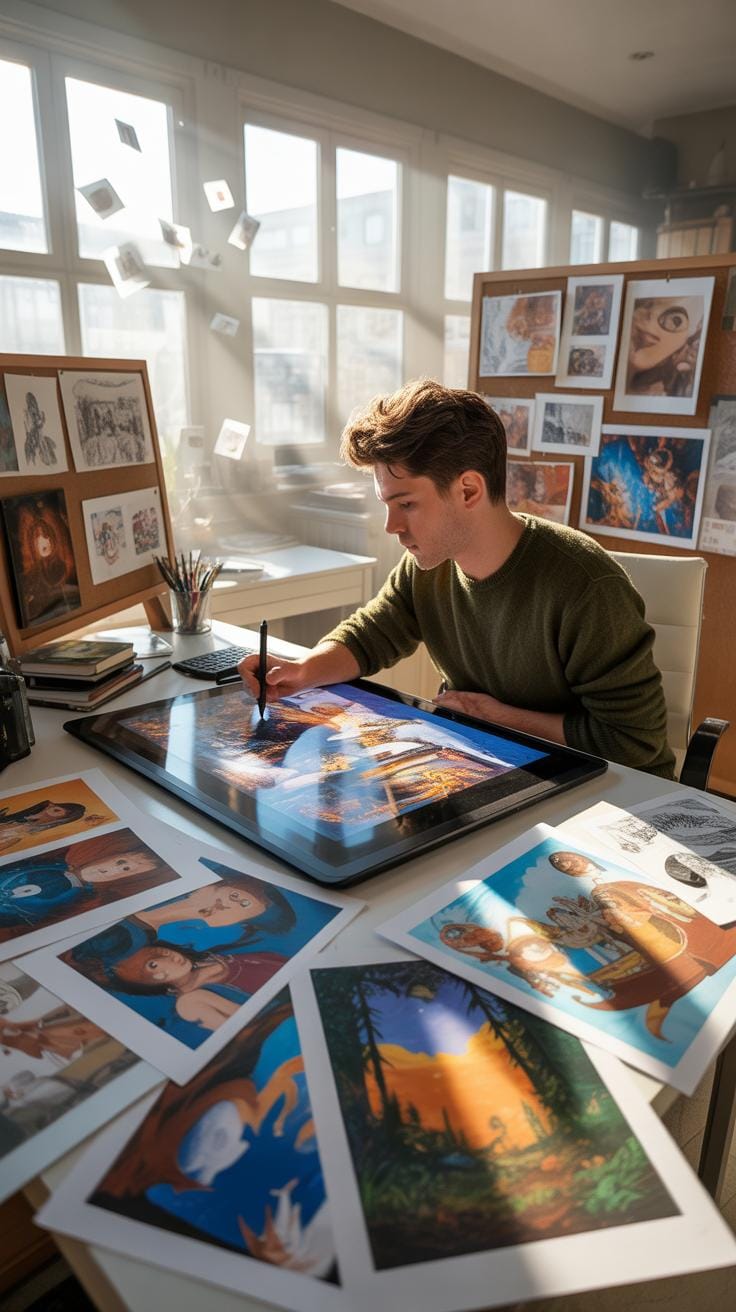
StepByStep Design Process

Initial Sketch To Digital Draft
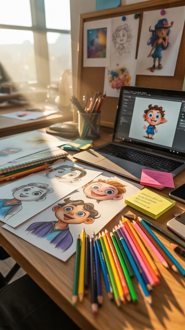
Start by putting your ideas on paper—rough sketches that capture the mood and attitude of your cyberpunk female character. Don’t worry about details at this point; it’s more about exploring silhouettes and key traits like posture and armor design. As you sketch, think about what personality your character conveys. Is she rebellious, calculating, or a bit mysterious? These traits will steer the design.
Once you have a few concepts, refine the sketches by adding defining features: cybernetic implants, hairstyles, clothing textures. Think about how these elements tell a story without a single word. Choosing a color palette comes next. Bright neon or muted metallics? Maybe a mix that balances gritty urban decay with flashes of tech glow. Don’t rush; experiment digitally with colors to find an identity that fits.
Finalizing And Exporting For Platforms
With your digital draft ready, it’s time to polish. Enhance textures, sharpen lines, and add lighting effects that suggest depth and atmosphere. Keep in mind where the image will be used—social media thumbnails need clarity at small sizes, while website banners might allow for more detail. Export files in multiple formats (PNG, JPEG, SVG) and resolutions to cover these needs.
Be sure to double-check color profiles; something that looks right on your monitor might shift elsewhere. Since marketing platforms have varying upload specs, resizing and optimizing your images becomes necessary. It can feel tedious, but preparing clean files tailored for each platform saves headaches later. Last but not least, consider adding subtle branding elements that won’t overpower the art but reinforce your campaign’s identity.
Conclusions
Creating cyberpunk female character art requires focus on distinctive features like technology themes, edgy design, and color use. Applying these techniques strengthens your digital marketing visuals and attracts targeted audiences effectively. Remember to balance futuristic elements with clear storytelling in your artwork.
Using cyberpunk female art in marketing can elevate your brand’s visibility. By following the discussed methods and tips, you can produce compelling visuals that resonate with cyberpunk fans and digital audiences. Practice these strategies to enhance your marketing success step-by-step.